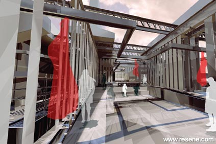
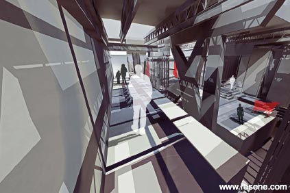
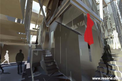
Through the use of colour, the architecture engages the occupants, generating an intimate relationship between the various bodies, both diner and beast.
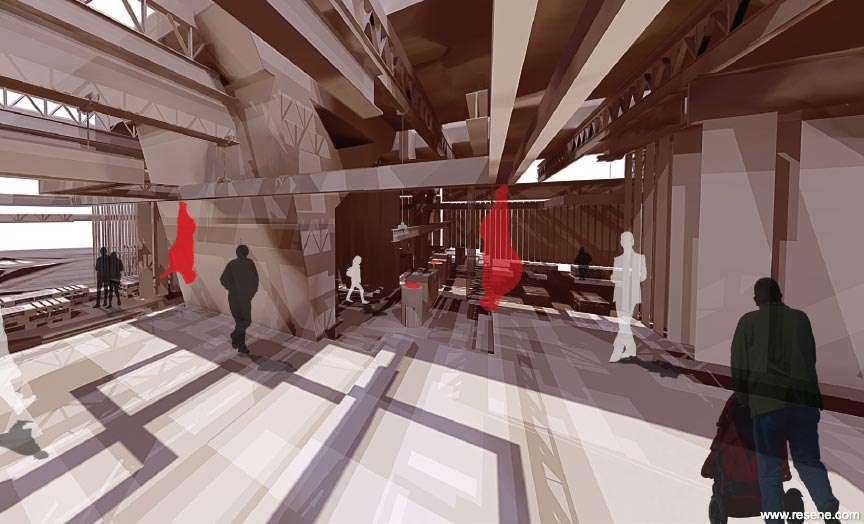
'Space for the Deglutition of Esculent Meat' investigates the connection and process between beef production and beef consumption. The result is a single edifice, consisting of slaughterhouse, meat preparation areas and restaurant, coexisting under the same roof. This intentional juxtaposing seeks to counter the modern day separation that exists between the preparatory process of beef and the consumer.
Through the use of colour, the architecture engages the occupants, generating an intimate relationship between the various bodies – both diner and beast – that occupy the space.
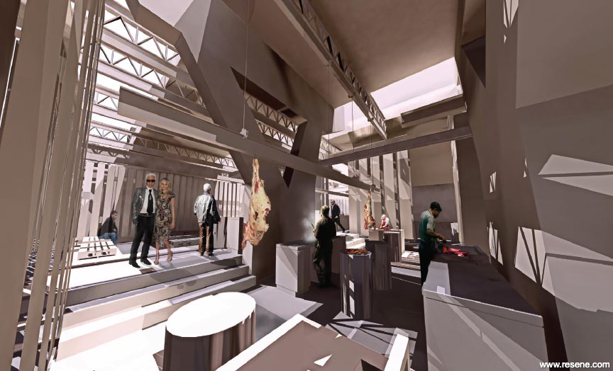
The modern day slaughterhouse interior is visually destitute and colour deficient. By contrast, the colour palette here was developed and refined to reflect the abattoir process. As the consumers move through the building they take part in the various slaughter procedures using all their senses, in particular the visual sense. Through the use of colour, the architecture is able to engage and connect the consumers to the various slaughter processes, therefore generating a more holistic, and successful design. As a result, the building speaks the language of its function – rich reds progress through to dark blacks, and back to light creams, emulating the processes of slaughter through to purification.
The slaughter process and consumption sit together and inform each other in a single environment. Nothing is sealed or enclosed behind doors – consumers are involved in the slaughter process and meat preparation. The varying shades of colour complement and enhance the varying processes which occur in each space; consumers move freely throughout the spaces, pausing in any space that appeals to them.
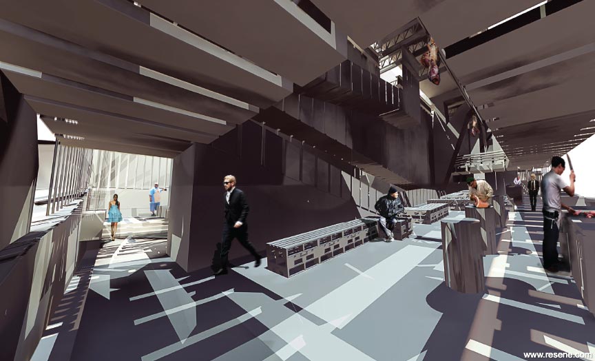
Linked together through the shedding of blood, the architecture therefore is a site for both slaughter and purification. Lifeless carcasses move through the architecture reflecting and praising the colour palette used throughout the space.

Colours used: Resene All Black, Resene Cork, Resene Link Water, Resene Maxwell Smart, Resene Soya Bean, Resene Trojan.
Specifier: Fraser Moore
Project: Resene Total Colour Awards 2011
Resene case studies/awards project gallery
View case studies that have used Resene products including many from our Resene Total Colour Awards. We hope these projects provide inspiration for decorating projects of your own... view projects
Total Colour Award winners:
2023 |
2022 |
2021 |
2020 |
2019 |
2018 |
2017 |
2016 |
2015 |
2014 |
2013 |
2012 |
2011 |
2010 |
Entry info
Latest projects | Project archive | Resene news archive | Colour chart archive
![]()
![]() Get inspired ! Subscribe
Get inspired ! Subscribe ![]() Get saving ! Apply for a DIY card
Get saving ! Apply for a DIY card
![]()
Can't find what you're looking for? Ask us!
Company profile | Terms | Privacy policy | Quality and environmental policy | Health and safety policy
Colours shown on this website are a representation only. Please refer to the actual paint or product sample. Resene colour charts, testpots and samples are available for ordering online. See measurements/conversions for more details on how electronic colour values are achieved.
What's new | Specifiers | Painters | DIYers | Artists | Kids | Sitemap | Home | TOP ⇧