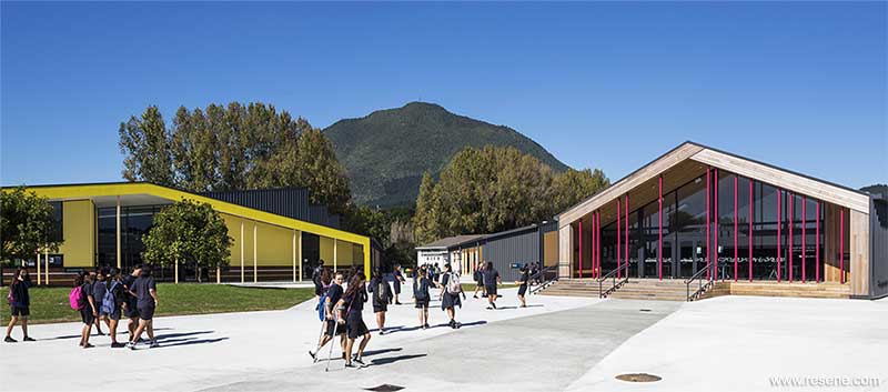
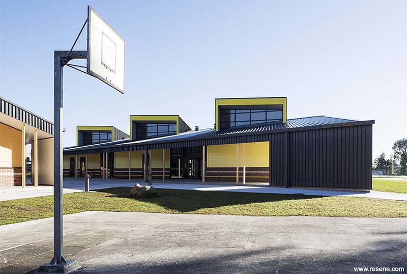
Cheeky pops of colour working seamlessly with natural materials have won Tarawera High School top honours in the Resene Total Colour Awards, with a colour palette that brings the community into the school, and the school into the heart of the community.
Resene has a long history of colour and today's colour range of thousands of hues is a far cry from the handful that was available when Resene started 70 years ago. The Resene Total Colour Awards were launched to encourage and celebrate excellent and creative use of colour; to showcase striking colour palettes and combinations and provide fresh inspiration.
Awards have been given for the best colour use in: Residential Exterior, Residential Interior, Commercial Exterior, Commercial Interior Office, Commercial Interior Public + Retail Space, Installation - Experiential - Product, Education, Neutrals, Heritage, Rising Star and Lifetime Achievement, with the Colour Master Nightingale Award for the best overall colour use. Find out more about the winners and read the judges' comments below:
Colour Award winners
The Resene Total Colour Master Nightingale Award, named after the Nightingale family who founded and still run Resene today, recognises excellence in colour and paint use, and was awarded to Tarawera High School by Richard Naish, RTA Studio. It also won the Resene Total Colour Education Award.
The judges said "This project is simply outstanding. It's a beautiful interpretation of colour created through a commitment to solid research and focused community involvement.
Symmetry and connectivity is created with a real play on how to manipulate colour to both advance and recede structures and spaces.
A textbook lesson in how to use colour well."
Find out more about this project
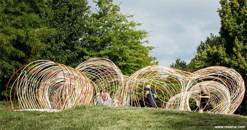
Daughter of the Swamp by Alexander Sacha Milojevic, Raphaela Rose, Ryan Mahon and Edward Roberts. Also winner of the Resene Total Colour Installation - Experiential - Product Award.
"You just can't look past this entry; it's a perfect example of how to use paint to enhance structure and how to make paint colours work harmoniously in such a stunning installation. The colours help to draw you in and add exponentially to the enjoyment."
Find out more about this project
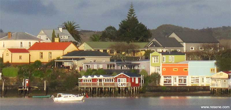
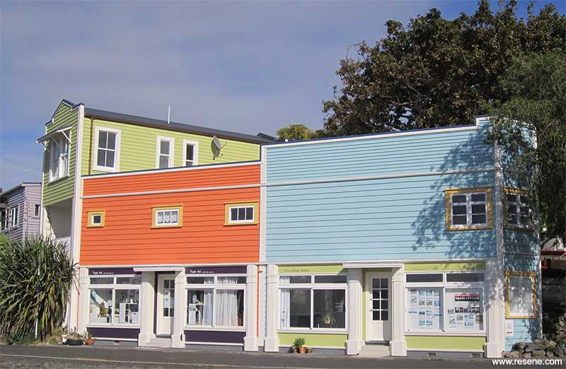
The Wedge, Rawene, Northland by David Truscott and Gaynor Revill
"This project enhances the entire townscape with an extraordinary manipulation of colour. The soft colour palette works well with the built landscape and the watery surroundings and is applied with sensitivity, enhancing the building form with its placement.
The stronger colours are reinforced with careful trim colour combinations that add shape and definition.
Viewed from afar, the buildings add to the vista and beckon you as you approach from the water, encouraging exploration when you disembark. From street level the colour adds personality.
A perfect example of the transformational power of colour."
Find out more about this project
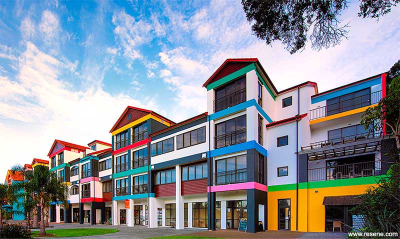
Oceans Resort – Tutukaka by Richard Cranenburgh, On the edge design.
"The summertime beach theme creates a happy joyful holiday spirit lifting a building that might once have simply blended into the background, into a local talking point. The colour placement breaks with convention; it's bright, bubbly, bold and undeniably colourful.
Colour can be used to both draw attention and distract attention and this project cleverly does both using the bold pops of colour to draw your eye across the building focusing on the colour highlights, effectively helping to camouflage other elements.
For those arriving from the sea, it provides a colourful backdrop to the Tutukaka marina acting as a colourful welcome home for locals and visiting mariners."
Find out more about this project
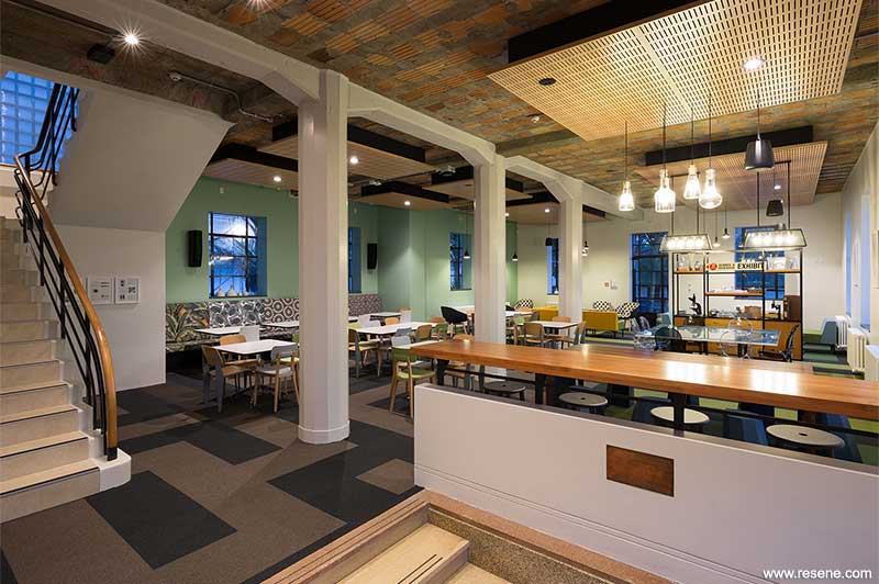
Plant & Food Research by Charnay Mouldey, Creative Spaces Limited
"Relaxed and fun, this office represents the business it houses through its colours and materials. There is a sense of balancing a sympathetic colour palette in keeping with the heritage of the building while bringing the beauty of nature indoors in a softened colour palette.
The feel is comfortably casual and not too corporate with a subtle vintage vibe and an office space that cocoons around staff supporting them in their work.
The woven tapestry of colours and materials creates a real connection of parts. It's a subtle interpretation of colour that fits perfectly."
Find out more about this project
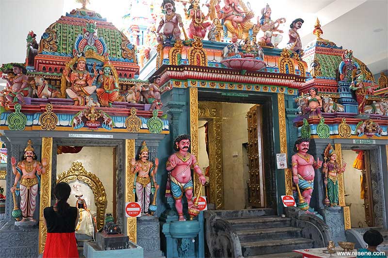
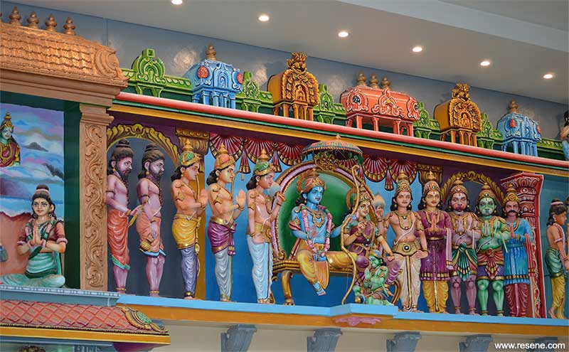
Hindu Temple Building Project – South Maclean by N. Ketheeswaran, AKVA Chem Consultant
"This project is iconic, memorable and will continue to draw attention for many years to come.
It's a truly unique project with an historical application of colour teamed up with the skilful application of paint. Modern paint and colour technology meets traditional artisans who have worked their magic carefully combining a multitude of colours for a striking effect.
The attention to detail and the dedication to ensuring each colour is in its rightful place is both fascinating and inspiring.
The colour brings all the elements to life and celebrates and showcases a culture bursting with pride."
Find out more about this project
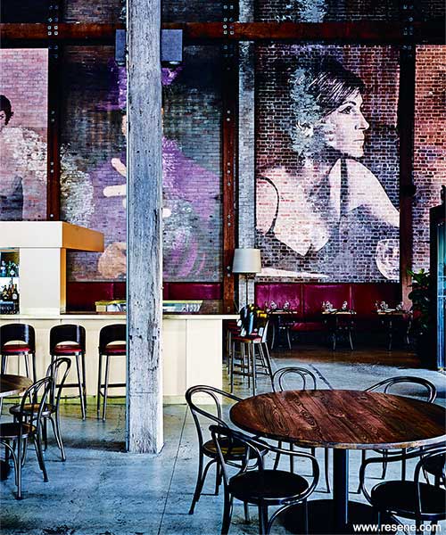
Bar Machiavelli – Jason Mowen
"The richness and layering of materials and elegant colours creates an uber-glamorous feel.
The amazing use of colour in murals carefully washed onto the challenging texture of the brick wall creates colour that appears to be growing out of the wall and has been there forever. Timeless and aged, the purposefully weathered palette adds a soft and sensual backdrop.
Commanding attention is the striking gold bar, dazzling in gold metallic paint. Rich materials and hues are combined into this artfully beautiful theme with Imperial Roman colours grounded and highlighted with the unforgettable one of a kind gold bar."
Find out more about this project
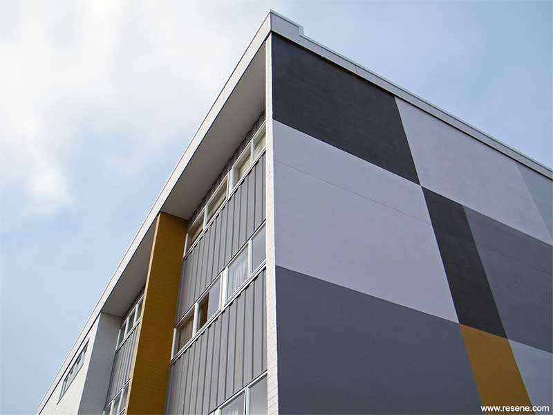
Seafield Apartments Exterior Refurbishment by Malcolm Taylor, Xsite Architects Ltd
"This elegant colour scheme has turned what could have been a very non-descript white block building into a contemporary and pleasing project.
Situated by the beach, this apartment building has been salvaged with paint adding relief with the architecture. The colourways and colour placement are a pleasant surprise as you wander towards the beach, giving the building a new lease of life.
The rectangular block is characteristic of the area and era. The addition of colour has articulated the building and added depth yet is completely respectful of the original building design.
The colour palette is entirely appropriate and rejuvenated this building in a contemporary style."
Find out more about this project
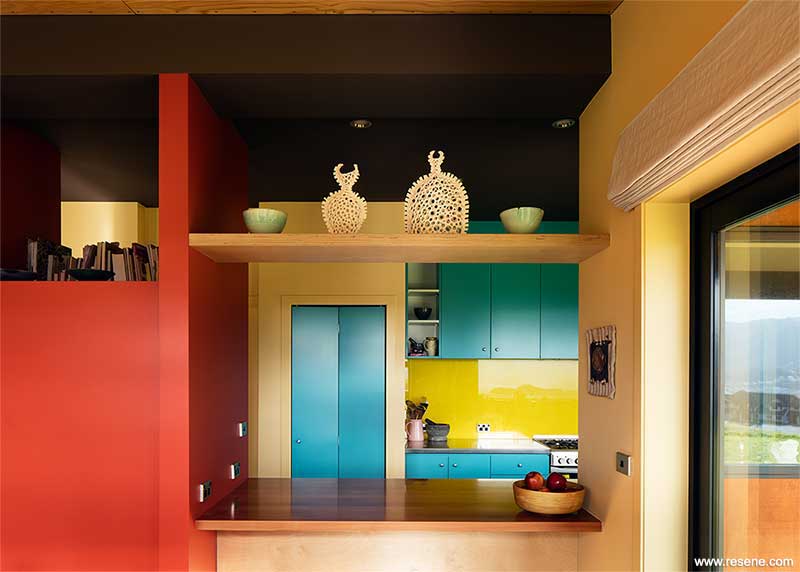
Saddle Hill House, Tawa by Aonui Architecture
"The warmth of the neutral wall colour, when so often we see white, creates an underlying sense of cosiness and warmth, reinforced by the stronger colour selections punctuated throughout this home.
There is a skilful use of colour in transitional areas; the spine of dark brown is used to perfection connecting spaces through the home. Pops of colour have been grounded against a background of timber. The sense of colour meets nature through the timber finishes creates a home that feels welcoming and easy to live in.
An unexpected use of colour, the replicated use of colours and materials in this home shine."
Find out more about this project
Huntly Road House by Mark Wilson, Masonry Design Solutions
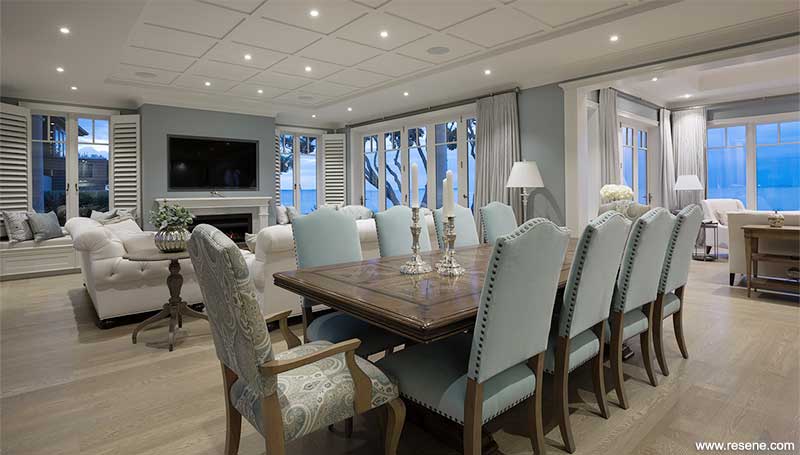
"Drawing inspiration from the beautiful beach positioning, the sea is gently washed inside with weathered tones of blue and white.
The colour palette is a traditional balanced scheme with a beautiful application of a tonal colour palette without resorting to grey or stone.
With a magnificent view and vista of both sea and sky, this home completely encapsulates both, merging them together for a sense of infinite relaxation. The soothing colours frame the view for an easy transition from indoors to out.
Simply classic, timeless and elegant. Absolutely nothing is out of place."
Find out more about this project
The Opera House, Wellington; Centenary Upgrade by Mitchell Burrows, Shand Shelton
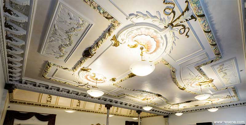
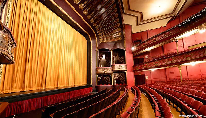
"Breathtakingly beautiful; a monochromatic delicate colour palette has been applied with such care and attention. The subtlety of the colours lures you in; the longer you look, the more you can appreciate the exquisite detailing and the colours as they gently complement each other.
The project has a beautiful delicacy fitting with its history. Elegance is created in circulation areas with a quiet careful restraint. This elegance is the opening act setting the stage for the theatre with its rich related palette of orange, red and burgundy.
Colour leads the way bringing out this building's beauty."
Find out more about this project
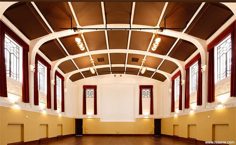
Sir Geoffrey Peren Building by Studio Pacific Architecture
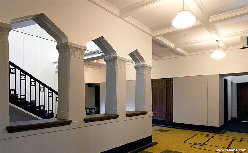
"This building was originally designed by the renowned American architect Roy Alston Lippincott whose work is punctuated throughout New Zealand. The influences and colour application is respectful of the restrained work of Lippincott.
Careful research into this building's past was used to guide the current colour choices. Line and form are clearly defined acknowledging the building's history and heritage.
Key architectural features are highlighted with appropriate colour use. The colour palette is sympathetic to the building's style, drawing attention to details without being overpowering. It's a very fitting and respectful restoration to its original elegant form and the Spanish Mission architectural style."
Find out more about this project
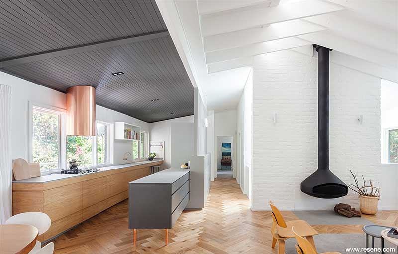
Riverview House by Nobbs Radford Architects
"While neutrals are often seen as a default option, it takes skill and careful consideration to really harness the power of neutrals.
This home carefully plays off dark and light with a well-constructed neutral palette that allows feature lines to show. There is a playful use of textures and detailing to enhance the subtle colour flow, casting light and shadow.
The juxtaposition of the ceiling colour delineates the space with elegance and solidarity. The wooden floor adds warmth and pattern to complete the colour palette.
It's simply beautiful."
Find out more about this project
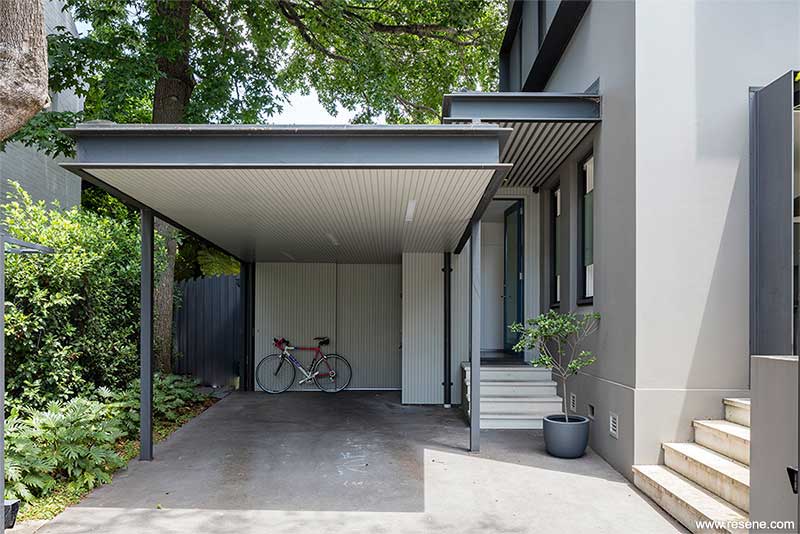
Paddington Corner Terrace - hungerford+edmunds architects
"Inside and out this home is a very sophisticated project that is well thought through.
Warm neutrals outside transfer to a softer cleaner interior aesthetic. It's a lovely transference of colour where both the public face and the private face of the home complement each other.
Relaxing, restful, yet still stylish with a subtle neutral colour palette. From the paint colours to the furnishings and accessorising, all elements come together for a relaxing and peaceful home that's easy to live in and easy to visit. A perfect sanctuary from the busy city."
Find out more about this project
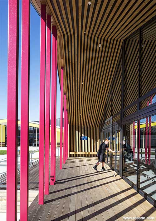
Tarawera High School by Richard Naish, RTA Studio. Also winner of the Resene Total Colour Master Nightingale Award
"A school is often the heart of the community, and this project exemplifies that, bringing the local environment and community into the school. The colour selections reflect the rich surroundings with the colour used to enhance and create a meaningful engagement between home and school, and community and school.
Playful without being predictable; cheeky pops of colour work in seamlessly with natural materials. The colour of each building has helped create a personality for each, bringing them together to create a complete family as a school. The colour is applied in different ways to each building, so that each truly has its own identity within the whole.
Easily identifiable, sensitively and extremely well put together, this school embraces colour wholeheartedly."
Find out more about this project
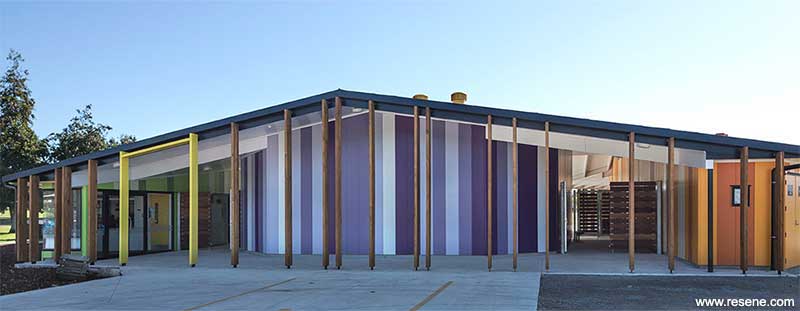
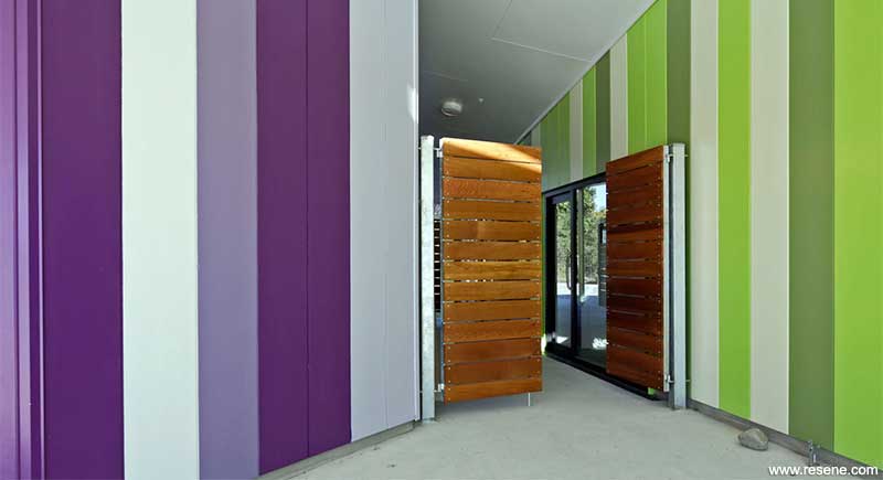
Te Kura Kaupapa Maori o Ngati Kahungunu o Te Wairoa by Richard Naish, RTA Studio.
"Colour is used to wonderful effect.
The colour development process engaged the local community. This has brought a sense of belonging, connection and pride that shines through the colour selections. The colours aren't the normal primary colours that you see on many schools, but tend towards dustier and more complex tonal contrasts.
The colours are applied in vertical bands, with palettes of related colours that have a sense of movement and rhythm that wouldn't have been achieved with large blocks of colour. The colours draw you in and give each part of this school its own personality.
A confident use of colour integrated with design."
Find out more about this project
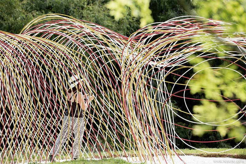
Daughter of the Swamp by Alexander Sacha Milojevic, Raphaela Rose, Ryan Mahon and Edward Roberts. Also winner of the Resene Total Colour Nightingale Colour Maestro Award.
"A spectacular installation, the form and colour is completely welcoming and draws you in. Irresistible to young and old, it entices you to traverse through for a moving colour experience as the palette of three colours appears to dance when viewed on different angles.
The colour is thoroughly integrated, rippling through, just as the land does beneath it.
The installation creates standalone excitement; it's stunning, whimsical, but yet retains a sense of fragility. With each new viewing angle, the colours play off each other and the installation's form in a new way.
Just stunning, a stand out use of colour."
Find out more about this project
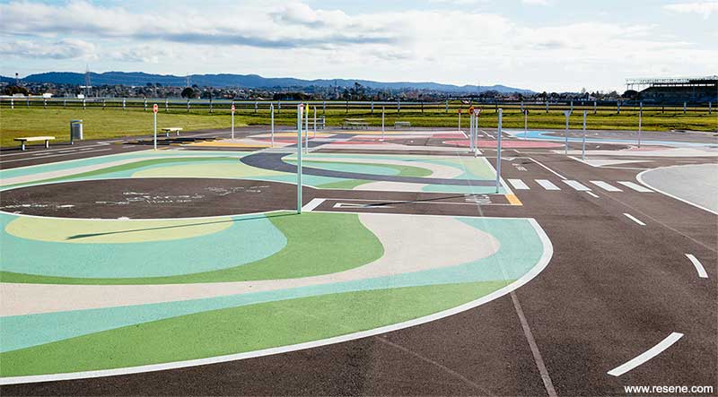
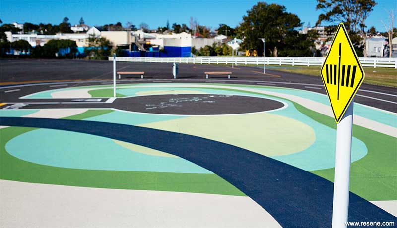
Learn to Ride/Avondale Racecourse by Studio106 Architect
"This project captures the imagination of all ages, while providing a practical space for riders to learn to ride.
It would have been so easy to simply mark the roads, add patches of green and the job would have been finished. Instead, the colour is implemented with such care that the significant expanse of flat surface has a sense of topography as colours flow together to replicate land contours and water. The placement of colour on this sheer scale makes this project even more challenging with a careful balance needed to ensure that the colour works when viewed up close by riders and at a significant distance as they set their direction.
A powerful statement of how you can enhance a facility with the clever application of paint."
Find out more about this project
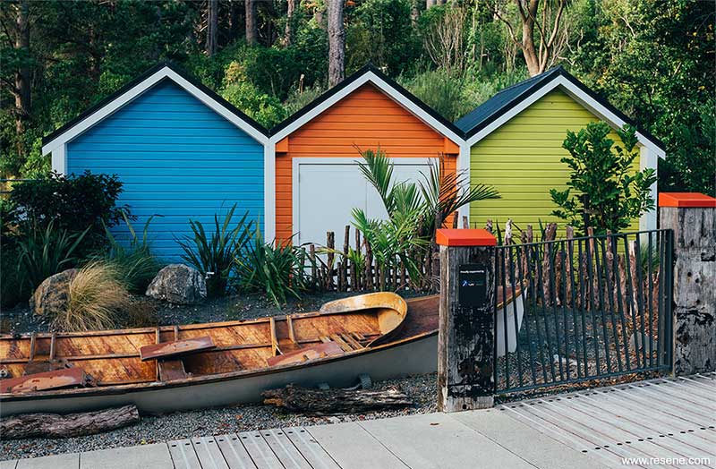
Meet the Locals He Tuku Aroha by Isthmus Group Ltd
"When creating a new feature within an existing space, the challenge is even greater to ensure that the new has a personality of its own while still feeling part of the whole. This project cleverly embraces local iconic forms with colour to draw attention and give a sense of belonging. The playful theme encourages exploration and opens up visitors to being educated about our local living treasures.
Architecture that could easily be hidden is celebrated with bolder colours, becoming part of the enjoyment of the space.
Fun, colourful and creative – who wouldn't want to meet the locals that live here?"
Find out more about this project
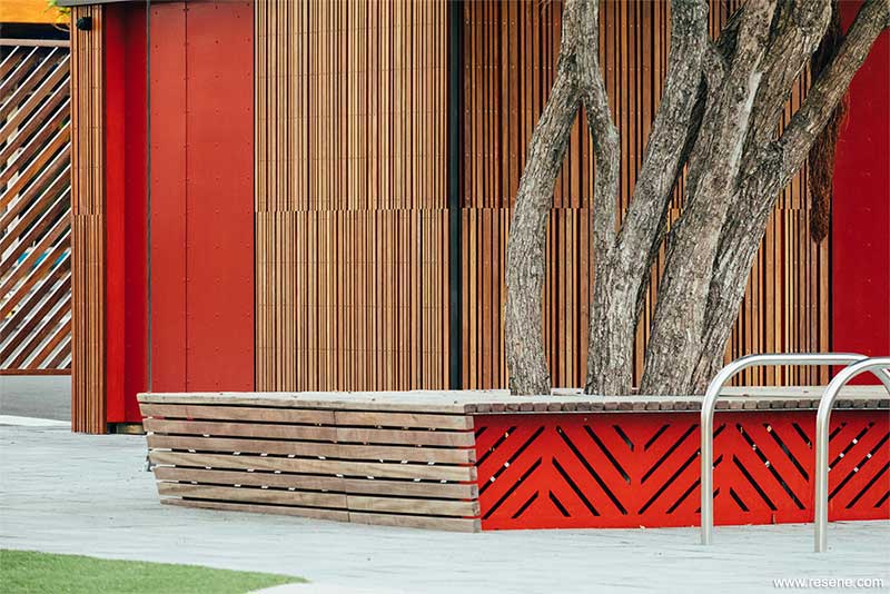
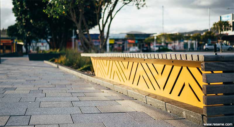
Porirua CBD by Isthmus Group Ltd
"The practicality and durability of form are enhanced with colour, subtly drawing attention to the detailing.
The integration of the colour palette shows close attention to detail to ensure each use of colour complements all others, while also providing a new curation of the colours depending on the angle they are viewed from.
Cleverly placed pops of bolder colour punctuate what could have easily been a sea of grey concrete, adding a sense of fun, energy and vibrancy welcoming visitors into the CBD."
Find out more about this project
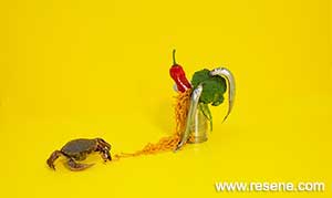
Don't Play with your Food! by Harriet Beex and Matthew Torr, Harry + Matt.
"If you want to attract attention, what better way to do it than with striking colour choices that command attention? This is a fantastic festival project that deliberately leaves viewers and guests baffled.
The focal colours are the hero adding a positive and warm feeling, drawing you in to see the carefully arranged elements.
Each image has a sense of story and life, working as well individually as they work together. The humour and attitude add so much personality amplified by the colours.
An incredibly interesting and unexpected entry."


(selected by Resene)
There is one thing that John Mills' projects share - a love of colour.
John's projects are recognisable by their distinctive, clever and considered colour use. With a considerable portfolio of colourful projects to his name, while no two are the same, each has a confidence of colour use, weaving multiple colours together for a memorable and unique finished effect. While introducing bold colour gives projects additional strength, for John the colour is also part of the composition.
There is no pre-defined colour palette, no favourite go to colours that pop up in each project. Each colour palette is carefully selected for each client.
John believes the story begins and ends with the client – who they are, what their values and aspirations are, what music they like – it's all relevant and therefore each of those lines has a consequence. It helps too when John can see opportunities where nobody else can see them.
Evenings, weekends, year after year, John wants the spaces he creates to work perfectly for his clients and even get better as time goes by. Thoughtful use of materials and colour all promote this longevity.
The team at John Mills Architects, led by John, has a distinctive aesthetic that seeks to combine their passion for materials and colour with a desire to create uniquely tailored architecture for the individual or specific organisation.
As John himself says "Colour makes a space more dynamic and complex. It is also ambiguous and begs interpretation, which is all part of the art of architecture. The way colour changes throughout the day, for example, determines how a space is perceived. A room that is fresh and bright by day has a lot of personality and strength. At night, however, the rich tones make the space more moody and intimate. I remember well at architecture school an architect saying that colour has the ability to make space infinite. I have been trying - I'm still trying - to make that happen every now and then."
The architecture and landscaping, lighting, colour and furniture – for John it's about developing the whole story. It's an approach that seems to work, with most of his work featured in publications or celebrated in various awards, including multiple Resene Total Colour Awards, and clients that tend to stay for the long term in the homes he's designed for them.
With an accountant for a mother and a father in the dry cleaning business, architecture may not have been in John's blood but it was the perfect career choice for a boy utterly obsessed with drawing and making things. John has now passed his love of architecture and colour onto his daughter who is finishing her Masters in Architecture, and is herself a Resene Total Colour Award winner.
As a previous winner of multiple Resene Total Colour Awards for his projects, it is only fitting that this time it is John himself who is recognised for his commitment to using the power of colour to help develop the whole story and to create memorable projects that his clients can enjoy long into the future.