In a challenging year, the entrants for the Resene Total Colour Award winners have shown the power of colour and creativity to change space, mood and emotions. From new builds to making the most of what is already there, a little paint, colour and passion can reinvent any surface.
An unexpectedly playful and energising palette of historically appropriate colours wins Nancy Martin House, by Frederick Ost by Ann Shelton and Duncan Munro the top colour award in the Resene Total Colour Awards 2020.
The judges said "colour selections have been ever so faithfully chosen to honour and respect the original. It reminds us all to make the most of what is already there – sometimes all that is needed are fresh coats of paint colour to make old new again. So much passion and painstaking research and attention to detail has been poured into choosing just the right colours and placing them ever so carefully in the right places. This home is loved by colour."
Resene has a long history of colour and today's colour range of thousands of hues is a far cry from the handful that was available when Resene started 74 years ago. The Resene Total Colour Awards were launched to encourage and celebrate excellent and creative use of colour; to showcase striking colour palettes and combinations and provide fresh inspiration.
Awards have been given for the best colour use in: Residential Exterior, Residential Interior, Commercial Exterior, Commercial Interior Office, Commercial Interior Public + Retail Space, Installation - Experiential - Product, Landscape, Education, Bright Spot, Neutrals, Visual Art and Rising Star, with the Colour Master Nightingale Award for the best overall colour use.
Colour Award winners
Colour Maestro award winners
The Resene Total Colour Master Nightingale Award, named after the Nightingale family who founded and still run Resene today, recognises excellence in colour and paint use. The Award went to:
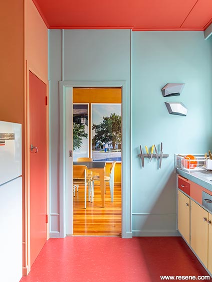
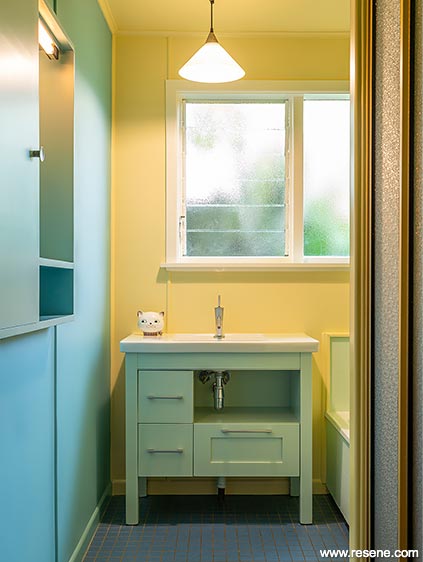
Nancy Martin House, by Frederick Ost by Ann Shelton and Duncan Munro.
Also winner of the Resene Total Colour Heritage Residential Award.
The judges said "a labour of absolute love, this project is lavished with era appropriate hues, selected with incredible care and attention to detail and placement. The palette honours the value of design, wrapping it with a charming sense of mellowness and restfulness. The rimu doors cleverly read as a neutral thread. This project reminds us all that history has so much to offer as inspiration for colour selections of today if we make the time to look back and learn."
This project uses Resene Mexican Red, Resene Sea Mist, Resene Burning Sand, Resene Shadow Green, Resene Primrose, Resene Pearl Lusta, Resene Neptune, Resene Mist Grey and Resene Rose.
Also winner of the Resene Total Colour Heritage Commercial Award.
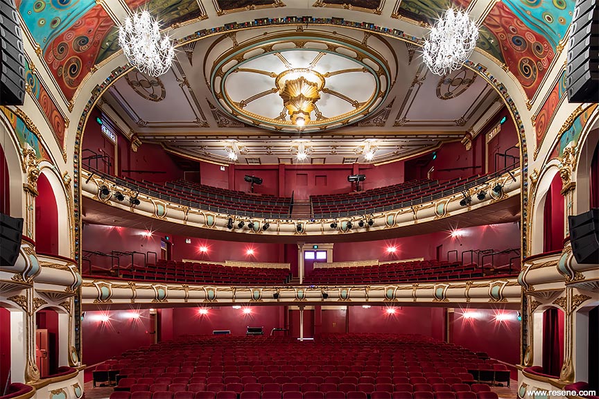
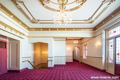
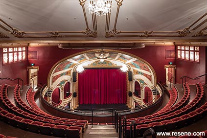
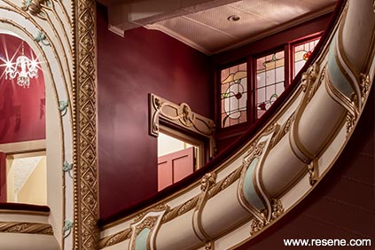
Hawkes Bay Opera House Upgrade by Dave Pearson of DPA Architects Ltd.
Opening back up in grand style, this project is steeped in colour, so richly and dramatically dressed. Features are carefully picked out in appropriate hues encouraging the eyes on a colour journey. A definite crowd pleaser, the hues warm up the audience and create a sense of anticipation for the performance that lies ahead. Well deserving of a standing ovation.
This project uses Resene Vanquish, Resene Merlot, Resene Eighth Pearl Lusta, Resene Half Pearl Lusta, Resene Triple Pearl Lusta, Resene Gum Leaf, Resene Canterbury Clay, Resene Quarter Canterbury Clay, Resene Half Gum Leaf and Resene Carnaby Tan.
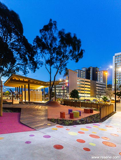
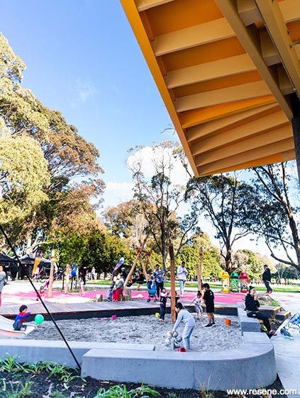
Hayman Park by Wraights Athfield Landscape Architecture (WALA).
The judges said "colour is thoroughly integrated into the bigger picture, with colour used as a device for wayfinding and to signify areas of the park that fulfil different functions. Structures are defined by their chosen colours and together glow in welcome to park visitors, working equally well during the day and as the sun sets. The bold colour palette opens up the park extending the boundaries and ties all the elements together with a sense of excitement and anticipation."
This project uses Resene Uluru, Resene Crusade, Resene Pitch Black, Resene Buttercup, Resene Supernova, Resene Bahama Blue, Resene Half Jumbo, Resene Tangerine and Resene Irresistible.

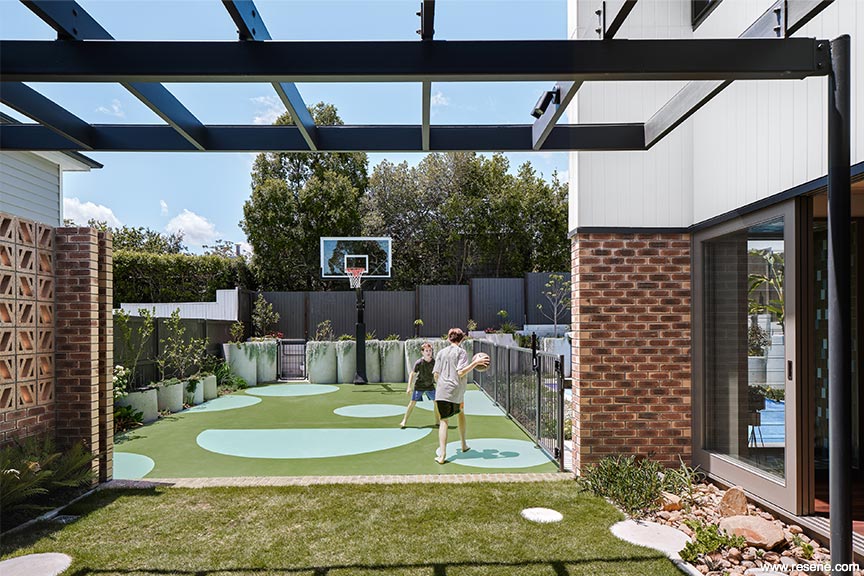
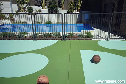
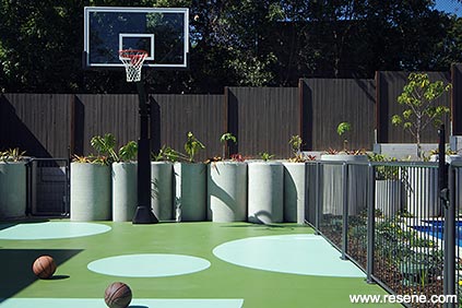
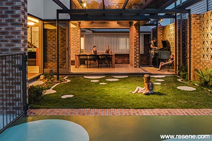
Breezebrick Courtyard House by Jason Haigh of Cloud Dwellers.
The judges said "this project is the perfect example of how with a little creativity and paint colour you can easily create something out of nothing. What could have been a nondescript concrete pad has become a clever colourful feature deftly encouraging outdoor play while adding aesthetic appeal. The scale and rhythm of the circles is ever so carefully planned to elevate the space without overwhelming, perfectly complementing the distinct zones. An innovative and inspiring play on colour."
This project uses Resene Dell, Resene Padua and Resene Double Mondo.
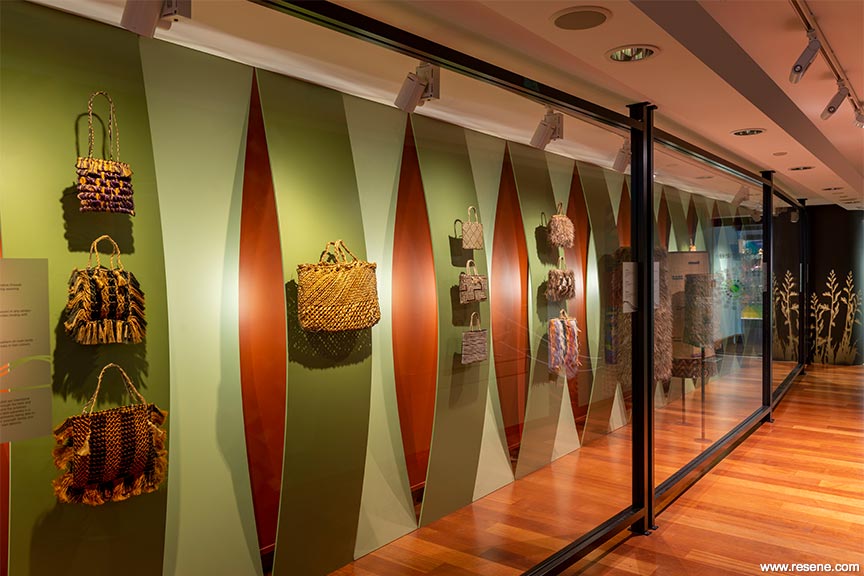
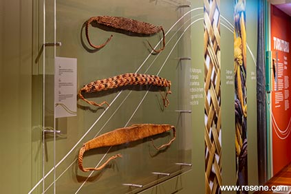
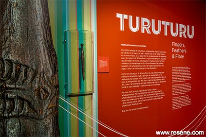
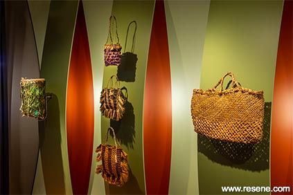
Turuturu: Fingers, Feathers & Fibre by MTG Hawke's Bay.
The judges said "the colours are so carefully woven into this project it is almost difficult to see where one colour ends and the next one begins. This careful related selection means not only are the hues sympathetic to the curated collection, but they relate equally well to each other. Inspired by nature's unerring mastery of colour, this palette layers the best of nature's inspiration with a flaxen twist. A natural winner."
This project uses Resene Flax, Resene Cross Country, Resene Mustang, Resene Black Magic, Resene Serenity, Resene Opal, Resene Petite Orchid, Resene Kalgoorie Sands, Resene Caper, Resene Nirvana, Resene Chelsea Cucumber, Resene Origin, Resene Contessa, Resene Rose Of Sharon, Resene Flourish, Resene Bay Leaf, Resene Aqua and Resene Area 51.
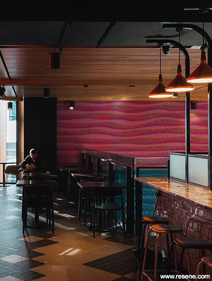
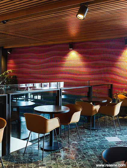
Harbour Eats, Commercial Bay by Love bErto Street Artist.
The judges said "meticulously detailed the colours ripple out across the wall. With an underlying vibe of a radio frequency, the colour subtly plays on the senses. Each colour is cleverly and painstakingly separated from each other so that each colour and the space that lies between set the rhythm in harmony. A unique application of colour that wraps and elevates this space."
This project uses Resene Havoc, Resene Black, Resene Origin, Resene Hemisphere and Resene Yarra.
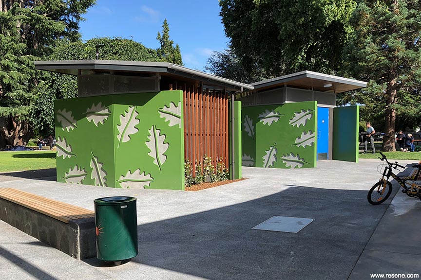
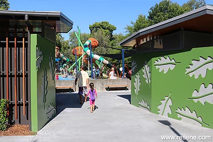
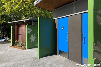
Cornwall Park Public Toilets by Brent Scott of Citrus Studio Architecture.
The judges said "this project raises the bar for public space amenities with its combination of colour and design. The hero hue and leaf motif are a careful balance of being bold enough to be a wayfinding device at distance while still being at one with the wider park surrounds. So well designed, well coloured and simply gorgeous."
This project uses Resene Dell, Resene Brandy Punch, Resene Tory Blue, Resene Ironbark and a custom made Sandstone Grey.
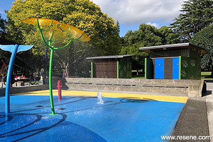
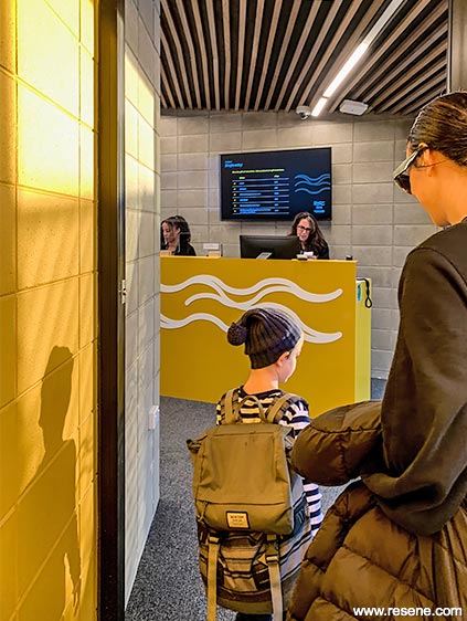
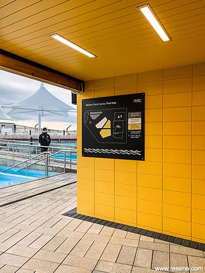
He Puna Taimoana, the Hot Pools at New Brighton by AW Architects.
The judges said "judicious splashes of colour set the scene. Easy on the eye, hues of teal and yellow roll over from surf and sun to bring energy into this social space. Slatted materials add an extra textural dimension and create an illusion in the colour layers to read as a multi-toned woven vista. A masterful pairing of colour tone and treatment."
This project uses Resene Surfie Green, Resene Tulip Tree, Resene Galliano, Resene Aspiring, Resene Black, Resene Black White and Resene Pitch Black.

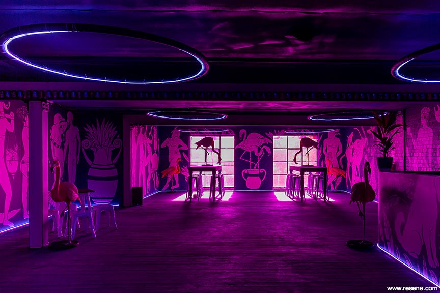
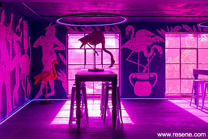
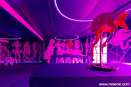
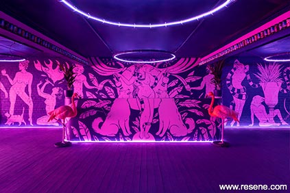
Bacchanalia Bar by Justine McAllister.
The judges said "blank walling is totally transformed with an impressive sense of movement, playfulness and colour. The careful combination of lighting with colour, brings the work to life, enhancing it and using it as a beacon to draw in the fun loving crowds. An energetic celebration dancing of colour for all to enjoy."
This project uses Resene Checkmate and Resene Illusion.
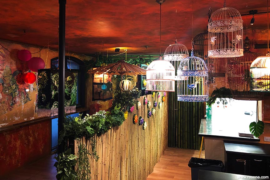
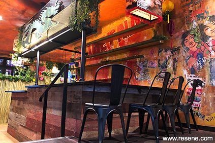
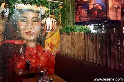
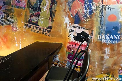
Saigon Kingdom by Element17.
The judges said "historical and antiqued notes thread through this thematic space. Colours are at one with the surface giving the appearance they have been there forever as if engrained with a painterly look. The colour use and theming cleverly define the space and bring a distinctive taste of international inspiration home to enjoy kiwi style. It is a feast for the eyes."
This project uses Resene Turbo, Resene Bright Red, Resene Jalapeno, Resene Hyperactive, Resene Bilbao, Resene Goblin, Resene Space Cadet and Resene Picton Blue.
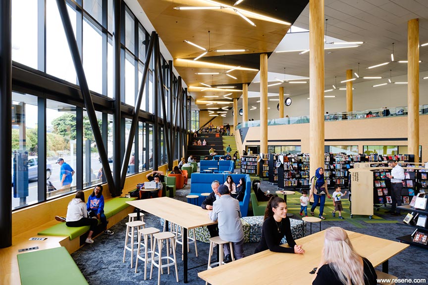
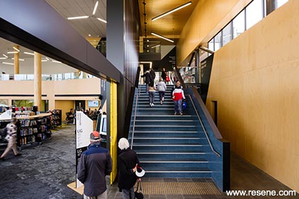
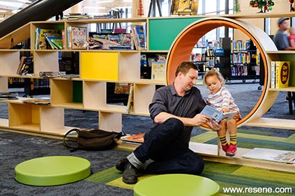
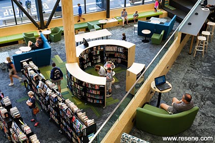
Waitohi Johnsonville Library and Community Hub by John Hardwick-Smith, Chris Winwood, Nick Strachan, Jaime Lawrence, Robin Aitken, Ari Stephens, Katherine Dean, Karly Houston, Stephen Brennan, Oliver Wright of Athfield Architects Limited.
The judges said "as the backdrop to a busy space, the palette is sensitively chosen and placed. Appropriate, welcoming and calm it is serene with just the right amount of colour to liven the senses while focusing attention on the collection within. A fitting backdrop to a public space where young and old can sit and enjoy the space at their own pace."
This project uses Resene Copper Canyon, Resene White Pointer, Resene Spanish Green, Resene Crisp Green, Resene Nocturnal, Resene Eureka and Resene Ironsand.
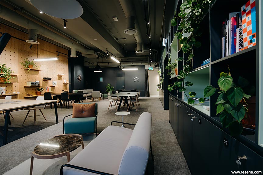
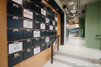
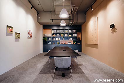
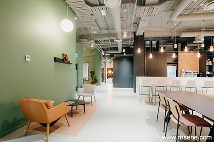
Spaces Karangahape Rd by Chris Wheeler of Hierarchy Group.
The judges said "colour defines this workspace with a thoughtful and restrained use of colour. With a myriad of people to appeal to, the palette is universally appealing and instantly welcoming to all. The softened hues are light on the senses for easy concentration to support those busy at work with just the right amount of energy and liveliness to encourage convivial collaboration."
This project uses Resene Half Alabaster, Resene Xanadu, Resene Triple Canterbury Clay, Resene Cinder, Resene Half Cougar, Resene Pristine Lavender, Resene Half Cobblestone, Resene Kalgoorie Sands, Resene Cararra and Resene Kandinsky.
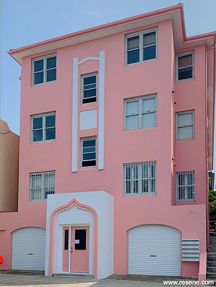
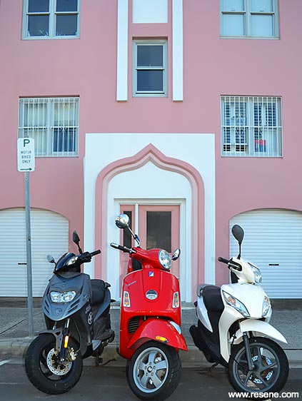
Beau Rivage, Bondi by Kat Everett.
The judges said "this beachside location celebrates a local love of colour. With a neighbour dressed in colour, this project needed to have a colourful wardrobe of its own befitting its part in the colourful vintage duo. The colours carefully accentuate the architecture without overwhelming it. Happy, beachy and so full of sunshine."
This project uses Resene Petite Orchid, Resene Alabaster, Resene Half Petite Orchid, Resene Quarter Petite Orchid.
Lean on Me – Exterior by Pat de Pont of Strachan Group Architects.
The judges said "snuggling into its site from the streetscape into the landscape, the clever pairing of hues seamlessly handle the transition from street to private space and from traditional to modern. The light filled private space is an unexpected delight which blends beautifully with the garden for a quick escape from city to social."
This project uses Resene Siam, Resene Gravel, Resene Double Sea Fog and Resene Woodsman Whitewash.
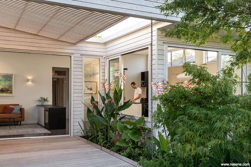
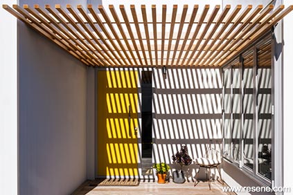
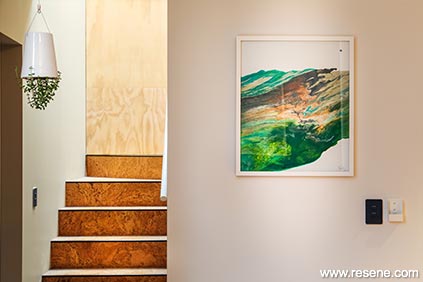
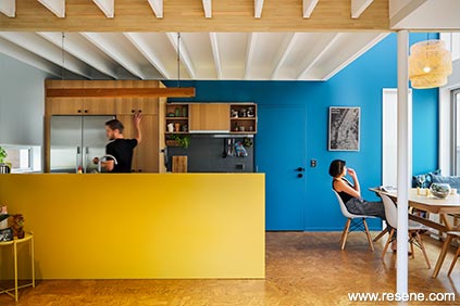
Chen Anselmi Units by Paul Anselmi of Bull O'Sullivan Architecture Ltd and Maria Chen.
The judges said "the delightful use of bold colour lifts the spirits. The timber is a foil to the hues and brings a taste of the trees outside indoors connecting this home back to the landscape. Exciting, optimistic and inspirational, with a clearly defined colour palette you simply can't wait to come home to. Colour makes this home."
This project uses Resene Blumine, Resene Celebrate, Resene Double Napa, Resene Wafer, Resene Coffee Break, Resene Sugar Loaf, Resene Grass Hopper, Resene Coral, Resene Teal Blue, Resene Half Robin Egg Blue, Resene Quarter Robin Egg Blue, Resene Zumthor, Resene Clockwork Orange, Resene Wan White and Resene Half Wan White.
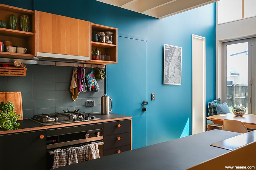
Twin Peaks by Natasha Markham of MAUD Ltd.
The judges said "a breath of tranquillity washes over this home, with a restrained yet undeniably beautiful colour palette. Darker colours are cocooning in more intimate areas leading to lighter hues in shared social spaces. An elegant palette interpreted with modern living in mind. A masterful lesson in how to weave tranquil colour into a home."
This project uses Resene Hit Grey, Resene Steel Grey, Resene Dawn Pink and Resene Double Alabaster.
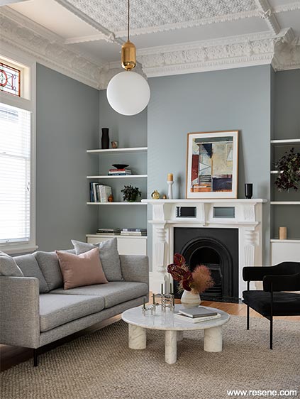
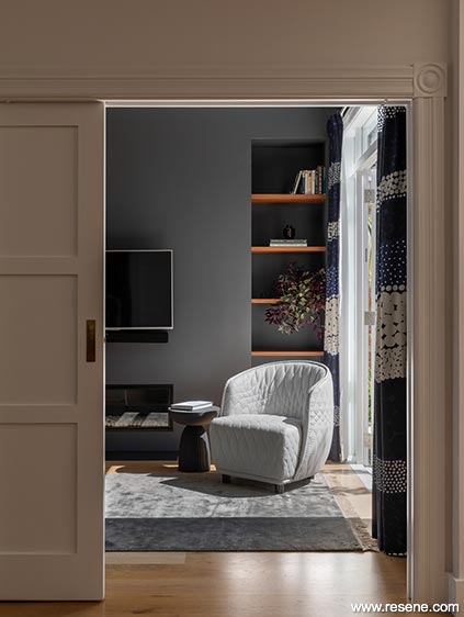
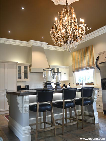
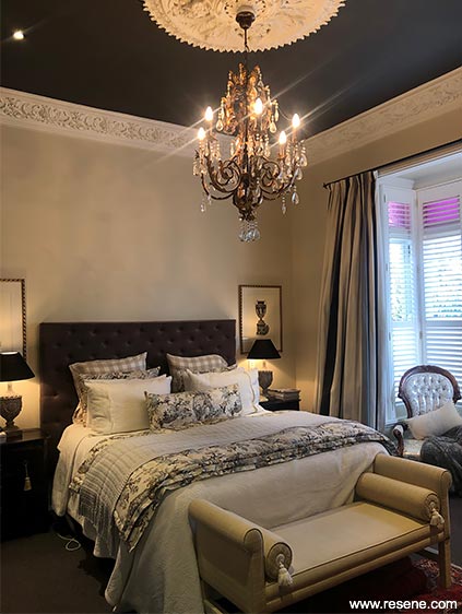
Glamorous Heritage Villa by Amber Hamilton of Amber Hamilton Interior Design.
The judges said "flamboyantly dressed, eyes are immediately drawn to the magnificent ceilings of colour, which reach down from the ceiling into the room. Warm, deep and glamorous, using the ceiling for the main colour features allows the colour to make a grand entrance in each space with an uncluttered space to really let the colour sing. Beautiful."
This project uses Resene Cafe Royale, Resene Pohutukawa, Resene Ebony, Resene Baltic Sea, Resene Double Parchment, Resene Canterbury Clay, Resene Quarter Craigieburn and Resene Quarter Thorndon Cream.
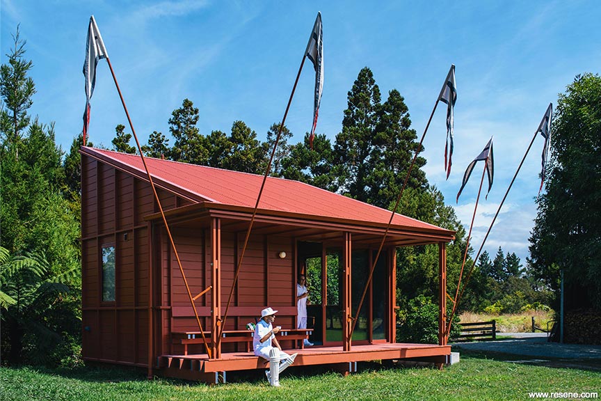
Point Wells Cricket Club by Pac Studio.
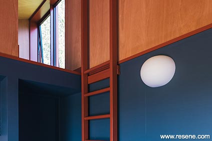
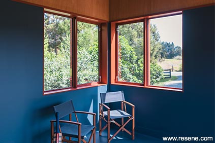
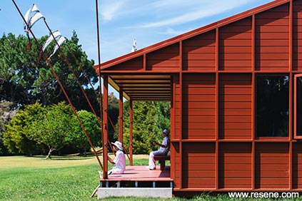
The judges said "a whimsical folly, this project just makes you smile. Drawing from the heritage of the sport reinvented in a quintessential kiwi vernacular, every element is touched with a sheer love of the game with local flourishes for good measure. Camaraderie, cricket and colour come together for a perfect match."
This project uses Resene Pioneer Red, Resene Half Periglacial Blue and Resene Coast.
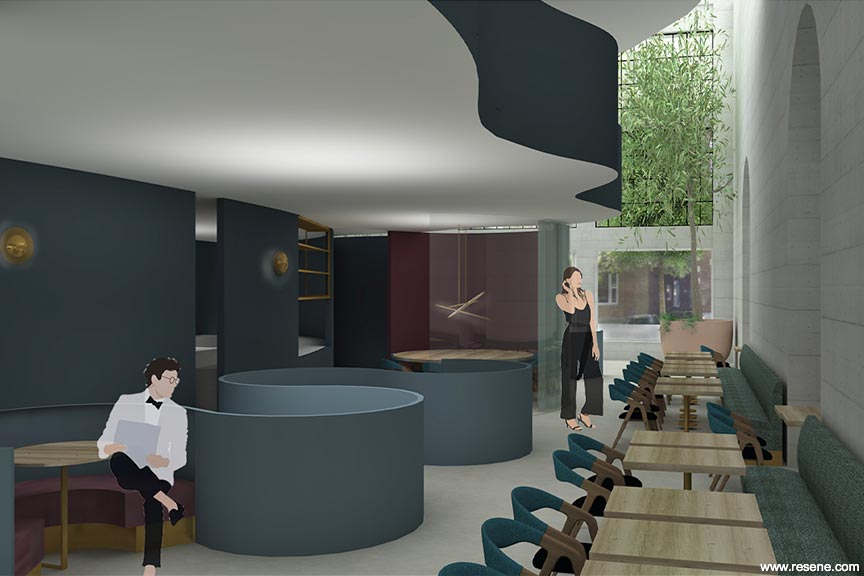
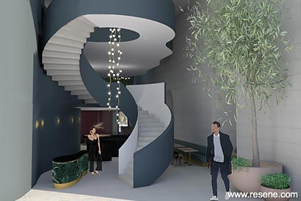
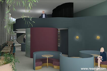
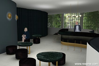
'Fuel' Restaurant Concept by Anna McMillan.
The judges said "the concept of fuel is cleverly wrapped into this memorable design at all stages embracing a deep colour palette with a sense of fluidity that is entirely appropriate. With a nod to the history of the building, the welcoming décor is carefully designed to suit a night-time focused space. Dark and cocooning, guests are encouraged to relax and linger longer."
This project uses Resene Blue Bark, Resene Ivanhoe, Resene Spitfire and Resene Juniper.
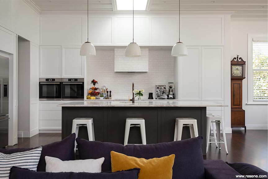
Roseberry Villa by Abbey Lang of Abbey Lang Home.
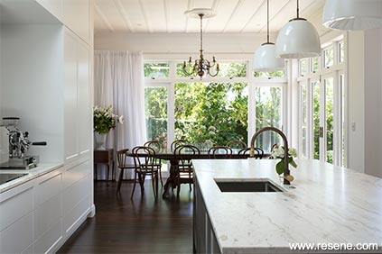
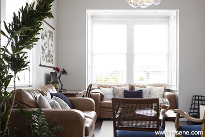
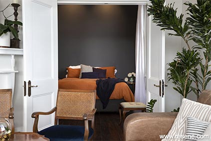
The judges said "quiet and unassuming this home is a haven on the senses harnessing the power of an achromatic palette. Dark neutrals are used carefully, with lighter hues for added loveliness. This colour palette combination will undoubtedly inspire other homeowners to eschew the all-white look and uplift their own home with stronger hues."
This project uses Resene Triple White Pointer, Resene Windswept, Resene Nocturnal, Resene Alabaster and Resene White Pointer.
Te Hohepa Kohanga Reo by Bull O'Sullivan Architecture Ltd.
The judges said "a little colour goes a long way with this project, bringing excitement and a warm welcome to young and old alike. Paint colours have been used as a versatile medium to co-ordinate with other materials. With the Kohanga Reo star leading the way, the hues have dual use as wayfinding devices, much as one might navigate by the stars at night. A considered use of the whole material palette with paint colours as the connection. An exciting new look for Kohanga Reo."
This project uses Resene Half Stack Grey, Resene New Denim Blue and customised versions of Resene Pohutukawa, Resene Thumbs Up and Resene Blue Chill.
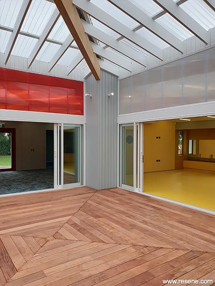
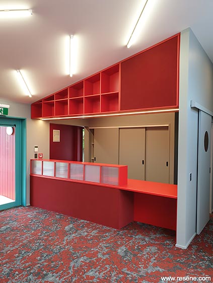
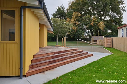
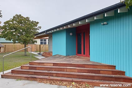
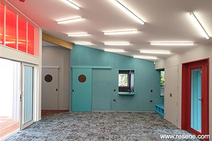
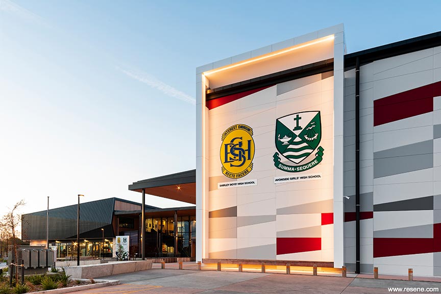
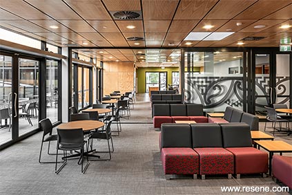
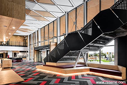
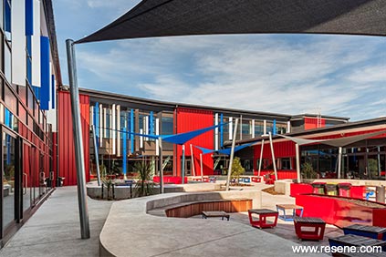
Shirley Boys' and Avonside Girls' High Schools by ASC Architects.
The judges said "cultural narratives are carefully woven into a new interpretation of colour. With two school cultures to honour, the sophisticated colour palette brings together the needs of both, while personalising each and providing identity and wayfinding elements. Like fraternal twins, each school maintains its own sense of self but equally reads well as a duo. An astute use of colour that nurtures identity both individually and in combination with each other."
This project uses Resene Jalapeno, Resene Grey Friars, Resene Endeavour, Resene Delta, Resene Kakapo, Resene Koru, Resene Endeavour, Resene Breeze, Resene Double Concrete, Resene Quarter Grey Friars, Resene Cod Grey, Resene Shingle Fawn, Resene Woodburn, Resene Wood Bark, Resene Bilbao, Resene Spotlight, Resene Chicago and Resene Concrete.
George Rose for a range of projects – The Berra, No Bed of Roses, Melbourne Kicks, Year of the Rat, Gotta hold on you, California Dreaming, Healing Vision, Croydon – Past, Present & Future and Bright Depths.
The judges said "an incredible body of work, bold interpretations and colour palettes bring streetscapes and public spaces to life in a true celebration of colour and artistry. The works are so over scaled to suit each environment. With an underlying style, the art is reinvented with each brief so that each work truly shines on its own. Harnessing an enviable eye for colour, the colour palettes and proportions are beautifully and brilliantly intertwined."
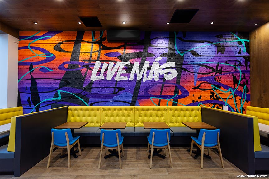
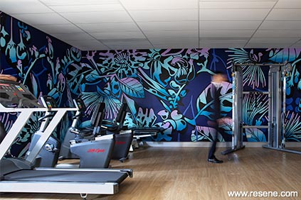
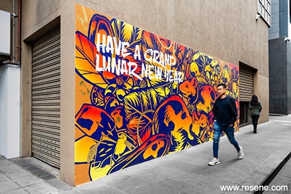
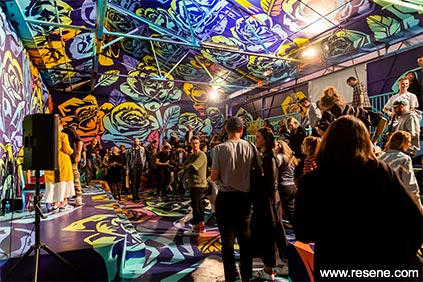
These projects use:
The Berra: Resene Adrenalin, Resene Clockwork Orange, Resene Daredevil, Resene Galliano, Resene Havoc, Resene Persian Red, Resene Havoc and Resene White.
No Bed of Roses: Resene Black, Resene California, Resene Canary, Resene Chetwode Blue, Resene Governor Bay, Resene Grenadier, Resene Malibu, Resene Paua, Resene Riptide, Resene Smitten, Resene Spritzer and Resene Switched On.
Melbourne Kicks: Resene Black, Resene Shuttle Grey and a custom made Resene red.
Year of the Rat: Resene Adrenalin, Resene California, Resene Gold Leaf, Resene Paua, Resene Pursuit and Resene Turbo.
Gotta hold on you: Resene Black, Resene Chetwode Blue, Resene Geronimo, Resene Governor Bay, Resene Riptide and Resene Smitten.
California Dreaming: Resene Adrenalin, Resene California, Resene Geronimo, Resene Governor Bay, Resene Studio and Resene White.
Healing Vision: Resene Anise, Resene Black, Resene Calypso, Resene Curious Blue, Resene Dancing Girl, Resene Gold Drop, Resene Governor Bay, Resene Paua, Resene Riptide and Resene Shakespeare.
Croydon – Past, Present & Future: Resene Black, Resene Blue Gem, Resene Paua, Resene Daredevil, Resene Galliano, Resene Governor Bay, Resene Outrageous and Resene Riptide.
Bright Depths: Resene Cupid and Resene Havoc.