Drawing on their particular passion for purple, raspberry and lime, we began by exploring complementing colour combinations and design possibilities.
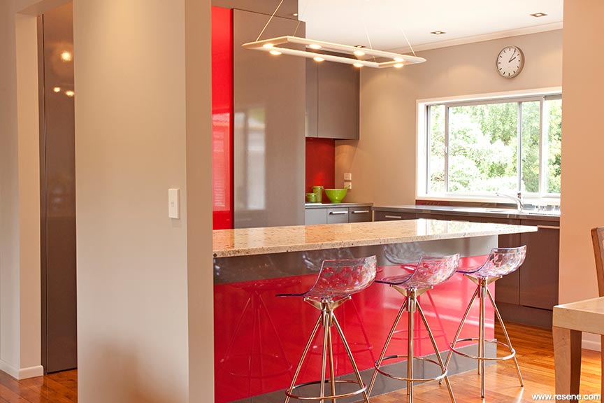
With a contagious passion for life and colour, the owners of this 60s renovation were keen to have a bit of fun and let the kitchen design reflect their confident expressive personality.
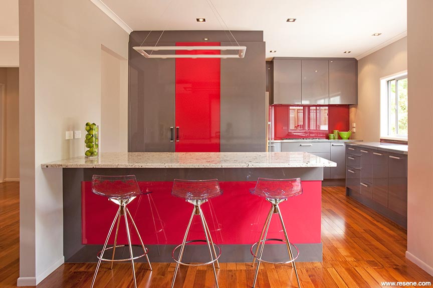
Drawing on their particular passion for purple, raspberry and lime, we began by exploring complementing colour combinations and design possibilities. What evolved was a gathering of inspirational images that visually summarised our tri-palette – in particular a photo of a fuchsia flower which epitomised it perfectly.
Further inspired by a natural granite ‘White Galaxy’ with its splashes of raspberry-toned highlights and pewter veining, we refined our final colour palette. Resene Sensual Red was found to be the ideal hue – a pink-red – desirable in its own right yet complementary to the owners’ love of intense colour and our newly discovered granite.
Continuing to consider the granite tones, we then tweaked the rich purple to a more sophisticated violet-based pewter grey in a metallic finish for a bit of ‘bling’. By specifying the gloss finish for both colours, the intensity of the Resene Sensual Red hue and shimmery reflections in the pewter were enhanced resulting in a glamorous yet striking combination.u
Design wise, the three prominent faces of the kitchen display the Resene Sensual Red sandwiched by violet-grey, while around the corner the softer tones of stainless steel and mauve-based mushroom doors create a complementing combination. Keeping within the mushroom colouring, walls are treated with Resene Half Perfect Taupe while ceilings and window trims are Resene Eighth Thorndon Cream. A feature Resene Magnetic Magic painted wall to the island offers freedom to display children’s artwork and important messages.
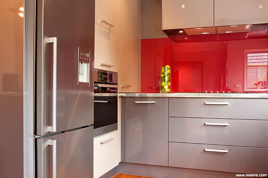
Not forgetting our original fuchsia inspiration and colours, lime green accessories contrast superbly with the Resene Sensual Red as expected and a hint of purple sneaks its way back into the clear perspex seats adorning the island.
A brief to add personality and life to the kitchen space with just the right balance of rich colour and the owners’ sense of fun and confidence in their designer, has whipped up a slice of raspberry delight in their everyday living.
Colours used: Resene Eighth Thorndon Cream, Resene Half Perfect Taupe, Resene Sensual Red.
Products used: Resene Lustacryl, Resene Magnetic Magic, Resene SpaceCote Low Sheen Kitchen & Bathroom.
Architectural Specifier and Colour Selection: Toni Roberts
Kitchen Manufacturer: Kitchen Link
Interior Designer: Claire Yildiz, wall colour selected in consultation
Painting Contractor: Dave Bates, Mainly Decorating
Photographer: Tony Gatman
Project: Resene Total Colour Awards 2011
Resene case studies/awards project gallery
View case studies that have used Resene products including many from our Resene Total Colour Awards. We hope these projects provide inspiration for decorating projects of your own... view projects
Total Colour Award winners:
2023 |
2022 |
2021 |
2020 |
2019 |
2018 |
2017 |
2016 |
2015 |
2014 |
2013 |
2012 |
2011 |
2010 |
Entry info
Latest projects | Project archive | Resene news archive | Colour chart archive
![]()
![]() Get inspired ! Subscribe
Get inspired ! Subscribe ![]() Get saving ! Apply for a DIY card
Get saving ! Apply for a DIY card
![]()
Can't find what you're looking for? Ask us!
Company profile | Terms | Privacy policy | Quality and environmental policy | Health and safety policy
Colours shown on this website are a representation only. Please refer to the actual paint or product sample. Resene colour charts, testpots and samples are available for ordering online. See measurements/conversions for more details on how electronic colour values are achieved.
What's new | Specifiers | Painters | DIYers | Artists | Kids | Sitemap | Home | TOP ⇧