The result is a clever patchwork of colours that defines the entry point while breaking the forms and mass of walls.
This house is born of passion, a committed client, inventiveness and a sense of play, a respect for environment, an understanding of the client's needs, desires and cultural ideas, a tight budget, and attention to detail.
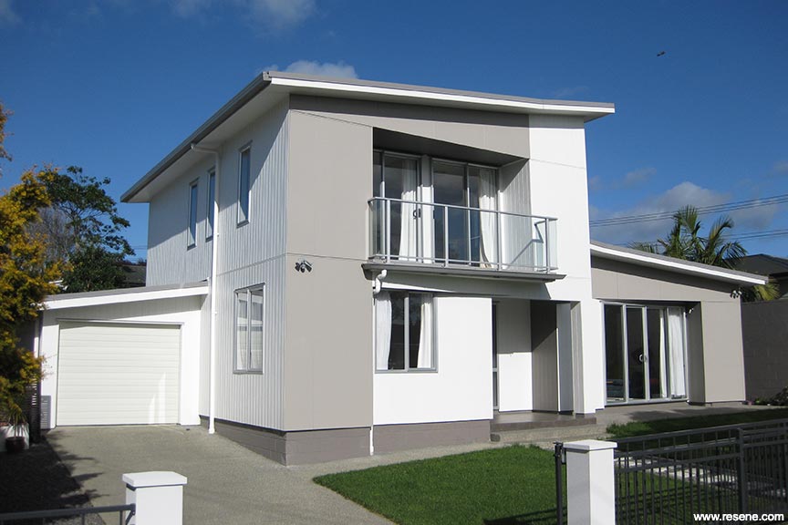
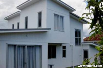
The site was a small, flat, low section with neighbouring houses overlooking the land. Despite all barriers, the house is carefully shaped within the height boundaries to enjoy the openness and capture the view. The layout is compact and efficient.
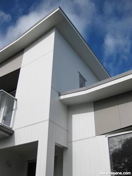
The owners were involved in the design process from the early stages and were adamant that they wanted their house to be in harmony with neighbouring houses. They preferred a neutral colour (white) for cost effectiveness and easy maintenance. In contrast, to maximise heat absorption, the North elevation cladding needed to be painted in a dark colour.
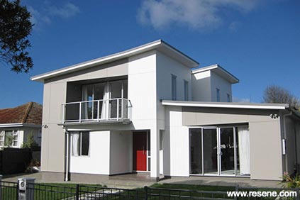
The solution was to mix the cladding types, and offer a variable palette of colour. The result is a clever patchwork of colours that defines the entry point while breaking the forms and mass of walls. It offers a rich diversity of colour and texture, and unlike most properties, it is also presentable, dynamic and changes when viewed from different angles.
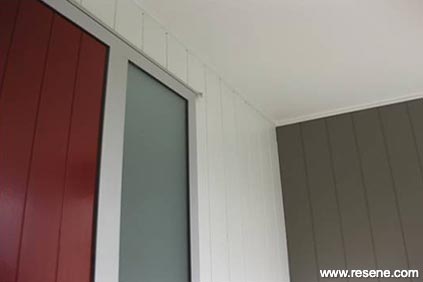
Resene Pohutukawa in a gloss finish is used for the door to emphasis the entry point. The neutral colour of the garage door, makes it less visible and merges the door with the back walls. Sandstone Grey is used for the roof to achieve maximum performance in summer and winter. The existing back garden fence was very old and damaged. It is reused and cleaned. Resene Furniture and Decking Oil was used to provide a natural timber look.
The colour scheme and proportion of colours are selected to be timeless and cohesive. The patchwork paint and materials are 'mixed and matched' with care to give an original styled effect, while maintaining a harmony with landscape and surrounding buildings.
This house has three requirements of the modern mantra; space, light and a connection with outdoor. It shows a thoughtful colour scheme enhances the architecture. It shows what's possible, not just at the top of market with a spectacular location, but what might be obtained for affordable suburb housing. It raises the bar.
Colours used: Resene Asteroid, Resene Charcoal, Resene Half Sea Fog, Resene Matterhorn, Resene Pohutukawa.
Products used: Resene Furniture and Decking Oil.
Architectural Specifier and Colour Selection: Mitra Emami
Building Contractor: Warwick Builders Ltd
Painting Contractor: Pacific Painters
Project: Resene Total Colour Awards 2011
Resene case studies/awards project gallery
View case studies that have used Resene products including many from our Resene Total Colour Awards. We hope these projects provide inspiration for decorating projects of your own... view projects
Total Colour Award winners:
2023 |
2022 |
2021 |
2020 |
2019 |
2018 |
2017 |
2016 |
2015 |
2014 |
2013 |
2012 |
2011 |
2010 |
Entry info
Latest projects | Project archive | Resene news archive | Colour chart archive
![]()
![]() Get inspired ! Subscribe
Get inspired ! Subscribe ![]() Get saving ! Apply for a DIY card
Get saving ! Apply for a DIY card
![]()
Can't find what you're looking for? Ask us!
Company profile | Terms | Privacy policy | Quality and environmental policy | Health and safety policy
Colours shown on this website are a representation only. Please refer to the actual paint or product sample. Resene colour charts, testpots and samples are available for ordering online. See measurements/conversions for more details on how electronic colour values are achieved.
What's new | Specifiers | Painters | DIYers | Artists | Kids | Sitemap | Home | TOP ⇧