AGM Publishing
Energetic on the one hand yet calm and functional on the other, so you can either rev up or sit and concentrate depending on the coloured location you choose.

In design Offices are funny, organic creatures. Staff join, create systems, file papers, leave, new staff then inherit systems and papers and objects, unsure of whether these are important or not, then they eventually leave. On and on this goes so that an office has a detritus of years of ideas, plans started and never followed through, outdated paperwork, and odd objects without a real purpose but surely too good to throw out.
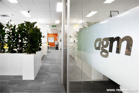
So it was with AGM Publishing, home of such well known publications as Architecture NZ, Houses, Urbis and Prodesign. 20 years in the same space provided plenty of excuses to pile up things that no-one was quite sure whether they should be thrown out or not. The move upstairs was the catalyst needed to clean out the accumulation of years past, while bringing together an office that would reflect the design content of the magazines.

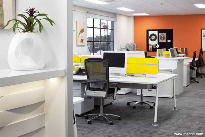
Workstations now define areas for each of the teams while screening devices and architectural greenery separate out areas within those divisions. Colour was one of the key design intentions – from the glossy yellow partitions in desking to the bright orange wall at the end of the design studio and the artworks. Energetic on the one hand yet calm and functional on the other, so you can either rev up or sit and concentrate depending on the coloured location you choose.
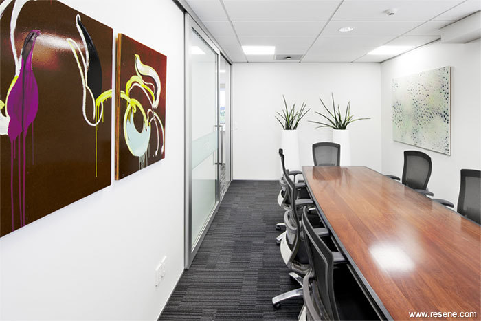
The interior is predominantly neutral, with Resene Zylone Sheen low sheen waterborne enamel and Resene Lustacryl semi-gloss waterborne enamel tinted to a tonal palette of hues ranging from deepest black through to off white, with Resene Black, Resene Foundry (shadowy charcoal), Resene Cod Grey (deep dark grey), Resene Half Linen (ash green), Resene Milk White (cool white) and Resene SpaceCote Flat tinted to Resene Thorndon Cream (understated neutral).

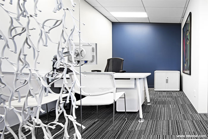
In a nod to the striking design nature of the company’s magazines, feature colours Resene Clementine Orange (persimmon orange) from the Karen Walker collection and Resene Wanaka (mineral blue) and Resene Inside Back (greyed green) have been carefully integrated to provide a colour pop without overpowering the modern design.
With fresh clean lines and many banished boxes of old files, there’s now plenty of space to gather up a new generation of accumulations.

Project Manager: AGM Publishing
Photographer: Jeff Brass, Think Photography
From the Resene News – issue 1/2011
Resene case studies/awards project gallery
View case studies that have used Resene products including many from our Resene Total Colour Awards. We hope these projects provide inspiration for decorating projects of your own...view projects
Total Colour Award winners:
2023 |
2022 |
2021 |
2020 |
2019 |
2018 |
2017 |
2016 |
2015 |
2014 |
2013 |
2012 |
2011 |
2010 |
Entry info
Latest projects | Project archive | Resene news archive | Colour chart archive
Order online now:
Testpots |
Paints |
Primers and Sealers |
Stains |
Clears |
Accessories
![]() Get inspired ! Subscribe
Get inspired ! Subscribe ![]() Get saving ! Apply for a DIY card
Get saving ! Apply for a DIY card
Can't find what you're looking for? Ask us!
Company profile | Terms | Privacy policy | Quality and environmental policy | Health and safety policy
Colours shown on this website are a representation only. Please refer to the actual paint or product sample. Resene colour charts, testpots and samples are available for ordering online. See measurements/conversions for more details on how electronic colour values are achieved.
What's new | Specifiers | Painters | DIYers | Artists | Kids | Sitemap | Home | TOP ⇧


