Colour Match is a system using Faber Castell colour coded pencils that are matched to the Resene Total Colour System.
This system helps you to illustrate the colours you have selected and enables you to confidently present colour concepts to your clients. The Resene Colour Match system can be ordered online or through Resene representatives, for $275 for the full set or the pencils can be purchased individually.
Resene Colour Match is a simple system to use. Read the following directions and explanations on how to achieve the best results:
How the system works | Selecting the technique | Pencil usage notes | Colour match hints
Resene has created pencil recipes for standard Resene colours. The pencil recipe for a colour tells you what pencil numbers to use to create that colour. Where the pencil number has brackets around it, this means the pencil should be only used lightly in the mix. The code numbers for the pencils are printed on the non-lead end of the pencil.
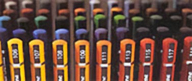
Find the pencil number at the top
Follow these steps:
Step one
Decide which Resene colours you wish to use in your design.
Step two
Look up each colour using the Resene pencil recipe list or the Resene pencil recipes in our Online Library to find out the appropriate pencil recipe for that colour. Resene pencil recipes are available in a hard copy list available free from your Resene ColorShop or view recipes online in the Resene Online Library.
For example: To create the colour Resene Tea, look up Resene Tea in the Resene pencil recipe list or in the Resene Online Library. This will tell you that you need to use pencils 271 and 270.
Step three
Consider how you want the colour to look, such as textured, intense, bright, subtle. Select your preferred technique depending on the look you want to achieve.
The appearance of the final drawing will vary depending on the technique selected and on the drawing and colouring style of the user. There are three ways to apply the pencils: wet, dry, or a combination of both.
Dry pencils are easy to control and they allow a wide variety of finished appearances. Colours can be intense or very subtle, and colours can be coarsely or smoothly mixed.
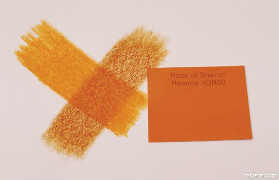
Layering colour
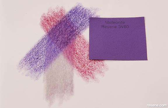
Colour order
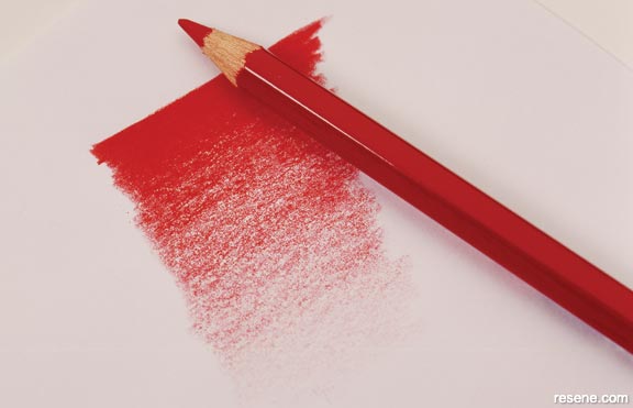
Increasing colour intensity
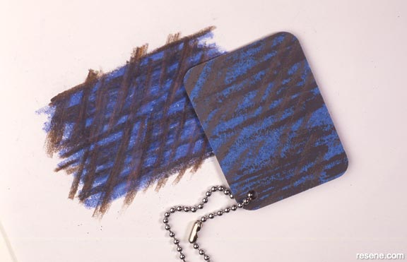
Illustrating textures
Layering colours
Build up the required colour by layering the colours one after the other until the right tone is achieved.
Colour order
It is best to use the darker or brighter colour first, followed by the lighter or duller colour. When white is required, use it last.
Intensity
Increase colour intensity by increasing pressure. Reduce intensity by using less pressure or rubbing back.
Texture
Use dry pencil techniques to illustrate textures of materials. Apply pencils over a rough background for a textured effect or other pencil strokes to create different results. Experiment.
Details
Fine details are more easily illustrated using dry pencils.

Illustrating textures
Wet application of Colour Match pencils can be done in a number of ways, each giving a different appearance to the finished drawing.
Wash effect/wet mix
Wet mix the pencils off the page, then apply as a watercolour. This is effective for large areas of even colour when a lower intensity is desired. It gives a lighter, more translucent appearance to the finished drawing.
Mixing
Mix the colours dry on a saucer, plastic sheet or palette, then wet with a paintbrush, mixing colours together thoroughly before applying to drawing as a watercolour wash.
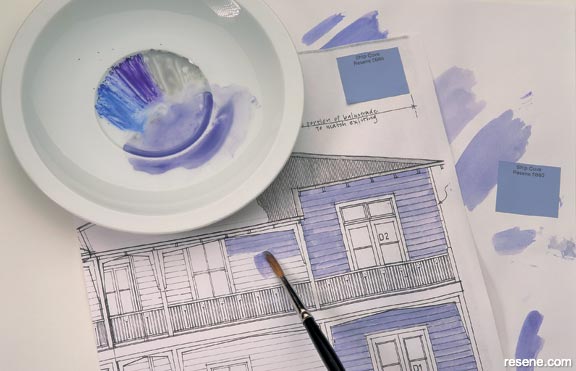
Wash effect/wet mix
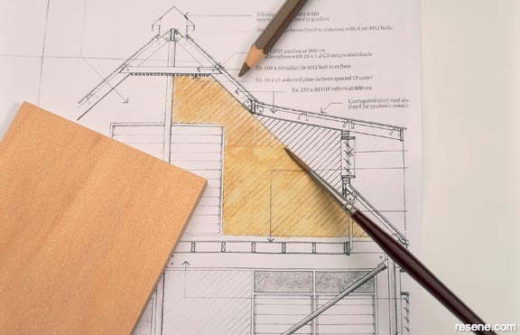
Dry mix on drawing/blend with wet paint
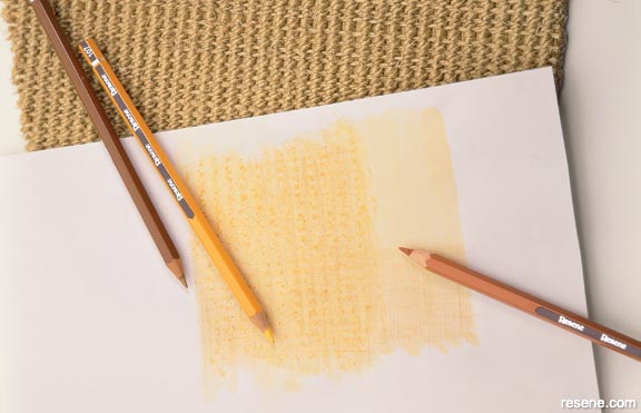
Dry over wet techniques
Testing
Test on a trial piece of paper to ensure you are happy with the colour and intensity before applying to the finished drawing. Allow to dry then adjust the mix until an ideal match is achieved.
Colour variations
Some colours become lighter when wet, the more water the lighter. When using grey to 'dirty' colours, more grey is needed in a wet mix than a dry mix. For lighter colours when white is specified, the white can be left out of the wet mix and dilution used to achieve the paler colour.
Dry mix on drawing/blend with wet paint
Colours can be dry mixed on the page and then wet to blend. The outcome is usually more intense than the wash technique, but the result is less consistent and the technique takes more practice to master. This method
does work well on small areas of dark, bright or intense colour.
Dip pencil in water/apply directly to drawing
This technique is useful for a very vibrant effect, for example when highlighting a detail. It is best used for small areas, or for adding pattern or texture after other techniques have been used.
Combining techniques can give interesting and vibrant effects. Areas of shadow, fine details and textures can be illustrated with the use of dry pencils applied over water coloured drawings.

Dry over wet techniques
Wet applications first
Colour drawing using wet techniques, allow to dry.
Dry pencils next
Highlight textures and details, using dry techniques over the watercolours. If water coloured drawings need adjustment when dry, use dry pencils to alter. Adjusting wet colours is usually less successful.
Dry application:
Pencils applied strongly and dry mixed on paper by overlaying to achieve the required colour.
Pencils applied softly and dry mixed on paper by lightly overlaying for textured effect and fading intensity.
Wet application:
Pencils applied strongly and dry mixed on paper then wet with brush
Pencils applied softly, dry mixed on paper then wet with brush to give graded intensity
A bracket around a pencil number means you use that pencil lightly in the colour mix.
White colours
As the colour and differences between colours are so subtle, the art of mixing becomes very important when matching these colours. Dark colours need to be used very softly and sparingly and overlaid by the pale colours. Most colours have a large proportion of white in them. Best results are achieved when colours are wet so that dilution can give the subtlety required and an even effect can be more easily created.
Metallic chart colours
The reflective nature of the metallic effect makes it more difficult to match the colours as they change with the light. As much as possible view all colour matches under the same light and at the same angle to the light. Metallics should be put on as per flat colours - dark to light. i.e. Start away from the light source and work towards it. Metallic pencils are those pencils numbered within the range 600-700.
Matching
Colours need to be matched by trial and by eye. Testing colours and
allowing them to dry is important for consistently good results.
Metallics
The reflective nature of the metallic effect of metallic colours makes
it more difficult to match the colours as they change with the light.
As much as possible view all colour matches under the same light and
at the same angle to the light. Metallics should be put on as per flat
colours - dark to light. Start away from the light source and work towards
it. Metallic pencils are those pencils numbered within the range 600-700.
Mixing
When working with white colours, as the colour and differences between
colours are so subtle, the art of mixing becomes very important when
matching these colours. Dark colours need to be used very softly and
sparingly and overlaid by the pale colours. Most colours have a large
proportion of white in them. Best results are achieved when colours
are wet so that dilution can give the subtlety required and an even
effect may be more easily created.
Paper colour
The appearance of any colour is affected by the colour of the background.
Always test colour mixes on the same background as the final drawing.
White paper stock will generally give the best results.
Proportions
The amount of each pencil needed for an ideal match will vary slightly,
depending on whether you use dry or wet applications.
Use lightly
A bracket around a pencil number means you use that pencil lightly in
the colour mix.
Results
The speed to achieve a quality end result will improve with practice
of the techniques outlined earlier. Individual styles allow for endless
variety in the finished product.