From the Resene decorating blog
Setting out on an interior design journey is exciting, but if you’re a beginner and lack confidence in your taste or design choices it can feel a bit daunting.
It’s easy to opt for a blank interior canvas of safe neutrals – and that can look stunning – but don’t cheat yourself of interiors that you love because you’re a little uncertain about your ideas, or where to start. Resene is here to help!
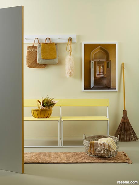
The artwork in this foyer has inspired a fresh, analogous colour palette.
The buttery walls are painted in Resene Moonlight, earthy floor in Resene Grey Olive and wooden bench in Resene Chorus Line. A fresh neutral is added to the bench legs, hooks and door in Resene Quarter Pearl Lusta. Project by Kate Alexander, image by Bryce Carleton. Mat from The Ivy House, artwork from endemicworld.
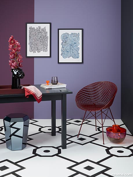
This room includes a sumptuous and calming colour in a range of purples.
Left rear wall painted in Resene RSVP and back wall in Resene Memory Lane. The right side wall in Resene Noir and table in Resene Blackjack add extra impact. The floor is Resene Elderflower with a pattern in Resene Black. Project by Kate Alexander, image by Bryce Carleton. Chair and vase from Backhouse, table/stool from BoConcept, artworks by Milly Watson from endemicworld.
Here are some simple tips, tricks and guidelines that a lot of professional interior designers work with to get each client started on their colour journey.
But remember, the first rule is… there are no rules. Don’t get too caught up in worrying about what colours should never be used together, or wondering if patterns and textures clash. In the end, it’s your space you’re decorating so it only matters if you like it.
If you’re not confident in knowing if colours look great together, some basic knowledge of colour theory can help, but don’t treat this as hard and fast rules. Think of it as a jumping off point to get you started.
Grab your paintbrush and let’s go…
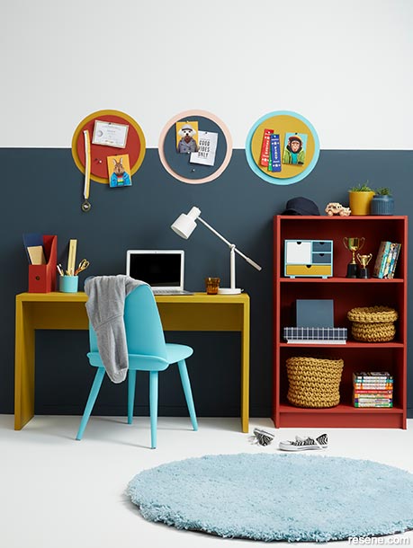
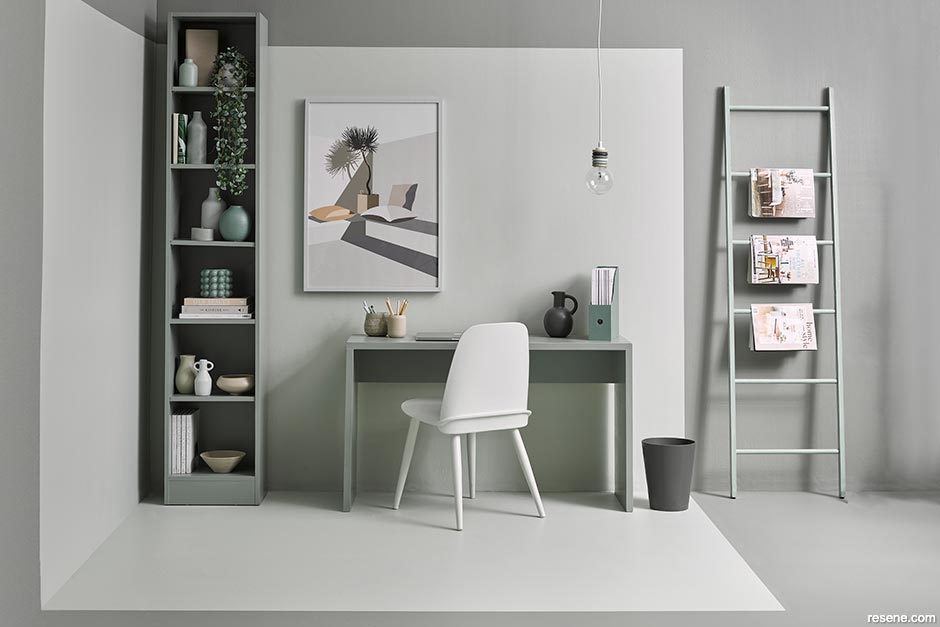
Complementary colours really add energy to this study zone.
The lower half of the wall is painted in Resene Coast, while the top half matches the floor in Resene Poured Milk. Desk painted in Resene Influential, chair in Resene Yes Please, bookshelf and magazine file in Resene Raging Bull, plant pots on the bookshelf in Resene Influential and Resene Coast, mini drawer unit inside the bookshelf in Resene Poured Milk, Resene Yes Please, Resene Coast and Resene Influential, wooden box in Resene Coast and pencil pot in Resene Yes Please. The circles painted on the wall are (from left to right) Resene Influential, Resene Shilo and Resene Yes Please with cork placemats used as pin boards in (from left to right) Resene Raging Bull, Resene Coast and Resene Influential. Rug and clock from Allium, stationery accessories all from The Warehouse, glass and baskets from Citta. Project by Vanessa Nouwens, image by Bryce Carleton.
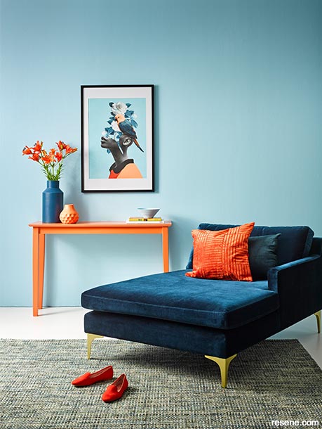
Bold blue and orange make this complementary colour scheme a conversation starter.
Resene Bluetooth has been painted on the walls to balance the deep blue of the chaise longue and the vibrant Resene Jailbreak of the wall console. The tall vase is Resene Wishing Well, the short vase is Resene Japonica and the ribbed bowl is Resene Slipstream. The floor is Resene Alabaster. Sofa from Contempa, cushions and shoes from H&M, artwork by Dada22 from Pop Motif, rug from Freedom, plate and book from Shut the Front Door. Project by Vanessa Nouwen, image by Melanie Jenkins.
If you did art at any stage of school, you’re probably familiar with the colour wheel. This is made up of:
Primary colours – red, yellow, blue (colours that are not made by mixing other colours).
Secondary colours – orange, green, violet (colours that are made by mixing two primary colours).
Tertiary colours – red/orange, yellow/orange, yellow/green, blue/green, blue/violet, red/violet (colours that are made by mixing primary and secondary colours).
In addition to these colours you have black, greys and white, known as achromatic colours.
Within these types of colour, lies an almost infinite variation of other colours, based on mixing different amounts of primary and secondary colours with achromatic colours. It’s the beginning of all the many shades you find in Resene paint colour charts.
Other useful things to know are:
Hue means any primary, secondary or tertiary colour without a black, grey or white added.
Shade means a hue with black added.
Tint means a hue with white added.
Tone means a hue with grey added to give a more muted colour. If you’re stuck for what colours to choose, the colour wheel is a great place to start.
Top tip: You can pick up a colour wheel from your local Resene ColorShop or buy one from the online Resene ColorShop.
You’ll often hear interior designers talk about warm or cool colours. These refer to where colours fall on the wheel, but also how they make a space feel. For example, reds, oranges and yellows are often described as warm colours that bring a sense of vibrancy to a room, whereas greens, blues and purples are generally cooler and calm things down. Cooler shades can also make a small space feel airier and larger, whereas warm shades can make a space feel smaller and more intimate.
Hot tip: When choosing neutrals to work together make sure they all have either a warm or a cool base. Red, orange, yellow and brown based whites such as Resene Quarter Solitaire or Resene Orchid White, are good for rooms that need warming up, Those with green or blue undertones such as Resene Black Haze or Resene Alabaster are good for cooling things down.
Complementary colours are those that sit opposite primary colours on the wheel. For example red, a primary colour like Resene Burnt Crimson, sits opposite green a secondary colour such as Resene Sea Green, or a blue such as Resene Optimist sits opposite an orange such as Resene Hyperactive. These combinations can make for really daring bold, colour schemes and work particularly well when used against the right neutral shade.
If a classic complementary scheme seems a bit much for your first forays into designing with colour, try the split-complementary approach. To do this choose one colour as your base shade and try it with the two shades either side of the colour it is directly opposite on the wheel. An example of this type of colour scheme would be the yellow of Resene Wild Thing, with blue-green Resene Sea Nymph and mauve Resene Siesta.
Analogous, or related, colours are those that sit next to each other on the colour wheel. A good rule is to work with three colours that sit either side of a primary colour. So, for example, beside a yellow like Resene Moonbeam you will find shades such as ochre yellow Resene Apache and zesty green Resene Citron.
When you work with related colours, think about 60-30-10 proportions. Choose one shade as your main colour and use it on about 60% of your room. Back that up with key features in your second colour on about 30% of the room. Use your third, 10% colour as an accent note.
A monochromatic palette involves using only one colour in your space, though you can mix it up in intensity and use different textures to keep it from looking monotonous. Using eighth, quarter, half, full, and double versions of your chosen colour creates an interesting layered effect. The Resene whites and neutrals collection has up to six strength variations of the most popular Resene colours to make it easy to choose lighter and darker options.
Top tip: A Resene colour consultant can be a big help with complementary or analogous palettes, guiding you to the shades that will work best with your preferred bold colour choice.
Decorating should be fun, so don’t get too tied down with the theory of it all. The simplest way to get started is start creating a ‘mood board’ of your favourite looks and colour combinations from magazines and websites.
The same applies with trends. There’s no need to stick too closely to colour or style trends. Use them as inspiration and think about how they’ll work in your house or room for you.
Start small with a bathroom, a home office or an outdoor shed – and practice with plenty of Resene testpots. Finally, remember paint is relatively inexpensive, so if you don’t love it you can try again!


July 02, 2021
Visit your local Resene ColorShop for expert advice and all the products and accessories you need to make the most of your home.
Book a colour consult | Ask a Colour Expert | Ask a Paint Expert
Resene's decorating blog
Paint your home beautiful! Discover the latest decorating trends, tips and colour news.
![]()
Previous «
Ways of working with white on white
![]()
Blog home
View the latest trends, tips and news
![]()
» Next
Create cosiness in large spaces
![]() Get inspired ! Subscribe
Get inspired ! Subscribe ![]() Get saving ! Apply for a DIY card
Get saving ! Apply for a DIY card
![]()
Can't find what you're looking for? Ask us!
Company profile | Terms | Privacy policy | Quality and environmental policy | Health and safety policy
Colours shown on this website are a representation only. Please refer to the actual paint or product sample. Resene colour charts, testpots and samples are available for ordering online. See measurements/conversions for more details on how electronic colour values are achieved.
What's new | Specifiers | Painters | DIYers | Artists | Kids | Sitemap | Home | TOP ⇧


