From the Resene decorating blog
White interiors have attracted some criticism at times, labelled as too minimalist or too austere. But, at the same time, the versatility of white on white interiors makes them perennially popular.
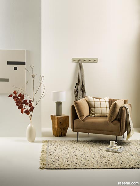
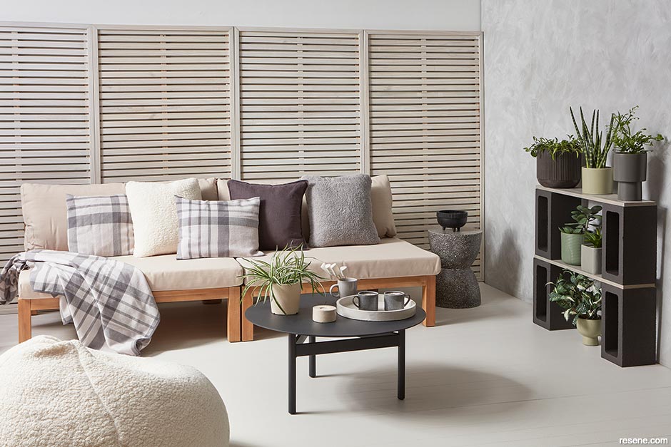
This room uses muted neutral textures with gentle pops of colour to celebrate its white on white base. Back wall painted in Resene Merino, front wall in Resene Alabaster, floor in Resene White Pointer, DIY artwork in Resene Quarter Tea, Resene Double Ash and Resene Half Truffle, tall vase in Resene Parchment, lamp in Resene Tapa, jug base in Resene Putty and wall hooks in Resene Double Ash. Spray from Flux Boutique, table from Indie Home Collective, armchair and rug from Contempa, grid cushion and gown from Citta, throw, mug and top two books from Sunday Home Store, top two books from Sunday Home Store, ‘The Tiny Mess’ book from Paper Plane. Project by Gem Adams, image by Melanie Jenkins.
The trick is choosing your whites carefully, playing with tones and paying attention to the light – natural and artificial. Add a little texture with bold bursts of contrast and your white interiors can go from chilly and harsh, to warm and filled with vibrant personality.
A white-based interior makes a fantastic neutral backdrop that allows you to switch out furnishings and room features to suit your changing tastes or the changing seasons at relatively little expense and with little effort.
Whites – and some of their complementary neutrals – also make a good base for rental properties, allowing tenants to add their own layer of colour design to suit their own taste and belongings.
But beyond these practical considerations, a white on white design ethos is also fantastic for showcasing an amazing piece of art, a treasured object or a conversation-starting furniture item. And if you have spectacular views through large windows or doors, a white on white room makes everything about that view – turning it into your prized piece of art.
For those with a minimalist bent, going with a white on white decor is about being free of clutter to appreciate clean lines and clear surfaces. It’s really all just a matter of taste.
Not all whites are created equal, and going for a white on white interior will often not mean choosing just one shade of white.
There are cool whites, such as Resene Black White and Resene Sea Fog, which will make your space feel crisp and bright, and warm whites, such as Resene Merino and Resene Half Pearl Lusta, which have a softer, more yellowy or creamy tone. Cool whites work well in modern interiors with lots of windows and work well in bright, sunny rooms. Warmer whites work well in colder rooms and often suit older homes with smaller windows. Warmer shades are also a little more forgiving on less than perfect surfaces.
An important rule for choosing whites is you can definitely layer different shades of white in a room, but it works best when those shades are either all warm, or all cool. Resene also has green-based whites which can shift between cool and warm depending on other colours and light around them. Some of these include Resene Quarter Linen and Resene Rice Cake.
Light is the other key factor to consider when choosing your whites, particularly when you want layers of white on white – and if you’re adding pops of bold accent colours. For example, a creamy off-white used under a window or on the ceiling will look darker, than the same colour on a different wall.
Resene testpots are your friend when it comes to choosing the right whites; as is your Resene colour consultant. Keep testing different shades in all the areas you are wanting to paint to ensure your mix of shades works with the surrounding light to give you the effect you’re after. Make sure you check them at different times of the day and in different weather as the light changes. Switching between quarter, half and full strengths of different whites can help offset some of the light impacts.
Hot tip: The Resene Whites and Neutrals collection is a good place to start your white on white plans. You can see how all the different tones work together, and see the difference between warm and cool shades.
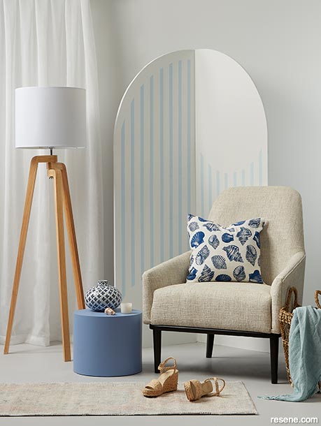
Sparing and subtle use of colour adds depth and cosiness to this white on white corner.
Wall painted in Resene Half Alabaster, floor in Resene Rakaia, arch screen in Resene Half Alabaster with stripes in Resene Pattens Blue and side table in Resene Ship Cove. White chair from Wolf & Co, lamp from Lighting Plus, basket, circle vase, throw and shell cushion from H&M Home, cushions and throw from Adairs, shoes from Seed, candle from Flo & Frankie. Project by Melle van Sambeek, image by Bryce Carleton.
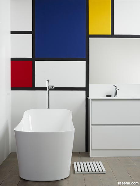
Mondrian-inspired primary colours with black trim, makes this bathroom’s cool white on white look bolder.
Wall painted in Resene Eighth Black White with a grid in Resene Blackjack, colour blocks in Resene Jalapeno, Resene Aviator and Resene Galliano, floorboards in Resene Colorwood Mid Greywash and draining mat in Resene Black White. Bath from Plumbing World, Resene Palazzo Towels from Briscoes. Project by Megan Harrison-Turner, image by Bryce Carleton.
Whites – and other different toned neutrals – are among Resene’s most popular colours. Shades such as Resene Black White, Resene Half Spanish White and Resene Eighth Thorndon Cream have long been best sellers but there are other nuanced white tones to try together.
For graduated tonal layers Resene Pearl Lusta is a great warm option as it goes from Resene Eighth Pearl Lusta all the way through to Resene Triple Pearl Lusta. For cool grey-toned layers try starting with Resene White, then Resene Quarter White Pointer, through to Resene Triple White Pointer.
One way to layer white on white so it feels inviting and warm, is by playing with texture. White brick or textured tiles, with rugs, curtains, cushions and light fittings in natural fibres and rough finishes all bring an element of imperfection and interest into your minimalist white space without disrupting your simple colour palette.
Another way to make your white on white really pop is to add one or two bold contrast items. Think about a spicy warm red such as Resene Lusty or sunny gold Resene Carpe Diem against your warm white layers. It might be just a table or an eye catching shelf that’s enough to really make your whites pop.
For cooler whites, try pops of mustard Resene Nugget or turquoise in Resene Hullabaloo.
Adding notes of black using Resene Black or Resene All Black with just one or two simple squares primary colours such as Resene Jalapeno, Resene Aviator and Resene Galliano can shift your white on white from minimalist to Mondrian inspired modern.
To soothe bright whites and freshen warm whites, add muted shades of green and wood finishes. Try sage toned Resene Spanish Green and Resene Colorwood Natural for cool tones, and deeper Resene Forest Green and Resene Colorwood Mahogany wood finishes.
All of these additional shades are not about disrupting your white on white plans. With the right combinations they should emphasise your main colour palette, and just add a note of extra interest.
Hot tip: Choose your white on white paint colours last. If your commitment to white on white extends to furniture and fittings, choose these first and then your paint colours. It’s a lot easier to work that way than trying to match your sofa or new bath to your paint.


June 30, 2021
Visit your local Resene ColorShop for expert advice and all the products and accessories you need to make the most of your home.
Book a colour consult | Ask a Colour Expert | Ask a Paint Expert
Resene's decorating blog
Paint your home beautiful! Discover the latest decorating trends, tips and colour news.
![]()
Previous «
Down to earth – the evolution of terracotta
![]()
Blog home
View the latest trends, tips and news
![]()
» Next
Colour theory for beginners
![]() Get inspired ! Subscribe
Get inspired ! Subscribe ![]() Get saving ! Apply for a DIY card
Get saving ! Apply for a DIY card
![]()
Can't find what you're looking for? Ask us!
Company profile | Terms | Privacy policy | Quality and environmental policy | Health and safety policy
Colours shown on this website are a representation only. Please refer to the actual paint or product sample. Resene colour charts, testpots and samples are available for ordering online. See measurements/conversions for more details on how electronic colour values are achieved.
What's new | Specifiers | Painters | DIYers | Artists | Kids | Sitemap | Home | TOP ⇧