From the Resene decorating blog
Primary colours have always been with us. Red, blue and yellow, these basic shades are significant because they can't be formed by mixing with any other hues. Other colours, however, are made as a result of combining these primaries.
There will always be those with love for the clean, Mondrian-style, bold display of primary colours. Such clean and flawless hues energise us. However, given that their presence can seem bold and intense, some may feel they can't celebrate them in their homes because they're overwhelming. But when it comes to using these paint colours in your home, it's best to apply them in small doses to not overpower the space.
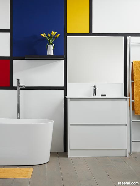
The signature style of Mondrian reigns in this bathroom. A clean white backdrop allows for the primary shades of red, yellow and blue to take centre stage within geometric shapes. Soft furnishings echo these colours, creating continuity within the space.
Wall painted in Resene Eighth Black White with grid in Resene Blackjack and colour blocks in Resene Jalapeno (red), Resene Aviator (blue) and Resene Galliano (yellow). Timber floorboards in Resene Mid Greywash, shelf in Resene Blackjack, vase (with tulips) in Resene Half Black White and ladder in Resene Quarter Surrender. Bath from Plumbing World, Resene Palazzo Towels from Briscoes. Project by Megan Harrison-Turner, image by Bryce Carleton.
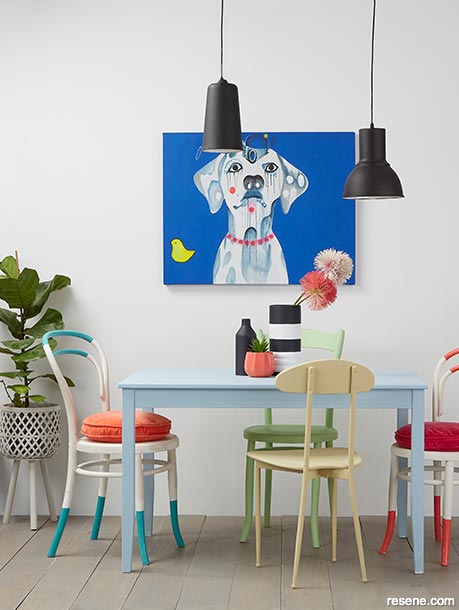
Small pops of saturated red, yellow and blue make their presence known in this dining room through painted chair legs and an artwork, balanced with pastel and turquoise hues set against a neutral wall. The result is a fresh and energetic dining space that breaks from tradition.
Wall painted in Resene Double Alabaster, table in Resene Frozen, chairs in Resene Bubble White with details in Resene Spring Fever, Resene Maestro and Resene Rapture, green chair in Resene Anise, pendant lamps in Resene Nero, small plant pot in Resene Rapture and striped vases in Resene Double Alabaster with Resene Nero stripes. Plants from Give Plants, cushions from Castle and Things, artwork by Jessie Breakwell. Project by Annick Larkin, image by Bryce Carleton.
For those who prefer a low-key look, rest assured you can still celebrate primary hues. The technique here is to not use them in a large room that you use all-day every day. Instead, find a small-scale space in your home that calls out for some colour and life, such as an office space, hallway or a mural wall behind a desk.
Interior designer Annick Larkin suggests a powder room or scullery as ideal places if you're not ready for a full-on foray into primaries. "Paint a dark background and add pops of colour to it, i.e. paint a home office in Resene Fuscous Grey and add a waste receptacle painted in Resene Rouge or Resene Turbo," she says. "Add more colour and texture through soft furnishings, indoor plants and desk accessories."
Turn to the more traditionally 'fun' spaces of the home – children's bedrooms, Annick recommends. They're perfect for bringing in colours such as the blue of Resene Spinnaker or yellow of Resene Turbo. "Experiment with colour, but if you're not quite ready for painting all four walls then try coating a headboard or toy box first. Alternatively, use Resene Alabaster on your walls paired with a bold coloured ceiling in Resene Undercurrent."
Today's use of primary colours has evolved with a modern turn; they're combining with non-expected colours, such as dusky shades, warm neutrals, and even wooden furniture with natural textures.
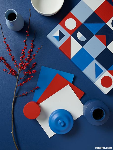
Add another dimension to your primary colour palette by varying the tones of one colour, like these light and dark blues. The result adds depth to your setting, while the fresh white balances the scheme.
Background painted in Resene True Blue with A4 drawdown paint swatches in (from top to bottom) Resene St Tropaz, Resene Red Red Red and Resene Bianca, painted accessories in (clockwise from top) Resene Bianca, Resene True Blue, Resene St Tropaz, Resene Red Red Red and Resene Smokescreen and DIY geometric artwork in Resene Midnight Express, Resene St Tropaz, Resene Red Red Red, Resene Smokescreen and Resene Bianca. Project by Laura Lynn Johnston, image by Bryce Carleton.
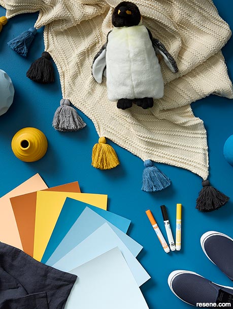
Break up primary blue and yellow with shades or tangerine and apricot. These sandy hues can be easily brought into your interior by painting a bedside table or lightshade.
Background painted in Resene Spinnaker with A4 drawdown paint swatches (from right to left) in Resene Frozen, Resene Quarter Frozen, Resene Blue Moon, Resene Matisse, Resene Bright Spark, Resene Smoke Tree and Resene Roxy and vases in Resene Fuel Yellow, Resene Frozen and Resene Matisse. Throw from Freedom, linen pillowcase from Citta, penguin puppet from Toyco. Project by Laura Lynn Johnston, image by Bryce Carleton.
When it comes to combinations with other colours, look to a mid-toned neutral and a fun green shade. "Stripes are a great way of adding colour and can be paired with a neutral for contrast," Annick says. "Upcycle furniture with a quick and easy coat of paint for a statement pop of colour. Try stripes in Resene Thunder Road and Resene Spanish White with a feature chest of drawers painted in one of my favourites Resene Away We Go."
It is no easy feat to decorate a home well in a riot of colour, Annick says, but it can be done beautifully using the right tones. The addition of small doses of dusky or pastel hues, such as Resene Paper Doll, will soften your primary colours, bringing a more gentle touch to your interior. "I love a bold interior that looks haphazard at first, but slowly reveals itself to be curated and cleverly done," she says. "The trick to making that impact without it turning garish is to ensure you choose shades that aren't too clean or bright. Pick shades that have some black in them. Some of my favourites would be Resene Coral Tree, Resene Rivergum and Resene Hammerhead. Bold paint colours with muted undertones are going to feel more visually soothing and will be easier to life with."
Kate Alexander, creative director at Places and Graces, says to take care when bringing all three primary colours into a home. "One observation having lived with a primary palette is that when you start to add secondary colours, it gets hard. At that point, you need to choose which of your primary colours will be the hero. Mine is yellow."
"If you're using all three primary colours together, keep it sophisticated by using your colours minimally, like they were used mid-century when the palette first had its heyday. Allow for single items in these primary colours so they don't overpower each other."
Introduce them bit by bit, for example, on the edge of a door, on a lightshade or an item of furniture, she says: "Our door edges are all painted in Resene Broom as are our dining chairs, and our bright blue dining table is in Resene Resolution Blue.
Primary colours can work in any room, Kate says, but because they can create an 'active' feeling they are easier to live with and better suited to living room areas. "In a bedroom, choose to use just one of the three," she says. "Using one primary colour works best if you then pair it with secondary colours close to it. Red can work well as a feature colour, and will feel less primary if you pair a maroon red with earthy tones of brown, cream or taupe. It's a good choice if you have a base palette of Resene Tea or Resene Perfect Taupe."
Yellow can be easily paired with orange and red to create a warm palette, Kate says, or keep within tones of yellow with mustard shades. "Yellow is a good primary option if you have cream-coloured base such as walls in Resene Pearl Lusta or Resene Spanish White."
A clever approach to bright primary colours is to extend your palette on something existing in your home. "Take inspiration from a colourful artwork or Resene wallpaper and use these colours as the basis of your paint palette," Annick says. "Choose a finite palette of colours (I would suggest no more than seven) and repeat them throughout the home for a cohesive look.
If you paint your dining room walls in one colour, paint a chair in a child's bedroom the same colour, as well as a frame in the study and a basket in the laundry so the colour gently repeats." To allow for creative cohesion, choose a primary colour pattern in your artwork, a cushion or curtain, and paint a mural in the same pattern elsewhere in the house.
Experiment with painting accessories such as legs of chairs, planter pots, handles of chopping boards, candlesticks or picture frames for small elements of vibrancy, Annick says.
"A space can also be made cheerful just by introducing a bold and colourful piece of accent furniture – such as a painted desk or chair. A statement front door is another fab option for adding one bold colour – Resene Vibe or Resene Broom are all great choices for making a bold statement."
Always allow for a break in your space from saturated colour, it'll be easy on the eye. "It is important to have some relief from large blocks of bold colour so keep skirting boards, ceilings, window frames and flooring neutral," Annick says. "Resene Wan White, Resene Double Alabaster or Resene Rice Cake are a few of my favourites."


June 18, 2021
Visit your local Resene ColorShop for expert advice and all the products and accessories you need to make the most of your home.
Book a colour consult | Ask a Colour Expert | Ask a Paint Expert
Resene's decorating blog
Paint your home beautiful! Discover the latest decorating trends, tips and colour news.
![]()
Previous «
How to work with jewel colours
![]()
Blog home
View the latest trends, tips and news
![]()
» Next
Down to earth – the evolution of terracotta
![]() Get inspired ! Subscribe
Get inspired ! Subscribe ![]() Get saving ! Apply for a DIY card
Get saving ! Apply for a DIY card
![]()
Can't find what you're looking for? Ask us!
Company profile | Terms | Privacy policy | Quality and environmental policy | Health and safety policy
Colours shown on this website are a representation only. Please refer to the actual paint or product sample. Resene colour charts, testpots and samples are available for ordering online. See measurements/conversions for more details on how electronic colour values are achieved.
What's new | Specifiers | Painters | DIYers | Artists | Kids | Sitemap | Home | TOP ⇧