From BlackWhite magazine - issue 05, libraries feature
How great design and colour use have kept libraries relevant in the internet age.
No matter what demographic you’re a part of, there is always a place for you at your local library. Among humankind’s most universally socialised and accessible systems, the welcoming nature and community value that libraries offer is unique in our greater society. And despite the meteoric expansion of the world wide web, they’ve held on to their relevancy even as the market for print media has shrunk. While the internet could have spelled disaster for the centuries-old concept of libraries, these vital neighbourhood resources have always evolved in step with community needs and continued to be a vital part of our social fabric.
Libraries have always been innovators and disruptors and keenly contrarian in the face of capitalism. In a time when most things are becoming more expensive, libraries have taken steps towards increased affordability and accessibility for all income brackets, moving to offering memberships for free and eliminating late fees. Rather than push against the internet, libraries have leaned into the ways in which it can be used to improve their services. Physical collections, while still important, are only part of a contemporary library’s offerings. As media has changed shapes and formats, today’s libraries have less shelving and more technology and different types of amenities, with many offering electronic catalogue options like Hoopla and OverDrive to supply patrons with a wider collection of books, movies, music, newspapers and magazines than their physical structures could ever possibly store.
Libraries have also become far more than book repositories over recent years. Today, world-class library facilities cater to growing interest in new technologies like 3D printing, coding, computer programming and robotics, and may offer a range of maker-focused spaces for things like sewing, cooking and woodworking and areas to enjoy social hobbies like video gaming, board gaming or watching movies. There are also different types of media available in libraries than there was previously which can demand different methods of storage and display. Graphic novels, self-published ‘zines’ and even vinyl records can all be found in contemporary libraries but need to be treated and cared for differently than standard books.
Even before the pandemic, many patrons saw libraries as an extension of their homes and workplaces; a comfortable third zone for studying, working and pursuing hobbies. They were ahead of the curve in accommodating remote work by offering a variety of spaces aimed at supporting group work, idea incubation, individual focus, skill development and child care. Similarly, libraries can act as a safe social centre away from school for students. Libraries with distinct kids’ and teens’ areas often inspire a sense of independence in young people, giving them a place where they can spend time apart from mum and dad without rise for concern about their safety.
When we ask new graduates of creative programmes what project typologies they hope to have the opportunity to design during their career, libraries are among the most common responses – and, frankly, it makes sense. Who wouldn’t want to have a hand in shaping a nerve centre of their community, with so many exciting and evolving programming requirements and the need to apply analytical thinking to come up with innovative, complex and richly-detailed design solutions?
And then there is the colour. Libraries are seldom plain, but rather a celebration of the people that enter their doors and places they are located. No matter how large or small the budget, paint is always within reach to chromatically personalise, energise and unify these social hubs.
Here, we look at three inspiring library designs that demonstrate what an important part colour plays in communicating user identity of the communities they serve and the message that they’re a place where everyone belongs.
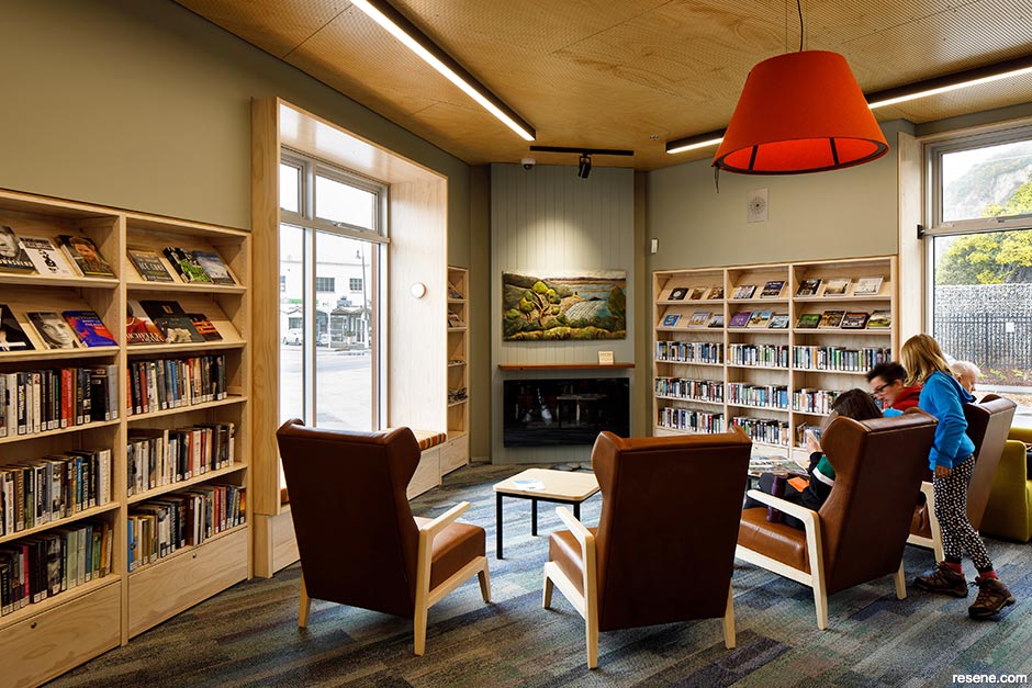
Sumner, Christchurch
Part library, part community hub and part museum, Matuku Takotako: Sumner Centre was built to replace facilities and buildings demolished following the Canterbury earthquakes. During consultation for the Sumner Village Centre Masterplan, it was identified as a key feature and community asset.
Entry from the street or courtyard leads you to a generous shared public atrium. The triple height atrium acts as an internal courtyard that the library, hall, museum and hub open out to and joins the ground and first level together as one building. Spaces for the library and community hall wrap around Wakefield Avenue and Nayland Street, making the most of natural light and superb views. Community services, offices, bathrooms and the museum ‘bookend’ the northern boundary while the external courtyard acts as an extension of the library space and a place for the public to gather.
Externally, the building’s form and a variety of materials support the identity of the internal spaces and provide visual variety and interest to the local neighbourhood. Inside, the library has been designed as a community living room, where window box seats have been integrated into the shelving and armchairs are arranged around a fireplace beneath a dropped ceiling. The colour palette references the seaside suburb’s landscape, overlaid with vibrant tones of sun umbrellas and beach towels.
Within the domestically-scaled space, Resene Half Lemon Grass has been used to complement sea-toned carpeting and timber accents, which add to the cosy, homey atmosphere. Resene Celestial Blue defines the library pod, providing a graphic backdrop to the magazine display wall while burnt orange, acidic yellow, lipstick pink and striped textiles provide pops of inviting energy.
Artworks by Fayne Robinson and Brent Brownlee bring life and personality to the space. Their carvings and designs offer a ‘window into the world’ of Sumner, interpreting stories of the local culture and landscape.
Architectural, colour and interior specifications: Athfield Architects
Build: Armitage Williams Construction
Painting: Spencer Painters and Decorators
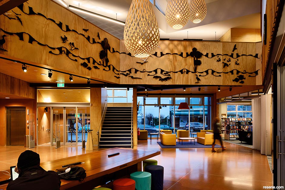
Johnsonville, Wellington
The design competition that led to Waitohi sought a library three times the size of the old one to be linked to Keith Spry Pool, Whānau Manaaki Kindergarten, a café, a transport hub and Memorial Park. But it also ended up setting a precedent for other suburban areas looking to transition into denser ‘town centres’ by connecting and consolidating facilities to create an engaging new hub that became the beating heart of Johnsonville.
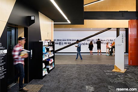
Since Johnsonville was originally dense forest and the name ‘Waitohi’ refers to the stream that ran through the area, the project is filled with nods to the land it is built upon. Throughout the facility, you’ll find acknowledgement and celebration of the historic vegetation, topography and geography of the site through a re-imagining of the original forest setting in a new terraced architectural landscape.
The interior was imagined as a ‘learning landscape’, creating a journey of discovery as users experience spaces as an ascension from the lower levels to the upper ones. The tree trunk-like columns of the ‘forest floor’ connect with the articulated ceiling ‘canopy’ above while an ‘escarpment’ mediates between – providing a place to sit and work with views out over the landscape. ‘The Link’ extends through the building, joining the library to Keith Spry Pool, the transport hub and Memorial Park beyond. The café activates the edges, spilling into shared landscape to the west. Upgraded from part of the original site, the kindergarten was relocated to level 1 and the rooftop terrace.
Within the building, opportunities for playful visual connections between the library and the kindergarten are encouraged, connected by large porthole windows. Traditional library thresholds are blurred, with large flexible spaces allowing a range of programming and community events to be hosted. A makerspace and recording studio acknowledge the changing technological needs of library users and bookable community meeting rooms, staff workrooms and support spaces are provided throughout.
The Resene colour scheme is also derived from the narrative of the historic Johnson’s clearing and pays homage to the original forest on the site. Flooring acts as wayfinding signifiers but also acknowledges the subterranean stream, Waitohi. Wall colours are inspired by seasonal choices of flora and fauna, from fresh greens through to autumnal browns and reds, with the inner ‘tree trunk’ lined in plywood and strandboard to bring the natural appeal and woody warmth. Low VOC products including Resene SpaceCote Low Sheen, Resene ClinicalCote and Resene Lustacryl were specified to consider indoor air quality during the on-site application but also for their durability. Clear sealers were used to protect the plywood and strandboard surfaces and Resene Uracryl was used to add protection to exterior steelwork.
With consideration of access and inclusion for all, the project aim was to be the first Wellington City Council library to be rated with the Be Accessible Platinum Standard – which was achieved with flying colours. The colourways were a major component of the accessibility design in terms of orientation and contrast and were recognised with a Resene Total Colour Commercial Public Interior Colour Maestro Award. Since opening, Waitohi has seen a massive increase in registrations and use as the community has flocked to embrace a place of activation and belonging.
Architectural, colour and interior specifications: Athfield Architects
Build: Southbase
Painting: Freear Philip
Images: Jason Mann
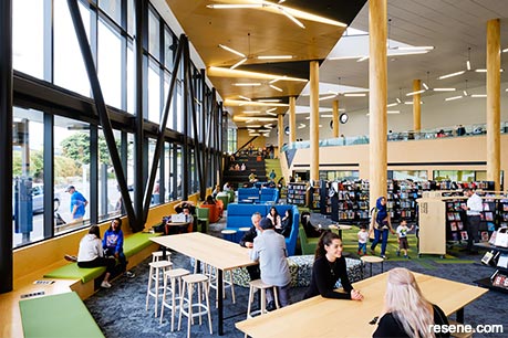
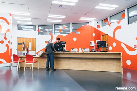
Auckland Central, Auckland
When it was time for routine maintenance on the public areas of Auckland Central Library, which included like-for-like replacement of the carpet and required all the collection, furniture and shelving to be moved, a clever library manager recognised an opportunity to shake things up. They wondered if a bit of fresh thinking and inspiration could have it all put back in a different arrangement to address a number of functional problems, improve the visitor experience and support the library staff’s delivery of Auckland Libraries’ 21st Century Service Model – and if it could be done on a shoestring.
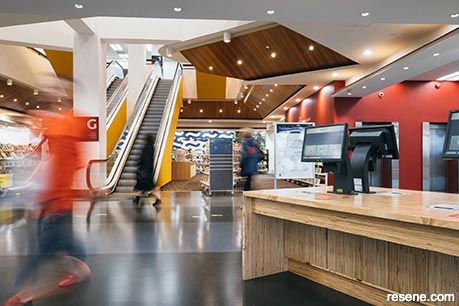
Athfield Architects undertook a spatial review of the building, stakeholder consultations, site analysis and best practice benchmarking to conceive the ‘big picture’ principles. The available tools that fit within the financial constraints consisted of leveraging the existing furniture and adding timber, paint, graphics and hanging on to the existing carpet pattern. The small budget was put to work in a big way, building from and amplifying the strengths of the existing library and complementing its best qualities with new insertions – spread as far and as wide over the three floors as possible.
Overall, the library became remarkably lighter and brighter with a better arrangement of workstations and benches and vastly improved signage. A striped floor was added to link the ‘browsing library’ on the ground floor to the street. Large timber work surfaces were placed on each floor to gather students into smaller groups and break the monotony of the ‘reading library’ on level 1. The strategic removal of walls and shelves on level 2 improved circulation and curation of the ‘research library’. The addition of a terraced event space on the ground floor provided a place to host active public programmes and event offerings. And artist Frances Cooper created a mural comprised of 127 silhouettes of significant contributors to the library’s collection, arranged as a crowd.
It was the refreshed Resene colour scheme that tied the entire concept together with hues that responded to the existing colours and finishes of the building – with the most vocal component being the carpet. An abstracted version of a stick navigation map used by Lapita sailors to navigate the Pacific, it hosts an endless array of golden sticks with teal and sea green triangles peppered with red bobbles representing shells. In a sparing nature, reds were dedicated to points of access: Resene Guardsman Red brings attention to the service counter while Resene Hot Chile was used for the walls of the main lift core throughout the building. Resene Nite Life was used for the public bathrooms. Because of the library’s deep floorplate, brightening the spaces was of chief concern. Resene Alabaster was used throughout the building on all the columns. Its impact is most significant in the central atrium space, where new up and downlighting creates the effect that the space could be open from above.
The use of Resene Merino painted on walls on the second floor in the library’s heritage collection was chosen to bring a touch more warmth than the truer white of Resene Alabaster. Resene Double Concrete hems the newspaper and magazine reading space and Resene FilmPro Digital Green and Resene FX Blackboard Paint are both functional and complementary wall finishes that enhance the activities the library’s makerspace regularly hosts.
Architectural, colour and interior specifications: Athfield Architects
Build and painting: Cassidy Construction
Images: David St George
This is a magazine created for the industry, by the industry and with the industry – and a publication like this is only possible because of New Zealand and Australia's remarkably talented and loyal Resene specifiers and users.
If you have a project finished in Resene paints, wood stains or coatings, whether it is strikingly colourful, beautifully tonal, a haven of natural stained and clear finishes, wonderfully unique or anything in between, we'd love to see it and have the opportunity to showcase it. Submit your projects online or email editor@blackwhitemag.com. You're welcome to share as many projects as you would like, whenever it suits. We look forward to seeing what you've been busy creating.
Earn CPD reading this magazine – If you're a specifier, earn ADNZ or NZRAB CPD points by reading BlackWhite magazine. Once you've read an issue request your CPD points via the CPD portal for ADNZ (for NZ architectural designers) or NZRAB (for NZ architects).
![]() Get inspired ! Subscribe
Get inspired ! Subscribe ![]() Get saving ! Apply for a DIY card
Get saving ! Apply for a DIY card
![]()
Can't find what you're looking for? Ask us!
Company profile | Terms | Privacy policy | Quality and environmental policy | Health and safety policy
Colours shown on this website are a representation only. Please refer to the actual paint or product sample. Resene colour charts, testpots and samples are available for ordering online. See measurements/conversions for more details on how electronic colour values are achieved.
What's new | Specifiers | Painters | DIYers | Artists | Kids | Sitemap | Home | TOP ⇧


