From BlackWhite magazine - issue 05, Resene Total Colour Awards
The accolades roll in for this year’s Resene Total Colour Award winners.
Education Award + Colour Master Nightingale Award
Despite the many roadblocks and challenges specifiers have been up against during the past few years, the 12th annual Resene Total Colour Awards saw a bumper crop of impressive entries. From mammoth to miniature and vibrant to subdued, the incredible breadth of projects expertly coloured with Resene paints, stains and wallpapers were truly a thing for the judges to behold.
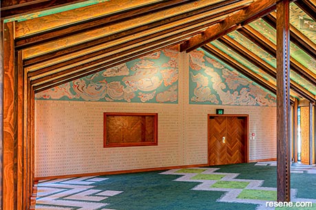
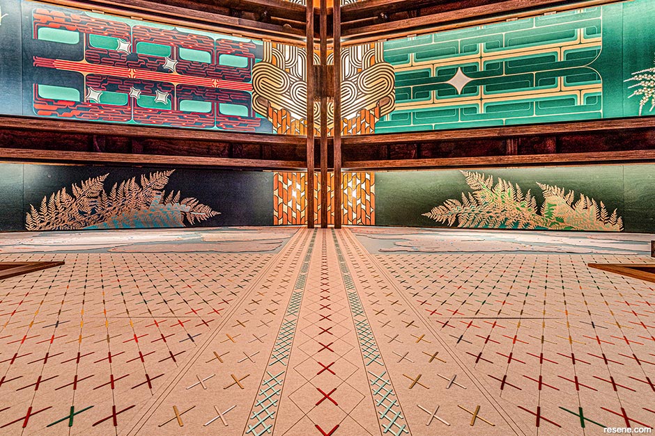
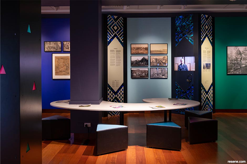
A co-led collaboration between Te Kāhui Toi and Athfield Architects was honoured with this year’s Resene Total Colour Master Nightingale Award as well as the Resene Total Colour Education Award. Their exquisitely coloured Te Rau Karamu Marae project offers a warm welcome to students and guests alike at Massey University’s Pukeahu Campus. Rich in detail and meaning, the marae invites visitors to come together, engage and rejuvenate as they are immersed in the knowledge and values of te ao Māori. The interior configuration, integration and Resene colour palette connect it with the surrounding landscape and the greater natural environment while facilitating learning, engagement and a sense of identity.
Resene Melting Moment, Resene Bright Spark, Resene Golden Tainoi, Resene Vista Blue, Resene California and Resene Gelato were the key hues used in the marae’s wharekai and a wide array of Resene testpots were used to create artwork in the wharenui.
The judging panel, which included Sylvia Sandford (colour expert), John Walsh (previous editor of Architecture, architecture writer) and Laura Lynn Johnston (editor of BlackWhite magazine, previous editor of habitat magazine), applauded the project’s inclusivity, elegance and the way it celebrates history while looking towards the future.
Congratulations to all the winners and runners up and sincere gratitude to everyone who took the time to enter this year’s awards and share their extraordinary work.
Te Kāhui Toi + Athfield Architects
Te Rau Karamu
Judges: “Breathtakingly beautiful and undeniably sophisticated, this marae combines the power of colour, artistry and light, exuding calm and peacefulness to draw you in. With painstaking attention to mesmerising and elegantly finished details, the sheer depth of love and passionate effort wrapped into this project is undeniable. This project draws on the past, celebrating history, yet sits beautifully in the present with an eye toward the future. Courageous use of lighter colours helps to give levity to the internal space. Within an urban environment, it gives the campus a heart with a colour palette that is inclusive and designed to bring people together. Incredibly beautiful and elegant.”
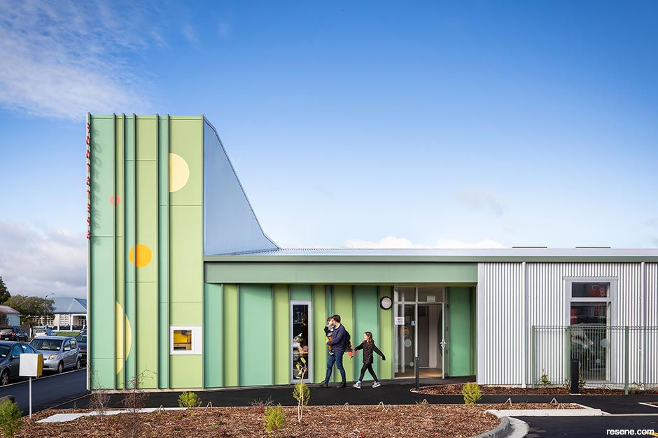
Footsteps Preschool
Craig Burt, Parsonson Architects
Judges: “Harnessing a refined colour palette, the combined effect is cheerful and uplifting to match the exuberance of the children who learn and play there. The project showcases an innate understanding of the power of colour and how it can be cleverly manipulated to integrate and define zones in a space.”
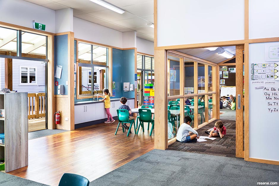
Silverstream School Redevelopment
Murray Robertson, Robertson Hidzir Architects
Judges: “Colour is viewed through timber frames with related hues, which connect one space to the next, like chapters of a book developing a story. Task-based zones are communicated through the palette using clear colour cues without being too overt. This project shows how you can elevate a building with careful thought and attention to colour placement. The hues have given it light, energy and fresh appeal.”
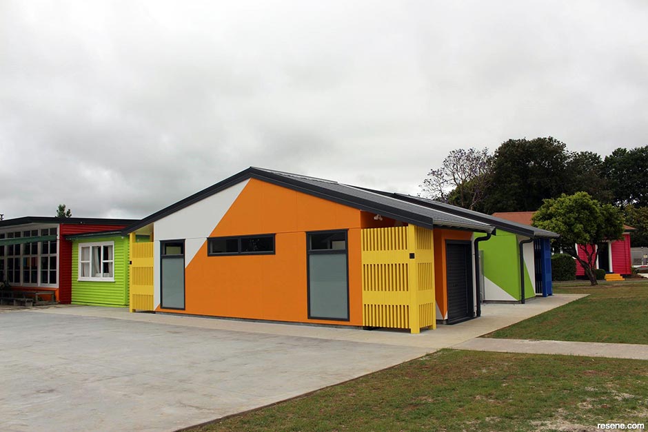
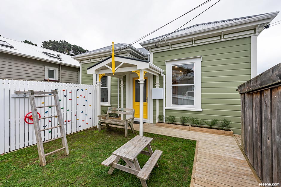
New 3 Classroom Block + Toilet Block, Hikurangi School
Sarah Bertie, Designgroup Architects h + k
Judges: “Colour blocking cleverly knits old and new together, giving a sense of coherence across the whole project. In this project, colour knows no bounds, seamlessly continuing confidently across a multitude of surfaces and planes with a lively and bold palette. A textbook lesson in how colour can be used to turn the ordinary into the memorable.”
Identity Redefined
Varna Berriman
Judges: “A classic example of one space many ways, this project role models how we should all think about colour in spaces. Physical and emotional needs have been taken into account to lead decision making when choosing and placing colour to ensure they support each user’s identity. A toolkit of colour is unlocked to adapt the project to enhance and celebrate individuality.”
See more of this project here.
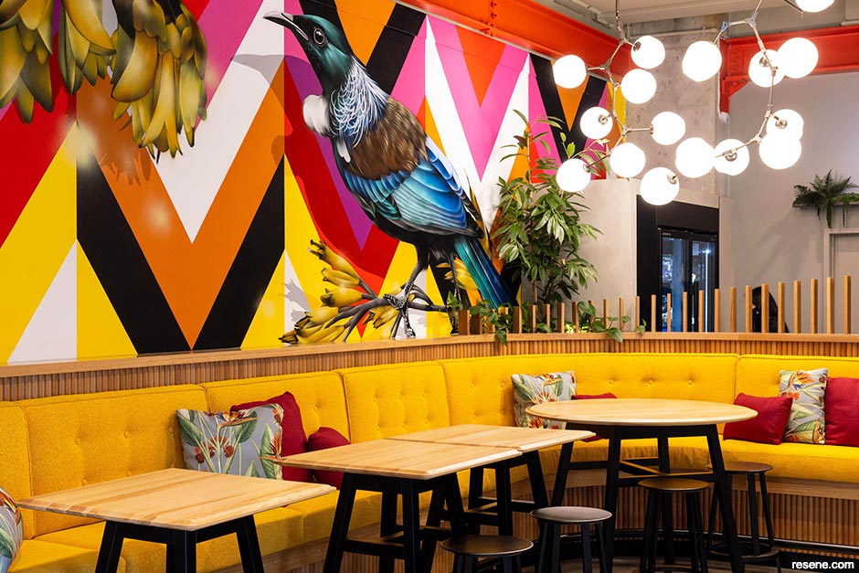
Undercover Bistro
Sarah Straker-William, Straker Williams
Judges: “A simple idea that’s been so cleverly realised. This structure is adaptable and can be reconfigured with colour as a visual transition. Clever colour blocking using highly-appealing hues brings together a beautiful colour palette that showcases the structure in whatever configuration it appears.”

Bugi Bagi
Jessica Rayment, Jessica Alice Design
Judges: “The juxtaposition of something so transient and precarious against something so enduring provides a beautiful harmony. This project reaches out beyond its surroundings to the neighbouring parkland and draws those elements in, anchoring nature into this space. The restraint of the colour palette works beautifully because the environment is so strong; it’s empathetic, yet distinctive.”
Beach Barn
Alex Fulton, Alex Fulton Design + Nott Architects
Judges: “Colour brings personality to this home. Creatively executed, this palette is holistically designed and draws attention to feature spaces with relief and neutrality, allowing the carefully curated accent colour choices to lead the colour story. Colour selections and curations of treasures are interwoven with care so that each supports the other.”
Titirangi Mid-century
Felicity Brenchley, Felicity Brenchley Architects
Judges: “Colour builds a sense of interiority in this home, focusing attention on internal spaces with their carefully placed blocks of colour. The hues complement the mid-century appeal, with a few bright surprises to delight. Each room’s colour choices invite you in, encouraging you to make yourself at home.”
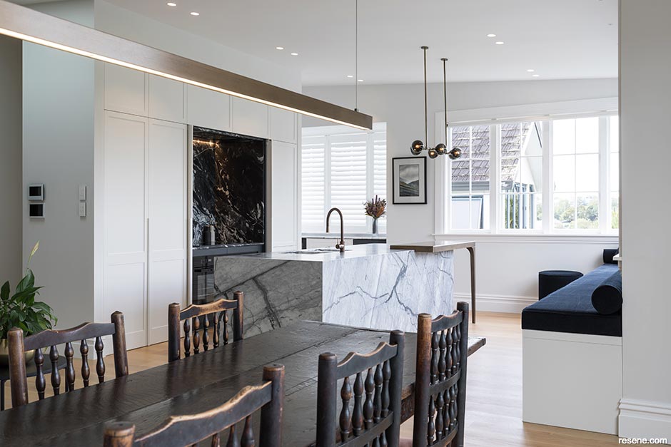
Portis Blue – Ngaio Renovation
Katie Peck, Kurio
Judges: “Colour is used confidently, purposefully and courageously, lifting this home’s interior and giving it distinction. Colour adds character to each space, imbuing each with its own unique personality to enjoy.”
Huntly Residences
Method Group Ltd
Judges: “This home has great style, sense of presence and the anticipation of waiting for an occasion – and it’s the colour that brings the atmosphere and sets the tone. The colour selection has followed the lead of the architecture, complementing it and drawing attention to the architectural detailing. Each choice defines the mood of the space, so you instantly know exactly what each room is for.”
Bellevue Street
Sims & Blue Limited
Judges: “This graceful home has had its beauty restored with colour and quality of workmanship. The colour palette has just the right touches to draw your eye to the interesting form and architectural details. Deep blue grounds the home and sets the base for a layered colour palette that lightens as it rises, bringing out this home’s many charms.”
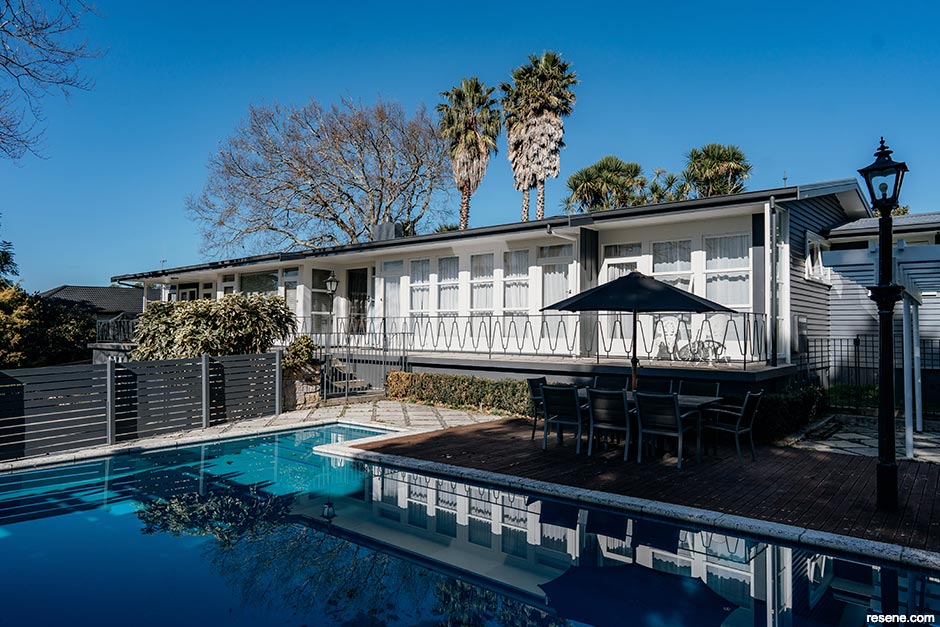
Kerr Residence
Melanie Jayne Design (Limited) + P&B Painting NZ Limited
Judges: “A handsome choice of colours, this palette celebrates the vintage of this home. Clearly distinguishing the ground level and the top living level, the living environment appears to float with the lightened hue. The feature front door is striking, it’s colour reflective of the water of the pool and yet still authentic of its original era.”
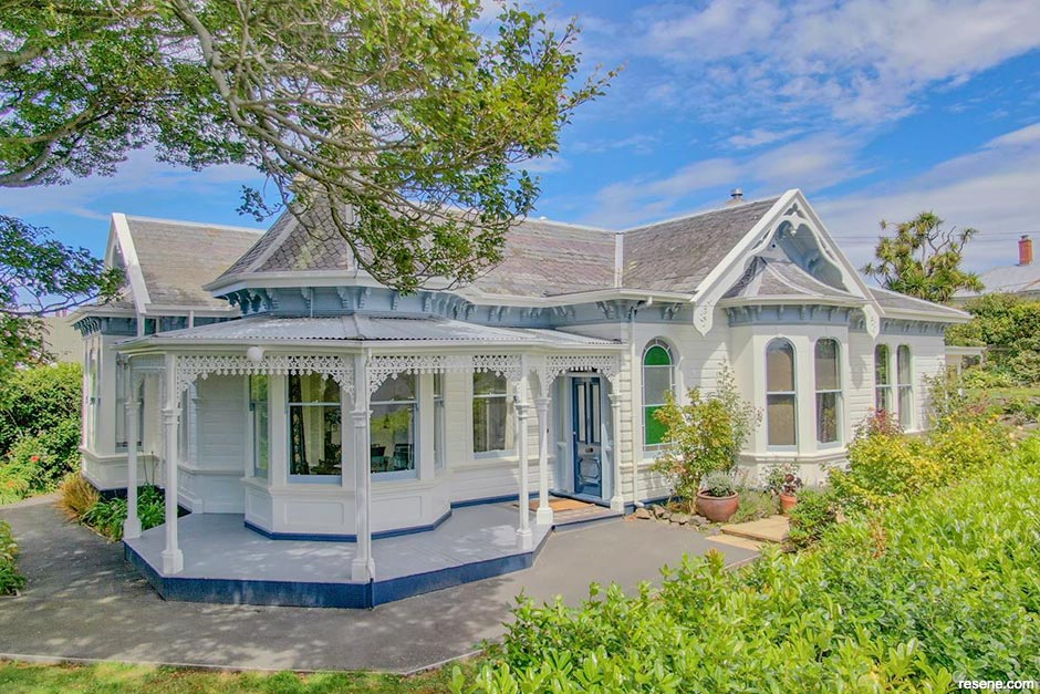
Henry Street Villa
Russell Allen Architect
Judges: “All roads lead to this front door glowing with welcome. Small details are ever-so-carefully picked out with cheerful yellow to lift the spirits. The hues are empathetic of the history of this home celebrating its past and bringing in colour with a hat tip to nature, while moving it forward into today’s environment.”
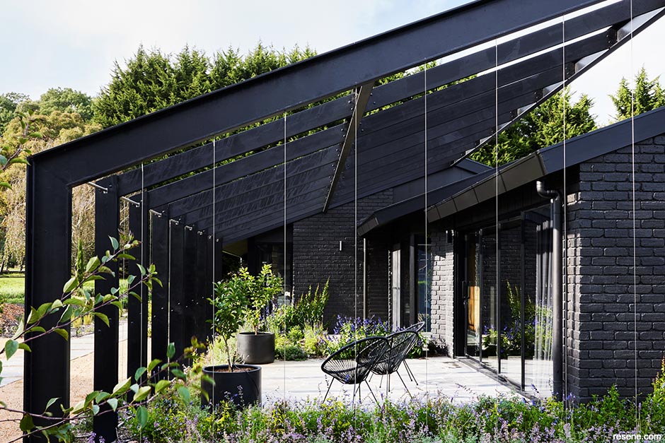
The Seat
Atlas Architects
Judges: “This landscape has a sense of things to come. Already beautifully integrated and breathtaking, this will become even more so once the plantings mature. The origami roof plays with the light making one colour seem like many more nuances of colour. The achromatic palette works wonderfully with the green foliage, helping it nestle well into the surrounding landscape.”
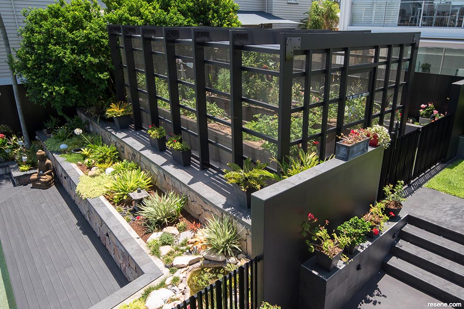
Queenslander Home Renovation at Hawthorne
Dion Seminara, Dion Seminara Architecture
Judges: “Diversity in planting and the combination of rock and retaining walls comes together to support a landscape that isn’t just aesthetically pleasing but also encourages productive growing activity. The grand point of entry provides tremendous curb appeal and sets the scene for the supporting landscape.”
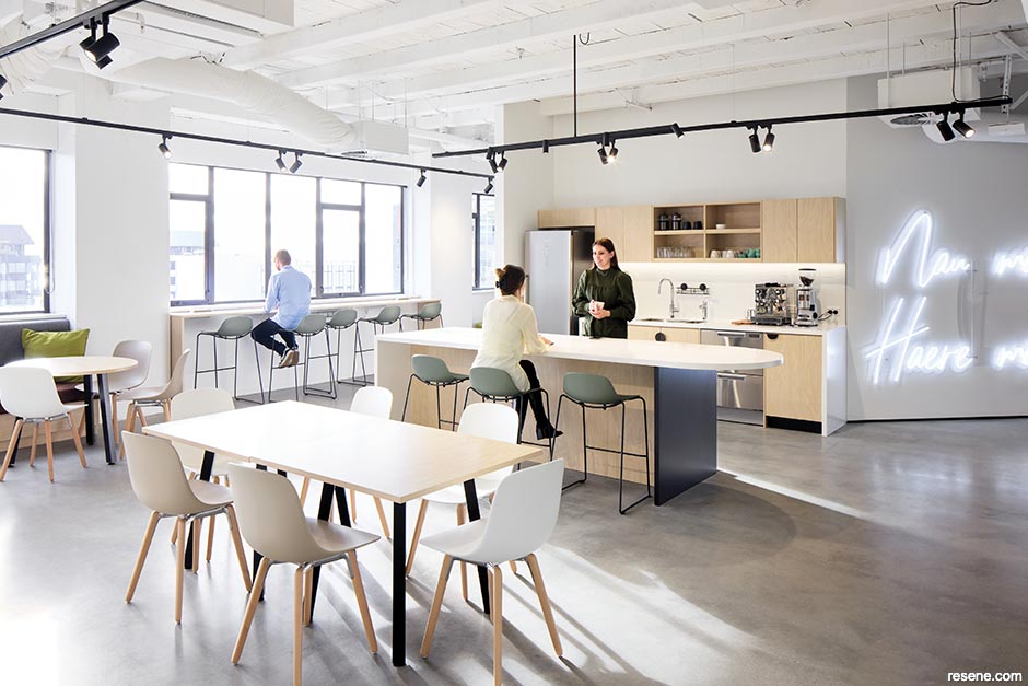
Internet NZ
Caroline Watts, Studio DB
Judges: “The palette enhances the spaciousness of this office, deliberately uncluttered, where the colour selection follows the same philosophy. The infusion of light supports the neutrality, giving clarity to the space. Varied gloss levels of materials play with the lighting and sense of space. An undeniably calm zone that sets the scene for office harmony.”
Bell Rd
Katie Scott, Sticks+Stones Design
Judges: “Different spaces are well connected through a neutral palette that touches all surfaces for a monochromatic rhythm of subtle colour. Playing off dark and light, this home carefully balances both. It’s the perfect backdrop for living that allows occupants to add their own colour contrasts with furniture, accessories and treasures.”
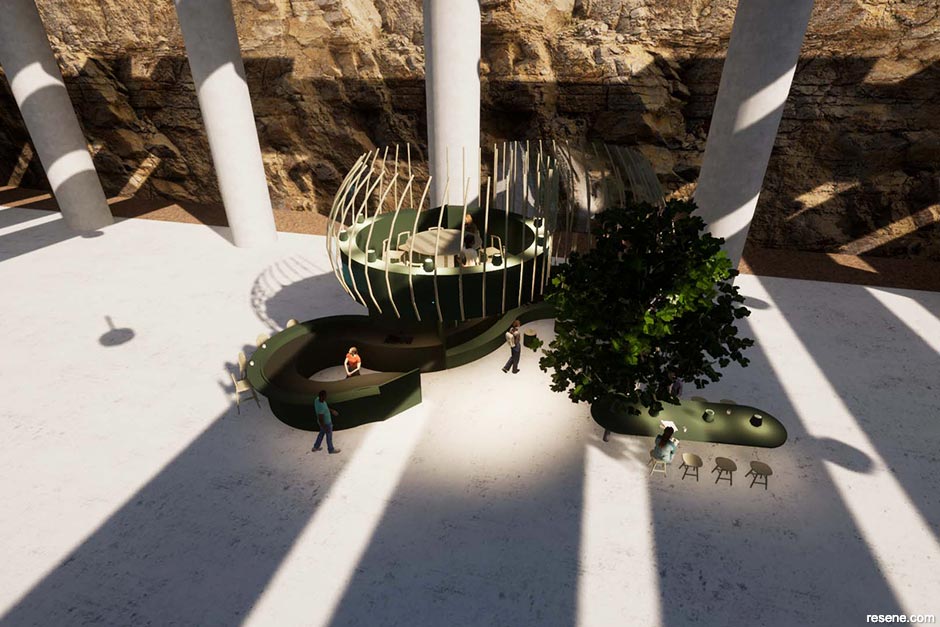
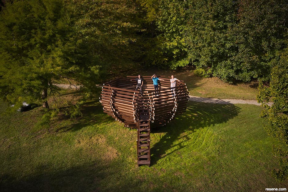
Brick Bay Wines and Sculpture Trail – The Nest
Nicholas Rowsby + Brandon Carter-Chan + Joseph Trace
Judges: “Beautiful gradation with subtle colour shifts, each colour in this project highlights line, form and structure. Wholeheartedly embracing the ethos of circular design, the team’s strong vision is clear from the design through to the finished build. The project is distinctive yet nestles well within the landscape. A masterclass for us all as to how old can become new again.”
See more of this project here.
Kuru Taonga: Voices of Kahungunu
MTG Hawke’s Bay
Judges: “Tremendous attention to detail has created this immersive and luscious colour experience. Continuity, patterning and a connection to nature come together to form a natural flow through the exhibition. Powerful repetition and colour draws visitors in and ensures their visit is a memorable one.”
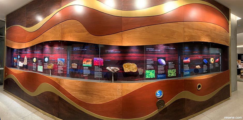
Stardust to Supercontinents Timeline
Ceci Wilkinson + Lis Cherry, Thylacine Design
Judges: “Timber has an agenda all its own, and this project pays the material homage with layer upon layer presented in a carefully chosen palette of wood stain hues inspired by a key specimen. The inspiration is brilliantly realised in the exhibition to draw your eye into the exhibits. It’s a rare treat to see timber used so creatively to set the scene.”
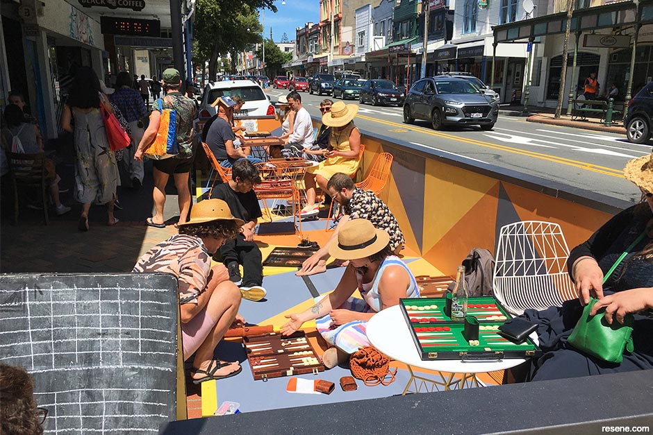
Te Atamira a te Iwi – The Peoples Platform
Isthmus Group
Judges: “Here today moved tomorrow, this inviting and energetic temporary space stands in contrast to the streetscape. Cleverly designed for adaptability in location, multipurpose use and access, it boldly celebrates repurposing street space for all to enjoy. The strong triangular forms and distinct colouration are delightful and make it a memorable bright spot to seek out in the city.”
See more of this project here.
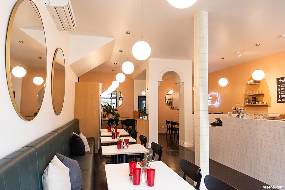
Patti’s and Cream
Annie Simpson King, Simpson King Design
Judges: “Yum! This project not only celebrates the experience of having an ice cream but elevates it. The delicious colours call you inside, offering comfort and the warmest of welcomes – then cosily wrap around you, encouraging you to stay. A scrumptious evolution of this brand’s story.”
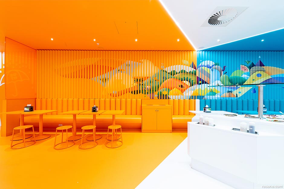
SoYo Frozen Yoghurt
Hierarchy Group
Judges: “Colour is used to push the boundaries of what we have come to expect from mall retail. The placement of hues at mind-bending angles redefine the sense of space to stretch the definition of its limits. The design is innovative in its use of the client’s branding colours, in a way that wholeheartedly embraces them. An ‘Instagrammable’ destination.”
Noah’s Ark Teahouse Cuba Store
ZhenJian Ruan
Judges: “A warm welcome awaits in this intimate space with a colour palette that has been carefully, sympathetically and beautifully executed in a heritage building. The hues draw inspiration from the steeped qualities of tea with layers of tonal colour that nod to nature. The restful palette offers respite from the bustling street outside, a tempting invitation to simply sit and sip awhile.”
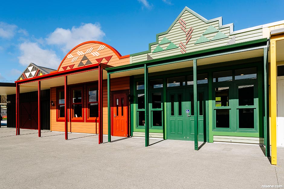
Te Hurihanga Training & Service Centre
MODE Design Corp Ltd. in collaboration with Avail Pacific
Judges: “Lively, exciting and happy, colour is ambitiously harnessed to maximum effect. Occupying a physically central space, this project wholeheartedly embraces the spirit of the town through its new colours. Each component has its own unique personality drenched in bold colour from tip to toe, showcasing its character both in isolation and in tandem with its neighbours.”
See more of this project here.
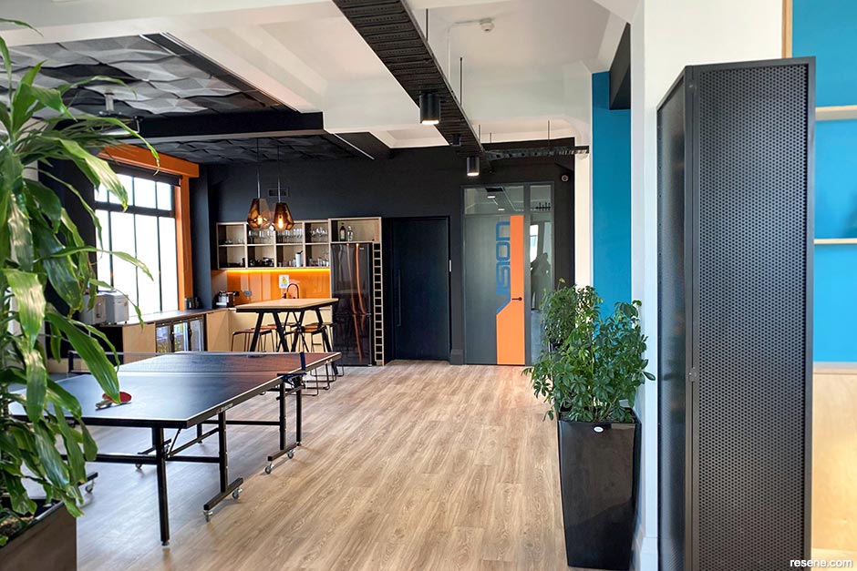
Vision Systems Office Fit-out
Studio Soul Limited
Judges: “Strength of colour defines this office’s architecture. The robust colour treatment responds to the strong building shell, reflecting the client’s identity and imparting depth to the building fabric. The space feels anchored, delightfully celebrating the many nooks for an uplifting play on colour surprise.”
See more of this project here.
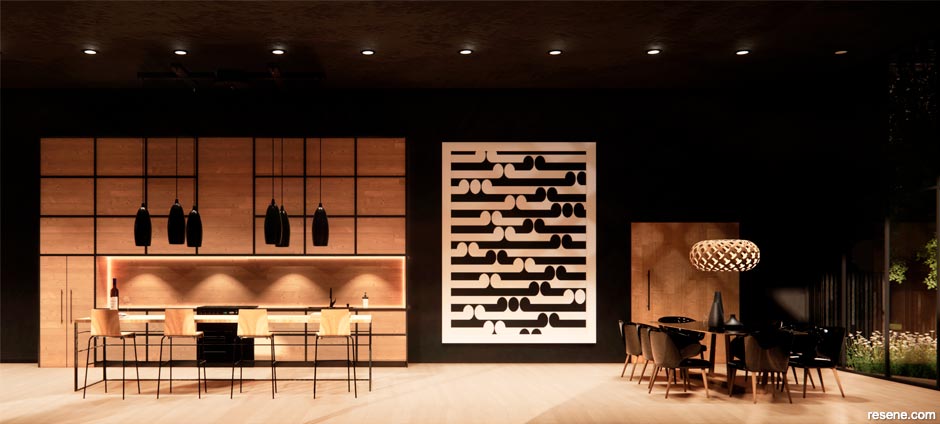
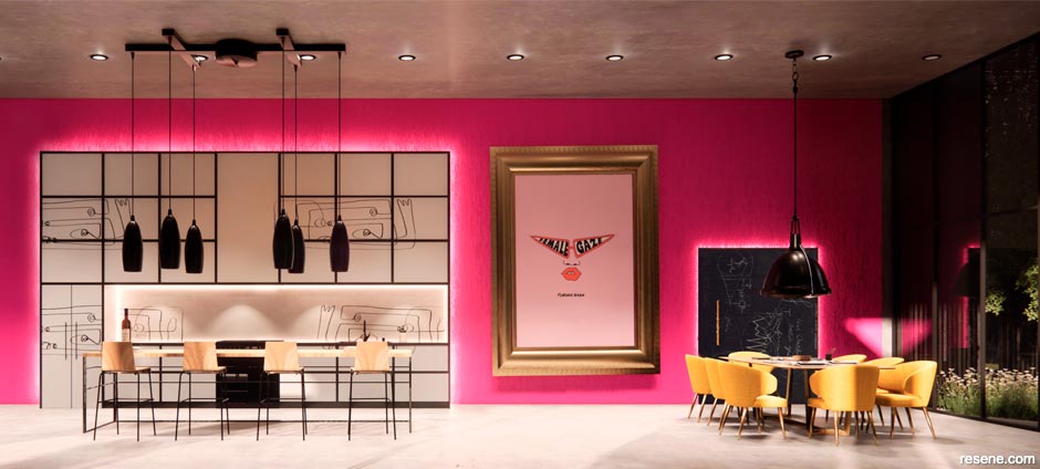
MC Te Kāuta
Sophie Burns, Anna Kean Pritchard, Christopher Gough Palmer, David Storey, Guy Whateley, Emma Harney Burning Red Design + Saturday Creative
Judges: “This lively, fun and exciting social space is an unexpected colourful treat in a corporate office. Whether experiencing the space individually as a retreat from a traditional workstation or as a social core to share with colleagues, the colour treatment is immediately invigorating and energising. The perfect pick-me-up palette.”
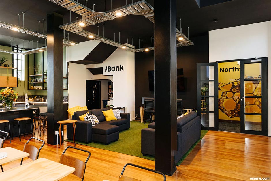
The Business Hive
Annabel Berry and Meghan Nockels, Design Federation
Judges: “Buzzing with earthy and cheerful colours, this honeycomb of hues is uplifting and undeniably apt for a busy working space brimming with personality. Harnessing the power of colour psychology, each hue is used deliberately to enrich the use of the office space for all, combining the best of working from home, away from home.”
Hastings Municipal Building
Matthews & Matthews Architects Ltd
Judges: “This grand project is proudly prominent on the streetscape, leading through to an interior welcoming all with a palette that is the perfect balance of relaxed, serene and sensitive. The hues make the space adaptable to all occasions and events, inviting the community to make the space their own. A challenging project to complete, this project is beautifully finished and graciously glorious.”
See more of this project here.
Heritage Award
Heritage Colour Maestro Award
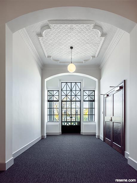
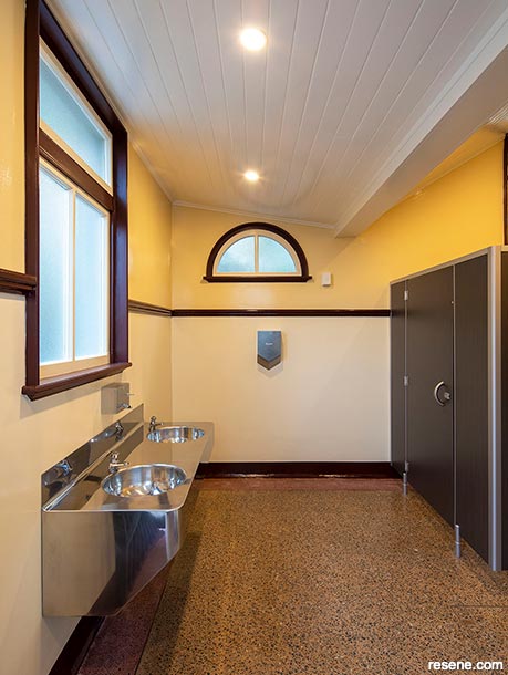
Symonds Street Public Conveniences and Shelter
Salmond Reed Architects
Judges: “It’s always a joy to see so much thought put into almost forgotten spaces. This project is wonderfully restored with a fitting heritage palette that is much more detailed than first impressions may suggest. The careful placement and selection of colour builds up the heritage story so that each part works in harmony with all others.”
Megan Harrison-Turner
Megan’s love of all things colour is evident as soon as you meet her. It’s a love she shares enthusiastically and generously – with clients, companies, students and through her styling work.
As well as an innate knowledge of the power of colours and how to combine them into palettes to make the most of each space, Megan also has the rare ability to be able to articulate what the hue brings to a space and why it works so that others can share this same knowledge. Megan combines the artistry of colour with the technical knowhow of colour theory, which makes her colour selections and teachings all the more apt and valuable.
Megan’s work has added colour to a huge number and range of projects over the years and led to an ever-expanding list of grateful clients. Megan’s energy and enthusiasm for colour is infectious. Her work has encouraged clients to become more confident in their colour choices and embrace new hues. And for her students, Megan’s colour teachings have set each on a colour journey of their own.
We look forward to seeing even more of Megan’s colourful work in the future.
› Selected projects are featured in this issue of BlackWhite magazine. Keep an eye out for more on other projects in future BlackWhite and habitat by Resene newsletters and publications. For details on all of the Resene Total Colour Award winners, visit www.resene.com/awardwinners.
This is a magazine created for the industry, by the industry and with the industry – and a publication like this is only possible because of New Zealand and Australia's remarkably talented and loyal Resene specifiers and users.
If you have a project finished in Resene paints, wood stains or coatings, whether it is strikingly colourful, beautifully tonal, a haven of natural stained and clear finishes, wonderfully unique or anything in between, we'd love to see it and have the opportunity to showcase it. Submit your projects online or email editor@blackwhitemag.com. You're welcome to share as many projects as you would like, whenever it suits. We look forward to seeing what you've been busy creating.
Earn CPD reading this magazine – If you're a specifier, earn ADNZ or NZRAB CPD points by reading BlackWhite magazine. Once you've read an issue request your CPD points via the CPD portal for ADNZ (for NZ architectural designers) or NZRAB (for NZ architects).
![]() Get inspired ! Subscribe
Get inspired ! Subscribe ![]() Get saving ! Apply for a DIY card
Get saving ! Apply for a DIY card
![]()
Can't find what you're looking for? Ask us!
Company profile | Terms | Privacy policy | Quality and environmental policy | Health and safety policy
Colours shown on this website are a representation only. Please refer to the actual paint or product sample. Resene colour charts, testpots and samples are available for ordering online. See measurements/conversions for more details on how electronic colour values are achieved.
What's new | Specifiers | Painters | DIYers | Artists | Kids | Sitemap | Home | TOP ⇧


