From BlackWhite magazine - issue 05, gold standard
A strong vision and detailed use of colour garnered a Resene Total Colour Award for this historical retrofit.
When helping others fit-out their commercial spaces with electrical and data systems is your bread and butter, you’re all too familiar with all the effort that goes into an effective office design that meets the client’s needs. That’s certainly the case with Vision Systems who recently took occupancy of a freshly-revived space in the heart of Christchurch. They knew precisely what they were after, and the results are miles away from your bog-standard commercial office.
Vision Systems dreamed of an open-plan concept that would facilitate both work and play by providing a great space for their team to enjoy weekly social club gatherings, set within the stunning former post office. The building has significant social and historical value for the city and greater region, and the abundance of style and details inside and out made it an enviable location to house their Canterbury operations. They entrusted Studio Soul to help them turn their concept into a reality and architectural designer Brooke Browne – who is known for her ability to share in her clients’ vision – was up to the task.
With its expansive windows, natural light and exposed beam and column design, the architectural richness of the space offered Brooke both opportunities and constraints. “It was important to not close off the floor and continue to encourage the symmetry of the original architecture,” she says. To accomplish this, she knew the right Resene colour palette could be leveraged to articulate different areas within the building’s envelope and that her selections would be vital for creating the right atmosphere.
top tip Waterborne enamels like Resene SpaceCote Low Sheen, which was used on this project, combine the durable finish of traditional solventborne products with Environmental Choice approval, low VOCs, low odour and a quick dry time, so offices can be repainted easily with minimal disruption to staff.
The grid-like architecture of the former post office offered opportunities to use Resene Astral to highlight and bring attention to key zones within the space, such as the reception and break areas. Main walls and ceiling in Resene Black White and lowered ceiling in Resene Nero.
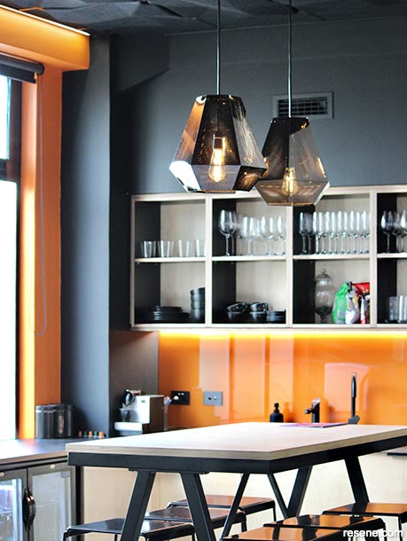
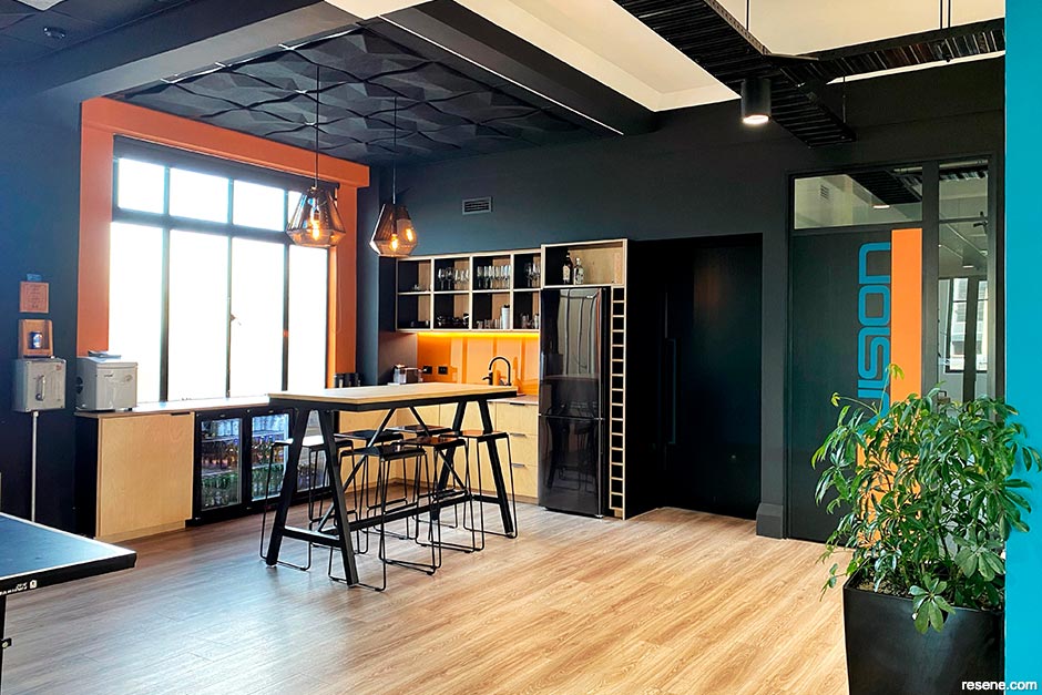
Vision Systems’ new kitchenette area looks dramatic with its walls and ceiling in Resene Nero and contrasting window frame and splashback in Resene Clockwork Orange. Now, the employees have the perfect place to enjoy each other’s company over Friday drinks.
“The former post office building was originally going to be built of brick, however, earthquake building standards were altered after the Napier earthquakes and – being a government building – the design was quickly changed to incorporate reinforced concrete construction. This structural alteration no doubt helped the building significantly in the Canterbury earthquakes. It also meant the building reflected American-style skyscrapers in its design and structure with its classical column and beam repetition. Other than the toilets, a small meeting room and some management offices, the floor plan mostly remained open – including the new kitchenette. The natural divisions, thanks to the internal columns, allowed us to create zones through the colour scheme that subtly communicate what each space is for.”
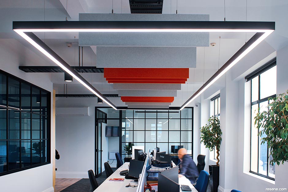
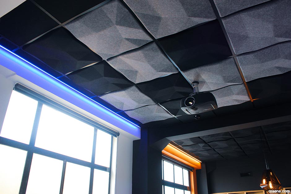
Brooke’s execution of the pared-down yet graphic palette of Resene Astral, Resene Clockwork Orange, Resene Nero and Resene Black White does a brilliant job of highlighting and amplifying the former post office’s handsome features. “The client was open to using bold colour, so we utilised both colour blocking and the symmetry of the columns to create a central break-out hub that naturally divides the play and work areas,” she explains. “A backdrop of Resene Black White contrasts with the black accent materials and gives it a contemporary twist while also creating a blank canvas for Vision Systems’ stunning lighting selections. Lines and geometric shapes were incorporated in subtle ways within the geometric ceiling panels through to the manifestations on the glass. Now, the office has the excitement of a modern-day New York loft complete with all the functions Vision Systems needed from the space.”
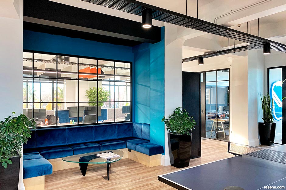
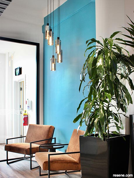
Using complementary colours like blue and orange together can be a powerful combination, so Brooke notes that it was important to match the intensity of the colours so that they would work together throughout the space. “Resene Clockwork Orange sets the tone in the ‘social zone’, where the team loves to have table tennis tournaments and social gatherings. Against the Resene Nero walls, Resene Clockwork Orange adds energy to this playful space. And being a brighter variation of the blue in Vision Systems’ logo, Resene Astral worked to the client’s requirements while matching the spirit of deep jewel toned blues from the Art Deco era. Though bold, it acts as a calming colour for the office in tandem with the carpeting and hanging acoustics. A colour block of Resene Astral was also used around the break-out booth seating paired with deeper navy upholstery and a lowered dark ceiling in Resene Nero to create an intimate setting to relax in.”
Brooke says that the division of columns, though ornate and charming in design, were challenging to design around at times since space and circulation were limited to a fixed grid. “We made the most of the columns by organising space around them, creating built-in seating and adding glazing with beading to reflect the loft style. In terms of construction, installing modern aluminium framing in the mitred corners of the columns and skirtings was a challenge for Angus Interiors, who led the build. And the original passenger lift – though adorable – proved to be a tight squeeze for the contractors transporting materials in and out of the building.”
Nick Sinclair, who headed up the project management for Angus Interiors, agreed that the lift proved to be one of the biggest hurdles in the project. “The stairwell is also extremely tight and the windows only open a fraction as the sashes have restrictors. In the end, we loaded in through the far northeastern corner of the building using a scissor lift. That had to be completed before the lower-level café opened at 6am each day, so we began loading in early in the morning around 3am.
“The upper floors were also tenanted, so noise of any sort that affected any of the leaseholders had to be completed after hours. This proved to be exceptionally difficult at times, as some tenants were open from 6am until 10pm on certain days,” adds Nick.
His favourite outcome of the project is the integration of both old and new elements within the design. “At times this was challenging, but in hindsight, the finished fit-out looks seamless between its colonial details and the new add-ons within what’s become a chic CBD workspace.
“I also really enjoyed working with a designer who was 100% on top of her game. Brooke knew every tiny detail on this project, right down to colour locations and finishes without needing to review a plan. When certain things were not going to work or if I thought there could be an easier way to do something, she was very open to suggestions. I don’t find this to be common, at least with some designers, but it was very much appreciated by the build team.”
For Richard Kenny of Chamlang Plasterers and Painters, merging the new and old finishes was the trickiest part for the applicators. “The age of the existing building elements merging into modern ones meant that we had to apply our knowledge by preparing older areas differently to get a great overall result. There were many different colours, materials and textures incorporated into the design, which really came alive at the end once all the trades were finished. These sorts of projects are always interesting for our team as white often seems to be the status quo these days.
“We really enjoyed modernising an older space with the Angus Interiors team,” he adds. “It was good to see the wide range of services they offer. Vision Systems wanted a unique workspace and it was fun to see that come to fruition.”
top tip It’s easy to create a coloured splashback in your chosen Resene colour with Resene Imperite I.F. 503. The coating system gets painted onto the back of the glass, so be sure to specify low iron clear glass to avoid affecting your colour selection. To change the colour, remove the glass and install a new back painted splashback. If you want a splashback that blends in with the existing wall, you can install glass directly over the wall finish.
Tristan Bailey, Business Director at Vision Systems, says that his clients have been loving the office’s new look. “We always get positive feedback about it. Most people can't believe it's a tradies’ company office! Some have even come in and been so impressed that they have left and renovated their own offices.”
When asked about his favourite part of the finished design, Tristan couldn’t choose. “I think everywhere you look, there is something unique – lots of colours and different angles, which gives it a real feel of difference to most commercial offices. Brooke and her team were fantastic from the initial design to helping us close out the project. Her team took the brief and delivered exactly how I imagined it.”
His best advice for others considering a fresh fit-out for their commercial office is to find a project team that’s the right fit and who shares in your vision. “If you dream it, find someone who will deliver on it!”
Architectural specification, interior design and colour selection: Studio Soul
Build: Angus Interiors
Painting: Chamlang Plasterers and Painters
Lighting: Vision Systems
Images: Litiana Harding
This is a magazine created for the industry, by the industry and with the industry – and a publication like this is only possible because of New Zealand and Australia's remarkably talented and loyal Resene specifiers and users.
If you have a project finished in Resene paints, wood stains or coatings, whether it is strikingly colourful, beautifully tonal, a haven of natural stained and clear finishes, wonderfully unique or anything in between, we'd love to see it and have the opportunity to showcase it. Submit your projects online or email editor@blackwhitemag.com. You're welcome to share as many projects as you would like, whenever it suits. We look forward to seeing what you've been busy creating.
Earn CPD reading this magazine – If you're a specifier, earn ADNZ or NZRAB CPD points by reading BlackWhite magazine. Once you've read an issue request your CPD points via the CPD portal for ADNZ (for NZ architectural designers) or NZRAB (for NZ architects).
![]() Get inspired ! Subscribe
Get inspired ! Subscribe ![]() Get saving ! Apply for a DIY card
Get saving ! Apply for a DIY card
![]()
Can't find what you're looking for? Ask us!
Company profile | Terms | Privacy policy | Quality and environmental policy | Health and safety policy
Colours shown on this website are a representation only. Please refer to the actual paint or product sample. Resene colour charts, testpots and samples are available for ordering online. See measurements/conversions for more details on how electronic colour values are achieved.
What's new | Specifiers | Painters | DIYers | Artists | Kids | Sitemap | Home | TOP ⇧


