From habitat magazine - issue 39, testpots
Embrace the ocean’s palette to lift your mood and energise your home.
The energising effects of water and in particular the sea are well known. Just take a stroll on the beach when your mind needs clearing and you’ll find the fresh ocean air and waves will gently engage you with feelings of calm and ease.
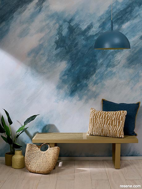
Clever use of a mural wall design can give you the sense of being surrounded by the sea, even when you don’t live near the coast.
Mural painted in Resene White Pointer, Resene Half Breathless, Resene Half Dusted Blue, Resene Seachange, Resene San Juan and Resene Soothe, bench seat in Resene Colins Wicket and floorboards finished in Resene Colorwood Breathe Easy.
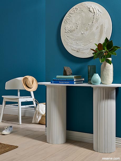
Texture helps create visual hooks against a bold block colour.
DIY artwork created with plaster applied to a circular canvas for texture painted in Resene Eighth Thorndon Cream, Resene Half Thorndon Cream, Resene Thorndon Cream, Resene Triple Thorndon Cream and Resene Half Alabaster. The wall in Resene Undercurrent is an invigorating nod to the ocean. Paring the floor back with a light Resene Colorwood Breathe Easy finish softens the space and is reminiscent of a sandy beach. Choosing a light white for your trims also allows the blue walls to be the hero. Trims painted in Resene Eighth Thorndon Cream, console table in Resene Half Alabaster, chair in Resene Half Thorndon Cream, tall vase in Resene Triple Thorndon Cream and book and small vase in Resene Calypso.
The restorative effect of water and sea have been documented for many years. A recent report from the Spanish city of Catalonia measured the healing powers of a coastal environment. The trial, called the ‘Blue Prescription’, followed 24 recovered cancer patients over a two year period. They discovered that these patients improved significantly both mentally and physically as a direct result of spending time near, or in, the ocean. “It’s something that gives you a lot of endorphins, a lot of energy”, explained participant, Maria Palou.
While we’re not all lucky enough to have the ocean on our doorstep, we can create a similar uplifting effect in our homes with colour. The colour blue has long been known for its connection to freedom and inspiration. Choosing a beautiful blue as part of your overall palette will also add a rich level of depth and stability to your home.
Bringing nature indoors is a staple in our interior colour choices, with blues connecting a strong link to the ocean and the sky, reflecting a feeling of calm and serenity in your home. Whether you opt for a deep blue like Resene Madison or are drawn to the soft neutral tones of Resene Gull Grey, bringing the calming effects of the sky and sea into your home is but a paintbrush away!
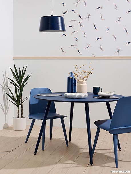
Who says you can’t have a little fun with your décor?
Resene Wallpaper Collection ONB102696234 has a refreshing uplifting effect teamed with walls painted in Resene Alabaster and floorboards in Resene Colorwood Breathe Easy. Dining table in Resene Biscay, chairs in Resene Waikawa Grey, pendant in Resene Blue Night, vase in Resene Bone, striped vase in Resene Waikawa Grey and Resene Blue Night, dish in Resene Alabaster and DIY swimmer placemats in Resene Blue Night with cutouts of Resene Wallpaper Collection ONB102696234.
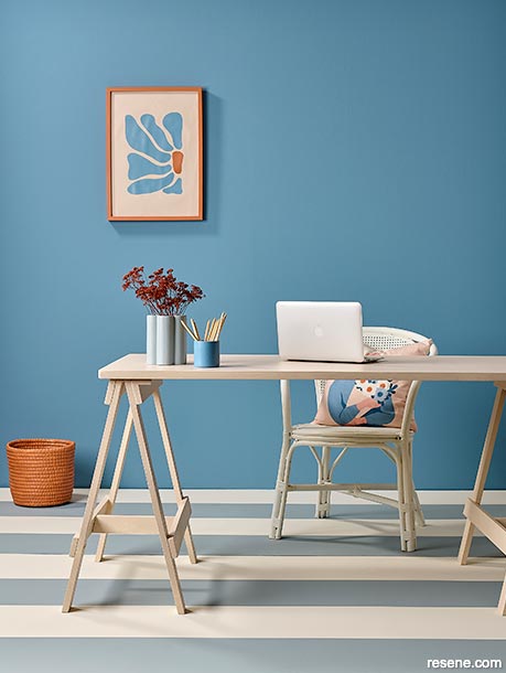
Brighten your home office with these complementary tones. Selecting the right tones of blue and orange allows these colours to work harmoniously.
Floor painted in summer-inspired hues in Resene Villa White and Resene Bounty, wall in Resene Bermuda Grey, desk in Resene Bone, basket in Resene Tuscany, vase in Resene Bounty, pencil pot in Resene Wedgewood and rattan chair in Resene Villa White.
top tip When you are working with complementary colours, choose one as your feature and bring in the secondary colour in three to five places to allow each colour to have its own breathing space.
Clashing colours is a long-standing interior trend, but, Resene Colour Expert Amy Watkins says, just how to go about it can be somewhat daunting. “Creating a palette that works in bold tones in a bright and expressive manner is a great way to bring a sense of fun to your room. Bringing colour back into our environments is a trend gaining momentum as we embrace fun and revel in the delights colour offers,” Amy says. The opportunity to inject a little fun in our homes has become more prevalent over the past year and we’re seeing bold bright tones gain popularity in interior design.”
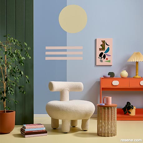
Create a sense of enchantment in your room with a complementary clashing palette.
Side wall panels painted in Resene Vantage Point, back wall in Resene Oxygen, vertical strip in Resene Smokescreen, circle in Resene Hampton, stripes in Resene Inspire, sideboard in Resene Big Bang, handles in Resene Inspire and stool top in Resene Wild West. Artwork by Jodi Clarke from endemicworld, chair from Danske Møbler, lamp by The Brim Label.
A sense of frivolity is easy to create with colour clashing and, Amy says, following some simple guidelines will help you create both a stylish and fun space. When you’re looking to colour clash, choose complementary colours – these sit opposite each other on the colour spectrum. Lean away from the primary tones to softer light tones for a bright space, or for a cosy room, lean into those muddier shades. “Aim for around three to five colours in your palette” says stylist Annick Larkin. Using a grounding darker colour and working in lighter shades or tones as accents will help create a harmonious yet fun room.
Colour blocks are a chic way to draw the eye to your artworks, Amy suggests. This is when you paint a block of colour behind the art piece on the wall. “This is a clever and simple way to enhance your artwork. These colour blocks create a gallery wall and talking point in your entrance or hallway,” Amy says. When selecting the background block colour, ideally choose one of the least dominant colours within the artwork to use as your colour block. This allows the artwork itself to be the hero, but also have the colour work cleverly as its backdrop.
“If you don’t have art but have treasured artefacts, you can use colour blocks as the background to highlight them. Opt for floating shelves in the same colour as the block itself and they’ll disappear leaving your treasured items as the focus of your display.“
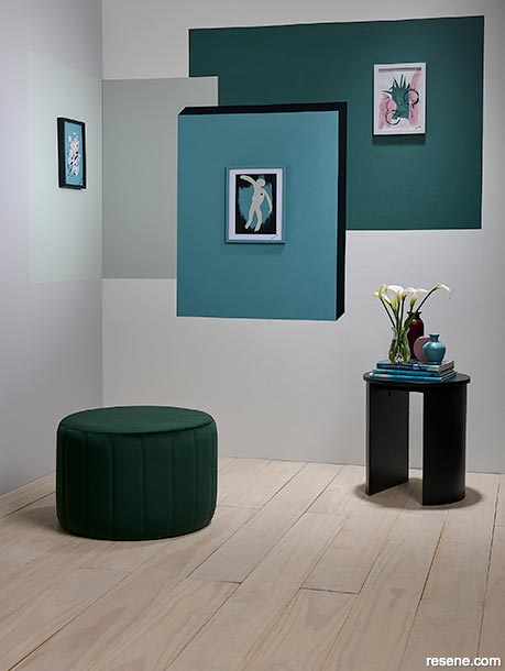
Creating an art wall is a simple weekend DIY endeavour, with a palette of gorgeous Resene shades.
Back wall painted in Resene Half Black White, left side wall in Resene Triple Concrete, floorboards in Resene Colorwood Breathe Easy, left colour block in Resene Tasman, largest colour block on back wall in Resene Green Meets Blue and central colour block in Resene Gothic with a shadow line on two sides in Resene Double Cod Grey.
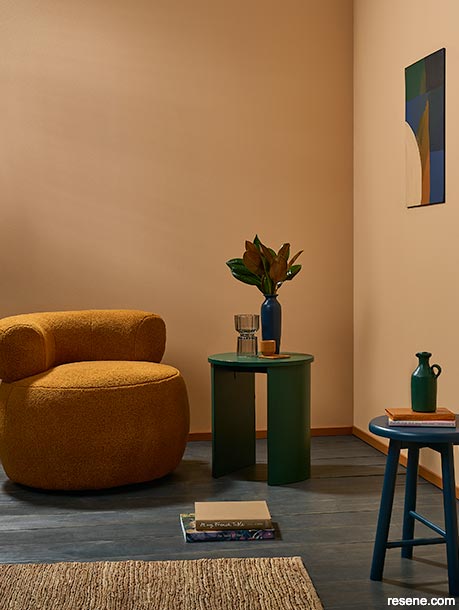
Opt for deeper tones in blues, greens and apricot beiges to create a stormier ocean feeling.
Walls painted in Resene Manhattan, trims, mug and coaster in Resene Chelsea Gem, stool in Resene Tangaroa, side table and jug in Resene Bush, vase in Resene Madison and floor finished in Resene Colorwood Shade. Chair from Danske Møbler, rug from Nest Direct, glass vase from Freedom.
Whether you choose to go bold and make your frames and trims stand out or have them flow into the walls by treating them with the same colour, Amy says these areas are a great opportunity to add a snap of personality. Door jambs, window frames and trims are all fair game to bring a splash of colour to your home. “Bring the sunshine in by framing your windows in the bright citrus pop of Resene I Dare You. The key to making this trend work is to keep your walls neutral so the colour pops out just where you want it to.” If you prefer a sophisticated pared back look, Amy suggests continuing your colour all the way from the ceiling to the walls and follow through to your trims. Using a Resene Enamacryl gloss finish on your trims will help the colour pop and make them stand out.
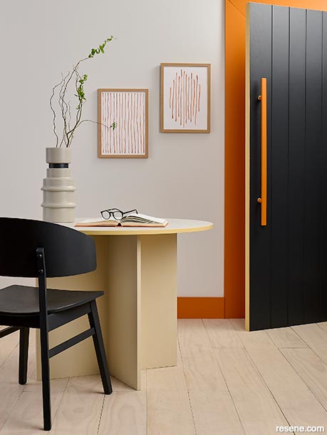
Crafting colourful interest through your trims and doorframes is as simple as choosing a favourite Resene accent colour.
Trims painted in Resene Clockwork Orange frame walls in Resene Eighth Truffle, floorboards in Resene Colorwood Breathe Easy, door in Resene Ebony Clay with edge in Resene Putty and handle in Resene Clockwork Orange, table base in Resene Blank Canvas, table edge in Resene Putty and tabletop in Resene Truffle. DIY artwork painted in Resene Clockwork Orange and tall vase in Resene Triple Truffle with stripe in Resene Ebony Clay.
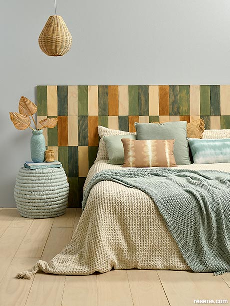
Create a nature-inspired bedroom with light character neutrals.
Wood panels finished in colours from the Resene We Speak Beach collection with Resene Colorwood Breathe Easy, Resene Rising Tide and Resene Shore Thing teamed with Resene Colorwood Natural and Resene Colorwood Whitewash, wall in Resene Loblolly, floorboards in Resene Colorwood Breathe Easy, pendant in Resene Blanc, side table in Resene Tiara and vase in Resene Destiny. Bedlinen and palm leaves from Adairs, sage cushions from H&M.


Projects: Kate Alexander, Annick Larkin, Vanessa Nouwens, Moneuan Ryan
Images: Bryce Carleton
Search habitat magazine stories
Printed copies of habitat highlights are available from late March 2024 at Resene ColorShops and resellers, while stocks last. You can view back issues of habitat magazine online.
Specifiers:
If you have an idea, project or story that you think would suit habitat, we’d love to hear from you. Please drop us an email with your details and include photos if submitting a project.
Sign up for a DIY card and Save! Australia | New Zealand
![]() Get inspired ! Subscribe
Get inspired ! Subscribe ![]() Get saving ! Apply for a DIY card
Get saving ! Apply for a DIY card
![]()
Can't find what you're looking for? Ask us!
Company profile | Terms | Privacy policy | Quality and environmental policy | Health and safety policy
Colours shown on this website are a representation only. Please refer to the actual paint or product sample. Resene colour charts, testpots and samples are available for ordering online. See measurements/conversions for more details on how electronic colour values are achieved.
What's new | Specifiers | Painters | DIYers | Artists | Kids | Sitemap | Home | TOP ⇧