From habitat magazine - issue 39, feature home
Resene Bismark transforms this home, complementing its 1970s aesthetic and wrapping it in a warm hug.
In 2007, Michael and Amanda bought a home in Brisbane’s Bridgeman Downs, ripped out the carpets, stripped the wallpaper and gave the walls a lick of paint.
Eighteen months later, they upped and moved to Sydney for a decade.
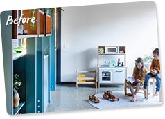
They returned with plans to sweep the home of an unfortunate 1970s legacy – mainly, a pokey kitchen (“it wasn’t a joy to be in”) and a dark and dysfunctional layout that put a massive walk-in pantry in the middle of the house.
But like many homes of that era, it had good bones; the architecture was interesting, the craftsmanship excellent and the materials top quality.
“The existing house had a real mix of things that were fantastic and terrible,” says Jason Haigh, co-director of architectural practice Cloud Dwellers. The kitchen was a letdown, and the house flowed awkwardly. But lots of expressed timber gave the two-storey suburban home a “dominant characteristic of warmth, detailed scale and linear geometries”.
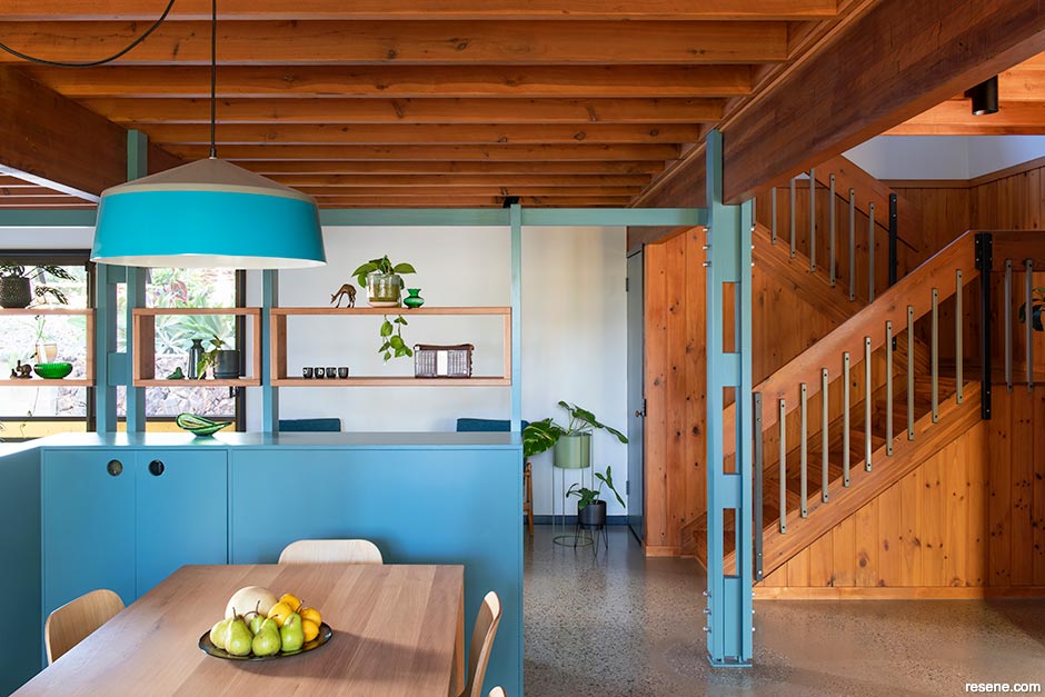
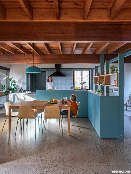
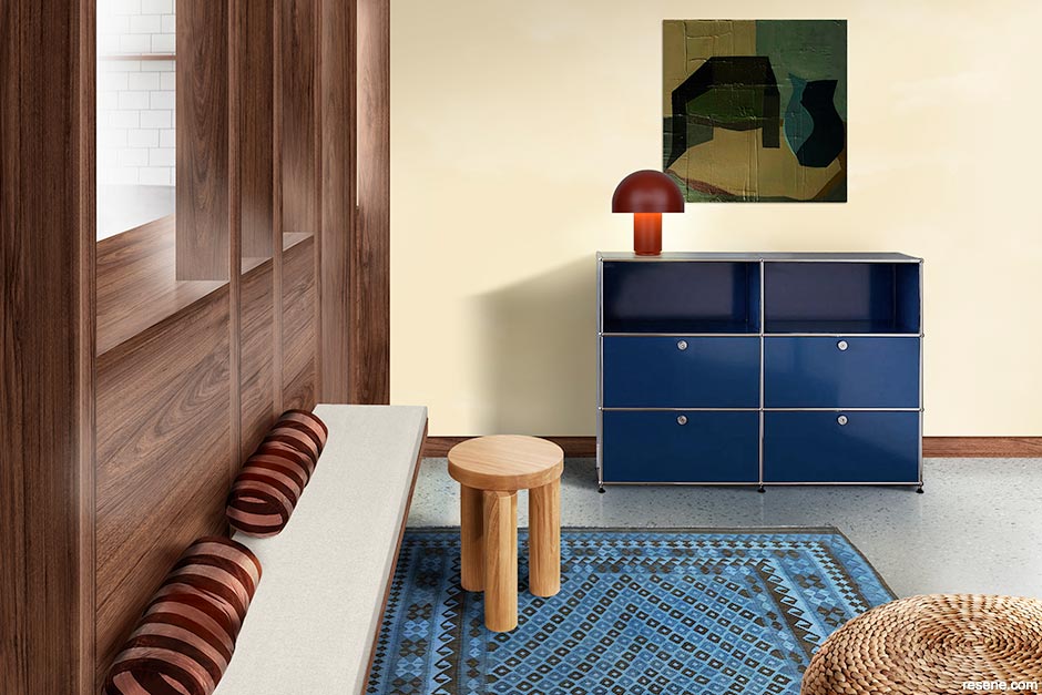
Enter a kind of blue: Resene Bismark, to be exact. While paint wasn’t the only tool used in the building’s makeover, it was undoubtedly the most transformational. More than just a colour, Resene Bismark defines the home.
While paint wasn’t the only tool used in the makeover, it was undoubtedly the most transformational, with Resene Bismark the standout favourite of 24 colour options suggested by Cloud Dwellers. To complement the wood stairwell, the bannisters were painted in Resene Foundry.
The renovation took about a year from concept to creation and included sorting out a wonky 1970s floorplan that had a pantry smack bang in the middle of the home. Michael, Amanda and their five-year-old son now have a home they call cohesive and happy.
Says Jason: “It’s common to hear people talk about ‘restrained’ colour palettes. But we believe a neutral material palette will generate a neutral reaction; how can you fall in love with a space if it makes you feel nothing?”
The brief was to renovate the home's ground floor, which contained all the common areas. Builders demolished the kitchen and surrounding internal walls, leaving the perimeter walls painted in Resene Triple Rice Cake to ‘frame’ the four new interconnected living spaces (dining, lounge, kitchen and play area). Cork flooring was removed and the slab polished. The project also unmasked a previously concealed staircase.
“The house is much more liveable now. The kitchen is the hub, so having it opened up, with the island facing the living areas, has transformed the house,” says Michael. “Before, everyone felt isolated in different rooms. Now, the areas are combined.”
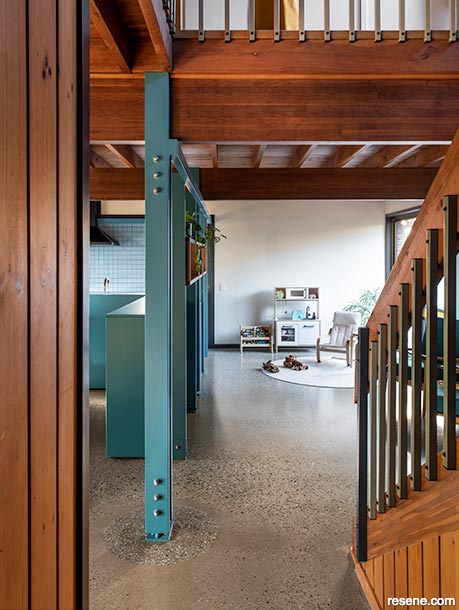
To interconnect the areas, Cloud Dwellers helped steer Amanda and Michael towards colour: the most impactful being Resene Bismark. The steely blue snakes through the living spaces and is used on an L-shaped cabinet to the side of the home’s entry, on a timber room divider and throughout the kitchen. Custom pendants extend the concept beyond the main renovation area.
“Resene Bismark makes the space,” says Michael. “Although renovated, the house has stayed true to its 1970s roots and has unlocked its potential. While the areas are new and modern, they could have been done 30 years ago. We didn’t want a typical spec home; we wanted something with interesting features.”
He says the new areas are brighter, better connected and have renewed the family’s love of living there.
“The colour running through the frame and into the kitchen ties the areas together while allowing them to be separate. With so much wood in the house – with the beams and exposed wooden floorboards of the floor above – the blue helps to balance the colour of the timber.
The choice of Resene Bismark was a collaboration. Recognising the importance of colour to help delineate spaces, Cloud Dwellers suggested an impressive 24 different options. Resene Bismark was the standout.
“It is an unusual colour for the house’s interior,” says Michael. “Jason convinced us it would sit well with the pre-existing exposed beams and flooring. Cloud Dwellers did some 3D design mock-ups to help with the decision-making process. Throughout the process, Resene Bismark was our favourite.”
Although Resene Bismark is the focal colour, other Resene hues also play their part. Resene Triple Rice Cake has an essential role. Restricted to the communal area’s perimeter, it also helps to define the new spaces.
To enhance the strong geometry of the original timber structure, existing and new trims were painted with Resene Foundry, helping to “create a sense of juxtaposition at material junctions”, says Jason. Resene paint wizards were also called upon to create a custom colour match to a laminate surface used on the cabinetry surrounds in the kitchen (for a similar colour try Resene Emerge). This was then used on doors and a pantry alcove as a consistent colour for shadowy background elements. The original wall cladding was painted in Resene Log Cabin. And the advantage of living with such an energetic hue? The colour dominates the space – in a good way – making it feel cohesive and happy, says Michael.
Blues are a versatile colour that can change the whole look and feel of a space, says Resene Colour Expert Amy Watkins. Softer, greyed blues like Resene Breathless, Resene Duck Egg Blue, Resene Regent Grey, or Resene Shuttle Grey, can cool down a room and give it any airy feeling, Amy says. “Pairing them with shades from the opposite side of the colour wheel with warm offwhites like Resene Bianca will help maximise the breezy coastal feeling. To create a statement try pairing Resene Duck Egg Blue with an orange like Resene Kombucha.”
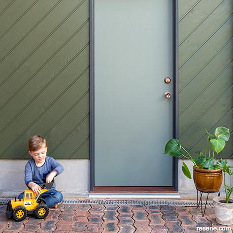
The couple’s son plays in front of the original cladding now painted in Resene Log Cabin. The door is painted in a Resene colour custom-matched to a laminate surface used in the kitchen, try Resene Emerge for a similar colour. The door jambs are in Resene Foundry.
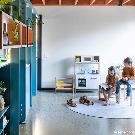
This area off the kitchen allows for a great play zone for children. Protect concrete flooring with Resene Concrete Wax, a durable finish that's easy to maintain.
Choose the right Resene colours and paints for the job.
Keep interior concrete looking good with Resene Concrete Wax. It’s easy to apply and repair any scratches. If your concrete needs a little colour pick-me-up, which can help it blend in with the rest of your room as well as help to hide imperfections, use Resene Concrete Wax tinted to your favourite Resene In The Wash colour. This will impart a soft wash of colour to your concrete, much like using a whitewash finish on timber.
Creating a home that enables play while still looking stylish and clean can be a challenge. Select interior colours and get them tinted into Eco Choice approved Resene SpaceCote Low Sheen for walls and Resene SpaceCote Flat for ceilings. These waterborne paints are durable and fully washable and impart a stylish natural low sheen or flat finish to keep your home looking its best. Ask your Resene ColorShop team to add Resene Fly Deterrent into Resene SpaceCote Flat for your ceiling to help reduce fly spotting.
Our collective weather patterns have taken a turn over the past few years and one of the best ways to ensure your home stays protected is choosing the right exterior paint. Front doors are best painted in a gloss finish, such as Resene Enamacryl or Resene Super Gloss, which will help to protect them while making your colour pop. The sun can be especially harsh on bright colours. Apply Resene Clearcoat UVS over bright colours to help protect them against fading.
Design: Cloud Dwellers
Words: Tracey Strange
Images: Cathy Schusler
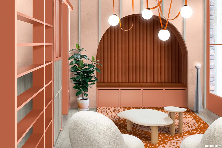
embrace curvaceous charm
Ton Vu from Atlas Architects suggests this alternative scheme:

Ton Vu
Incorporating soft curves, round shapes and an earthy, warm palette this design helps transform the room into a grounded, nurturing space for conversation and relaxation. By seamlessly wrapping the ceiling joists into the wall detailing, exposing these structural members starts to look like a deliberate design decision. These timber elements are finished with Resene Colorwood Whitewash elaborating the soft and natural aesthetic that this colour scheme entails. The banquette seating, hugged into the wall cavity, is presented in a red clay hue, which continues down to the floor, ultimately defining the focal point. Resene Sunbaked is used to centre the space and highlight the periphery elements such as the window and the dividers between rooms. These ultimately frame the views to both the exterior and interior respectively. By reducing the harsh linearity of the original design, the space is inviting and well suited to the residential family context it is held within.
email ton@atlasarchitects.com.au web www.atlasarchitects.com.au
Top tip You can never have enough storage. Built-in storage is an easy way to make your treasures and tools easily accessible and help you display all your favourites without cluttering up your space. Protect cabinetry and shelves with Resene Lustacryl semi-gloss waterborne enamel. Or if you are getting the cabinetry installed, ask the maker to use Resene AquaLAQ for a two-pack finish with extra durability. If your storage includes handle-free drawers or doors, ask for Resene AquaLAQ SoftTouch so you can spend more time using the storage and less time wiping off fingermarks.
eclectic elegant style
Designers Natalia and Kate from Kanat Studio suggest this alternative scheme:

Natalia and Kate
We love this home for its great open plan feel and original 1970s features. The space we have redesigned is a long and somewhat narrow thoroughfare, which needed to accommodate foot traffic. We chose to create a loose family space with the opportunity for kids and parents to break out together. We have opened up the sightline from the kitchen into the space by removing the open shelving. The steel columns are clad in timber finished in Resene Colorwood Walnut for continuity. Timber also features on the skirtings, architraves and new door joinery to bring in warmth, all stained in Resene Colorwood Walnut. The far wall is colourwashed in Resene Hampton and Resene Villa White, adding depth and layering to the interior space. Versatile seating options include the floor cushions allowing for floor play and the built-in bench seat for enjoying a morning coffee. The floor rug adds comfort underfoot or when laying down. Reds and blues contribute to the scheme by way of storage and accessories to keep the space feeling relaxed and casual.
email natalia@kanatstudio.com, kate@kanatstudio.com web www.kanatstudio.com
Top tip To protect your interior timber’s natural beauty, apply Resene Aquaclear on walls, trims and the ceiling. The most popular option is the satin finish, but you can choose semi-gloss or gloss if you prefer a higher sheen finish. For an uber natural, barely there look, use Resene Aquaclear Natural on walls and ceilings. This will protect the surface with a sheen that looks like bare timber.
Search habitat magazine stories
Printed copies of habitat highlights are available from late March 2024 at Resene ColorShops and resellers, while stocks last. You can view back issues of habitat magazine online.
Specifiers:
If you have an idea, project or story that you think would suit habitat, we’d love to hear from you. Please drop us an email with your details and include photos if submitting a project.
Sign up for a DIY card and Save! Australia | New Zealand
![]() Get inspired ! Subscribe
Get inspired ! Subscribe ![]() Get saving ! Apply for a DIY card
Get saving ! Apply for a DIY card
![]()
Can't find what you're looking for? Ask us!
Company profile | Terms | Privacy policy | Quality and environmental policy | Health and safety policy
Colours shown on this website are a representation only. Please refer to the actual paint or product sample. Resene colour charts, testpots and samples are available for ordering online. See measurements/conversions for more details on how electronic colour values are achieved.
What's new | Specifiers | Painters | DIYers | Artists | Kids | Sitemap | Home | TOP ⇧