From habitat magazine - issue 38, whites and neutrals
Interior designers and colour experts share tips for finding the perfect white or neutral for your home.
One of the most common comments Resene staff, interior designers and architects hear is: “There are so many whites.” It’s true – there are 360 colours ranging from bright white to charcoals in the Resene Whites & Neutrals fandeck and many more whites in other Resene colour chart collections. While Resene Black White, a cool white with a hint of black, has been Resene’s most popular paint colour for the past five years (followed closely by Resene Alabaster), these whites might not be the best choice for every home. From creamy and dreamy to cool, bright and beautiful, every white and neutral in the Resene Whites & Neutrals colour collection has a time and place, says Resene Canterbury Design Advocate Brooke Calvert. It’s time to explore neutral territory.
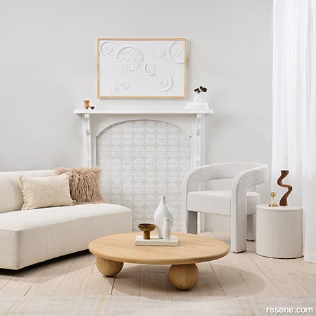
When creating a tonal scheme using multiple strengths of the same white hue, add additional texture by painting some elements in different sheen levels.
The wall is painted in Resene SpaceCote Flat tinted to Resene Triple Black White and the fireplace is in Resene Lustacryl semi-gloss tinted to Resene Half Black White. The faux tile pattern inside the boarded-up fireplace is created using Resene Triple Black White and Resene Eighth Black White, flooring in Resene Colorwood Breathe Easy, side table in Resene Triple Black White and vases and DIY artwork in Resene Lustacryl semi-gloss in Resene Eighth Black White. Sofa and coffee table from Soren Liv, chair from David Shaw, cushions from Baya.
There is a reason that Resene's top 20 colours are all whites and neutrals – versatility. White goes with everything and can be an excellent unifying colour. Says Brooke: "There are so many different shades of white. Cool shades such as Resene Sea Fog often work well if you are working with a modern new home. With a more traditional style home, warm, soft whites such as Resene Half Spanish White will be complementary, especially if there is a lot of native timber. For something in between, greige – where grey meets beige – is a good option," says Brooke.
Resene Colour Consultant Amy Watkins suggests choosing whites to complement the home's chattels when renovating. "Start by choosing flooring, tiles, carpet, laminate and wood, as these will soon narrow down paint or stain colour choices," she says. "For example, if you have warm, neutral-coloured carpet, it's best to go with a warm white such as Resene Chalk Dust. If the carpet contains grey tones with a slight blue, you could use Resene Poured Milk."
Whites with brown or red undertones are considered warm neutrals; whites with a violet-grey or blue undertone are considered cool. Green, as an undertone, is considered an in-between colour because it is made of both yellow and blue. Examples of green-based whites include Resene Thorndon Cream, Resene Rice Cake or Resene Linen. “Often, the exciting colours in your home dictate whether you have to go cool or warm,” says interior designer Kate Alexander of Places & Graces. “To determine if your existing walls or trims are warm or cool, hold up a neutral colour swatch that’s a very yellow neutral such as Resene Double Spanish White or a very cool colour like Resene Designer White, and observe whether the tone matches or contrasts.”
To learn more about warm vs cool colours, see ‘Whites & Neutrals decoded’ below.
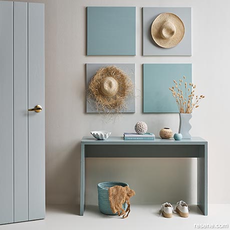
Resene Rice Cake on the floor and wall is a green-based white that ties in with both warm and cool tones.
Door painted in Resene Duck Egg Blue, console table in Resene Half Innocence, basket in Resene Sorrento, artwork squares in Resene Sorrento and Resene Conch, clamshell in Resene White and vases and other ornaments in Resene Duck Egg Blue, Resene Sorrento and Resene Rice Cake. Rug from Mocka, tealight holder from Indie Home Collective.
Neutrals by theme
Brooke Calvert suggests whites and neutrals for every mood.
One myth about white is that it can make a room appear light and airy – even bigger. In fact, using the same colour everywhere can make a room feel cramped as the eye cannot take in the space’s height and depth.
Darker colours on furniture or flooring can ground the room to help the eye perceive the distance between the ceiling and the floor, as can varying the strength of the paint and the sheen level.
“When it comes to a neutral colour scheme, Resene makes it easy because of the way they have the double, half, quarter etc strengths all displayed together in one sample card,” says interior designer Megan Harrison-Turner.
“When taking advantage of Resene’s tonal colours, change the gloss levels on different surfaces. For example, use Resene SpaceCote Flat on the ceiling, Resene SpaceCote Low Sheen on walls and Resene Lustacryl semi-gloss on trims. Glossy surfaces will read as slightly lighter in colour because gloss is more reflective of light.” Megan suggests that instead of pure white (Resene White), a classic renovator choice, use the lightest colour available on the sample card for ceilings, aiming for no more than a half or quarter strength of your main wall colour.
There are moments when you might want to use the same colour on the walls and ceiling. “In some rooms, it’s a good idea to use the same colour to simplify the architecture and disguise certain elements – for example, a crooked wall or a cornice you don’t like,” says interior designer Kate Alexander. “Use different sheen levels to create variation.”
The risk of painting a room white from top to toe is that it can appear flat, like the pages of a brochure, even if you introduce pops of colour. Megan says two things are needed to make a neutral room sing:
She says lighting can be as simple as a table lamp in the corner. “To create texture, a good option is timber flooring with its natural colours knocked back, such as one finished with Resene Colorwood Whitewash. Remember to introduce texture. A two-tone wall created with Resene FX Paint Effects Medium is a good option, as are textured textiles and rugs.”
Another way to keep a white room dynamic is by remembering Megan’s styling rhyme.
“This is my adaptation of the old bridal rhyme,” she says. “When styling a room, look for: ‘Something old, something new, something shining, something hue.’
“The ‘something old’ could be an heirloom or opshop treasure, which work well because patina is a way to show texture, personality and character. The ‘something new’ could be fresh Resene paint or new bedding, ‘Something shining’ could be metal or glass or something painted in Resene FX Metallic paint to create visual texture as a contrast to the older pieces in the room. The ‘something hue’ is either about keeping the tones similar or, if the room has colour, ‘hue’ refers to repeating the colour on a different scale and a different plane to the wall colour.”
![]() When you are comparing whites and are finding it difficult to see the undertones, place a piece of white printer paper underneath each swatch. This will help your eyes to see the undertone in the Resene paint swatch.
When you are comparing whites and are finding it difficult to see the undertones, place a piece of white printer paper underneath each swatch. This will help your eyes to see the undertone in the Resene paint swatch.
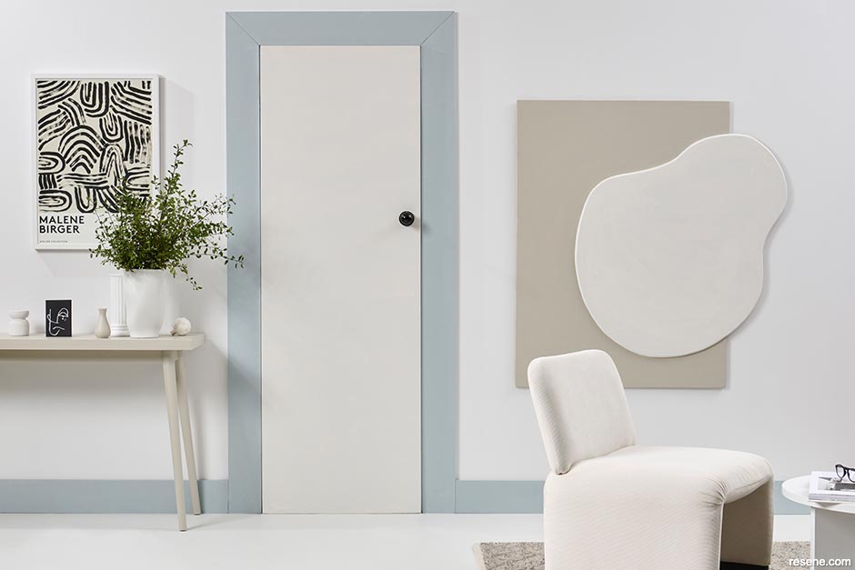
If you’re keen on using statement feature colours, consider your colour palette before committing to one neutral colour throughout. For example, if your heart is set on Resene Duck Egg Blue, a yellow neutral such as Resene Pearl Lusta might detract from the blue’s chalky grey qualities. A softer choice might be a tonal white with grey undertones like Resene White Pointer. With bright or dark feature walls, consider the reflections on white walls.
“Whites often have a high reflectance value, which you can find neighbouring colours reflect onto easily,” says Brooke. “For example, if you painted a hot-pink feature wall and had a sofa to match, it’s very likely the colour will come through with a soft pink hue on crisp white walls. You can achieve a softer approach using a tonal scheme rather than a full-on colour block.”
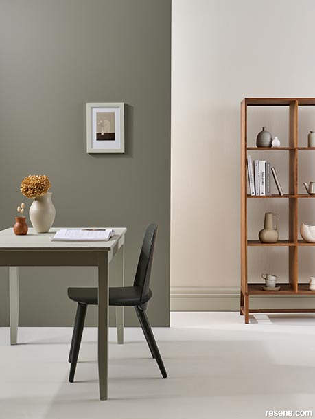
Back wall of this dining room painted in Resene Thorndon Cream, skirting in Resene Triple Thorndon Cream, floor in Resene Quarter Thorndon Cream and front wall in Resene Cobblestone. Dining table in Resene Half Lemon Grass and chair in Resene Thunderstorm. Vases and ornaments in Resene Cobblestone, Resene Quarter Thorndon Cream, Resene Double Ash, Resene Thunderstorm and Resene Brown Sugar. Home Time artwork from endemicworld.
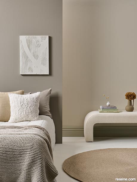
Back wall of this bedroom painted in Resene Thorndon Cream, skirting in Resene Triple Thorndon Cream, floor in Resene Quarter Thorndon Cream and front wall in Resene Credence. DIY artwork created with Resene EzyFill and Resene Quarter Thorndon Cream. Vases in Resene Cobblestone and Resene Quarter Thorndon Cream. Rug from The Ivy House.
Comparing colours
Resene Thorndon Cream on the back wall of this bedroom and dining room (above) is one of Kate Alexander's favourite neutrals because of the versatility of its green and grey undertones, which pair well with greens and earthy colour palettes. Resene Triple Thorndon Cream on the skirting grounds the palette, and the trim adopts greener tones depending on the colours next to it. Resene Cobblestone, used on the front wall of this dining room, has a khaki undertone, which diffuses the intensity of the green on the skirting and back wall, while Resene Credence in the bedroom is a softer brown. It is more of a contrast with the back wall, making the back wall appear greener and creamier.
Use Resene testpots or A4 drawdown paint swatches to test the paint colour in your home. This will help you observe how the colour ‘shifts’ in different lighting and at different times of the day or night.
Try your painted swatches in different parts of every room you want to use that colour in – or every side of the house if you’re painting the exterior – to see how the colour changes as the available light changes.
Place your painted swatches next to key furniture items like sofas to see how the colours work together, or if you’re doing a full makeover, try your painted swatches next to curtain, carpet and upholstery fabric swatches. Make sure you also experiment with Resene testpots and painted swatches in any contrasting or trim colours to make sure everything works together in all lights.
If something isn’t working, remember that most whites are available in different strengths – for example, Resene Rice Cake comes in six different strengths from Resene Triple Rice Cake to Resene Eighth Rice Cake. You may find that different strengths of the same neutral work better in different rooms.
For more than a decade, cool, flat greys and whites have been the favourites in the Resene top 20 colours, including best-sellers Resene Black White and Resene Alabaster, though there is a trend towards more dynamic hues. “There has been a shift to warmer and more complex options, such as character neutrals, which feature more depth in their subtle undertones,” says Brooke.
“Look out for biscuit beiges, blush suedes, steeped tea toned whites, olive taupe, slate and stone and complex pewters. Resene Cobblestone, Resene Solitaire, Resene Athena, Resene Foundation, Resene Cargo, Resene Carpe Noctem and Resene Silver Chalice represent the new neutrals. Immensely flexible thanks to their rich and complex undertones, each of these hues makes a great base for those who like to change up their accent décor regularly.”
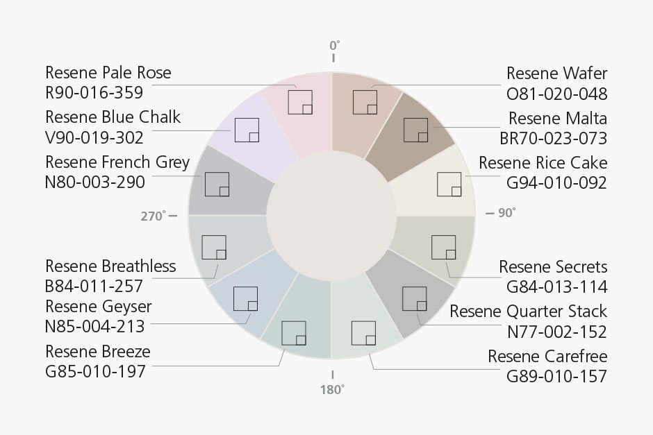
When flicking through the Resene colour charts, you’ll notice a colour code on the front under the colour chip and an LRV percentage on the back. For example, Y91-009-076 and LRV 78% for Resene Merino.
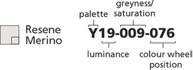
The first letter of the colour code indicates what type of colour it is. The last three numbers of the colour code indicate where it sits on the colour wheel, with red being 0. This is important with off-whites because it will indicate some of the paint’s undertones.
| R (Red) | = | 357-39 inclusive |
| O (Orange) | = | 40-69 inclusive |
| Y (Yellow) | = | 70-90 inclusive |
| G (Green) | = | 91-204 inclusive |
| B (Blue) | = | 205-284 inclusive |
| V (Violet) | = | 285-356 inclusive |
There are three extra colour groups:
| N (Neutral) | = | Very low saturation |
| BR (Brown) | = | Part of the red, orange and yellow spectrum with lower saturation and specific luminance |
| M (Metallic) | = | Metallic colours |
The LRV percentage of a colour is measured using a spectrophotometer. It indicates the brightness of a hue or proportion of light a surface reflects compared with the amount of light that falls on that surface. 100% indicates the brightest white; a pure black would have an LRV of 0%, absorbing all light. So, based on the colour chart information, although Resene Merino might appear slightly grey, the Y in the colour code indicates a yellow base colour and the number 076 indicates it is approaching the green part of the spectrum, which is what gives Resene Merino its green oxide quality. Resene Merino has a reasonably high LRV percentage of 78% but is not as bright as Resene Alabaster, which has an LRV of 92% and will appear brighter. Matte paint or painted textured surfaces absorb more light and will reduce the perceived reflectance of a colour making it seem darker, but will not change its stated LRV. Light, glossy and/or smooth surfaces reflect more of the light that falls on them and will make the colour seem cleaner and brighter.


Projects: Kate Alexander, Megan Harrison-Turner, Vanessa Nouwens, Melle Van Sambeek
Words: Emma Rawson
Images: Bryce Carleton, Melanie Jenkins
Search habitat magazine stories
Printed copies of habitat highlights are available from late March 2024 at Resene ColorShops and resellers, while stocks last. You can view back issues of habitat magazine online.
Specifiers:
If you have an idea, project or story that you think would suit habitat, we’d love to hear from you. Please drop us an email with your details and include photos if submitting a project.
Sign up for a DIY card and Save! Australia | New Zealand
![]() Get inspired ! Subscribe
Get inspired ! Subscribe ![]() Get saving ! Apply for a DIY card
Get saving ! Apply for a DIY card
![]()
Can't find what you're looking for? Ask us!
Company profile | Terms | Privacy policy | Quality and environmental policy | Health and safety policy
Colours shown on this website are a representation only. Please refer to the actual paint or product sample. Resene colour charts, testpots and samples are available for ordering online. See measurements/conversions for more details on how electronic colour values are achieved.
What's new | Specifiers | Painters | DIYers | Artists | Kids | Sitemap | Home | TOP ⇧