Architecture NZ x Resene Colour Collab
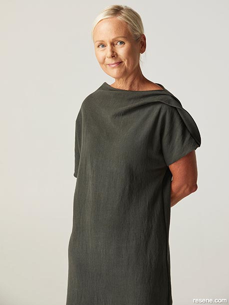
An architect with a passion for ‘designing experiences’, Naomi started Studio Naomi Rushmer three years ago. Her projects range from workplace, hotel and retail through to wellness and residential.
You trained as an architect but now focus more in the field of interior architecture. What inspired the move?
I still practise as an architect but I’m really interested in the ways in which the senses play a part in the design experience. I found myself drawn to the layers of design beyond the built realm we see. How does the space make you feel? What is the experience within it? How are the senses engaged? A built environment feels like the stage set ready for many more layers of storytelling and I love to be involved in bringing these design layers to life. When I collaborated with Blur the Lines on the Comvita Wellness Lab, we had the opportunity to push a retail environment towards a multi-sensorial spatial, digital and virtual experience, a theatre, a tasting and soundscape experience, and an augmented-reality mapped forest. It was magical.
How is colour factored in to the way you design?
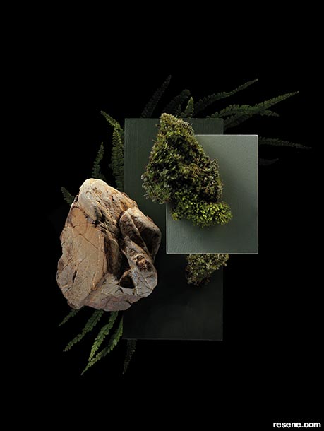
In my early career, I was fortunate to lose myself in an atelier in Florence, spending my days learning how the Masters painted nudes. I became very aware of the importance of light, pigment mixing and colour. Colour seems to inspire wildly different emotional responses. Whether darkened and moody, or crisp and clinical, colour is intrinsically entwined in mood, memory and experience. I feel my calmest and most inspired when I’m surrounded by tones like Resene Inside Back, Resene Green Meets Blue, Resene Coast, Resene Smoky Green, Resene Dark Slate and Resene Atomic. Colours can feel so mysterious and alluring and inform an early approach to design decisions in many projects.
Do you think growing up in Titirangi shaped the way you see the world?
For sure. I grew up surrounded by five acres of native bush. It was a sensory overload: the smell of rain in the mānuka trees and clay earth, fingers running through toetoe and the moody hues of all around. We knew all the bird sounds. Dad would fire up the kiln and we’d throw ourselves at the potting wheel to conjure up creations. I was able to explore the sensorial design connections to landscape. I feel most inspired when the outside and inside collide on an edge: how they engage and what that opportunity presents. We’ve worked on our own urban garden recently with Richard Neville and actively engaged those edges and vistas, with a boardwalk connecting the experiences.
Your collaboration references architect Geoffrey Bawa’s Heritance Kandalama hotel in Dambulla, Sri Lanka.
Yes. Titirangi and architecture certainly inspired a visit there. It’s a place of breathtaking beauty, drawn from 20th-century modernism and Sri Lankan tradition. Bawa nestled a grid of steel and timber into an organic, rolling rockface and jungle, obscuring the edges with the landscape to such an extent that you cannot feel what is inside or what is out. The built edge is dramatic and unfathomable, raw and mesmerising: a perfect stage, balancing the senses, inviting you to explore and engage with its space and materials.
Tell us about your colour choices.
I’m often drawn to working within the gem-like tones across a single colour, just as light throws in nature. In this collaboration, colours were drawn from the intense moodiness and drama of the landscape meandering through the hotel and I’ve chosen what could be the same green in different lights: Resene Olive Green, Resene Spanish Green and Resene Paddock. I’ve then layered in the warmth of Resene Piha Sand, drawn from the organic rockface that holds tight to and hosts the building on the site.
Architecture NZ. December 2022
Expert inspiration
Get inspired by colour and design professionals!
Discover architecture, art, design and colour! Browse through articles from the following magazines: Architecture NZ, Good, NZ House & Garden, Style, Life & Leisure and BlackWhite.
![]() Get inspired ! Subscribe
Get inspired ! Subscribe ![]() Get saving ! Apply for a DIY card
Get saving ! Apply for a DIY card
![]()
Can't find what you're looking for? Ask us!
Company profile | Terms | Privacy policy | Quality and environmental policy | Health and safety policy
Colours shown on this website are a representation only. Please refer to the actual paint or product sample. Resene colour charts, testpots and samples are available for ordering online. See measurements/conversions for more details on how electronic colour values are achieved.
What's new | Specifiers | Painters | DIYers | Artists | Kids | Sitemap | Home | TOP ⇧


