From the Resene decorating blog
Interior designer Gael Garrett has been a long-time lover of tonal colour schemes and tone-on-tone decor in general. And she’s not alone.
Gael, and many others, know well that this paint concept adds visual interest to a home.
She explains that tone-on-tone colouring is generally defined as a decorative technique that takes a single, or few colours, and uses a different saturation of that colour (or colours) throughout a space. When done right, tone-on-tone colour combinations in a room can result in subtle elegance and may be considered a gesture of artistry and design. More simply, they can just look great.
“A tone is generally considered to be lighter and darker variations on a single colour. In design, creating a tone-on-tone of tonal scheme means working with a hue you like then manipulating that colour through fabrics, tints, shades and textures to create interest and variety.
“In the paint world specifically, that involves different shades of the same colour and results in a room that can be dramatically transformed just by lightening or darkening a colour,” Gael explains.
It’s a colour concept which Gael believes works in any room – bedrooms, bathrooms, kitchens and living spaces. It can be used throughout an entire home or a technique that can be applied in single room such as a bedroom, for example.
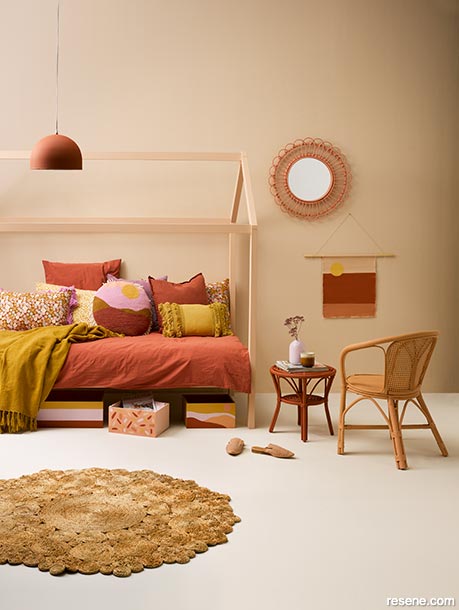
In the context of a bedroom, one idea is to use a headboard to add tone-on-tone interest. Paint the wall behind the bed in a slightly deeper tone than your headboard colour. In this way, the headboard will match the wall nicely without blending into it completely.
Of course, tonal schemes can be used on the exterior of a house, too. It’s an effect often used on windowsills and provides a perfect way to accent a feature, such as shutters.
Gael finds creating tone-on-tone colour palettes to be a fascinating exercise and believes it’s a strategy that works well with any hue, regardless of whether the desired impact is out-there, or a more subtle look.
“For a dramatic space, use a dark wall colour as an accent colour then half, quarter and even one eighth strength of the colour on trims, skirtings and even on the ceiling. For more drama, use more contrasting shades. For a more subdued look, stick to just two or three shades.
“Incorporating similar shades, plus the clever use of repetition and contrast makes it work. Mix and match patterns and materials but keep them all within the same colour family,” she advises.
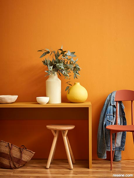
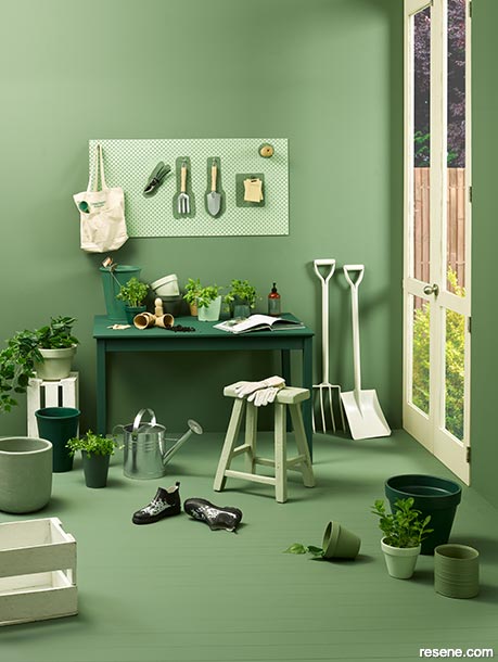
For example, in a living room use one colour for the walls and then lighten the same colour in pillows, cushions, and accent rugs. This will result in a pulled together look, she assures.
In a tonal scheme, there’s often some trickery involved, too. Clients with very high ceilings who want to make their room feel more intimate are advised by Gael to match their curtains to the walls. Choosing a darker colour for the ceiling can also help it to advance, bringing the height down visually.
She’s found that tone-on-tone schemes also work beautifully with true neutrals like black and white.
“These neutrals work seamlessly together they will meld together with little effort. Use black or white in fabrics and trim colours to accent a tone-on-tone palette,” she says. Look to shades like Resene Nero and Resene Half Alabaster for the starkest contrast.
The trick is to pick hues that complement, with enough variation to keep things from becoming completely homogeneous.
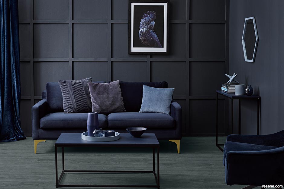
The tonal theme is most certainly not limited to variations on neutrals. When deep, rich and luscious purple was the colour de rigueur last year, then paired paint colours included the likes of Resene Gun Powder and Resene Chapta And Verse – perfect for a cosy, cocooning bedroom. The deep rich purples of Resene Couture and Resene Sumptuous work well with this tonal combination.
However, now that lilac is the new ‘it’ purple, try pairing up soft and feminine Resene Mozart with Resene Sixth Sense, a mushroom taupe with a soft grey base, with Resene Rocky Mountain, a warm grey with a purply brown undertone, or with Resene Purple Rain, a true purple for a trendier look.
Consider using Resene Triple White Pointer for the walls, Resene White Pointer for the trims and doors with Resene Quarter White Pointer for the ceilings – a lovely neutral palette that’s soft with warm undertones.
For a restful tone-on-tone effect, use Resene Linen which has an earthy green edge. Use this for the walls, half or quarter linen for the trims and Resene Quarter Joanna for the ceilings.
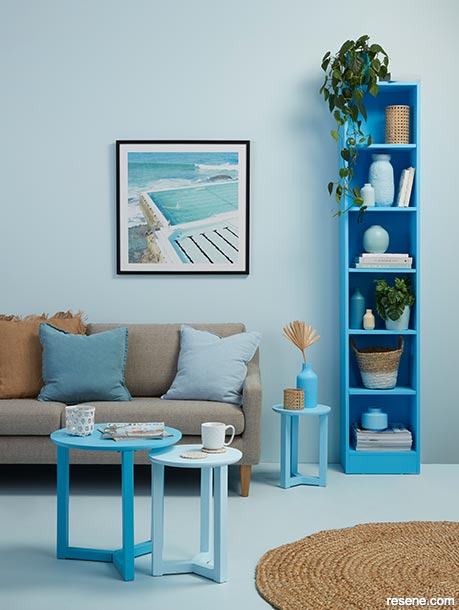
With the lovely blue colour palette happening now, succumb to the beauty of Resene Duck Egg Blue with Resene Half Duck Egg Blue and, for a little bit of drama, add in Resene Coast. Trims in Resene Wan White will really pop this colour palette.
Consider using matte finishes on walls, such as Resene SpaceCote Flat, to soften a tone-on-tone palette, which will give them a soft, velvety look.
Don’t be afraid to add shots of a different colour to visually separate tones from each other for more visual interest.
Aspects such as natural light will impact on the selection of paint tones chosen. For example, Resene Tea in a hallway may look too deep, and Resene Napa in a bathroom may look twice as dark as expected (and a bit muddy). Lightening those tones would be the answer, for example, opt for the tone-on-tone combination of Resene Half Tea and Resene Half Napa.
When using two tones on the same wall (for example, in the case of wainscoting), paint the lower portion of the wall in the darker colour. Darker shades on the lower area of the wall ground the space; lighter shades at the top elevate the sense of space.
Ceilings (sometimes called the fifth wall) can be part of the tone-on-tone equation. A brighter tone will expand the space while a darker one will bring it in.
For a different take on the two-toned approach, create contrast using similar colours in different sheens. Try walls in a matte finish paired with furniture painted in the same hue in a high-gloss finish, such as Resene Enamacryl.
Remember the handiest tool to creating a tonal colour scheme is paint. Instead of combing the shops for a vase, or planter that’s just the right shade. Simply get out the paint and paint brush.


October 18, 2019
Visit your local Resene ColorShop for more colour ideas and all the expert advice and products you need for a superb finish on all your decorating projects.
Book a colour consult | Ask a Colour Expert | Ask a Paint Expert
Resene's decorating blog
Paint your home beautiful! Discover the latest decorating trends, tips and colour news.
![]()
Previous «
Renovate your kitchen without losing your mind
![]()
Blog home
View the latest trends, tips and news
![]()
» Next
Why buy quality paint?
![]() Get inspired ! Subscribe
Get inspired ! Subscribe ![]() Get saving ! Apply for a DIY card
Get saving ! Apply for a DIY card
![]()
Can't find what you're looking for? Ask us!
Company profile | Terms | Privacy policy | Quality and environmental policy | Health and safety policy
Colours shown on this website are a representation only. Please refer to the actual paint or product sample. Resene colour charts, testpots and samples are available for ordering online. See measurements/conversions for more details on how electronic colour values are achieved.
What's new | Specifiers | Painters | DIYers | Artists | Kids | Sitemap | Home | TOP ⇧