From the Resene decorating blog
It makes sense to choose colour wisely before committing from paint swatch to wall. But did you know that the colours you paint can evoke a variety of moods, from peaceful harmony to passionate rage, or even oppression?
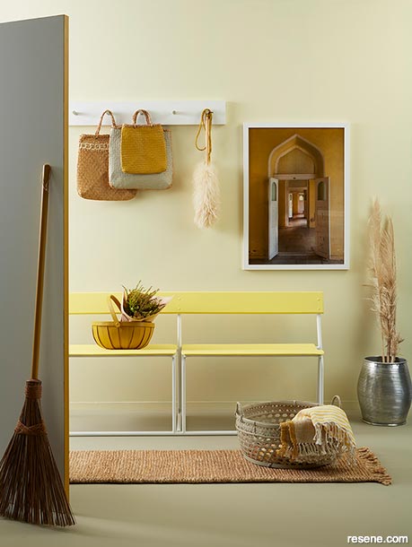
The soft yellow of these Resene Moonlight walls create a welcoming entryway paired with cheerful Resene Chorus Line on the bench seats. The bench legs and coat hooks are in Resene Quarter Pearl Lusta – as is the door, but with a surprising stripe of Resene Influential on its edge for added interest. For balance, the floors have been kept neutral in warm Resene Grey Olive. Project by Kate Alexander, image by Bryce Carleton.
Introducing colours to your home is an easy way to assert your personality. But beware – while you might feel confident pairing a hot pink shirt with a leopard print jacket, the combination might not work so well on the walls of your bedroom.
Every colour has a psychological value, and when you put it on the walls, it’s going to affect the way you feel in that space. Colours influence emotions, thoughts and moods as well as having an impact on how spaces appear.
Lighter colours, for instance, are expansive and airy, making rooms seem larger and brighter. Dark colours are sophisticated and warm and make spaces feel more intimate and cosy. Warm colours create an active response in the brain and bring feelings of excitement, passion and sometimes aggression. In extremely large spaces, an abundance of warm colour can get overwhelming and is best matched with neutral tones. Cooler hues, however, bring about a more passive reaction in the brain and can make a person feel pleased, relaxed or even subdued.
Before you pick up a brush, think about how certain colours make you feel, says Brenda Ngatai, a Resene colour consultant in Auckland’s Wairau Park ColorShop.
Brenda personally loves yellow. “It is an energising, uplifting colour that’s very positive and makes you feel happy. It puts a smile on your face,” she says.
“Yellow is big and bold and looks great on a front door, in a dark hallway or in a big entry because it’s expansive and welcoming. But it’s hard to use in large amounts in the home.”
Some studies have shown, however, that people may be more likely to lose their temper in a yellow room. It has also been shown to create feelings of frustration and anger. “So be careful using it as a main colour scheme,” Brenda cautions. “It could work on a kitchen that is part of a bigger space and subtle touches through accents might be a good idea.”
Red is another colour that raises a room’s energy level, she says. “Red has a different vibration. It’s fiery and passionate, so it’s a good choice for a dining room where you want to stimulate appetites and conversation.” Different shades work better depending on the season. From Resene Flame Red to Resene Dynamite, red is a glamorous hue that will bring warmth and liveliness to your interior.
If one of your family members happens to be on a diet, however, it may not be the best choice for your kitchen. According to psychologists, red could stimulate the appetite.
Orange is another colour that evokes excitement, says Brenda. “Some colour experts say it promotes communication, so it is also good for the dining room, but avoid using a high impact gloss or semi-gloss as it will likely overwhelm the space. A low sheen finish works better with bolder colour statements like Resene Jailbreak or Resene Party Zone.”
Then there is pink, which has had a big fashion moment as of late in every shade from gentle blush such as Resene Soulful to shocking pink like Resene Pink Ribbon.
Pink – which is essentially light red – is frequently associated with love, romance and femininity so it is often used in bedrooms. It is also thought to have a calming effect, which is why it is sometimes seen on prison walls. For some, pink evokes a creative vibe which it can be found in workspaces and offices of those in artistic professions.
Greens, blues and greys are more restful hues that can be used for almost any room in the home, says Brenda. Green, the colour of nature, has a calming quality, relieving stress. It tends to cool things down, making it suitable for the kitchen, family or living room. Try soothing shades like Resene Peace, Resene Nourish or Resene Unwind on your walls if you’re looking for something to suit a snooze-friendly space.
Blue is said to bring down blood pressure, which is why it is considered calming and serene and often recommended for bedrooms and bathrooms. If you opt for a light blue as your primary room colour, balance it with warmer furnishings and finishes. A pastel blue such as Resene Mystery or Resene Remember Me can be chilly in some spaces, so pair it up with a warmer-toned grey such as Resene Grey Area or Resene Suits.
“Jewel-like blues and turquoises, like Resene Fast Forward or Resene Wishing Well, can be great in smaller spaces, and Resene Half Dusted Blue and Resene Duck Egg Blue are popular in open plan areas. Brenda suggests Resene Shadowy Blue, a Karen Walker colour or Resene Zinzan – a navy blue – for a bathroom or to cosy up a lounge,” says Brenda. Balance it out with lighter colour flooring, a white ceiling or accents in soft taupe hues.
Grey works brilliantly when different tones are layered together. “Really soft greys, Resene Foggy Grey for example is peaceful and relaxing, perfect for the bedroom,” says Brenda. “Bring in accents like pink, fuchsia and navy or charcoal to make it really pop.” Try Resene Shilo, Resene Smitten, Resene Coast or Resene Porter.
In its darkest shade, purple is rich, dramatic and sophisticated. It is associated with luxury and creativity. As a secondary colour, it gives depth to a scheme, making it perfect for entertaining spaces – try it in Resene Purple Rain or Resene RSVP. Toned down to soft lavender or lilac, such as Resene Whimsical, Resene Mozart or Resene Dreamtime, purple is considered spiritual and meditative, which definitely works in a bedroom or library. It’s just as restful as blue without the risk of feeling chilly.
Donna White of Donna White Interior Design says violet relaxes and slows the metabolism. “It is associated with lateral thinking and imaginative thinking so it works in dining areas, living rooms or a study.”
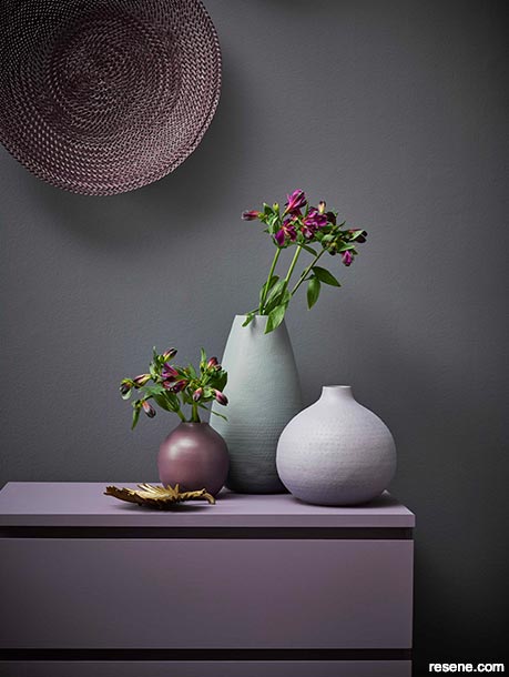
This trio of vases in Resene Steam Roller, Resene Mamba and Resene Couture atop the muted Resene Chapta And Verse set of drawers and the painted tray in Resene Avalanche show how sultry and complex bruised lilacs and purples can be together – especially against cocooning Resene Gun Powder walls. Project by Claudia Kozub, image by Melanie Jenkins.
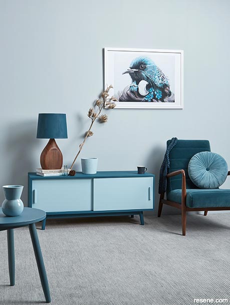
Resene Half Duck Egg Blue, shown on the walls of this lounge, is one of the most popular colours out there. Paired with Resene Fast Forward on the lampshade and the outside of the console, Resene Mystery on the doors, and Resene Artemis on the side table, it seems restful enough of a space to cosy up with a book with just enough variety to keep things interesting.
Associated with classics and sophistication, blacks like Resene Noir or Resene Charcoal creates a moody atmosphere that adds drama to a room and can be a great accent colour.
“Some people think it’s gloomy, but when it’s pared with white benchtops and timber accents, it’s elegant and trendy, especially in kitchens at the moment,” says Brenda. “If there’s a lot of light coming into the room, it’s really nice.”
Neutrals, taupes and browns like Resene Napa, Resene Coffee Break and Resene Earthen epitomise nature and are used abundantly in design – so much that many earthy natural tones may go unnoticed. Brown and neutral tones can represent anything from peace and calm to wholesomeness and reliability or even boredom. It has a variety of functions, though – especially as a background and accent colour – and brown blends well with almost every other shade to create a pleasing effect suitable in practically any room.
Donna frequently recommends a neutral paint palette throughout the home, “because it allows greater freedom to inject colour through your choice of art, upholstery fabric, cushions, rugs and other accessories.”
“The neutral background of the walls acts rather like putting foundation onto a face before makeup is applied,” she says.
Brenda says that the only hues she would not likely recommend client’s use indoors is a dark, grey like Resene Battleship Grey or Resene Evolution, a green brown, as they could feel oppressive to some. “In a semi-gloss inside, it could feel upsetting. But the same shades could be perfect on a garden shed or on your concrete steps or a fence.”
Once you’ve chosen your colour options, you need to look at a big piece of the colour in the room to see how it affects you. Pick up a Resene testpot and try it before you buy it. Paint an A2-sized card with the full contents of the testpot – leaving an unpainted border – and move the colour around the room at different times of the day and night to see how it affects you before you commit. Or pick up a few Resene drawdown swatches – an A4-sized swatch coated in real paint – which can be purchased for the same price as a testpot.
To coordinate colours successfully within a room, it is important to understand how different colours work together. Pick up a Colour Wheel from your local Resene ColorShop. It arranges colour schemes into families and is a useful tool to help you put your colour scheme together.
If you find a colour inspiring but too intense to use on your walls, try painting a key piece of furniture with durable Resene Lustacryl semi-gloss or Resene Enamacryl gloss waterborne enamel.


March 30, 2019
Visit your local Resene ColorShop for more colour ideas and all the expert advice and products you need for a superb finish on all your decorating projects.
Book a colour consult | Ask a Colour Expert | Ask a Paint Expert
Resene's decorating blog
Paint your home beautiful! Discover the latest decorating trends, tips and colour news.
![]()
Previous «
Turning a feature wall into a feature room
![]()
Blog home
View the latest trends, tips and news
![]()
» Next
The dream of the 80s is alive
![]() Get inspired ! Subscribe
Get inspired ! Subscribe ![]() Get saving ! Apply for a DIY card
Get saving ! Apply for a DIY card
![]()
Can't find what you're looking for? Ask us!
Company profile | Terms | Privacy policy | Quality and environmental policy | Health and safety policy
Colours shown on this website are a representation only. Please refer to the actual paint or product sample. Resene colour charts, testpots and samples are available for ordering online. See measurements/conversions for more details on how electronic colour values are achieved.
What's new | Specifiers | Painters | DIYers | Artists | Kids | Sitemap | Home | TOP ⇧