From the Resene decorating blog
The soothing, and yet unexpected, colour combinations in this palette are all about pushing ourselves to trust our sensory reactions, rather than over-thinking which colours ‘should be matched’ together. An expression of this same sentiment is the growing popularity of the Japanese design principle of wabi-sabi; seeing the beauty in imperfections and embracing the cycles of nature.
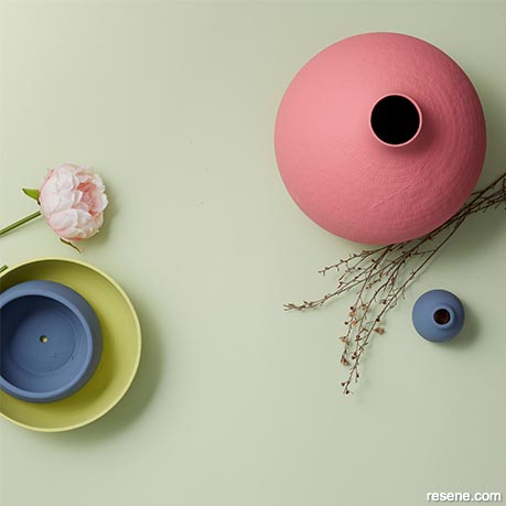
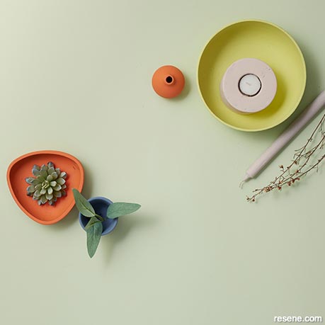
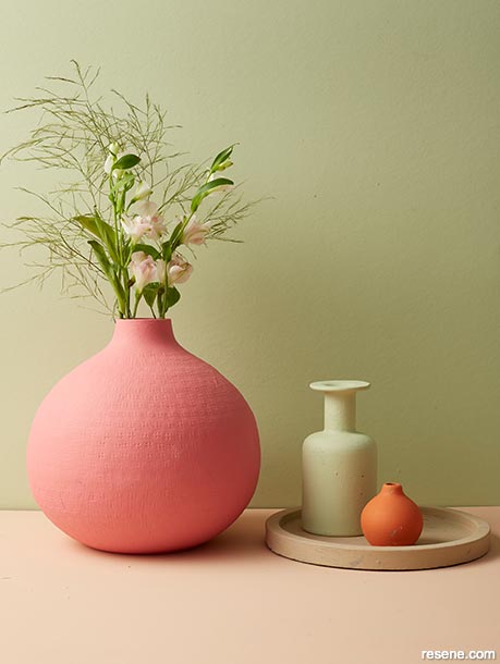
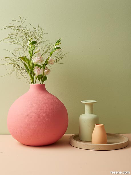
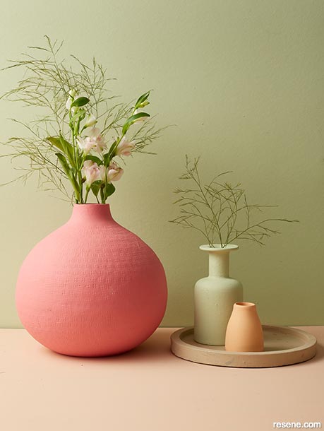
The pastel greens and pinks evoke a spring freshness that’s prevented from being too ethereal with splashes of earthy terracotta and hot summery pinks.
The unexpected mix of colours would be complemented by a surprising mix of finishes and surfaces – think smooth wood with rough rattan, or polished tile with textured wool.
This calming colour combo would make a fantastic colour scheme for restorative bathrooms or sun-soaked bedrooms; anywhere you go to retreat and recharge.
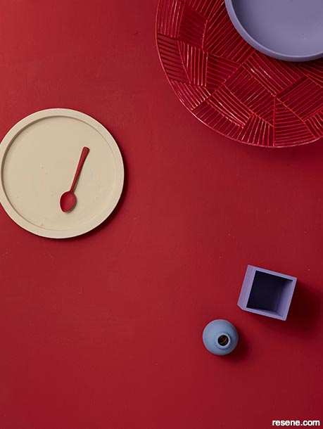
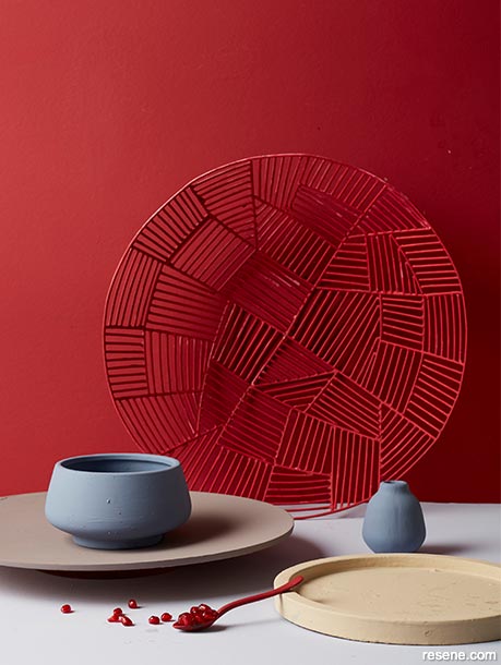
Create your own haven to escape the hubbub of the world by wrapping yourself in these strong colours, given depth by plenty of layers in graduated bold tones.
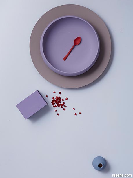
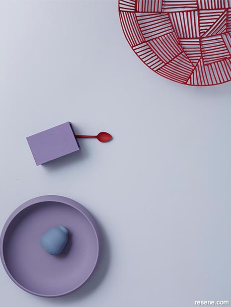
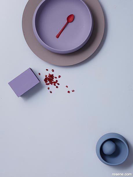
The saturated reds, purples and blues favoured in this palette are all about celebrating solitude as the ultimate luxury; the grown-up equivalent of building a fort. Touches of lighter creams and greys are still colour-rich and work to emphasis the almost jewel-like richness of the bolder shades.
It’s a scheme that lends itself to luxe textile fabrics like velvet and suede, but also gauzy, sheer silks and cottons to allow a little levity amongst all those dense colours.
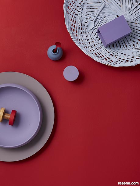
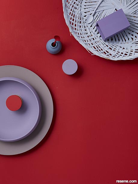
The key here is to keep decoration fairly minimalist, so those maximalist colours don’t become suffocating, and go for matt finishes for a soft finish.
This is a palette that likes blurred edges, organic shapes and soft finishes that melt into each other, rather that bold contrasting lines.


This is a trend made for a visual world, with colours that work particularly well on screen and particularly platforms like Instagram where the bold lines and bright colours catch your attention. You can feel the influence of pop art and a kind of retro-futurism in the colour intensity of bold golds or bright yellows with blasts of pink, orange and blue.
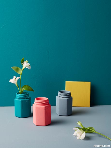
If that all sounds a bit overwhelming, the key to this palette is splashes of brights but balanced by softer, warmer shades in demin blues, dreamy teals and blush pinks. Soften the lines of the colour clash with curved edges and rounded corners.
You can also find order in the chaos with statement repeat patterns in wallpapers, tiles and fabrics, and touches of nature with leaf patterns or plants.
This is a palette is all about drenching your environment in colour to create diversion, combined with the self-expression of bold contrasts. Let your colour freak flag fly!
The flipside of the modern trend for colours of reflection and retreat comes this much louder, more celebratory trend, all about mish-mashing colour and design, and breaking the rules.

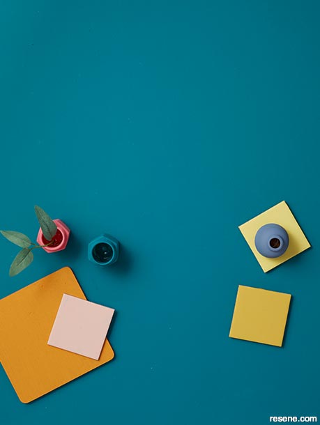
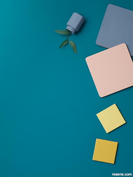
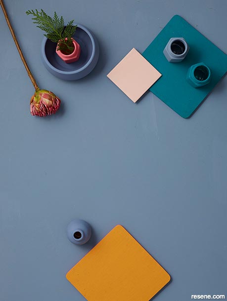
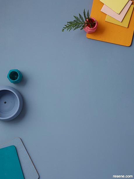
Stepping back from the relentless news alerts and demands of digital connection has contributed to the rise of colour palette that all about escape and protecting our personal space.
Warm, deep neutrals offset by splashes of bold blue or maroon, are less about shutting off from the world than finding a place of comfort that is creatively inspiring, rather than passive or isolated.
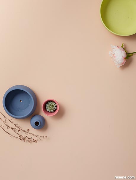
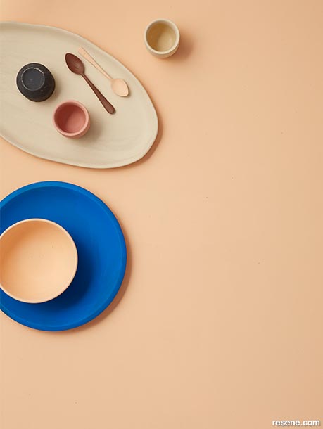
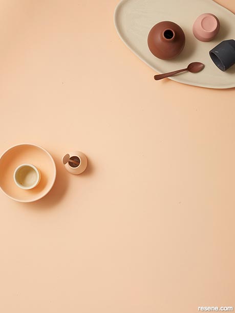
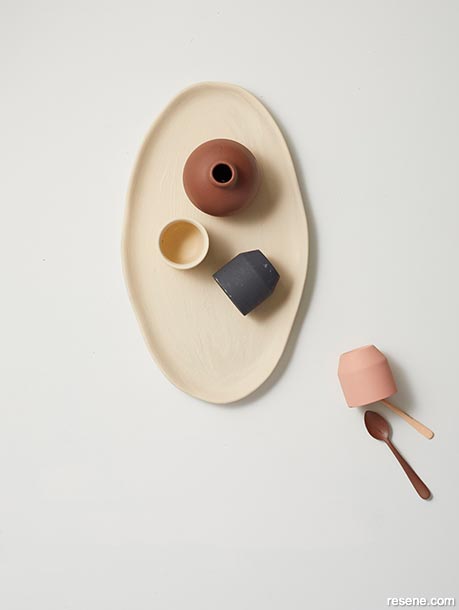
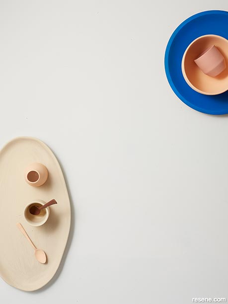
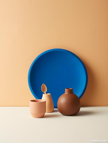
The colour scheme speaks to the trend for layers of neutral tones by deepening the colours themselves. Blush pinks, off-whites and creams have morphed into more sophisticated neutrals like pale apricot, oaty canvas and tawny browns.
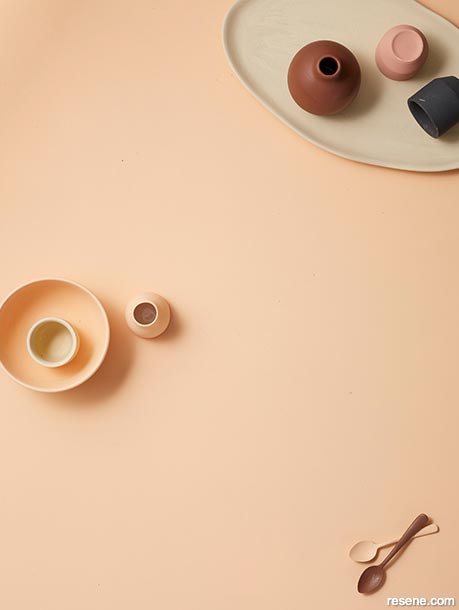
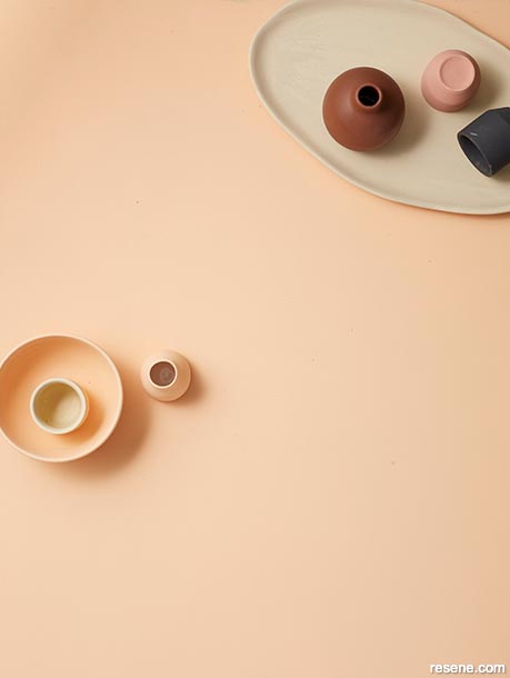
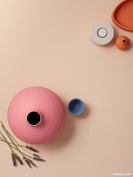
The bolder notes are reminiscent of warmer, even desert climates with dusky pinks against terracotta or hessian, grounded by inky charcoal and maroon. They work well with semi-transparent fabrics like gauze or mesh and softer finishes like frosted glass.
The bold cornflower blue lifts the palette, and adds that all-important inspirational spark. This would be a gorgeous scheme for creative spaces such as a studio, kitchen or office.


Project by Leigh Stockton
Images by Bryce Carleton
December 07, 2018
Visit your local Resene ColorShop for expert advice and all the products and accessories you need to make the most of your home.
Book a colour consult | Ask a Colour Expert | Ask a Paint Expert
Resene's decorating blog
Paint your home beautiful! Discover the latest decorating trends, tips and colour news.
![]()
Previous «
DIY: Have yourself a sparkly Christmas
![]()
Blog home
View the latest trends, tips and news
![]()
» Next
Today’s feature walls
![]() Get inspired ! Subscribe
Get inspired ! Subscribe ![]() Get saving ! Apply for a DIY card
Get saving ! Apply for a DIY card
![]()
Can't find what you're looking for? Ask us!
Company profile | Terms | Privacy policy | Quality and environmental policy | Health and safety policy
Colours shown on this website are a representation only. Please refer to the actual paint or product sample. Resene colour charts, testpots and samples are available for ordering online. See measurements/conversions for more details on how electronic colour values are achieved.
What's new | Specifiers | Painters | DIYers | Artists | Kids | Sitemap | Home | TOP ⇧


