From the Resene decorating blog
Neutral colourways are a perennial favourite with just about all of us. They offer simplicity, elegance and reassurance if you’re not particularly confident with your colour matching abilities.
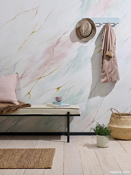
Flecks of gold and wisps of pastel shades lend an otherwise neutral room some visual magic.
This wall is painted in Resene Sea Fog with painted topcoat colours in Resene Hermitage, Resene Moon Mist, Resene Quarter Sea Fog, Resene High Tea and Resene FX Metallic Gold all mixed with Resene FX Paint Effects Medium. Skirting painted in Resene Cod Grey, floor washed in Resene Colorwood Breathe Easy, cup in Resene High Tea, hooks in Resene Hermitage, small planter in Resene Moon Mist and book in Resene Ashanti. Matt, cushion, throw and bench from nest-direct.com, basket from H&M Home. Project by Moneuan Ryan, image by Bryce Carleton.
That doesn’t mean you can’t add some flair and personal touches to your neutral colour schemes to make your rooms eye-catching and memorable.
Here are some tips and tricks from Resene for giving your neutrals a little pop of extra personality.
When trying to get the most from your neutrals and getting them to stand out, rather than fade into the background, colour choice is key.
There are a lot more shades in the ‘neutral’ colour spectrum than you might expect; it goes well beyond simple white, cream, beige or grey. The Resene Whites and Neutrals collection, for example, includes more than 350 shades to experiment with!
But there’s no need to be overwhelmed by the choice. Resene Colour Expert Amy Watkins says it’s best starting with some basic colour theory.
“Consider using complementary colours, which are colours that sit opposite each other on the colour wheel. It’s a way of bringing out the undertones in the neutrals.”
Amy says that working with undertones in neutrals will draw out their inherent colours making them seem as though they have more colour than they do. “Try Resene Haystack with Resene Quarter Iron to see how each brings out this effect in the other.”
Talk to the experts at your local Resene ColorShop about the undertones of different neutrals and where that means they sit in a colour wheel.
To pull a non-traditional neutral look together Amy suggests making sure you pair furniture and decor pieces with similar warm or cool undertones as your chosen paint shades.
“This helps to soften the depth of darker colour and makes it easy to add your personal touches of flair.” As an example, Amy suggests trying Resene Bokara Grey, which is a deep burnt charcoal, with deep red oxides like Resene Mocha.
For a paler, more muted look there are softer traditional neutrals to play with, Amy says, but there are also surprisingly versatile non-neutrals that can give you the clean finish of a neutral palette with the surprise of subtle colour.
She suggests trying Resene Wafer which is a soft muted pink, which works well with notes of equally soft Resene Spindle blue, or crisp white Resene Alabaster, or warm beige Resene Otter.
Another combination she suggests is the soft mustard-toned Resene Yuma with deep green Resene Eternity and classic beige Resene Tea.
“Once you have chosen your preferred wall colour, research the undertones and spend some time looking into complementary or triadic (colours equidistant on the colour wheel) neutrals that will bring the look to life. Or talk to your Resene Colour Consultant who can help.”
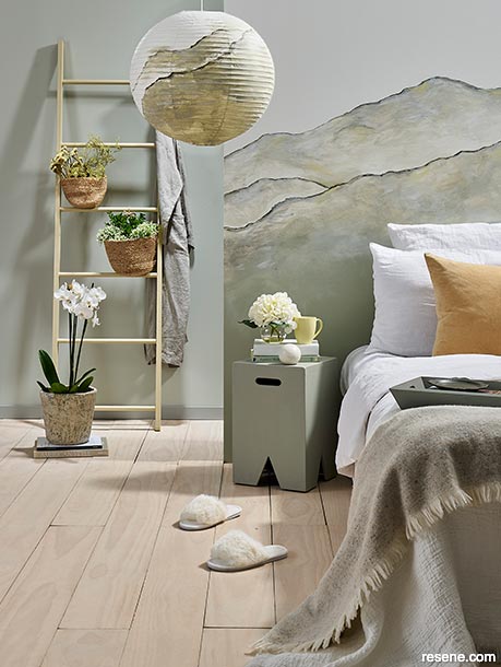
A blend of tonal layers creates an artistic finish for impactful yet soothing visual flair.
Rear wall painted in Resene Quarter Lemon Grass with skirting in Resene Quarter Tapa and floor washed in Resene Colorwood Breathe Easy. Mural and lightshade base colour in Resene Half Merino, with Resene Eighth Lemon Grass, Resene Half Lemon Grass, Resene Quarter Lemon Grass, Resene Lemon Grass, Resene Double Lemon Grass, Resene Half Merino, Resene Quarter Merino, Resene Quarter Tapa, Resene Lemon Twist and Resene Eternity mixed individually with Resene FX Paint Effects Medium, ladder in Resene Pavlova, stool in Resene Lemon Grass, tray in Resene Quarter Tapa, plate on tray in Resene Eternity, mug in Resene Lemon Twist and thick book in Resene Quarter Merino. Robe, cushion, bedspread and linen from Città, orchid and pot from Sills & Co. Project by Moneuan Ryan, image by Bryce Carleton.
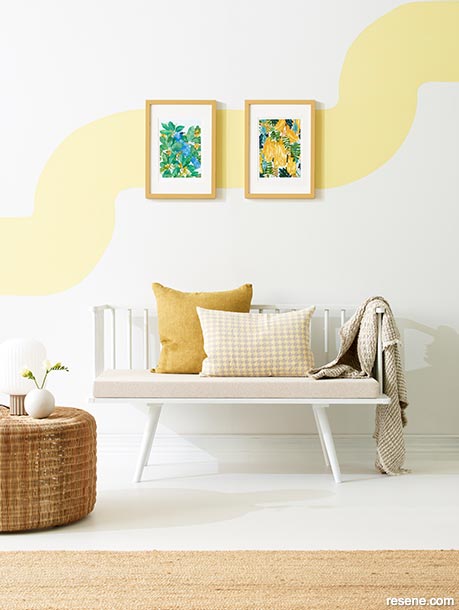
A simple sweep of bright colour gives this otherwise monochrome sitting area a fresh, zesty finish.
Wall, floor and bench painted in Resene Half Sea Fog, wall art in Resene Moonbeam and picture frames in Resene Teak. Artwork by Holly Roach from endemicworld, cushions from Bob & Friends and Aesthetic Store, throw from McKenzie & Willis, coffee table from Smith & Caughey. Project by Tracey Strange, wall art by Leigh Stockton, image by Belinda Merrie.
Looking to our surrounding environment is a common theme when choosing our painted colour schemes. This often leads us to a variety of blues and greens when we opt for colour, but it can also be a source of inspiration if you want to add more flair to a neutral colour scheme.
Think of the mineral gleam and unexpected colour streaks shades in rocks, the sparkling glimmer in black or golden sand, the vibrant earthy tones of a spice market, or the sunset shades of desert dunes. All of these can serve as inspiration to create neutral colour schemes that don’t rely on whites, creams or beige.
Try a tonal scheme of tonal warm neutrals in Resene Pavlova, Resene Coconut Cream and Resene China Ivory, then warm it up with accents in ochre-tinted Resene Alert Tan for the heat of the Australian desert.
For a spicier look try a background colour in a light neutral like Resene Alpaca, then pair it with bolder, sunbaked notes of Resene Sante Fe and shell white Resene Umber White.

Another way to add some depth and texture to a neutral colour palette is by trying different finishes. Environment-inspired neutrals often work well with intentionally weathered-looking finishes like a limewashed effect.
This can easily be achieved using Resene FX Paint Effects Medium. Try a basecoat of a neutral like Resene Double Napa, then add a topcoat of a lighter shade like Resene Quarter Napa mixed with Resene FX Paint Effects Medium for a relaxed, deliberately imperfect look.
Textured or subtly patterned Resene wallpapers in neutral shades can also add a lot of dimension and visual appeal to a pared-back colour scheme. Try the subtle botanical design of Resene Wallpaper Collection 537338, the burnished finish of Resene Wallpaper Collection IF2-023 or the woven textile look of Resene Wallpaper Collection 537741.
Notes of sheen and glimmer are also good ways to add flair and lift to neutrals.
Resene Colour Expert Jill Marsh says Resene FX Pearl Shimmer is a useful product to add natural levels of light-reflecting shimmer, without going full gloss. “It’s a good way to add additional visual interest to a plain, neutral scheme. It can be used as a finish coat over any shade and looks gorgeous when the light hits it.”
Jill also recommends browsing through the full Resene Metallics and Special Effects range, many of which have been inspired by natural minerals and elements and will pair well with traditional neutrals. Try shimmering charcoal Resene Basalt, softer grey Resene Pewter, fiery red gold Resene Magma or Resene Bedrock for subtle silvery shimmer.
Glass decor touches like mirrors, vases and light fittings will also bounce very effectively around your neutral colour schemes to add glamour, while experimenting with lush textiles like wool, velvet and suede can elevate neutrals to a more luxurious finish.
Top tip: When experimenting with different neutrals use Resene testpots on sheets of card to try them in a variety of light conditions, both natural and artificial. Light can have a huge impact on some neutrals, bringing some to life and making some look quite different.
Each Resene colour, including neutrals, has a code starting with a letter, which can help you decipher its undertones. The last three numbers of the code tell you where that shade sits on the circular colour wheel (in a position between 0 and 360 to account for the 360-degrees in a circle).
R (red) – 357-39
O (orange) – 40-69
Y (yellow) – 70-90
G (green) – 91-204
B (blue) – 205-284
V (violet) – 285-356
There are three other colour groups in Resene colours:
N (neutral), which has very low colour saturation often close to white or black; BR (brown), in the same group as red, orange and yellow but with low colour saturation; and M (metallic), for metallic shades.
Understanding where the colour sits in the colour wheel can be helpful when you are comparing two colours and will give you hints about what the undertones are likely to be in a colour. E.g. a near black that sits in the blue part of the colour wheel will show a blue undertone, which can be quite different to a black that sits in the red part of the colour wheel where the red undertone will make it feeler warmer.
Neutrals are a safe place to start understanding your style but, as Resene Colour Expert Madison McLeod explains, they can also be the key to finding bolder, brighter shades that suit your decorating style.
› To learn more about giving your neutrals a little pop of extra personality have a listen to the If these walls could talk podcast
Colours mentioned in this blog...
Products mentioned in this blog...
March 27, 2024
If you’re new to colour, there’s plenty of inspiration on the Resene website to get you started with ideas. Consider booking a colour consultation with a Resene Colour Expert to help you narrow down your choices or visit your local Resene ColorShop and view large A4 swatches of colours in their instore colour library which will make it easier for you to see how colours complement each other.
Book a colour consult | Ask a Colour Expert | Ask a Paint Expert
Resene's decorating blog
Paint your home beautiful! Discover the latest decorating trends, tips and colour news.
![]()
Previous «
What have you missed?: Tips and tricks for home DIY
![]()
Blog home
View the latest trends, tips and news
![]()
» Next
Into the light
![]() Get inspired ! Subscribe
Get inspired ! Subscribe ![]() Get saving ! Apply for a DIY card
Get saving ! Apply for a DIY card
![]()
Can't find what you're looking for? Ask us!
Company profile | Terms | Privacy policy | Quality and environmental policy | Health and safety policy
Colours shown on this website are a representation only. Please refer to the actual paint or product sample. Resene colour charts, testpots and samples are available for ordering online. See measurements/conversions for more details on how electronic colour values are achieved.
What's new | Specifiers | Painters | DIYers | Artists | Kids | Sitemap | Home | TOP ⇧


