From the Resene decorating blog
Daring yourself to step out of your comfort zone when it comes to colour and design can feel daunting, but can also be exhilarating and fun.
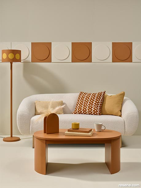
Rusty-hued accent notes add lively contrast to an otherwise neutral living room.
The rear wall, floor and alternate wall tiles are painted in Resene Spanish White, coffee table, lamp and remaining wall tiles in Resene Toffee and lamp accents and tealight holder in Resene Tussock. Sofa and cushions from Nood. Project by Vanessa Nouwens, image by Bryce Carleton.
When it comes to planning a colour scheme for the interior or exterior of your home, it’s very tempting to fall back on what you know. That might be the safety of neutrals or a minimalist and monochrome look. Even if you are a lover of colour it can still feel safest to stick to combinations you know you like.
Daring yourself to step out of your comfort zone when it comes to colour and design can feel daunting, but can also be exhilarating and fun, and you can be rewarded with spaces you find uplifting and beautiful. The trick to stepping outside your colour comfort zone is to get fresh perspective and advice from others.
To get you started we’ve asked some of Resene’s Colour Experts to suggest the colours that they think are often under-rated but might just add the beautiful, unique and personalised finish you’re looking for.
Resene Colour Expert Madison McLeod says pinks can be a surprisingly sophisticated choice, particularly in softer pastels or muted shades that can lend simple, versatile elegance much like a neutral.
“I think the pink family includes some beautiful shades that can get missed because pink is often thought of as only for child-like décor. But, pink has such a wide range of tones and shades, from cool to warm, that can brighten up your space.
“Try branching out with pale cherry Resene Gelato or subtle Resene Ebb to illuminate smaller, darker spaces or try introducing warm pinks like Resene Soothe or Resene Coral Tree as feature colours in lounges or bedrooms.
“Try pairing Resene Coral tree with a grey black like Resene Nocturnal and add a gold accent like Resene Gold Dust to give a modern Art Deco feel to a room.
“A dusty pink like Resene Soothe works beautifully with any tone in the Resene Perfect Taupe family (Resene Quarter Perfect Taupe, Resene Half Perfect Taupe and Resene Perfect Taupe). When paired together this colour scheme will add a warm yet lively feel to a space.”
Resene Colour Expert Amy Watkins is a fan of rich, saturated jewel colour tones and would like to see more homeowners take the plunge to using them.
“Colours such as deep grape Resene Upstage, ruby red Resene Salsa and sapphire blue Resene Cobalt are great statement colours while still being also soft enough that you can really commit and put them on all the walls of a room, rather than just limiting them to a feature wall.
“Pairing these colours with softer pastels of the same colour tone helps to soften the overall impact of the colours.” Some colour combinations to try are Resene Cobalt with Resene Comfortably Numb or, for contrast, a fresh green like Resene Pale Leaf. Try Resene Salsa with Resene Soothe, and Resene Upstage with soft mauve Resene I Do.
Top tip: Using a matt finish like Resene SpaceCote Flat can give dark, rich shades a luxurious, almost suede-like finished effect. Keep them to surfaces that don’t need constant cleaning such as master bedroom walls.
Resene Colour Expert Meryl Southey says she thinks deeper shades from the blue family, like purple and violet, and bold rust shades are often overlooked because they’re often perceived as being intense, and people are often not confident in using them with other shades.
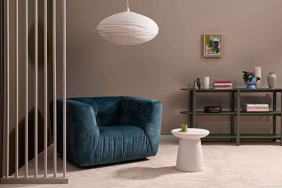
Richer jewel tones can be paired with parched, earthier notes to add luxury without overpowering a space.
These walls are painted in Resene Manhattan with skirting in Resene Chelsea Gem. Floor washed in Resene Colorwood Shade, side table in Resene Bush, stool in Resene Tangaroa, tall vase in Resene Madison, coaster and small cup in Resene Chelsea Gem, handled vase in Resene Bush and DIY artwork in Resene Madison, Resene Bush, Resene Tangaroa, Resene Chelsea Gem, Resene Manhattan and Resene Cod Grey. Rug from nest-direct.com, chair from Danske Møbler, vase from Freedom. Project by Moneuan Ryan. Image by Bryce Carleton.
“Mauves such as Resene London Hue can be a beautiful base colour for a bedroom or any space where you want to create a peaceful environment. It has an underlying warmth.
“Team with rusty terracotta shades such as Resene Twizel and organic greens such as Resene Hemlock and Resene Ecru White for an unexpectedly beautiful combination.
“Layer cool-toned lavenders such as Resene Moody Blue with warmer lilacs such as Resene Butterfly, and deeper purples such as Resene Grapevine to soften the effect of the cooler colour. Layering further with a flamingo hue such as Resene Sunglo and accenting with just a hint of Metallic Gold will give life and vibrancy to a living space.
“Rust shades such as Resene Cape Palliser look great teamed with tonal tans and ginger browns like Resene Pendragon and Resene Desperado. Soften the effect with pinks like Resene Ebb or stone greys such as Resene Kensington Grey, for a scheme that will work well in multiple rooms.”
It can be easy to veer away from colours that are outside your comfort zone, when you’re choosing simply because with colours grouped in similar shades on charts and palette cards, it can be hard to envisage how individual shades will look in your space, Meryl says.
She recommends making good use of the Resene Colour Chip Isolator to help cut through the visual distraction. These are the grey cards at the front of a fandeck that will block out surrounding, similar shades and help you hone in on your favourites. Resene ColorShops also have individual colour palette isolators that you can take and use with other colour charts.
“It’s a great colour tool to separate these colours. Then use Resene testpots to discover a new colour that works best for your project or space.”
Resene Colour Expert Jill Marsh is an advocate for dark browns, which, she says can often get overlooked in favour of charcoals or deep greys.
“Those greys have been a very popular on-trend colour over the past few years, and, by contrast, browns do sometimes have a reputation for being more old-fashioned and dated.”
Jill doesn’t agree. It all comes to experimenting with the right shades of dark brown, and interesting colour combinations.
“Resene Sepia is a stunning deep burnt brown. Try it with green-toned beige Resene Kilamanjaro is a deep blackened brown, and Resene Wood Bark a very dark velvet brown.”
Try your dark browns with different mid-toned beiges like Resene Beachcomber, Resene Tea or Resene Sour Dough, creamy Resene Pearl Lusta or off-white Resene White Pointer, and vibrant shades like Resene Pohutukawa and Resene Very Berry.
Resene stylist Moneuan Ryan says our love of nature means we tend to look to versatile shades of blue and green when we experiment with colours, but, she adds, she’d like to see more of us go more complex in our nature-inspiration, looking to deeper, more earthy shades.
“Earthen shades like rich red-brown Resene Hairy Heath, ochre Resene Cape Palliser, terracotta Resene Sante Fe, or tan Resene Papier Mache will bring a beautiful warmth and sophistication to spaces, alongside complementary neutrals.
“You could also try sunset inspired shades with Resene Soothe, Resene Beethoven, Resene Martini or Resene Wafer for a luxurious uplifting vibe.
“Browns of every strength also deserve a mention and I expect they are set to pop up on our design radar more over the next few years. Think lovely soft stony browns like Resene Quarter Stonehenge or the Resene Pravda or dive deeper with Resene Mondo, Resene Double Masala or Resene Half Wood Bark for rich intrigue.”
To stretch your use of bolder colours beyond a simple feature wall, Monuean suggests trying the current trend for wrapping colour around corners to cover more area and create cohesive, immersive spaces that lead you through rooms.
“Browns are stunning in formal dining rooms or media rooms and lounges and lovely in a bedroom to create a moody dark feature wall. Browns are best alongside neutral colours with a bit of body. They work especially well with warm biscuit beiges. Rich brown colours can create a feeling of cosiness while also reflecting luxurious sophistication. Resene Beachcomber which is a mid-tone ochre beige works well with Resene Sepia.
› To learn more about stepping outside your colour comfort zone have a listen to the If these walls could talk podcast
Colours mentioned in this blog...
Products mentioned in this blog...
March 14, 2024
If you’re planning on venturing out of your colour comfort zone to try something new, talk to the expert staff at your local Resene ColorShop, Ask a Resene Colour Expert online or book a Resene Colour Consultation.
Book a colour consult | Ask a Colour Expert | Ask a Paint Expert
Resene's decorating blog
Paint your home beautiful! Discover the latest decorating trends, tips and colour news.
![]()
Previous «
Metallics: the new neutral
![]()
Blog home
View the latest trends, tips and news
![]()
» Next
What have you missed?: Tips and tricks for home DIY
![]() Get inspired ! Subscribe
Get inspired ! Subscribe ![]() Get saving ! Apply for a DIY card
Get saving ! Apply for a DIY card
![]()
Can't find what you're looking for? Ask us!
Company profile | Terms | Privacy policy | Quality and environmental policy | Health and safety policy
Colours shown on this website are a representation only. Please refer to the actual paint or product sample. Resene colour charts, testpots and samples are available for ordering online. See measurements/conversions for more details on how electronic colour values are achieved.
What's new | Specifiers | Painters | DIYers | Artists | Kids | Sitemap | Home | TOP ⇧


