From the Resene decorating blog
Red can seem like a scary colour when it comes to decorating. It’s often thought of as too intense and overpowering to use in large quantities, or best left to dimly lit restaurants.
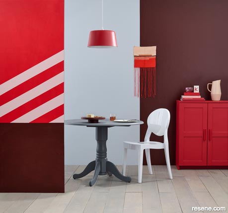
This room embraces red in all its shades, tempered by cooling grey-blues.
Left front wall bottom is Resene Volcano, top in Resene Smashing with stripes in Resene Paper Doll. Centre rear wall in Resene Half Gull Grey and right rear wall in Resene Volcano. Floor finished in Resene Colorwood Mid Greywash, sideboard in Resene Smashing, dining table in Resene Half Tuna, light pendant in Resene Roadster and jug in Resene Paper Doll. Chair from Cintesi, jug from Freedom, Rachel Long handwoven tapestry from Public Record. Project by Kate Alexander, image by Bryce Carleton.
But in the right shades, and in the right areas, red can breathe huge amounts of personality and style into interiors – and even some exterior spaces.
“Red is an intense colour and not for the faint hearted!” says Resene Colour Expert Meryl Southey. “Excessive amounts of red in a single interior can be overwhelming and tiring but applied well and combined with the right colour palette, red can bring just the right amount of drama to a room.
“It is well-suited to busy areas like kitchens and hallways but I’d suggest avoiding brighter tones in a bedroom as it can be over-stimulating and not very conducive to a good night's sleep.”
Instead, in these quieter rooms like bedrooms, dining rooms or sitting rooms try darker rich reds with more purple or magenta undertones, Meryl suggests. “These shades, like Resene Red Oxide, lend a heritage feel to rooms and are easy to integrate not only into traditional, older homes but modern settings as well.”
In functional spaces like bathrooms, laundries, toilets or garages red can become playful, adding vibrancy and eye-catching fun when used in small accents. Try a simple primary red like Resene Roadster on a single cupboard door or shelf against an otherwise black and white palette. Go all-in and opt for an almost glassy finish with Resene Super Gloss enamel.
“Red is a great colour to use to bring in an element of surprise,” Meryl says. “It is most successful when used as the colour of furniture and accessories, rather than walls or trim. It will always enliven an interior, but it needs to be balanced so the interior doesn't become chaotic.”
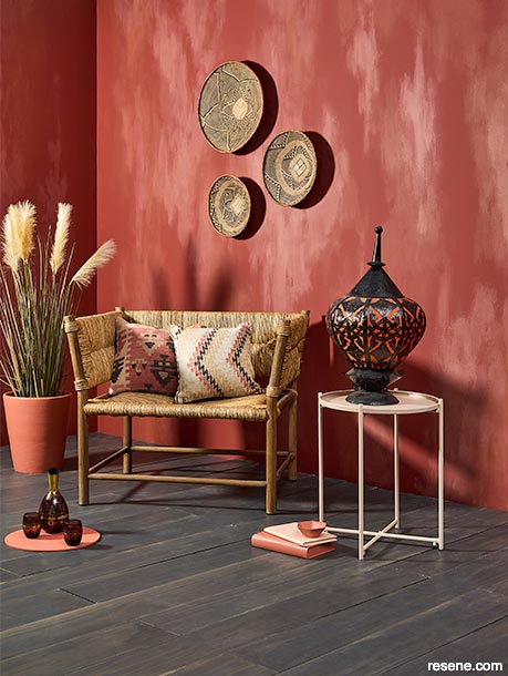
Parched, earthy shades and a washed effect help temper the boldness of red walls and centre this room right in Morocco.
The walls are in Resene Fahrenheit, with smudges of Resene Mocha and Resene Apple Blossom mixed into Resene FX Paint Effects Medium. The floor is finished in Resene Colorwood Shade, side table in Resene Cashmere, books in Resene Wax Flower and Resene Cashmere and planter in Resene Apple Blossom. Rugs and cushions from Yuva Rugs, lantern from Exhibitionist, chair from French Country Collections, glassware from Hunt and Foster. Project by Melle Van Sambeek, image by Bryce Carleton.
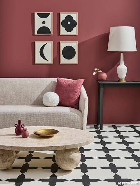
Sandy beige tones with black highlight the earthy undertones of this wall in Resene Savour.
The floor is painted in Resene Meringue with a stencil overlay pattern in Resene Black. Sideboard in Resene Black with case in Resene Savour, table vases in Resene Savour and Resene Incarnadine and DIY artwork in Resene Black and Resene Meringue. Cushion from Adairs, coffee table from David Shaw, sofa from Soren Liv, brass bowl from Simon James. Project by Melle Van Sambeek, image by Bryce Carleton.
When it comes to pairing reds with other shades to create a full palette for your room or house, the good news is red is surprisingly versatile once you delve into the full spectrum of shades. The key, Meryl says, is finding balance.
“Reds need to tonally work in a room so they complement everything else in the space and don't dominate.”
She says pairing reds with more muted shades like sandy beiges, blues and light greys will slightly neutralise the effect of red. “Whereas a bold white contrast might be a bit jarring.” As an example, try deep red Resene Aroha with beige-toned Resene Tua Tua and soft grey-blue Resene Baring Head. If you do want to add a white neutral, look for something greyed like Resene Sea Fog, so the contrast is not as strong.
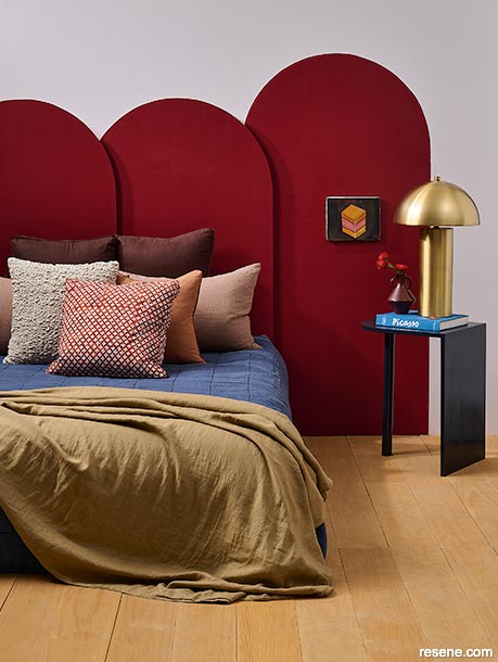
Deeper wine reds add immediate luxury and sophistication and work well in retreat spaces like bedrooms or sitting rooms.
The rear wall is Resene Bon Jour with arched headboard in Resene Salsa. Bedside table in Resene Jaguar and vase in Resene Volcano. Lamp from Freedom, quilt from H&M Home. Project by Kate Alexander, image by Bryce Carleton.
For some bolder colour combinations Meryl suggests looking to the colour wheel even if it throws up some surprising options. “Colours which are close to red on the colour wheel, such as orange and pink, should not be ruled out as they can all work beautifully together. Using two or three of these colours together will create a warm palette based on tonal similarities.” While pink and orange may sound overwhelming at first, softer, more subtle versions of those colours like coral pinks and terracotta can make great partners to reds, Meryl says. Some combinations to try are the sunset mix of Resene Mexican Red, Resene Ecstasy and Resene Coral Tree. Cool the mix down with a creamy neutral like Resene Spanish White.
If there is one trend that’s just made to experiment with some bold reds, it’s having a boldly painted front door. It’s the perfect, simple and cost effective way to add that splash of colour to your otherwise neutral exterior. Add it to your mailbox too for extra impact and find yourself some flowers in a similar shade to bloom in a nearby planter. Instant street appeal.
If your house is in a classic, stony-grey neutral like Resene Tana, try a door in firecracker Resene Whizz Bang with trim in Resene Sea Fog. For a house in a fresh, green-toned neutral like Resene Lemon Grass try a deep maroon-red like Resene Cab Sav with trim in Resene Half Spanish White.
Tomato reds: Orange-toned reds like Resene Del Toro. Try these vivid bold shades as a highlight against soothing Resene Thorndon Cream and deep neutral Resene Double Tea.
Primary reds: Embrace the primary colour palette and use a bright, pure red like Resene Havoc with its primary cousins blue (try Resene Resolution Blue) and yellow (try Resene Turbo) against a classic Resene black and Resene white backdrop for a Mondrian-inspired finish. The trick is to balance small accents of the primary shades as highlights against the black and white.
Brick reds: These earthy red shades are deeper with a more muted, scorched finish that makes them among the easiest reds to pair with other shades. Try Resene Red Planet with neutral beige Resene Half Sour Dough and a muddy deep green like Resene Karaka.
Wine reds: These moody, deep reds ranging from dark Resene Cab Sav to purple-ish Resene Merlot or Resene Incarnadine bring immediate luxury and sophistication to interiors. To add to the effect try them paired with notes of gold and opt for matte finishes for a soft velvet-like finish, perfect for bedroom retreats. Let them breathe with a contrast note of pastel pink Resene Inspire or a splash of fresh pistachio green in Resene Wild Willow.
“Consider your design aesthetic and decide which powerful shade of red is going to suit the room,” Meryl says. “The classic trio of black, white and red looks good in modern and modernist interiors and it is a great choice for glam and retro styles.”
Colours mentioned in this blog...
Product mentioned in this blog...
October 14, 2023
If you need help choosing just the right reds for your project, ask an expert at your Resene ColorShop or use the free Ask a Resene Colour Expert service online.
Book a colour consult | Ask a Colour Expert | Ask a Paint Expert
Resene's decorating blog
Paint your home beautiful! Discover the latest decorating trends, tips and colour news.
![]()
Previous «
Man caves, media rooms and she sheds
![]()
Blog home
View the latest trends, tips and news
![]()
» Next
Your homes sunsmart checklist
![]() Get inspired ! Subscribe
Get inspired ! Subscribe ![]() Get saving ! Apply for a DIY card
Get saving ! Apply for a DIY card
![]()
Can't find what you're looking for? Ask us!
Company profile | Terms | Privacy policy | Quality and environmental policy | Health and safety policy
Colours shown on this website are a representation only. Please refer to the actual paint or product sample. Resene colour charts, testpots and samples are available for ordering online. See measurements/conversions for more details on how electronic colour values are achieved.
What's new | Specifiers | Painters | DIYers | Artists | Kids | Sitemap | Home | TOP ⇧