From the Resene decorating blog
The fear of making mistakes in your interior design make-over can be paralysing. Or, at the very least, it can mean many of us fall back on safe and proven design choices, rather than letting our creativity and imagination run free.
Nobody wants to spend a lot of time, effort and money on a home makeover project only to make expensive mistakes or simply hate the finished result.
With that in mind, we’ve talked to some of our Resene design and colour experts about some of the most common dilemmas or hurdles in DIY home interiors, and how to avoid or, if necessary, fix them.
Balance and repetition are the keys to creating a cohesive colour scheme and can be achieved even if you’re interested in using multiple colours throughout your home.
For example, if your lounge feature wall is feeling disconnected from the rest of your home try repeating the colour through other areas of your home as an accent. It can be as simple as adding a similar coloured vase in your hallway or a towel in your bathroom for the repetition that will create a cohesive look throughout your home.
Regardless of how many colours you select, this repetition can help maintain balance.
– Rebecca Long, Resene Senior Architectural Representative
Designing a space is all about colours that relate or complement each other along with pattern and texture to add interest. The trick is getting the balance right without overdoing it. Don't be afraid to go with your instinct and what appeals to you, but if you're finding it hard to pull everything together, here are a couple of ideas.
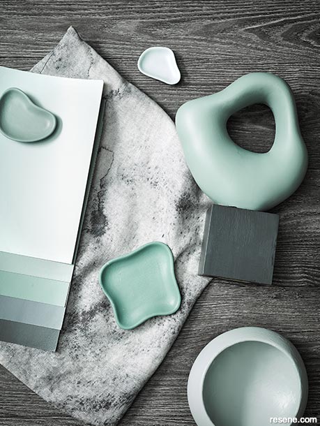
Colours that are close to each other on the colour wheel (known as analogous colours) can look stunning in varying depths all mixed together, such as blue/greens and yellow/greens. Try Resene Tarawera, Resene Wabi Sabi, Resene Vantage Point and Resene Green Days.
These colours can be used here and there as accent walls and the deeper colours look stunning in a media room or library. Resene Thorndon Cream is the perfect white shade to link them all together as it has a subtle green undertone.
For a totally different look, try colours that are opposite each other on the colour wheel (complementary colours). Make one colour dominate, then use small accents of varying tones of the opposite colour.
An example would be to use deep blue Resene Dark Knight which is opposite orange on the colour wheel. But instead of bright orange look to muted shades to elevate the dark blue such as Resene Cape Palliser, Resene Alamo and Resene Summer Rose. A good soft white to try with this scheme would be Resene Eighth Spanish White.
– Jackie Nicholls, Resene Colour Consultant
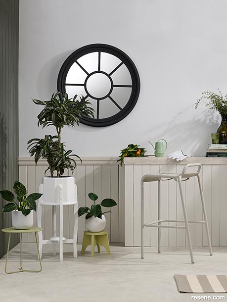
Using warm whites with a subtle yellow or warm undertone can help to brighten up smaller, daker spaces. Mirrors are also a great way to make the most of your natural light.
This floor is painted in Resene Foggy Grey with Resene FX Paint Effects Medium mixed with Resene Quarter Merino. The rear wall boards and shelf are Resene Quarter Merino, while the shelf has also been painted in Resene FX Paint Effects Medium mixed with Resene Foggy Grey. The top of the wall is Resene Double Merino, the left wall is Resene Quarter Karaka and the mirror is Resene Nero. The white planter is Resene Quarter Merino. The green plant stands are Resene Quarter Crisp Green. Stool and barstool from Jardin. Project by Kate Alexander, image by Bryce Carleton.
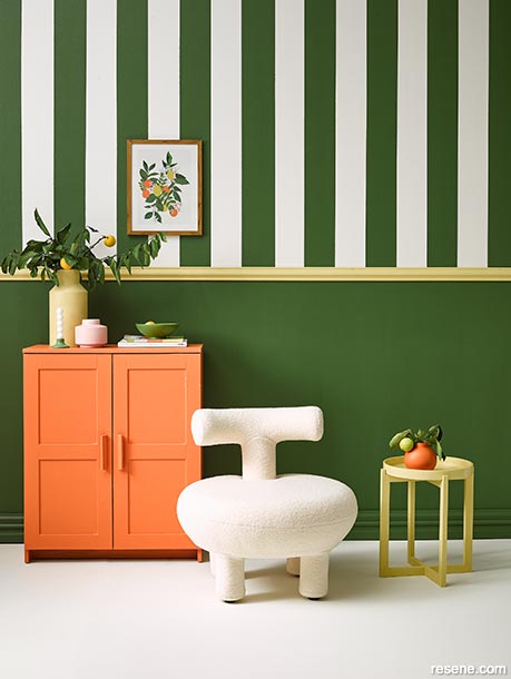
The trick to using bold complementary colours is repetition and balance. In this room the citrus shades of the artwork are picked out and used as accent colours to keep the bold use of Resene Clover and Resene Rice Cake on the walls looking fresh, vibrant and balanced.
Dado rail and large vase painted in Resene Chenin, cabinet in Resene Smoke Tree, candleholder in Resene Dingley, bowl in Resene Green Leaf, small vase in Resene Paper Doll and floor in Resene Rice Cake. Sofa from Citta, faux plant and terracotta cushion from Nood, candles from Superette, yellow bag and scarf from H&M, occasional chair from Danske Mobler. Project by Vanessa Nouwens, image by Wendy Fenwick.
Accent lighting focuses light on a particular area or object. It is a great way to build visual interest and highlight special features in spaces with low natural light.
Explore the likes of wall sconces, floodlights, recessed lights and lamps to build an inviting atmosphere.
– Rebecca Long, Resene Senior Architectural Representative
If you have a room that doesn't have a lot of natural light, slightly lighter but warmer colours like Resene Meringue or Resene Athena will help to brighten the room during the day. A large mirror will also bounce light around and make the room feel larger.
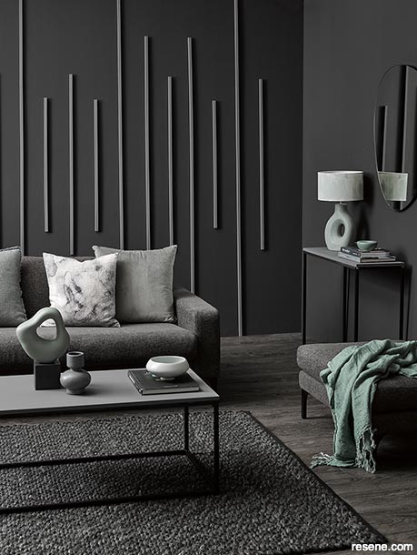
The other option is to embrace the natural light levels and choose a deeper, moody colour which can be a lot more inviting. Try Resene Night Magic or Resene Seaweed. Dressed with cosy rugs and throws, it can feel like a special retreat.
– Jackie Nicholls, Resene Colour Consultant
You don’t have to paint every room a stark white to add brightness. When it comes to selecting the ‘right’ white for a room with low natural light, look for colours with a Y for yellow as the start of their Resene colour code. You don’t have to go with a heavy old-fashioned cream, just a touch of warmth that will lift the space. Try colours like Resene Merino, Resene Half Rice Cake or Resene Blanc.
Painting your walls in a Resene Lustacryl semi-gloss or Resene Enamacryl gloss paint finish will also reflect more light. Just remember your walls will need to be in good condition as high sheen finishes can highlight imperfections.
– Brooke Calvert, Resene Canterbury Design Advocate
Off-white colours such as Resene Rice Cake can give the illusion of a larger space if wrapped on all walls and the ceiling.
Dark colours such as Resene Bokara Grey can give the illusion of a smaller space even if they’re just used in selected areas. A dark, Resene Bokara Grey feature wall will bring in the wall slightly whereas a Resene Rice Cake feature wall will feel slightly further back in comparison.
Use the proportions that colour offers to your advantage. There is fear around making a space feel smaller but there really is something glorious about wrapping your walls in a darker colour to create a cosy nook.
– Rebecca Long, Resene Senior Architectural Representative
Warm colours, such as yellows and reds, tend to advance and make the walls seem closer. They are a good option if you are working with a large space and want to create more of an intimate, welcoming feel.
Cool colours, such as greens and blues, tend to recede and make the walls seem further away. That makes them a good option for small, narrow rooms that you want to make appear more spacious.
– Brooke Calvert, Resene Canterbury Design Advocate
The best height to hang art in a room depends on how tall you are, or how tall the average person using the room is. Ideally, you want the centre, or just below the centre, of the artwork to be at standing eye level to enjoy it properly.
Art doesn't have to be hung on a wall. It can look great to group pieces casually on a ledge shelf, even overlapping each other a little. It's very easy to change your art pieces around when they’re simply resting on a shelf.
If you have a piece of art that's a bit lost on a wall, you could paint a block of colour behind it which can be more dramatic and make it seem larger.
– Jackie Nicholls, Resene Colour Consultant
Use smaller scale and lighter weight furniture to keep your rooms to scale. For example, try sofas with slim arms or chairs with no arms.
And remember, curves are easier to walk around, so try a round ottoman that doubles as a coffee table, rather than a standard oblong or square table.
– Brooke Calvert, Resene Canterbury Design Advocate


December 27, 2022
For help choosing colours to suit your projects, visit your local Resene ColorShop, ask a Resene Colour Expert online or book a Resene Colour Consultation.
Book a colour consult | Ask a Colour Expert | Ask a Paint Expert
Resene's decorating blog
Paint your home beautiful! Discover the latest decorating trends, tips and colour news.
![]()
Previous «
Sunshine design – working with yellow, red and orange
![]()
Blog home
View the latest trends, tips and news
![]()
» Next
Wonder walls
![]() Get inspired ! Subscribe
Get inspired ! Subscribe ![]() Get saving ! Apply for a DIY card
Get saving ! Apply for a DIY card
![]()
Can't find what you're looking for? Ask us!
Company profile | Terms | Privacy policy | Quality and environmental policy | Health and safety policy
Colours shown on this website are a representation only. Please refer to the actual paint or product sample. Resene colour charts, testpots and samples are available for ordering online. See measurements/conversions for more details on how electronic colour values are achieved.
What's new | Specifiers | Painters | DIYers | Artists | Kids | Sitemap | Home | TOP ⇧