From the Resene decorating blog
Nothing makes a statement quite like a splash of turquoise with all its simple visual connection to sky and sea. But turquoise is increasingly taking on a more sophisticated place in our interiors.
As well as warm beach vibes, it’s a shade that can go wistful, chilled-out and dreamy, it can be bold and modern, and even opulent and warm in its deeper tones. It’s versatility is probably not surprising given it sits between green and blue on the colour wheel, two other extremely popular interior colours. It’s natural complementary colours are coral-toned reds, but it can work well with warm beige, inky blues, silvery greys, deep plums or crisp white and bold blacks. The world is your turquoise oyster – or should we say Pāua shell?
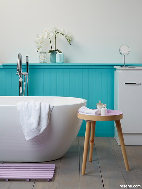
Touches of pink with bright turquoise create a fresh, crisp clean bathroom.
This wall is painted in Resene Elderflower with tongue-and-groove panelling and shelf in Resene Yes Please. Flooring finished in Resene Colorwood Mid Greywash, bath mat and tray tabletop in Resene Mozart and bases in Resene Meditation and Resene Kandinsky. Bath, bath filler and vanity from Plumbing World. Project by Megan Harrison-Turner, image by Bryce Carleton.
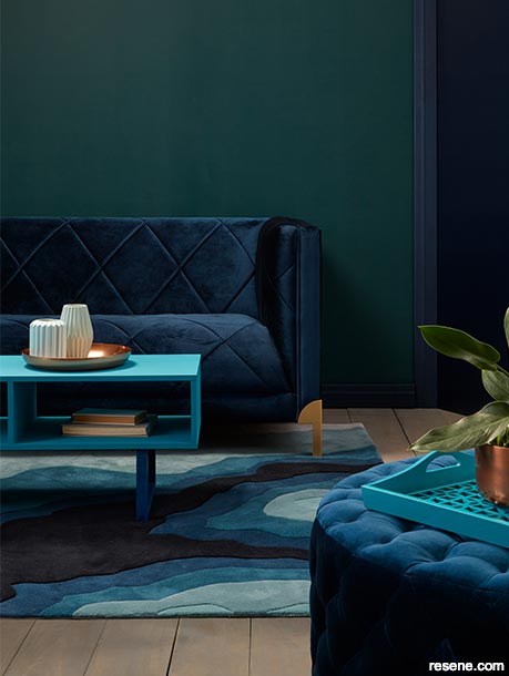
Crisp turquoise touches in Resene Yowza on the tray and Resene She’ll Be Right painted on the coffee tabletop keep this bold colour scheme feeling fresh and modern.
Walls painted in Resene Atlas with architraves in Resene Indian Ink, floor in Resene Colorwood Mid Greywash, coffee table legs in Resene Wishing Well and vases on the table in Resene Cleopatra. Sofa and ottoman from Contempa, copper vessels from Freedom, rug from Designer Rugs, silk cushions from Katrina Hobbs Design. Project by Megan Harrison-Turner, image by Bryce Carleton.
Turquoise, aqua and teal are all used fairly interchangeably to describe the full spectrum of blue-green colours ranging from wispy pastels to bold shocks of colour, but in terms of colour theory they do have different distinguishing features and it all starts with cyan.
Cyan isn’t a colour that comes up a lot in most of our colour vocabulary but, in printing it has an important part to play as the ‘C’ in CMYK. This is the ratio of cyan, magenta, yellow and black (‘K’) that are combined to make up all printed colours. Cyan is made up of equal parts green and blue.
Turquoise shades are generally darker versions of cyan. By comparison aqua tends to mean colours that are at the lighter end of the spectrum, and teal tends to be at the darker end.
Fun fact: teal is actually named after a freshwater duck found in part of Europe and Asia which features teal coloured feathers.
Sitting between blue and green on the colour wheel, turquoise has, broadly speaking, more yellow in it than teal but less than aqua.
Knowing the difference between the shades can be helpful when it comes to selecting your colour palette if you’re not sure where to start, other than you love turquoise. Complementary colours are those which sit opposite a colour on the colour wheel, and are a good place to start choosing a colour scheme. From there you can start to play with different colour intensities and tones.
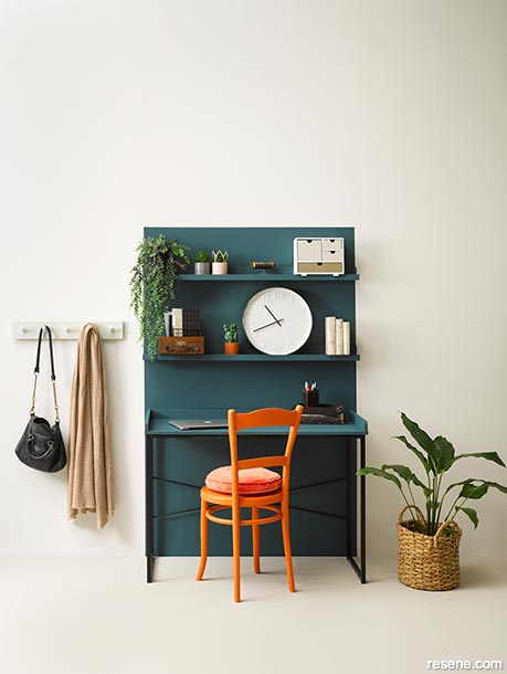
Deep teal contrasts beautifully with bold orange against a neutral backdrop to create an interesting, appealing study nook.
Walls painted in Resene Sea Fog, flooring in Resene Truffle, painted desk backdrop, shelves and desktop in Resene Fast Forward, chair in Resene Jailbreak, desk organiser in Resene Alabaster with drawers in Resene Truffle and Resene Earthen, small plant pots in Resene Moccasin and Resene Soulful and wall hooks in Resene Secrets. Clock from Flux Boutique, round cushion from Castle & Things, star cushion from Little Whimsy, rug from Thing Industries, basket from Kings Plant Barn, quilt from Society of Wanderers. Project by Annick Larkin, image by Melanie Jenkins.
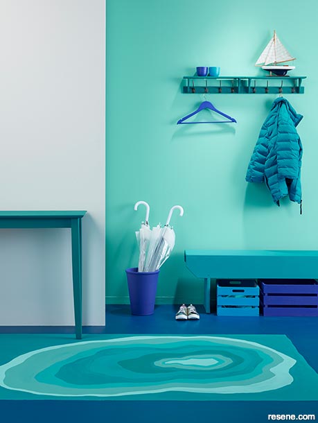
What a welcome! These bold blue-green colours make for a dramatic, uplifting entranceway.
Left wall painted in Resene Sea Fog and feature wall in Resene Freelance. Floor design painted in Resene Wishing Well Resene Deep Teal, Resene Maestro, Resene Yes Please, Resene Hullabaloo, Resene Yowza and Resene Big Chill. Hall table in Resene Yowza, bench seat in Resene Yowza, umbrella holder in Resene Submerge, crates under the bench in Resene Moana (left) and Resene Valour and coat hangers in Resene Submerge. Project by Megan Harrison-Turner, image by Bryce Carleton.
For a turquoise such as Resene Hullabaloo, a complementary shade would be a coral red such as Resene Tangerine; try with creamy Resene Eighth Spanish White. For a lighter aqua such as Resene Freelance a complementary colour would be a sunny orange like Resene Malarkey; try muted Resene White Pointer for trim. For a deeper teal such as Resene She’ll Be Right, try a complementary deep red such as Resene Pohutukawa and a bright white like Resene Alabaster.
If that sounds more vivid and bold than you were intending, remember you can choose colours in half or quarter intensity, and you can soothe everything down by opting for more muted and pastel shades, or soft yellow or grey toned neutrals such as Resene Half Spanish White or Resene Sea Fog.
Turquoise and its related shades are often associated with serenity and calm, which makes them perfect for soothing retreat spaces like bathrooms or creative spaces like studios. In bolder shades turquoise can be very uplifting and dramatic, so have a play with combinations that will suit both the mood and the room you’re focusing on.
For a dreamy calming combination, ideal for a bedroom or retreat space try pastel shades like the pale aqua of Resene Half Scandal, with warm Resene Grey Seal and Resene Merino. Add swirls or highlights of a soft pink like Resene Vanilla Ice.
Take the same idea of retreat and relaxation but go in a bolder, more smouldering direction with deep Resene Plum or Resene Blue Night, adding trim in Resene Blanc or Resene Merino and accessories in bright Resene Gulf Stream Aqua to give everything a lift. Alternatively double town on the moodiness with Resene Deep Teal. Add a layer of silk and velvet or simply a painted chair in rich copper or mustard gold such as Resene Copper Fire or Resene Alpine.
For that relaxed, indoor/outdoor beachy look pair a sea-toned turquoise such as Resene Yowza with lots of natural neutrals such as Resene White Pointer and warm beige tone in Resene Triple Blanc or Resene Quarter Nullarbor. Pair it all with plenty of pale wood stained in Resene Colorwood Natural or whitewashed in Resene Colorwood Rock Salt. Add a layer of casual accessories in natural fibres and tones that will really make the turquoise pop.
Take turquoise in a different direction to create a dramatic, modern dining or living area by using it as a bold impact colour against a monochrome backdrop. Keep furnishings and fittings in crisp blacks and whites, such as Resene Black White and Resene All Black, and just have one or two showcase pieces of furniture, soft furnishings or painted areas in a strong, vibrant turquoise such as Resene Hullabaloo. Just a splash of a vivid colour brings out the best in both a monochrome space and the featured turquoise.
If a monochrome option feels too stark, try subbing out the black for a deep moody navy blue like Resene Indian Ink, and mix your whites with splashes of silvery grey Resene Iron or even a pop of metallic in Resene Silver Aluminium. You could also mute your turquoise to a gentler or Resene Kumutoto.


October 29, 2021
Visit your local Resene ColorShop for expert advice and all the products and accessories you need to make the most of your home.
Book a colour consult | Ask a Colour Expert | Ask a Paint Expert
Resene's decorating blog
Paint your home beautiful! Discover the latest decorating trends, tips and colour news.
![]()
Previous «
Decorating drizzled in caramel
![]()
Blog home
View the latest trends, tips and news
![]()
» Next
Making time for red
![]() Get inspired ! Subscribe
Get inspired ! Subscribe ![]() Get saving ! Apply for a DIY card
Get saving ! Apply for a DIY card
![]()
Can't find what you're looking for? Ask us!
Company profile | Terms | Privacy policy | Quality and environmental policy | Health and safety policy
Colours shown on this website are a representation only. Please refer to the actual paint or product sample. Resene colour charts, testpots and samples are available for ordering online. See measurements/conversions for more details on how electronic colour values are achieved.
What's new | Specifiers | Painters | DIYers | Artists | Kids | Sitemap | Home | TOP ⇧