From the Resene decorating blog
If bold brights and deep jewel tones are a bit over-the-top for your tastes, and pale pastel palettes aren’t your cup of tea either, there is another colour theme option that might be just the thing.
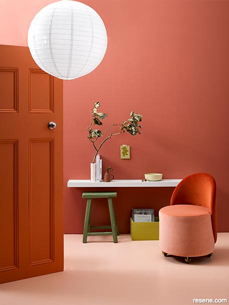
A tone-on-tone scheme of Resene Apple Blossom painted walls, Resene Wax Flower floor and the door in Resene Sebedee is dressed with green accent colours and accessories for added interest. The wide floating shelf, painted in Resene Quarter Tea, can also double up as a desk. Stool painted in Resene Woodland, crate in Resene Gingko, bowl in Resene Yuma and tall thin vase in Resene Just Right. Chair from Douglas and Bec, postcard on wall from Garden Objects, books from Paper Plane, jug from Blackbird Goods, rice paper shade from Wah Lee Co. Project by Gem Adams, image by Wendy Fenwick.
Maybe it’s that we’ve all had so much screentime recently our eyes need something soothing, but muted shades are having a moment. They represent a way to experiment with different colour combinations, or simply add more colour to a space without the risk of clashes or a finished space that feels intense and overwhelming.
The result will be a room that is elegant and modern, without having to resort to the safety of a completely neutral palette.
Muted colours are shades with a low colour saturation. They are subtler versions of colours that aren’t as bright or vivid. Often they have been tinted with blacks or greys or a complementary colour (for example a vivid red can be desaturated with green) so they are softer and more subdued while still adding beautiful touches of personality to a room.
Muted colours are not hugely dissimilar to pastels which are also low saturation, though pastels are often thought of as more pale, and cooler in tone – such as mint greens, baby pinks or duck-egg blues. Muted tones are warmer, slightly deeper in colour.
Opting for muted versions of your preferred colours, can also help make your overall look work better together, rather than going for clashing brights. For example a combination of bright red, green, blue and yellow could be a bit overwhelming. Instead try a mix of muted shades in a similar palette such as Resene Paprika, Resene Laurel, Resene Tarawera and Resene Sweet Corn. It might still seem a lot of colours for one room (although it could make for a fun children’s bedroom), but you can see how the softer tones make the colour combination easier on the eye, and more relaxing. The colours won’t compete so much for attention.
If you’re not sure where to start with your own favourite colours, book in a Resene Colour Consultation with a Resene Color Expert, talk to the team at your local Resene ColorShop or use the free Resene Ask a Colour Expert online service. Tell them the shades you like and they’ll be able to suggest more muted versions that will work well together.
As with any other colour palette, there’s no limits on where you can use muted colours, but they may particularly lend themselves to certain rooms or use areas. As a rule muted colours are inviting and relaxing, even nurturing or romantic!
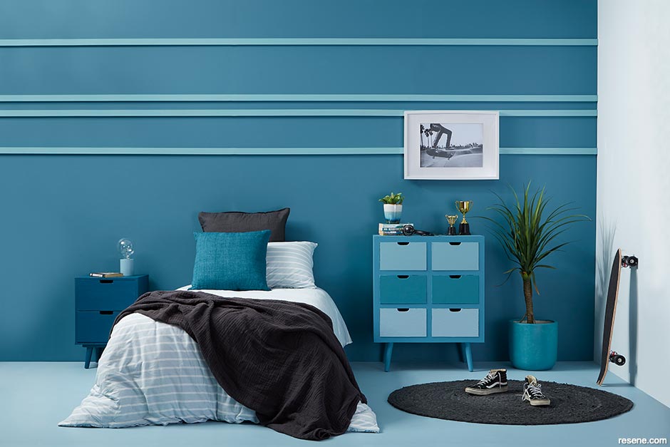
With that in mind a muted colour scheme can work particularly well in bedrooms, lounges and study areas. Think soothing blues such as Resene Undercurrent, with a fresh but understated note of Resene Japonica. Or the soft yellow of Resene Chenin with the muted red/brown of Resene Old Copper.
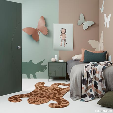
This fun children’s bedroom uses pattern and texture to bring vibrancy to a muted, earthy palette.
The door is painted in Resene Middle Earth, while the split rear wall is Resene Pewter on the left and Resene Otter on the right. The painted dinosaur is Resene Gecko while the butterflies are in Resene Pewter, Resene Serene, Resene Half Washed Green, Resene Paris White and Resene Double Sea Fog. The floor is also Resene Double Sea Fog. Artwork by Ruth McGill, rug from Slow store Queenstown, bedside from Mr & Mrs Ward in Resene Rivergum, butterfly stencils from Parkin Stencils, dinosaur from Republic Home, duvet from Thread Design, toys/throw/pillow cases from Citta, cushions from James Dunlop Textiles. Project by Greer Clayton, image by Bryce Carleton.
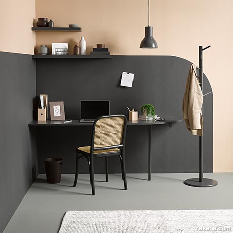
Clever use of colour carves out a muted two-tone office space from a larger room.
Upper wall painted in Resene Cashmere with the curved contrast in Resene Nocturnal over two coats of Resene FX Magnetic Magic. Desk, shelves, coat rack and pendant light painted in Resene Nocturnal, pencil cup and desk file in Resene Cashmere, rubbish bin in Resene Sepia and decorative vases and bowls in Resene Sepia, Resene Rebel, Resene Zeus, Resene Double Cod Grey, Resene Swiss Coffee and Resene Triple Rice Cake. Project by Laura Lynn Johnston, image by Wendy Fenwick. Chair from Mood Store, rug from Freedom.
Muted colours can also be a way to add unexpected, even bold touches to a room that has an otherwise pared back or neutral palette. The calming green of Resene Bush for example, works well as an accent colour against the warm neutral of Resene Half Spanish White or Resene Pearl Lusta, and wood flooring or features in Resene Colorwood Oregon.
Or flip the formula around into something more dramatic, with a muted but striking colour on the walls such as the on-trend ‘greige’ of Resene Millbrook with paler, warm accents in a neutral like Resene White Pointer or Resene Sea Fog.
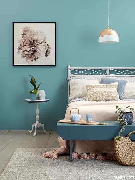
Muted shades need not fade into the background. They can be a dramatic but not overpowering way to use colour, as in this romantic bedroom. Walls painted in Resene Juniper, floor in Resene Colorwood Mid Greywash, headboard in Resene Dover White, bench in Resene Balderdash, pendant lamp in Resene Double Sea Fog with Resene Rose Gold metallic paint, bedside table in Resene Double Sea Fog on the top and base, painted with Resene Hammerhead underneath. The ribbed vases are Resene Balderdash and Resene Double Sea Fog. Rug and cushions from Contempa, duvet and pillowcases from Society of Wanderers, throw from Kip & Co. Project by Annick Larkin, image by Bryce Carleton.
To give your favourite muted shades the impact of a bold colour scheme without the risk of it becoming overwhelming, try layering different tones of the same colour.
A simple way to do this is to choose a muted shade you like and use it in eighth, quarter, half, full and even double intensities. While the finished result is essentially a one-colour or monochrome room, the different shades add depth and texture so it feels inviting and comfortable. This can be a good way to play with neutrals for a simple, clean effect. Resene Tea is a good choice here as it can go from a very pale neutral at eighth strength, to a warm muted grey/green at double intensity.
For something more bold try different, warm tones of an earthy colour such as terracotta, greens or browns. Resene Apple Blossom works well with Resene Sebedee and Resene Sakura. Or try Resene Oilskin with Resene Settlement and Resene Bronco. Add highlights in a fresh white such as Resene Alabaster for lightness and one or two touches of an unexpected contrast for interest, such as Resene Envy for the terracotta or Resene Avocado for the brown shades.
For best effect consider using a matt finish on your muted shades. This means they’ll reflect less light emphasising their soothing effect.
Much like neutrals, using a muted palette gives you much more control over where you direct people’s attention in a room. This makes them a great backdrop for a piece of furniture or art you want to showcase.
Muted shades aren’t just for people afraid of going bolder. They can work well for lovers of brighter colours who are simply trying to create a room with a certain relaxing or calming mood.
A mostly muted colour palette doesn’t prevent you from adding accents in vivid shades, it’s all about what works for your taste and your space!

August 14, 2021
Visit your local Resene ColorShop for expert advice and all the products and accessories you need to make the most of your home.
Book a colour consult | Ask a Colour Expert | Ask a Paint Expert
Resene's decorating blog
Paint your home beautiful! Discover the latest decorating trends, tips and colour news.
![]()
Previous «
The evolution of grey
![]()
Blog home
View the latest trends, tips and news
![]()
» Next
Refresh your outdoors for spring
![]() Get inspired ! Subscribe
Get inspired ! Subscribe ![]() Get saving ! Apply for a DIY card
Get saving ! Apply for a DIY card
![]()
Can't find what you're looking for? Ask us!
Company profile | Terms | Privacy policy | Quality and environmental policy | Health and safety policy
Colours shown on this website are a representation only. Please refer to the actual paint or product sample. Resene colour charts, testpots and samples are available for ordering online. See measurements/conversions for more details on how electronic colour values are achieved.
What's new | Specifiers | Painters | DIYers | Artists | Kids | Sitemap | Home | TOP ⇧