From the Resene decorating blog
Remember when you’d dress yourself as a kid, putting on all your favourite things at once with no thought for ‘rules’ about mixing stripes with spots, or bright pinks with bright oranges and kermit greens. How much fun was that?
It is possible to bring that spirit of clever clashing based on what you love, with only a smidgen more restraint than you applied to childhood outfits.
Here’s some quick tips from Resene for turning clashes into design triumphs.
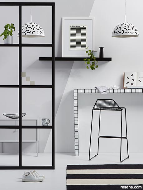
A monochrome palette means the mix of geometric and organic shapes actually brings cohesion and interest to this room.
Right side of the rear wall painted in Resene Eighth Black White with the left side in Resene Double Concrete, floor in Resene Half Concrete, timber frame screen stained in Resene Colorwood Pitch Black, while the desk/bar is in Resene Eighth Black White with a grid in Resene Blackjack, pendant lamps in Resene Eighth Black White with designs in Resene Blackjack, shelf in Resene Blackjack and basil pot in Resene Double Concrete. Rug from The Ivy House, bar stool from Cintesi, cabinet from IKEA, artwork from endemicworld. Project by Kate Alexander; image by Bryce Carleton.
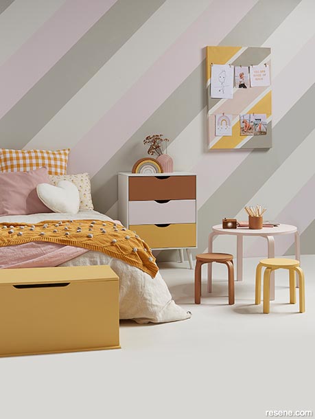
A pared back use of colour means this mix of patterns is charming rather than clashing.
Wall stripes painted in Resene Merino, Resene Ebb and Resene Truffle and floor in Resene Quarter Truffle. Exterior of drawers in Resene Merino with drawers painted in (top to bottom) Resene Brown Sugar, Resene Ebb and Resene Apache. Toy box in Resene Apache, table in Resene Soothe, stools in Resene Apache and Resene Brown Sugar, stacked rainbow in Resene Merino, Resene Ebb, Resene Truffle, Resene Apache and Resene Brown Sugar and pencil pot in Resene Brown Sugar. Duvet cover and linen throw from Adairs, gingham pillowcase and cushion from Homebody, pink cushion cover from H&M Home, heart cushion, pom-pom blanket and floral pillowcase from Little Whimsy. Project by Vanessa Nouwens, image by Bryce Carleton.
When you’re choosing patterns or colours to blend together into a cohesive design, think about choosing one or the other – especially if this type of mixing things up is new to you. A mix of checks and zigzags is one thing but adding in several bold clashing colours as well could make the final look a bit overwhelming and lacking cohesiveness. To start with, keep your background colours neutral or in layers of different tones of one colour. This will focus attention on all the fun you’re having with patterns and shapes. If, for example, you want to mix polka dots with zigzags, keep those elements in one colour, and surround them with other plain features in different shades of the same colour.
To bring some cohesion into your room, choose something your mixed colours or patterns have in common. It might be as simple as picking one colour for all your designs, even if it’s in different shades. It might be picking one shape and repeating it in different sizes and angles. It could be as broad as a theme, like ‘beachy’, ‘sunsets’ or ‘circus’ that ties all your elements together. Even if they are wildly different in tone, and shape, the theme ensures they’re part of a bigger picture that helps brings it all together.
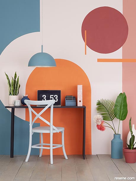
An art deco theme in muted, earthy shades means the colour combinations of this home office are soothing rather than clashing.
The pale wall colour is Resene Soothe, while the arch and lines are in Resene Sebedee. Circle painted in Resene Merlot, vertical stripe on the far right in Resene Coral Tree, blue curve on left and floor vase in Resene Streetwise, floor in Resene Sea Fog, smaller plant pot in Resene Merlot, large bottle on the floor in Resene Alabaster, tabletop vase in Resene Jaguar and desk in Resene Kilimanjaro with chair in Resene Silver Chalice. Plants from Give Plants. Project by Annick Larkin, image by Bryce Carleton.
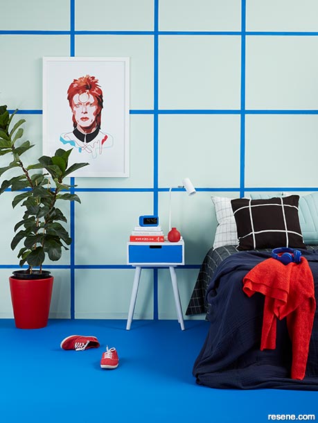
Different sizes of a similar check pattern prevent this tri-colour room from clashing.
Walls are painted in Resene Kandinsky with a grid in Resene Wet N Wild, floor and nightstand drawer in Resene Wet N Wild, nightstand exterior in Resene Secrets, large plant pot and tiny vase in Resene Jalapeno and lamp in Resene Alabaster. Bedding, cushion covers, jumpers and windbreaker from H&M, artwork by Anna Mckay from Endemic World. Project by Laura Lynn Johnston, image by Bryce Carleton.
Size matters when it comes to clashing patterns. Mixing an intricately patterned geometric Resene wallpaper with another busy and intricate floral design might make it hard for either to stand out. Instead pick one design that’s bold and simple and add smaller touches of the more intricate design. Suddenly they’re complementing each other rather than competing.
Another way to make unusual shapes work is to take one design – maybe a floral outline or a check pattern – and repeat similar patterns in different colours at different sizes, layered against one another. Your eye will pick up the similarities in design rather than the differences.
When it comes to mixing, unexpected or ‘clashing’ colours, think about tones and shades, rather than just primary or bright colours. For example a room that mixes a fire engine red like Resene Chaos with a lime green and a melon-toned orange, might be a bit much. But if you opt for more muted reds, greens and terracotta, against a warm putty neutral, it all becomes a little more workable. Think Resene Half Pohutukawa with Resene Colins Wicket and Resene Just Dance against a Resene Half Drought backdrop.
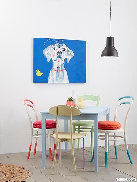
A simple, clean backdrop keeps this collection of colours from clashing.
The rear wall is painted in Resene Double Alabaster, while the floor is stained in Resene Colorwood Mid Greywash. Table painted in Resene Frozen, cream chairs in Resene Bubble White with details in Resene Spring Fever, Resene Maestro and Resene Rapture, green chair in Resene Anise, yellow chair and vase in Resene Yuma, pendant lights in Resene Nero, tall vase in Resene Frozen and plant pot in Resene Rapture. Plants from Give Plants, cushions from Castle and Things, artwork by Jessie Breakwell. Project by Annick Larkin, image by Bryce Carleton.
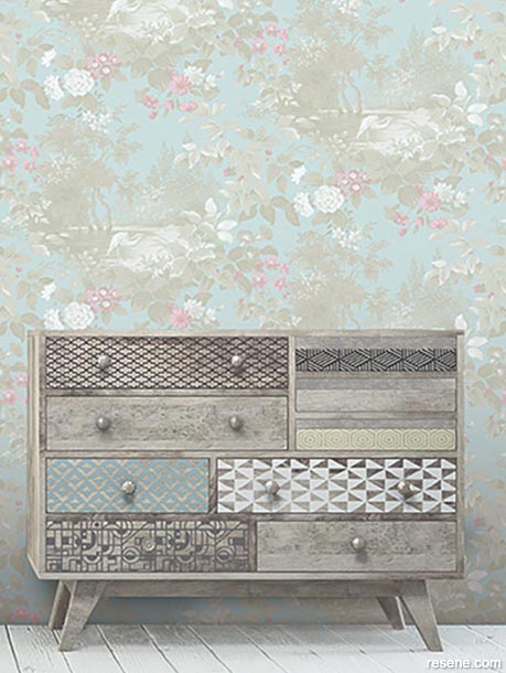
This wall in Resene Sanctuary Wallpaper Collection FJ40304 provides a stunning backdrop to this cleverly clashing set of drawers.
Using muted neutral shades, including Resene Colorwood Whitewash on the floor, provides a subtle backdrop to showcase different patterns.
Scared to go crazy with clashing patterns and colours in your lounge or bedroom? Start small. Cushions are a good place to start. Gather together a selection in different designs, fabrics, colours and shapes. You’ll soon start to get a feel for how to pull things together with surrounding colours and furnishings.
Another small scale project to find what unexpected colours and patterns will work in your space is to decorate a few small plant pots or vases with Resene testpots to see what combinations you like best.
If even that seems a step too far to begin with, play with online vision boards on platforms like Pinterest. They’re essentially digital scrapbooks that let you test your clashing talents out.
When it comes to shapes stripes are a simple way to mix things up. Mix the sizes – thick and thin, turn them into grids, chevrons, cross hatches or checks. Go vertical, horizontal or even diagonal to play with perspective and unexpected lines, Then add a playful mix of colours. Plus, straight lines are easy to paint! Use masking tape from Resene ColorShops to get a crisp clean edge on your shapes – make sure you remove it before the paint fully dries.
There are some stunning wallpaper designs available now, that can really kick off your clashing experiments. Many of them have already done the artful clashing for you. Resene Komar Heritage Wallpaper Collection HX6-043 mixes diamond shapes with stunning florals.
Animal prints are fun patterns to experiment with because you’ll be surprised how many things they work with and how effective they can be at pulling other disparate colours together. Most animal prints tend to be in fairly neutral colours so they offer visual texture while blending into the background. Pair them with unexpected patterns like checks and stripes in similar tones.
Unexpected colour combinations to play with are:
Pink and yellow: go bold with Resene Cranberry and Resene Festival or go muted with Resene Cinderella and Resene Primrose
Purple and brown: Go bold with Resene Eye Candy with Resene Tablelands, go muted with Resene Courage and Resene Eighth Stonewashed
Green and orange: Go bold with Resene Forest Green and Resene Trinidad or go muted with Resene Hillary and Resene Zest
Turquoise and red: Go bold with Resene She’ll Be Right and Resene Pohutukawa, or go muted with Resene Smashing and Resene Half Escape
Remember that ‘clashing’ colours is a fairly subjective idea. One person’s perfect colour or pattern match, might be another’s clashing nightmare.
A common school of thought is that colours on the opposite sides of the colour wheel are clashing colours. But just as often you’ll see these opposing shades described as complementary colours. So really, the only limit is your imagination. Just because your mum told you that you shouldn’t wear pink and orange together when you were little, doesn’t mean they won’t make a fun and vibrant bathroom combination.


June 08, 2021
Visit your local Resene ColorShop for expert advice and all the products and accessories you need to make the most of your home.
Book a colour consult | Ask a Colour Expert | Ask a Paint Expert
Resene's decorating blog
Paint your home beautiful! Discover the latest decorating trends, tips and colour news.
![]()
Previous «
Create hotel chic at home
![]()
Blog home
View the latest trends, tips and news
![]()
» Next
How to work with jewel colours
![]() Get inspired ! Subscribe
Get inspired ! Subscribe ![]() Get saving ! Apply for a DIY card
Get saving ! Apply for a DIY card
![]()
Can't find what you're looking for? Ask us!
Company profile | Terms | Privacy policy | Quality and environmental policy | Health and safety policy
Colours shown on this website are a representation only. Please refer to the actual paint or product sample. Resene colour charts, testpots and samples are available for ordering online. See measurements/conversions for more details on how electronic colour values are achieved.
What's new | Specifiers | Painters | DIYers | Artists | Kids | Sitemap | Home | TOP ⇧