From BlackWhite magazine - issue 06, wayfinding
Why colour is one of the most effective tools in helping users navigate your design.
If you think back to the first time you set foot in a new school, do you remember how you found your way to class? It’s a relatively universal experience to draw upon for most New Zealanders and Australians, and it’s a great example to broach the topic of wayfinding. Asking for directions is – at best – an embarrassing experience for a young person. In a smaller school, where locating a knowledgeable guide like a teacher, secretary or principal is a simpler task, getting pointed in the right direction might not be so tricky. But on a sprawling university campus, where each building may house an amalgamation of different studies and purposes, ambiguously named after a historical figure or a letter, there is a high chance for confusion and unnecessary stress. Asking a passer-by where to find the ‘Q Block’ is unlikely to be fruitful as most students only know where to find their own classes. Once you manage to pin down the right building, finding the correct room can be another story.
Wayfinding involves the spatial and environmental cues that help users move from one place to another. In urban and architectural environments, these elements go far beyond signage. Each wayfinding solution depends on the spatial scale and typology of the project and can even include things that span across multiple media and materials. Great wayfinding relies on intuitive designs – both in terms of the building itself, and the design of the other tools within your wayfinding system.
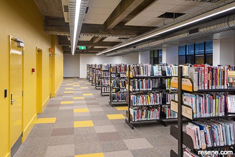
Some types of projects rely heavily on pre-acquired knowledge for wayfinding. For example, think about trying to locate a particular product in a supermarket that you’ve never visited before. There is often signage to assist in finding the correct aisle, but there is also some degree of pre-acquired knowledge needed. Even if you were in another country, where you didn’t understand the language on the signage, chances are it wouldn’t be too difficult to find what you were after. We can generally expect to find basics like fresh produce, bread, eggs and dairy along the perimeter of the shop’s floorplate, and we might be able to make educated guesses about other products being located in relation to certain ingredients on the inner aisles. In this situation, the prerequisite for knowledge might not be terribly problematic, but there are a whole host of other places and spaces where this would be unacceptable. Projects like hospitals and other medical facilities, shopping centres, libraries, transit developments like train stations, bus terminals and airports should all have sophisticated wayfinding systems in order to function at their best. But many other types of projects could – and should – do wayfinding better.
Dr Zena O'Connor is one of a handful of people whose PhD research investigated responses to colour in the built environment. A designer by training, Zena provides evidence-based independent research through her consulting business, Design Research Associates, where she shares insights, validation and colour strategies for design, the built environment, branding and advertising. Through her important work, Zena has helped to improve environmental visual literacy in healthcare and aged care projects as well as colour interventions in a number of urban and built environments.
Zena has discovered that many designers generally only take a structured approach to wayfinding on major projects – if at all – and it is frequently addressed too late in the design process. “I've found that wayfinding strategies and outcomes often appear to be less effective and perhaps devised as an afterthought. I feel that designers sometimes miss the mark, especially on large-scale residential and commercial complexes – and, more importantly, healthcare and aged care facilities. In these contexts, wayfinding strategies are often weak and poorly implemented. That is, the focus is often more on aesthetics than practical considerations and therefore there is a lack of visual indicators that attract attention and communicate effectively in a strong visual, non-verbal way so that they are useful for all age cohorts, cultural groups, etc. Wayfinding strategies need to be implemented so that they attract attention in a clear, unambiguous way, and designed so as to be quickly and easily perceived and understandable irrespective of age, visual capacity, cognitive capacity and language.”


Sometimes, designers make choices under the belief that they can and should design anything and everything to do with their project; that the knowledge of basic design principles and the ability to use graphic design software will get the job of wayfinding done. There is also a pervasive idea that if a building has been designed well, wayfinding simply takes care of itself. Others have the idea that when wayfinding works properly, users won’t even realise it – but this is much, much harder to accomplish than it might seem.
“Effective wayfinding strategies need to move beyond aesthetics and be formulated using evidence-based information which is underpinned by research into human visual perception and human-environment interaction studies. What may seem to be clever design can actually translate into ineffective design when implemented,” Zena says.
top tip Match printed graphic wayfinding elements like maps and other signage to your Resene paint colours by providing your graphic designer with a link to your chosen hue in the free online Resene Colour Library, where they will find the recommended colour values (RGB, CMYK, Hex, etc.) that are the nearest match. The nearest RGB value for most Resene colours can also be found on the back of its colour card or swatch. Use Resene A4 drawdown paint swatches (order from www.resene.com/drawdowns) to check for colour consistency in the finished product.
While every situation is different, engaging one or more experienced wayfinding consultants that bring an analytical understanding of human psychology and behaviour, colour psychology, the ability to anticipate user needs and goals, as well as evidence-based knowledge of best practices can be very helpful for many project typologies – but especially in healthcare, where poor wayfinding can impact people’s safety and wellbeing. It can be easy to overlook the diverse and differing needs of others when you are a healthy, able-bodied person, but no one’s health holds up forever. Our population is aging, and with cognitive diseases like dementia increasing at an alarming rate, designers need to pay close attention to ways projects can better accommodate these needs.
“One of the best approaches to effective wayfinding that I observed occurred at Auckland Hospital, where a team-based approach involved evaluation and assessment of wayfinding strategies by a range of different people with visual and physical challenges, dementia, varying age groups and other experiential differentiators,” says Zena. “Effective colour design is imperative in healthcare, aged care and dementia care for reasons beyond aesthetics. Colour design can be used to improve engagement and environmental visual literacy, which enhances orientation, wayfinding and the safe operation of daily activities.
“Older people also tend to experience declining visual capacity and this impacts their experience of the built environment, as the human visual system naturally undergoes changes as we age. Specifically, luminance (light-dark) contrast and colour sensitivity decline from middle age onwards. This is compounded by issues like macular degeneration and cataracts, which are often experienced by older people.
“Effective colour contrast plays an integral role in allowing people to easily differentiate contours, depth, shape and objects. In the context of built environments, it can make it possible to differentiate doors, fixtures, fittings and important design details – which is particularly important for those with visual and cognitive impairments. Where the tonal value and saturation level of different surfaces in a space are too similar, it can make it challenging to navigate the space as it will be difficult to distinguish where the floor meets the wall, pick out columns or obstructions and locate doors. And cognitive overload – such as too many competing patterns and fussy details within the field of vision – can result in the misinterpretation of design details and features.”
If a space is open to the public, no matter how large or small the project, you can pretty much bank on a base level of wayfinding being required: to help visitors find bathrooms and emergency exit routes. In buildings that have multiple dwellings, businesses or functions, you can count on a few others, too, such as signage on doors to number or mark what’s beyond them and in lobbies – particularly where there are lifts – to help guide people to the correct floor and suite.
As Zena explains, environmental visual literacy is defined as the ability to read and make sense of design cues that are embedded in the built environment in a meaningful way – which is dependent on functional visual perception and cognitive processing. These cues can be active, passive or a combination of the two. While they can sometimes be achieved through the design of the built form itself, things like sensory cues and signage are often much more effective.
“I have seen some great examples in airports overseas where effective visual wayfinding devices including coloured pathways/ signage and coloured landmarks are imperative to enable people to quickly and easily find their way. In such contexts, colourcoded pathways and coloured interior landmarks unambiguously distinguish pathways and delineate spaces, and this is mirrored in the use of colour in signage.”
top tip For visual cues on flooring, such as painted guide lines, directions or pathways, the right product to use depends on what your substrate is made of and where it is located. Always use Resene’s recommended floor coatings to maintain the safety of your floor, as using products only intended for vertical surfaces on horizontal surfaces can become slippery when wet and require more maintenance. Resene Non-Skid Deck & Path is designed for both interior and exterior walking surfaces for a non-grit slip resistant finish. Resene Walk-on is suitable for interior and exterior flooring also, with a less grit texture which can be enhanced with the addition of Resene SRG Grit. It’s recommended for light to medium-duty settings. For higher traffic areas inside, use Resene Uracryl.
Ideally, wayfinding should support all types of users, regardless of their different needs and goals within a given environment. “Colour is an ideal tool in wayfinding because humans are hard-wired to notice certain colours – such as red – as well as strong contrast (light-dark contrast, colour contrast, saturation contrast),” says Zena. “In addition, we tend to look for and ‘find’ patterns in our environment so the use of colour-coded pathways and similar strategies harnesses that tendency and can be used to guide people to specific destinations. Painted surfaces, wallpaper, coloured textured surfaces or cladding can also be easily and cost effectively installed and changed, if needed. In this context, paint is probably the most cost-effective method of implementing wayfinding strategies.”
Colour contrast plays an important role in visual perception, Zena adds. “When there is too much contrast, the visual information can be distracting – and this can become problematic depending on the situation and individual. Weak contrast, on the other hand, also impairs perception of the built environment as it can make it difficult for individuals to identify key design elements and cues. Bright or poor lighting and the reflectance of glare exacerbate these problems. Careful allocation of paint colours with low light reflectance values (LRV) can help mitigate glare reflectance issues.”
You may recall from past issues of BlackWhite magazine that LRV is expressed as a percentage, which can be found on the back of your Resene swatches and colour cards and in the online Resene Colour Library. Generally, whites and very light colours have a high LRV (close to 100%) while blacks and very dark colours have low LRV (close to 0%). Some project typologies have guidelines to help you determine how much of a difference in LRV percentage will result in adequate contrast. Paying attention to LRV contrast is also critical for signage visibility. For example, the Americans with Disabilities Act Accessibility Guidelines (ADAAG) recommend a contrast in LRV values between a sign’s text and background colours to be a difference of 70% or above.
Zena says that when she is devising colour schemes for her projects, she generally focuses more on the range and contrast of tonal values of paint colours (their lightness-darkness) than specific hues – which are often tied to existing material selections. However, she offered up a number of colour-related ideas that can be helpful.
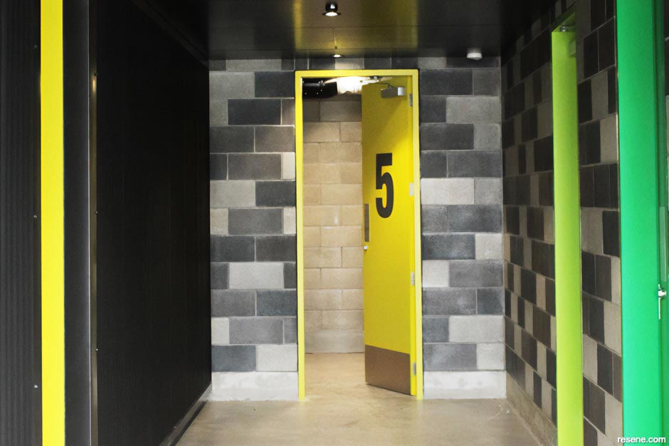
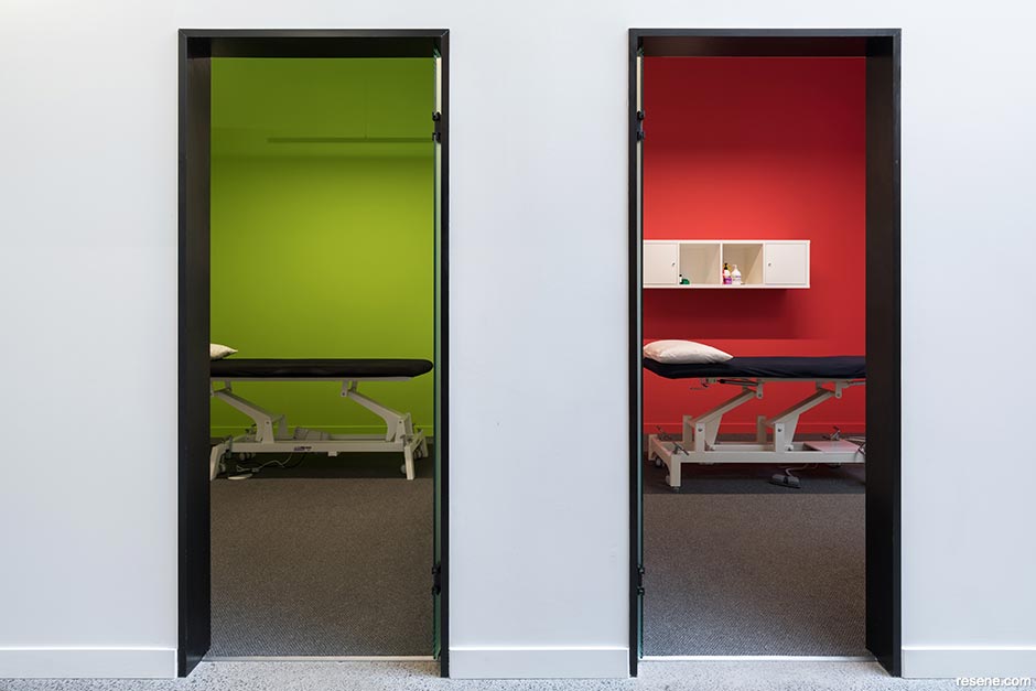
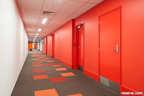
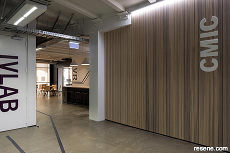
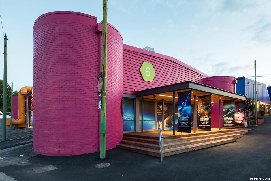
Warm colours: Research indicates that red and warm colours attract attention and draw people in. Referred to as the ‘hearth effect’, this colour strategy can be used to create landmarks and different interior zones. Adding a mural in warm Resene colours changes the impact of a bland hallway by attracting attention and drawing people towards it. A yellow wall can be welcoming and enticing, an orange door beckons people towards it and a red wall at the end of a hallway can attract attention and encourage people to approach it.
Warm/cool combinations: Use warm/cool Resene colour schemes to offset the impact of local climate. In cold climates, use warm colours in an entry area to counteract the impact of the external environment. Use cool colours throughout public spaces in buildings located in hot climates. This will make users of the built environment feel cooler and more comfortable.
Colour contrast, murals and feature walls: These support orientation and wayfinding strategies beyond regular signage. Pathways, districts, zones and landmarks can be created using variations in colour contrast as well as visual cues like murals.
Colour zoning/coding: Colour zoning is an ideal non-verbal way to create and identify different zones. Colour coding different levels in multi-level facilities provides relatively easy visual cues for users. Installing colour coding and large-scale signage at every key intersection throughout a building assists with orientation and wayfinding. Where possible, avoid using more than four distinct colour schemes because multiple colour schemes may become confusing and difficult to remember.
did you know? Resene has products that can be used to provide wayfinding and safety benefits at the same time, such as using Resene Non-Skid Deck & Path, or Resene Walk-on or Resene Uracryl 403 with a slip-resistant additive. These products can be used when incorporating directions, patterns and designs as part of your wayfinding solution for walking surfaces where there may be a higher risk of slipping on glossy, sloped or wet areas. Find out what product options will work best for your project by contacting your Resene Representative or ask a Resene Paint Expert.
Thanks to the versatility and affordability of Resene paints, virtually every surface in your project can be leveraged to improve your wayfinding and add visual environmental cues.
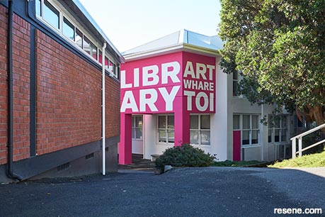
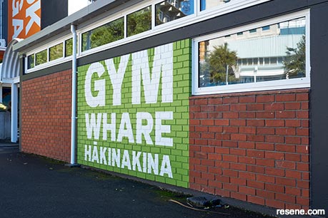
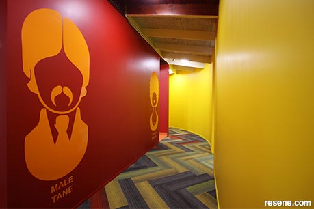
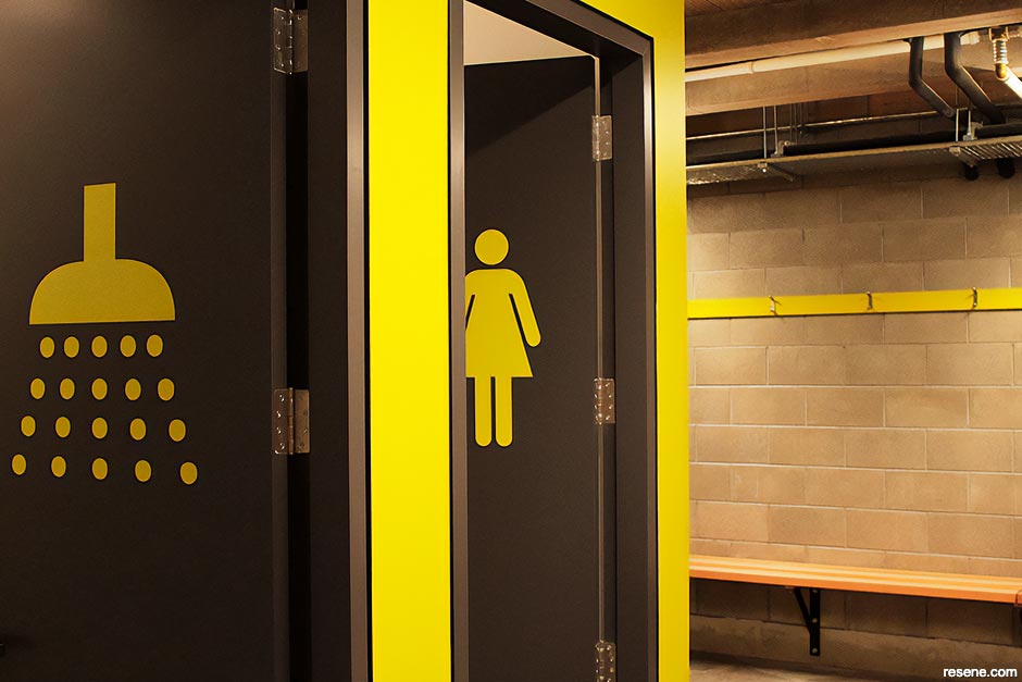
Iconography – which are the graphic symbols that appear on signage that we collectively associate with many aspects of life – can be painted on walls, doors, floors, ceilings and more both inside and outside by choosing the right Resene paint for each surface. The use of these symbols instead of relying on words alone can help improve navigation for those who can’t read the same language and those who haven’t yet learned to read at all, such as young children. Painted lettering can also offer a cost effective and easy-to-change solution to create signage that can be painted over or corrected, if needed. Painted guide lines or pathways added to walls or flooring can provide visual cues that are simple to follow when navigating confusing or expansive floorplans to keep foot traffic flowing. Colour coding is key to helping users make sense of getting around in some types of projects, and by choosing paint colours from the Resene Multifinish range, you can be positive that your hues will be consistent across your entire design – even when different formulas have been applied to a wide variety of different substrates. And as well as providing much needed navigational cues, colour can also add to the enjoyment of the space.
When subtle cues will meet the needs of your project, even painting guide lines, numbers or other designs in the same Resene colour but in a contrasting sheen level may be all you need. This same tactic can also be achieved by overcoating areas in a clear product such as Resene Concrete Clear gloss over walls that have been painted in Resene SpaceCote Flat, Resene SpaceCote Low Sheen or Resene Zylone Sheen, for example. This strategy has the added benefit of making the surface extra durable, which can be necessary for wayfinding components that might be regularly touched or rubbed up against.
› To learn more about Zena’s work through Design Research Associates, visit www.zenaoconnor.com.au.
Create clearly defined paths. Depending on the project, this can sometimes be accomplished with painted guide lines on walls or flooring.
Create regions of differing visual character, so different locations have unique identities.
Sometimes too much signage can be a bad thing. Don’t overwhelm with too many navigational choices. Communicate the right message at the right time, and never block the flow of traffic or important landmarks and destinations.
Incorporate painted murals to act as landmarks and provide orientation cues.
Use strong colour contrast between key design elements.
Minimise unnecessary visual clutter. Too many visual distractions, patterns and colour/contrasts hijack attention and add to cognitive load, thereby diminishing your design's effectiveness.
Consider the use of iconography to help those who can’t read or are unfamiliar with the local language.
This is a magazine created for the industry, by the industry and with the industry – and a publication like this is only possible because of New Zealand and Australia's remarkably talented and loyal Resene specifiers and users.
If you have a project finished in Resene paints, wood stains or coatings, whether it is strikingly colourful, beautifully tonal, a haven of natural stained and clear finishes, wonderfully unique or anything in between, we'd love to see it and have the opportunity to showcase it. Submit your projects online or email editor@blackwhitemag.com. You're welcome to share as many projects as you would like, whenever it suits. We look forward to seeing what you've been busy creating.
Earn CPD reading this magazine – If you're a specifier, earn ADNZ or NZRAB CPD points by reading BlackWhite magazine. Once you've read an issue request your CPD points via the CPD portal for ADNZ (for NZ architectural designers) or NZRAB (for NZ architects).
![]() Get inspired ! Subscribe
Get inspired ! Subscribe ![]() Get saving ! Apply for a DIY card
Get saving ! Apply for a DIY card
![]()
Can't find what you're looking for? Ask us!
Company profile | Terms | Privacy policy | Quality and environmental policy | Health and safety policy
Colours shown on this website are a representation only. Please refer to the actual paint or product sample. Resene colour charts, testpots and samples are available for ordering online. See measurements/conversions for more details on how electronic colour values are achieved.
What's new | Specifiers | Painters | DIYers | Artists | Kids | Sitemap | Home | TOP ⇧