From BlackWhite magazine - issue 06, gold standard
Two award-winning exhibitions reference precious taonga to build captivating Resene colour palettes.
MTG Hawke’s Bay Tai Ahuriri
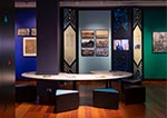
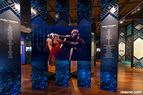
MTG Hawke’s Bay Tai Ahuriri is home to a stunning collection of the region's taonga and other treasures, which it uses to tell the stories of the Hawke’s Bay area and beyond. Locals often refer to it simply by its acronym, which stands for ‘Museum, Theatre and Gallery’, as the three-building campus houses all three. Over the last five years, MTG has been recognised with three Resene Total Colour Installation Awards for outstanding exhibition designs. The most recent of these awards acknowledged a jubilant presentation of Indigenous culture shared through objects and stories that were backed by a stunning jewel-tone palette of Resene paint colours, Kuru Taonga: Voices of Kahungunu.
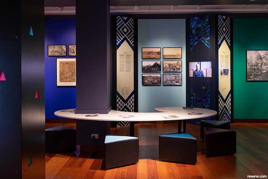
“Kuru Taonga: Voices of Kahungunu showed the history of people and places of Ngāti Kahungunu, telling stories of their time and the events that shaped Te Matau-a-Māui – the fish hook of Māui – into the region of Hawke’s Bay,” says James Price, MTG’s Exhibition and Facilities Coordinator. “Ngāti Kahungunu is geographically the second largest tribal rohe (territory) in the country extending from the Wharerātā Ranges in the Wairoa district to the Remutaka Range in South Wairarapa and has the third largest iwi population.
“Kahungunu the man established himself as a great diver and pāua gatherer, braving the waters of Te Māhia, regularly bringing back the bounties of the ocean and sharing it amongst the people of the tribe. In an outward display of his diving abilities, he would often rise to the surface of the water not only with his kete (basket) full of pāua but with extra pāua stuck to his body.”
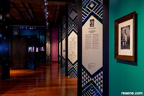
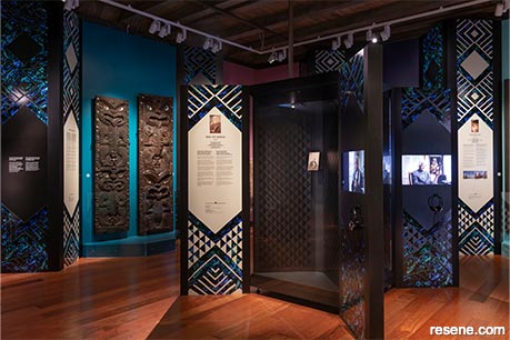
Through the exhibition’s design, James and his team aimed to create a uniquely Māori space to display objects and stories in a way that would resonate with the people of Ngāti Kahungunu. “A wharenui (meeting house), pāua and Te Ao Māori were researched and inform the design concept. Carved poupou and woven tukutuku panels found in a wharenui are referenced in the design. Walls are wrapped with triangular columns acting as poupou, alternating with artworks and objects creating intimate spaces, connecting objects and stories told through text and video interviews.”
To weave the stories and colours of the taonga (treasures) together, James found inspiration in the hues of the pāua shell. These glittering, pearlescent gifts of the sea are found in carved taonga on display and have been used behind artworks and objects, to create a uniquely Ngāti Kahungunu environment.
James explains, “pāua shell has great significance to the people of Kahungunu, who say ‘the pāua shell design and colour acknowledges us as people of the sea.’ The book Tangaroa’s Gift was also referenced in our research, which tells the story of how Pāua came to have his colours. Pāua wants to be beautiful like other sea creatures, so Tangaroa gifts him with colours from nature: ‘... the coolest blues from the ocean, the freshest greens of the forest, a tinge of violet from the dawn, a blush of pink from the sunset, and over all a shimmer of mother of pearl in the most intricate patterns...’”
An enchanting array of blues, greens, violets, pinks and silver Resene paint colours were used to adorn the gallery walls, echoing the swirling beauty that can be found inside a pāua shell, and Te Ao Māori themes were incorporated throughout. “The design included a wharenui that represented Te Ao Mārama (world of light). The roof represented Ranginui (sky) and the floor Papatūānuku (earth). The pou (posts) of the house represented those that Tāne used to separate earth and sky. These concepts and Māori narratives of creation, including the movement from Te Kore (nothingness) to Te Pō (darkness) to Te Ao (light), are intertwined in the design of a central triangular pou. A pou is an element that creates the space between Ranginui and Papatūānuku. It is a central anchor, the heart of the building conceptually, spatially and culturally, creating space around it radiating out from the centre. A triangular metal pou was designed and installed centrally in the space, connecting the floor to the ceiling. Internally lit, multiple triangular eyes with graduated pāua tones glowed and represented a living whakapapa. This central column acted as an anchor, distilling Te Ao Māori concepts through its design,” says James.
“The colours of pāua were central to achieving a uniquely Māori space that resonates with the people of Kahungunu. Many visitors instantly recognised the wharenui design and use of colours from the pāua shell and felt welcomed and at home in the space,” he adds.
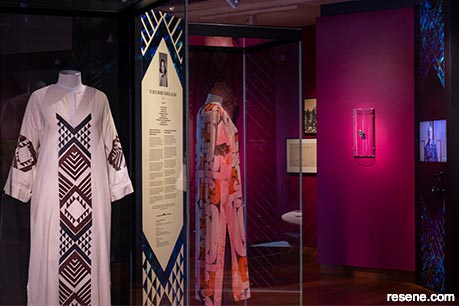
James says that one of the key challenges of the design was to ensure the colours selected were paired sympathetically with each object and artwork to create spaces that honoured the stories and objects displayed – without dominating them – yet stayed true to the colours found in pāua. “Over 100 different colours of Resene drawdown paint swatches were tested against pāua shell to get an initial selection, which then required more drawdown paint swatches to be ordered as the colours were refined and distilled down to the final ones we used. Pāua patterns and colours were also designed for the graphic panels, inspired from a Whetū Tirikātene-Sullivan dress echoing woven patterns of tukutuku panels. To achieve the shimmering qualities of pāua, substrates used for reflective traffic signs were experimented with to realise the desired effect.”
“We always specify Resene Zylone Sheen for the walls of our exhibitions, tinted to hues from the Resene Multi-finish range because of the flexibility offered by the extensive colour range. Resene Zylone Sheen’s unobtrusive low sheen finish and the low VOC and no added VOCs nature of its formula are ideal for enclosed spaces and around sensitive artworks and taonga. We also used a metallic finish, Resene FX Metallic Exponent, to create a silver section which provided some iridescent qualities – like that of a pāua shell – and for the pāua shaped table we used Resene FX Pearl Shimmer pearlescent finish, which sparkled under the exhibition lights,” James adds.
MTG is always free, and for the rest of the year, visitors can check out the DINZ Best Design Award-winning exhibition Waka Kōrero Māori, which encourages learning the Māori alphabet by pronouncing the names of the kaharehe (animal treasures) on display. Find out more about this and other exhibitions at www.mtghawkesbay.com.
Design: James Price, MTG Hawke’s Bay Tai Ahuriri
Build and painting: MTG Hawke’s Bay Tai Ahuriri Exhibitions & Facilities Team
Images: David Frost
Eromanga Natural History Museum
If there’s one thing visitors to the Eromanga Natural History Museum (ENHM) can’t miss, it’s Cooper. Cooper is a titanosaur sauropod – the largest known land-dwelling animal to ever walk the Australian continent. After his remains were discovered by 14-year-old Sandy Mackenzie while mustering on his family’s station, the Mackenzie family began searching the property and discovered a series of titanosaur fossil sites dated to 95-98 million years old, which represented a new genus and species of titanosaur. Active archaeological work is still conducted throughout the area and fossils are brought to the ENHM for processing, research and presentation.
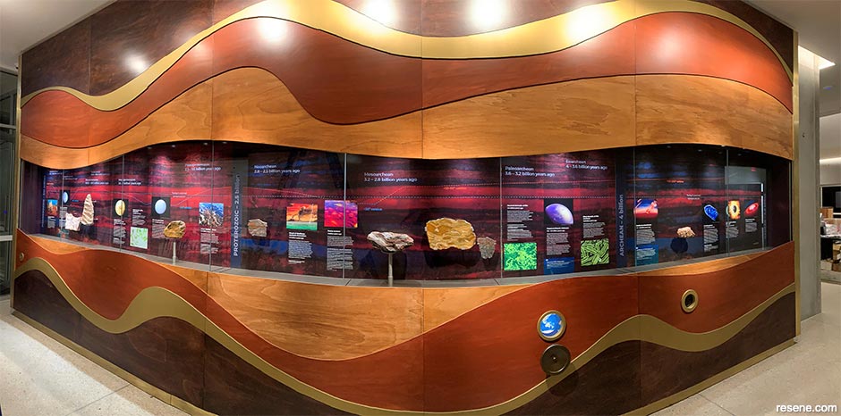
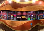
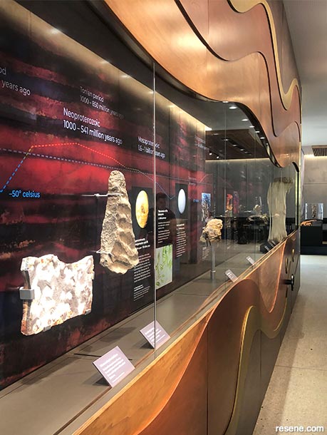
Thylacine Design worked closely with ENHM’s General Manager Robyn Mackenzie to create Stardust to Supercontinents, a deep time geological display that situates Cooper with the collection of ENHM. Senior Designer Ceci Wilkinson says the exhibit begins with the fiery formation of the earth, the Hadean period (4.6 billion years ago), before continuing through the Archean, Proterozoic and to the Phanerozoic period (541 million years ago), when early multicellular lifeforms first began to appear. Rare and beautiful rock specimens from the ENHM collection record these events and are displayed within the integrated 8.4m long showcase. A children’s path along the timeline provides interactive peepholes where younger visitors can catch glimpses of enormous events such as supercontinental drift, minute early multicellular lifeforms and magnified zircon crystals, which are used to date archaeological sites.
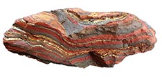
“Key specimens were selected to represent different epochs in the development of the earth along with interpretive graphics and interesting data points. The layered wood panelling of the display was inspired by the museum’s banded tiger iron specimen from the Ord Ranges in Western Australia. The stone’s striking pattern consists of alternating layers of golden tiger eye, silver metallic hematite and red, brown or black jaspilite and is reflected in the banded colours of the layered joinery. Resene Colorwood wood stains gave a distinct but controllable range of colours to the timber without losing the textural quality of the underlying plywood grain,” explains Ceci.
“The stained ply colours of the built form are derived from the burnt umbers and iron oxide red found in the banded tiger iron specimen. The colours are descriptors for this period of the formation of the earth dated 3 billion years ago, when the oceans of the earth were iron rich and rusty red. Incredibly, our wonderful fabrication team built the display joinery, object mounts and children’s interactive elements and drove a 44-hour round trip from Canberra to install it on site.”
The design team selected a trio of Resene Colorwood wood stains to create the striking effect: Resene Colorwood Deep Oak, Resene Colorwood Meranti and Resene Colorwood Walnut. Ceci says she liked the way these hues accentuated the inherent colours of the timber and left the natural wood’s grain on display. “Maintaining an organic textured look was particularly important and the colours chosen mimic genuine timber tones. The form, materials and colour palette were inspired by the colour variation of the rock specimens we referenced. Using a stain simplified the specification and Resene Colorwood produced reliable and accurate control of the finished colour.”
The exquisitely crafted stained forms of Stardust to Supercontinents caught the eye of the Resene Total Colour Awards judges, who awarded it a Resene Total Colour Installation Colour Maestro Award. "Timber has an agenda all its own, and this project pays the material homage with layer upon layer presented in a carefully chosen palette of wood stain hues inspired by a key specimen,” they said in their comments. “The inspiration is brilliantly realised in the exhibition to draw your eye into the exhibits. It's a rare treat to see timber used so creatively to set the scene."
Located in the heart of Australia, a trip to Eromanga Natural History Museum is a journey worth taking. Visit www.enhm.com.au to find out more about the museum, what’s on, how to get there and where you can stay on site.
Design: Thylacine Design
Build: Bryan Walsh, Matt Smith, Oscar Senden
This is a magazine created for the industry, by the industry and with the industry – and a publication like this is only possible because of New Zealand and Australia's remarkably talented and loyal Resene specifiers and users.
If you have a project finished in Resene paints, wood stains or coatings, whether it is strikingly colourful, beautifully tonal, a haven of natural stained and clear finishes, wonderfully unique or anything in between, we'd love to see it and have the opportunity to showcase it. Submit your projects online or email editor@blackwhitemag.com. You're welcome to share as many projects as you would like, whenever it suits. We look forward to seeing what you've been busy creating.
Earn CPD reading this magazine – If you're a specifier, earn ADNZ or NZRAB CPD points by reading BlackWhite magazine. Once you've read an issue request your CPD points via the CPD portal for ADNZ (for NZ architectural designers) or NZRAB (for NZ architects).
![]() Get inspired ! Subscribe
Get inspired ! Subscribe ![]() Get saving ! Apply for a DIY card
Get saving ! Apply for a DIY card
![]()
Can't find what you're looking for? Ask us!
Company profile | Terms | Privacy policy | Quality and environmental policy | Health and safety policy
Colours shown on this website are a representation only. Please refer to the actual paint or product sample. Resene colour charts, testpots and samples are available for ordering online. See measurements/conversions for more details on how electronic colour values are achieved.
What's new | Specifiers | Painters | DIYers | Artists | Kids | Sitemap | Home | TOP ⇧