From BlackWhite magazine - issue 06, red alerts
Times are changing, and so is the pace of our colour trend cycles.
They say that the more trips you take around the sun, the faster that time appears to pass. But since the return to ‘the new normal’, we’re pretty sure time feels like it’s passing at breakneck speed for everyone. After a couple of relatively stagnant years where most of us were stuck at home more than we might have liked, popular culture seems to have also put its foot on the gas to make up for lost time.
As the popularity of red rises, deep wine and brick reds will be the first to ascend to prominence – followed by brighter, bold versions.
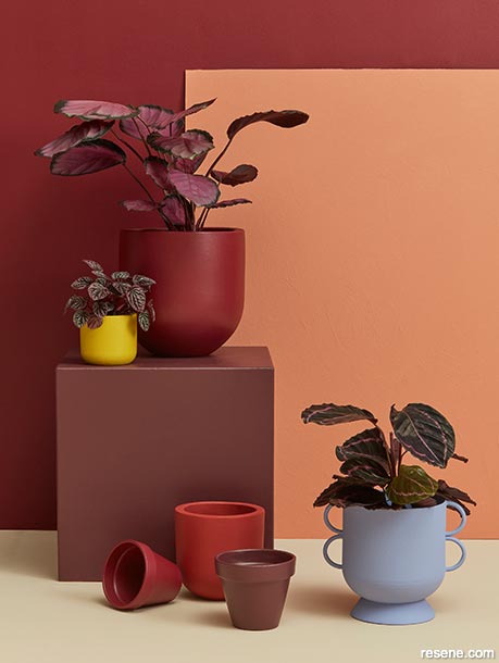
Try reds like Resene Incarnadine, Resene Pandemonium and Resene Arriba with papaya pinks, acidic yellow-greens and periwinkle blues like Resene Dawn Glow, Resene Funk and Resene Heliotrope. Back wall painted in Resene Incarnadine, board in Resene Sandtex Mediterranean effect in Resene Dawn Glow, plinth in Resene Pandemonium, floor in Resene Athena and plant pots in (clockwise from top) Resene Incarnadine, Resene Heliotrope, Resene Pandemonium, Resene Arriba, Resene Incarnadine and Resene Funk.
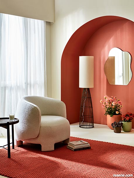
For those ready to embrace the arrival of red, using brick tones like Resene Savour and Resene Soiree to highlight key architectural features and a few small accessories adds punchy impact in an otherwise neutral space.
Arched niche and large plant pot painted in Resene Soiree, other walls and floor in Resene Meringue, medium pot in Resene Field Day and small pot and lamp base in Resene Allspice. Chair and rug from Ligne Roset, side table from Good Form, mirror from Mocka, books and candle from Father Rabbit.
Prior to the pandemic, we were accustomed to seeing drizzles and snippets of new trends peter through amidst more stable trends that would stick around for years at a time. Changes happened fluidly, where you could see the natural progression of hues warming, cooling or changing character across the course of many months. But today, new colour crazes are emerging faster than ever before – accelerating cycles that were previously so reliable, you could practically set your watch to them.
To better understand the context for why things are unfolding this way, it’s helpful to look back in history. Colour trends, of course, don’t exist in a vacuum; they’re always in response to what’s happening around us. Times of recession or conflict have often been marked by austerity, with the late 1960s through the 70s being one of a few notable exceptions. While it was a period with plenty of clashes and turmoil, it was also a time where freedom and individuality were celebrated. So it is, in a way, unsurprising that some of the colour trends, shapes and patterns that were popular in those decades are resonating and being referenced today as we look to breakout from things that were holding us back (lockdowns) and show the world what makes us unique (reflected in what we wear and how we decorate the spaces we live, work and play in).

As we collectively look to get out of the stagnant funk that was brought about by the arrival of the pandemic, optimistic hues like Resene Dawn Glow, Resene Funk and Resene Heliotrope are emblematic of making a fresh start.
Background in Resene Sandtex Mediterranean effect in Resene Dawn Glow, oblong tray and large bowl in Resene Athena, plate in Resene Pandemonium, small bowl in Resene Incarnadine and vases in (clockwise from top) Resene Heliotrope, Resene Funk, Resene Arriba and Resene Solitaire.
One of the most prominent emerging trends is red, a hue that’s poised to become an important colour in architectural and interior design over the months and years ahead.
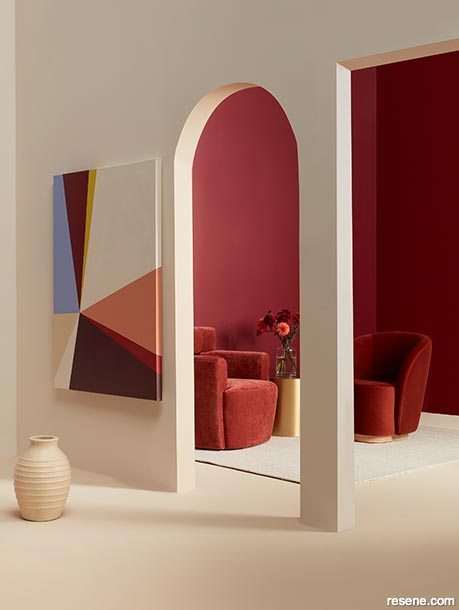
Front wall painted in Resene Solitaire, doorways and floor in Resene Athena, back walls in Resene Incarnadine, vase in Resene Athena and artwork in (clockwise from top left) Resene Heliotrope, Resene Incarnadine, Resene Funk, Resene Solitaire, Resene Dawn Glow, Resene Arriba, Resene Pandemonium, Resene Solitaire and Resene Athena. Chairs and side table from Soren Liv, rug from Baya, glass vase and flowers from Urban Flowers.
Some of the parallels we’re currently seeing to the 60s and 70s are very literal. Along with the return of bellbottoms, chunky platform heels and groovy, graphic motifs comes an explosion of fearless hues that are ready to shake things up. But there are some marked differences, too. Rather than a single hero hue defining a furniture or fashion collection, we’re seeing vibrant hues from across the spectrum being used together to create palettes bursting with energy and originality. For those embarking on a new project, fortune favours the bold with a veritable feast of highly chromatic colour options ready for you to translate them into a truly unique space.
While no one will be able to deny the presence and popularity of the bold and bright hues that will be affecting the design world over the coming months, rest assured that there are also plenty of softer and subtler tints, pastels and neutrals in the forecast, too. Here’s a rundown of all the Resene colours that will be most relevant over the coming six to 18 months.
You need nothing more than a quick glance to the world of fashion to wise up to the fact that red is primed and ready for a major takeover in the interior decorating and architectural design spheres. Brick reds like Resene Pioneer Red, Resene Thunderbird, Resene Arriba, Resene Soiree and Resene Savour have been fixtures in our colour forecasts for the past two years. While they will continue to be relevant, they are about to be joined by a tidal wave of fresh rouge tones, including truer poppy reds like Resene Roadster, deeper wine-like and carmine tones such as Resene Incarnadine and Resene Rudolph and even blue-edged raspberry reds like Resene Very Berry.
Although taking a trend-forward colour drenching approach with such robust tones is likely only going to appeal to braver clients, the coming renaissance of reds can present an interesting opportunity for food service and hospitality projects. Along with its fiery, passionate and toasty qualities, the psychological impact of red in increasing appetites has been widely studied – an effect that will likely appeal to many a struggling restauranteur.


Perhaps the most prominent colour family of the past decade, the greens that nursed us through a number of difficult years when we needed a strong connection to nature in order to feel grounded are stepping aside to allow other parts of the spectrum to have more space at the table. However, that doesn’t mean that greens are completely dropping off the radar.
Generally speaking, light and mid-range greens have warmed considerably over the past months and have been rapidly shedding their greyed and browned undertones. Now, top choices that were popular throughout the pandemic like sage, olive and nettle are evolving into more verdant, grassy and acidic varieties like parsley, gingko and chartreuse such as Resene Japanese Laurel, Resene Boundless, Resene Funk and Resene Illuminate. There is nothing shy about these statement hues, which are better saved for select details and are unlikely to grace more than a single wall or ceiling. For spaces that demand more delicate tones, you can rely on subtly warm greens like Resene Transcend, Resene White Noise and Resene Infused. And in spaces where depth is needed, continue to look to bushy, back-country options like Resene Off The Grid, Resene Seaweed and Resene Rolling Hills, which have held fast to their relevance.


Although pinks aren’t as popular today as they were a few years ago, lipstick, papaya and petal pinks like Resene Drop Dead Gorgeous, Resene Tropical, Resene Dawn Glow, Resene Valentine and Resene Inspire will continue to be used by those who want to harness the power of this hue’s positivity. Looking further ahead in the long-range forecast, softer pinks will begin to fall off in favour of mauver and purplier tones like Resene Soul Searcher, Resene Tenor and Resene Petal – which is worth noting if your project has a longer lead time before occupancy.
Although purple is often considered a polarising colour in decorating, the recent rise in the popularity of lavender and periwinkle tones is due to a shift in perception. Where purples were once symbolic of royalty (and all the stuffiness that entails), colours like Resene Heliotrope, Resene Perano and Resene Portage are seen today as futuristic and optimistic symbols tied to Gen Z and the fast-moving digital age. They’re joined in the trend forecast with deep plum and aubergine tones like Resene Black Doris, Resene Staccato and Resene Blackberry, which can serve as interesting alternatives to dark blues in a warm palette. Because these colours don’t commonly surface in the trend cycle, using them today feels fresh and contemporary.
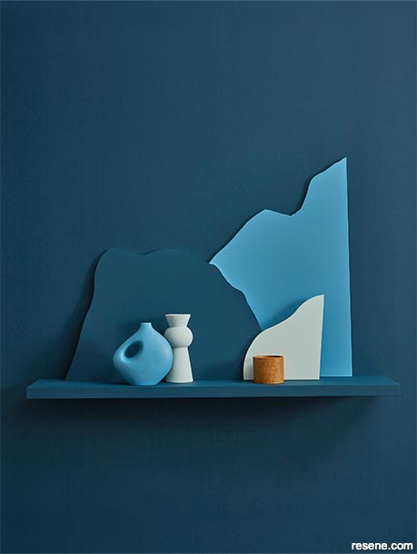
It’s pretty fair to say that blue paint colours never really fall out of popularity – especially in our part of the world, because of how well they sit with our naturally blue-tinged light, the expansive sky and surrounding seas – but there are times when blue becomes even more popular than usual. This is one of those times.
In addition to perennially popular choices that are also currently trending, such as Resene Duck Egg Blue and other dusty and grey-edged favourites like Resene Timeless, Resene Comfortably Numb and Resene Carpe Noctem, many of today’s top blues are taking on yellow and green undertones. While there are plenty of green blues like Resene Unite and Resene Morning Haze around at the moment, it’s yellower blues such as Resene Epic, Resene Island Time, Resene Now Or Never, Resene Lakeside and Resene Upside that will be coming to the forefront in the months ahead. Vibrant ultramarine blues like Resene Aviator and Resene Wet N Wild continue to be wildly popular statement colours, where even just a little will go an awfully long way in defining a space.
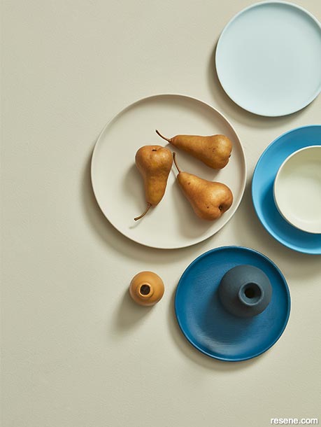
Complex beige tones like Resene Foundation are replacing grey as the preferred neutral.
Background painted in Resene Foundation, plates in (clockwise from top) Resene Timeless, Resene Island Time, Resene Epic and Resene Foundation, bowl in Resene Creme De La Creme, large vase in Resene Carpe Noctem and small vase in Resene Salted Caramel.
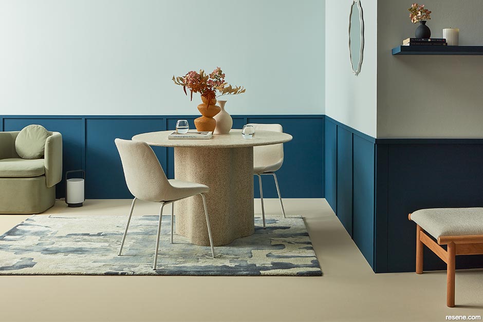
The colour trend forecast is full of bold statement hues, including eye-catching yellow-based blues like Resene Island Time – which can be an easier sell for clients wary of making vibrant colour choices.
Wall and shelf in Resene Epic, shapes in (from tallest to shortest) Resene Island Time, Resene Epic and Resene Timeless, vases in Resene Island Time (left) and Resene Timeless (right) and votive holder in Resene Salted Caramel.


Like purple, yellow can be a tough sell for some. Not only does personal preference come into play, but this hue carries a lot of significance for certain cultures – with both positive and negative connotations. When we see it emerge as a colour trend, uptake also varies greatly by region.
In decorating, yellow paint colours are hugely affected by both natural and artificial lighting circumstances. You may be aware that certain yellows can look sad in spaces without many windows, but in a room with lots of windows, how your yellow looks can also depend not only on the direction and visual temperature of the light coming in, but also on the surrounding environment that those windows frame. If the space looks out to tussock-covered hills, yellows will complement them beautifully. But if the view is of a concrete jungle, yellow might not be the top choice. On exteriors, however, bright yellow continues to be a very popular option for doors and window details as a way of bringing character to otherwise black façades.
For those keen on the colour, the forecast for yellow is looking sunny overall thanks to the hue’s current prevalence in fashion. Our mid-to longrange outlook sees today’s popular pastel yellows become bolder, more acidic and more golden or orange-tinged. Look to Resene Sunbeam, Resene Liquid Gold, Resene Light Fantastic and Resene See The Light for vibrant statement options. Try Resene Amaranth, Resene Athena and Resene Creme De La Creme for less overtly yellow-toned options. Or go for Resene Salted Caramel and Resene Kombucha if you want to get ahead of the trends and bring a bit of orange to your project.


At the beginning of the year, a number of trend influencers came out and overtly stated what’s been written on the wall for a while now: grey is out. It’s a hard pill to swallow for many designers who have come to love using grey in their work, but it’s a welcome change for others who have grown tired of seeing so much of it.
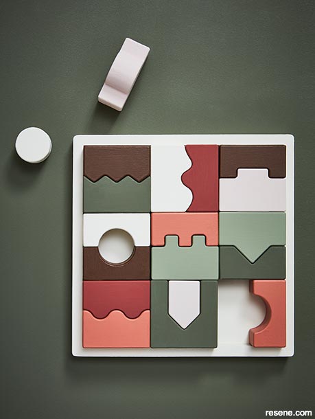
Greens with yellowed undertones are replacing cooler varieties, which also sit better with other popular colour trends as the visual temperature of colours heats up across the spectrum.
Background painted in Resene Off The Grid, tray in Resene Meringue and wooden shapes in Resene Contented, Resene Meringue, Resene Allspice, Resene Off The Grid, Resene Soiree, Resene Field Day and Resene Savour.
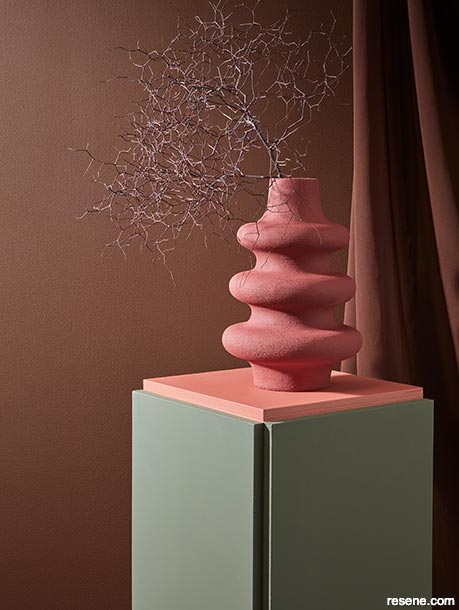
When designing dramatic or cocooning spaces, deep spicy brown tones make a warm and inviting on-trend alternative to greys, which are falling out of favour.
Wall painted in Resene Allspice, plinth base in Resene Field Day, plinth top in Resene Soiree and vase in Resene Savour. Projects by Amber Armitage, images by Wendy Fenwick.
Though it may no longer be trending, a classic colour like grey will never fall out of use completely. Preferred neutrals typically fluctuate between warm and cool for periods of about a decade or longer – something we discuss in more depth in "Neutral ground". Given that warmer neutrals will be in vogue for a while yet, if you do need to use a grey in your design, we recommend relying on warmer versions like Resene Hindsight, Resene Stepping Stone, Resene Credence and Resene Epitome as these hues blend well with other popular toasty neutrals like beiges, browns and taupe such as Resene Tua Tua, Resene Foundation, Resene Kia Kaha, Resene Rebel, Resene Dark Chocolate, Resene Courtyard and Resene Otter.
Savvy designers are also no longer taking a one-and-done approach to choosing neutral paint colours for their projects. We’re seeing not only more different strengths of some neutrals being used together within one palette, but also multiple different neutral colour cards being combined together for a variegated tonal effect. For example, instead of using your favourite Resene white, such as Resene Alabaster, on every surface of your project, or using three different strengths of Resene Sea Fog to differentiate the walls, trims and ceiling, try building your palette with multiple neutrals from two or three different colour cards from the Resene Whites & Neutrals collection. Or, leverage the curated selection of on-trend neutrals within the Resene The Range fashion colours collection and layer a number of them together. This strategy results in a richer, more complex look that sets the pros apart from the amateurs.
If you’ve ever gone to a salon to have your hair dyed blonde, you’ll probably have a more thorough understanding of this concept and the benefits of using a range of character neutrals together in a single colour palette. Sure, you can go and pick-up some blonde hair dye at the chemist and take a DIY approach at home – but you’re going to end up with a flat colour and what’s commonly known a ‘bottle blonde’ look. But at a salon, a professional colourist gets you that ‘million-dollar blonde’ look by using five or even ten different coloured dyes throughout your mane to create that richness and complexity that we see on Hollywood stars.
Whatever Resene colours you and your client decide are the right choice for your project, we always love to see what you’ve created. Send some photos to editor@blackwhitemag.com for a chance to be featured in upcoming issues of BlackWhite magazine or on our website. For the latest on evolving colour trends and to get alerted to new trends as they emerge, keep an eye out for monthly BlackWhite e-newsletters or visit www.blackwhitemag.com for monthly updates. If you’re not currently receiving BlackWhite e-newsletters, sign up for free at www.resene.com/enews.


This is a magazine created for the industry, by the industry and with the industry – and a publication like this is only possible because of New Zealand and Australia's remarkably talented and loyal Resene specifiers and users.
If you have a project finished in Resene paints, wood stains or coatings, whether it is strikingly colourful, beautifully tonal, a haven of natural stained and clear finishes, wonderfully unique or anything in between, we'd love to see it and have the opportunity to showcase it. Submit your projects online or email editor@blackwhitemag.com. You're welcome to share as many projects as you would like, whenever it suits. We look forward to seeing what you've been busy creating.
Earn CPD reading this magazine – If you're a specifier, earn ADNZ or NZRAB CPD points by reading BlackWhite magazine. Once you've read an issue request your CPD points via the CPD portal for ADNZ (for NZ architectural designers) or NZRAB (for NZ architects).
![]() Get inspired ! Subscribe
Get inspired ! Subscribe ![]() Get saving ! Apply for a DIY card
Get saving ! Apply for a DIY card
![]()
Can't find what you're looking for? Ask us!
Company profile | Terms | Privacy policy | Quality and environmental policy | Health and safety policy
Colours shown on this website are a representation only. Please refer to the actual paint or product sample. Resene colour charts, testpots and samples are available for ordering online. See measurements/conversions for more details on how electronic colour values are achieved.
What's new | Specifiers | Painters | DIYers | Artists | Kids | Sitemap | Home | TOP ⇧