From BlackWhite magazine - issue 05, spectrum science
What causes glare and how to keep it from adversely affecting your projects.

Avoiding discomfort glare and disability glare
Glare is something you literally know when you see it, but that doesn’t mean everyone knows what causes it or how to avoid it. In simple terms, glare is the difficulty of seeing in the presence of bright light. But in more technical terms, it’s a visual sensation caused by a significant ratio of luminance between the surface that is being looked at and the source of the glare, such as direct or reflected sunlight or artificial light. The angle between the task and the glare source and the way your eyes adapt to changes in light have significant impacts on the way glare is experienced, but the specific paint colours and finishes you and your clients choose to use for the inside and outside of your projects can also be a factor.
Luminance is the light that we actually see, and its brightness can be measured both as the light leaving a lamp or the light reflecting from an object’s surface. It is expressed in either candelas per square metre (metric) or footlamberts (in the English system).
Designers may choose to manipulate luminance in their projects to produce a sense of drama or highlight sparkling elements in a space, but it’s also necessary for practical purposes like working, reading and cooking – typically referred to as ‘tasks’. Tasks with too little brightness make it hard to see as there is less visible contrast between the task and what surrounds it. But too much brightness can produce levels of glare that either impair or prevent a desired task being performed.
Glare is generally divided into two types: discomfort glare and disability glare.
Direct glare comes straight from the light source. Reflected glare shows up on the task itself, such as a computer screen. Discomfort glare is a psychological sensation that does not necessarily impair your vision; but as the name suggests, it is uncomfortable. In buildings, discomfort glare can originate from small artificial lights, such as ceiling fixtures, which are significantly brighter than their surroundings.
Disability glare, on the other hand, prevents vision but might not cause discomfort. An example is holding a glossy magazine at an angle that reflects a light source back towards your eyes; a veiling reflection results, impairing your ability to read the page. Disability glare is often caused by the inter-reflection of light within the eyeball, reducing the contrast between task and glare source to the point where the task can’t be distinguished. This could arise when driving westward at sunset, for instance. But it can also happen when observers aren’t looking directly at a bright illuminated source, like when they are focusing on a visual task such as a computer screen, where the bright source is within the viewer’s peripheral vision.
When glare is so intense that vision is completely impaired, it is sometimes referred to as ‘dazzle’.
top tip If you find a surface has too much glare once the project is finished, you can reduce the glare by applying a topcoat in a lower sheen clear finish, such as Resene Concrete Clear Flat, to reduce the gloss and reflection of the surface.
The last thing anyone wants after putting their heart and soul into a project is for it to be painful to look at – or worse, dangerous. But luckily, glare can be avoided by incorporating some simple considerations into your general design and specification practices.

You may recall learning from a previous issue of BlackWhite magazine about Light Reflective Values (LRV). An LRV refers to the percentage of light that a paint colour reflects and is measured on a scale from 0% (which would be a pure black that doesn’t reflect any light) to 100% (which would be a pure white that reflects all light). For easy reference, you can find a colour’s LRV on the back of each Resene colour swatch and on Resene’s online swatch library. If a paint colour has an LRV above 50%, it is reflecting more light back than it is absorbing. So understandably, if a paint colour is reflecting more light, it can cause more glare than a colour that reflects less light.
Of course, an understanding of LRV will only get you so far because glare is dependent on other factors. Since it’s light that really causes glare rather than a particular paint colour, the sources of light, how bright they are and how direct they are need to be taken into account. That’s why it’s so important to view your colour swatches in situ whenever possible – and for your lighting design to be finalised – so that you can see firsthand how the colours will be affected before you or your client sign off on the selection. It’s also strongly recommended to view larger samples such as Resene A4 drawdown paint swatches, which can be ordered online or by brushing out a Resene testpot. From there, you can reduce glare by choosing a darker colour, a lower sheen and by adjusting your lighting.
Paint colours also reflect light in different two ways, specularly (or mirror-like) and diffusely, which is why the finish you choose also affects glare. A black paint in a high gloss finish can reflect significant amounts of light but you have to be opposite the light source in order to perceive it. Conversely, a flat white paint also reflects a great deal of light, but it does so diffusely. Textured surfaces also help diffuse light – even if they’re glossy – as the different facets cause light to bounce off in different directions rather than directly back to the observer’s eye. Glare can be reduced by choosing a lower sheen or more textured finish, or both.
Did you know? Older people are usually more sensitive to glare due to the aging characteristics of the eye. Keep this in mind when specifying for community centres, libraries, aged care, healthcare facilities, retail and other projects where elders may be present as you may need to adjust your colour and finish selections to better suit users.
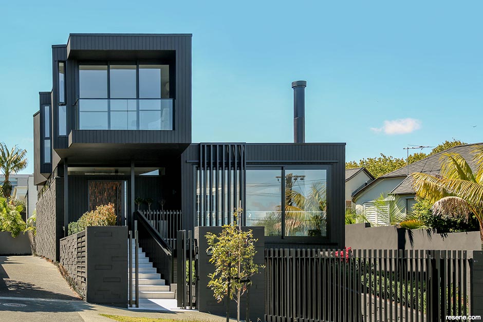
As a rule of thumb, it’s best to choose colours for building exteriors that have a lower LRV if you want to avoid glare. Firstly, there are a number of factors outdoors that are beyond your control, such as the brightness and ever-changing angle of the sun and the colours of your building’s surroundings. Not only will whites and bright colours with high LRVs reflect more sunlight back at the observer, but these hues almost always contrast sharply with their surroundings – which in some ways exacerbates glare.

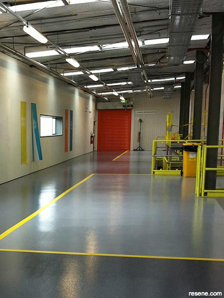
The principles of glare can be leveraged to increase the safety of your project, such as painting contrasting colours and safety lines on to flooring so that pedestrians can navigate around hazards. To create a contrast effect, try painting flooring in Resene Avalanche and Resene Delta and add safety stripes in Resene Uracryl 403 tinted to Resene Turbo.
Many councils understand this and have in turn set maximum LRVs guiding what colours you can use on the outside of buildings to make sure exteriors fit suitably into their surroundings and don’t create unnecessary glare. Often, this is below 50%. However, many suppliers of building systems and supplies require specified coating colours to have an LRV of no less than 40% as darker paint colours absorb more of the sun’s energy than lighter hues, and the heat from this energy can be so intense that it damages the substrate. In these circumstances, Resene CoolColours can be important for balancing the need to camouflage and reduce glare with the requirements of your building material. Resene CoolColours look the same as normal Resene colours, but thanks to special pigment technology, they reflect more heat so that the surface and substrate don’t get as hot as a normal colour would. They are created by replacing the standard carbon black pigment that absorbs heat and light with a unique pigment that enables much of the infrared portion of the sun’s energy to be reflected.
Of course, choosing a lower sheen formula or textured finish for exterior surfaces can also help to further reduce glare. Low sheen and matte options suitable for exterior applications include: Resene Lumbersider Low Sheen waterborne paint, Resene Lumbersider Matt waterborne paint, Resene X-200 weathertight membrane, Resene Walk-on flooring and paving paint, Resene AquaShield mineral effect, Resene Non-Skid Deck & Path and Resene Waterborne Woodsman wood stain – all of which can have Resene CoolColours tinted into them. Resene Construction Systems also offers a wide range of textured exterior cladding systems. Speak with your Resene representative to learn more about the choices that will best suit your project or find out more about these products at www.resene.com/products and www.reseneconstruction.co.nz.
When designing buildings, be sure to take care with surfaces that will be angled towards the sun, as these can be high risk for causing glare issues for neighbouring buildings and to passing drivers.
When it comes to avoiding glare through your interior specifications, you’ll typically have far more control. In addition to being able to choose your Resene paint colour, sheen and surface texture or Resene wallpaper, you can also generally manipulate the angle that light hits your painted surfaces – something that is much harder to control outdoors. Softer, more diffused lighting options such as upwardfacing lights can provide adequate ambient lighting while reducing glare from walls and the light sources themselves. You can also avoid reflective tiles and glass, incorporate blinds, shades or curtains on windows so that users can control the amount or transmittance angle of sunlight entering the space, add diffusing media or shades to light fixtures, add dimmer switches and provide adjustable task lighting to give occupants the ability to reduce glare if it does occur.
top tip Check out the Resene Curtain Collection for a range of fabrics designed to work with popular Resene colours. Selections include solids, stripes and patterns designed to complement a wide range of colour schemes and décor styles.
There are certain instances where the principles of glare can be useful and even enhance the user experience and safety of your project. For example, painting a white or reflective edge on to dark stairs or painting safety lines on to the flooring of a warehouse for pedestrians to follow can help people avoid hazards and dangerous equipment. In these cases, glare and contrast draw the viewer’s attention and make detriments to their safety easier to see.
top tip For residential and light commercial uses, Resene Walk-on flooring and paving paint and Resene Non-Skid Deck and Path are ideal for highlighting edges of stairs and decking to increase safety. Use two coats of Resene Uracyl 403 for yellow and white industrial line markings and safety stripes.
Design and image: Studio2 Architecture.
Build by BigSky Build.
This is a magazine created for the industry, by the industry and with the industry – and a publication like this is only possible because of New Zealand and Australia's remarkably talented and loyal Resene specifiers and users.
If you have a project finished in Resene paints, wood stains or coatings, whether it is strikingly colourful, beautifully tonal, a haven of natural stained and clear finishes, wonderfully unique or anything in between, we'd love to see it and have the opportunity to showcase it. Submit your projects online or email editor@blackwhitemag.com. You're welcome to share as many projects as you would like, whenever it suits. We look forward to seeing what you've been busy creating.
Earn CPD reading this magazine – If you're a specifier, earn ADNZ or NZRAB CPD points by reading BlackWhite magazine. Once you've read an issue request your CPD points via the CPD portal for ADNZ (for NZ architectural designers) or NZRAB (for NZ architects).