From BlackWhite magazine - issue 07, gold standard
Bespoke colours steeped in geographic and cultural significance bring mana to Ngāti Whātua Ōrākei Trust’s new home.
There is a lot to love about the newly completed space that Ngāti Whātua Ōrākei calls home.
Since the 17th century, Ngāti Whātua have called Tāmaki Makaurau (Auckland) home. Today, the collective affairs of more than 7000 registered hapū (sub-tribe) members throughout New Zealand and beyond are looked after by the Ngāti Whātua Ōrākei Trust. Every member of Ngāti Whātua Ōrākei can trace their whakapapa (genealogy) to a shared ancestor, Tuperiri, and are descended from the three hapū: Ngā Oho, Te Taoū, me Te Uringutu. Together, they are collectively referred to as Ngāti Whātua Ōrākei and their celebrated lineage and legacy has enabled a strong connection to their stunning traditional lands – and one another.
Given what a large whanau (family) they take care of, it’s understandable that Ngāti Whātua Ōrākei Trust and its commercial subsidiary, Whai Rawa, need a functional and agile workplace where they can perform their integral role. And, as with any other family, they needed their home to be designed in a way that would be reflective of the needs and values of those it belongs to. Previously, Ngāti Whātua Ōrākei's operations were located across two separate locations and lacked a sense of place, creating a disconnect between the two entities and the important work they needed to accomplish. After some investigation, the organisations found a suitable tenancy where they could both be housed within its walls. Since the space was essentially a blank canvas, they engaged the design team at STACK – who has an extensive history of creating outstanding commercial office spaces – to help their vision take shape.
“The brief was to accommodate the needs of our two entities where we could collaborate, connect with each other and our partners, and reflects the iwi and its history,” says Lisa Davis, Chief Executive for Ngāti Whātua Ōrākei Trust. “The design team had a challenging space to work with and skilfully delivered a solution that embodied functionality and the importance of manaakitanga (hospitality, generosity and kindness) and whanaungatanga (forming and maintaining relationships and strengthening ties between kin and communities).”
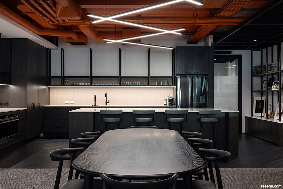
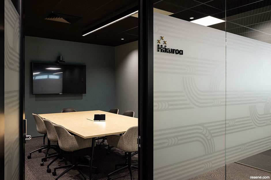
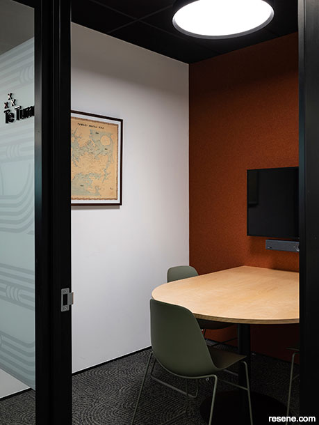
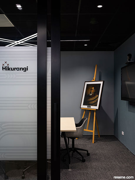
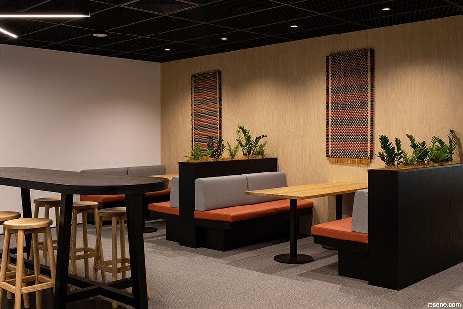
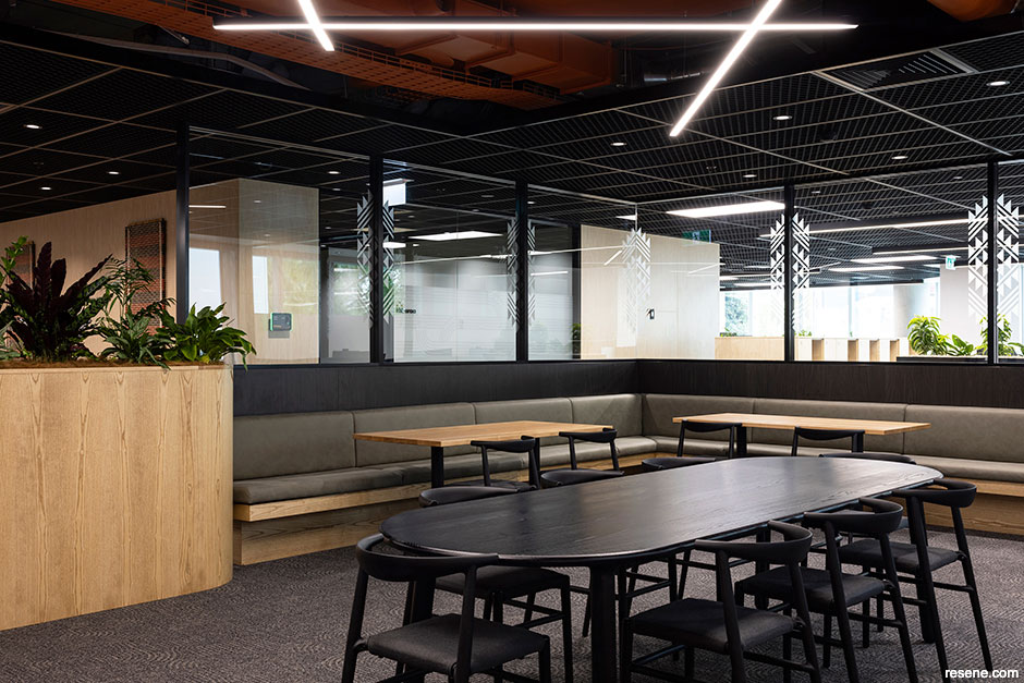
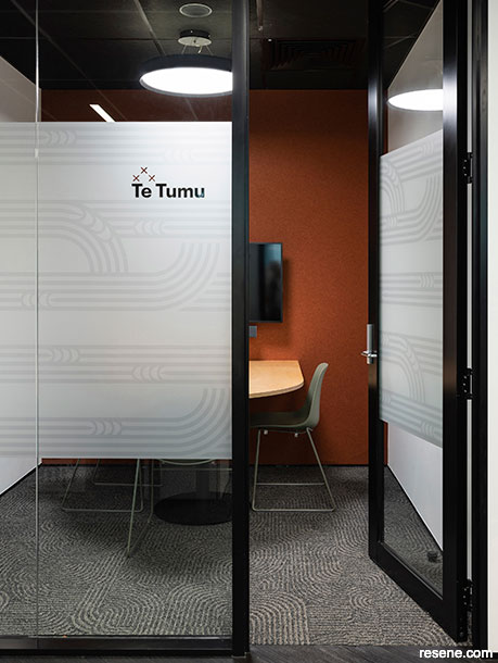
The new workspace, which is not only wonderfully fit-forpurpose but also remarkably beautiful, exemplifies the dedication and collaborative efforts of the entire project team. The openplan layout unites the organisation within a single location that serves a dual function, accommodating Whai Rawa's commercial requirements and providing a home for the Ngāti Whātua Ōrākei Trust whānau. The design takes a sincere approach in balancing meaningful elements of the iwi’s culture and identity in a contemporary context, honouring taonga (treasured possessions) and kōrero tuku iho (tradition). Collaborative meeting rooms for conducting business and a shared wharekai (dining area) have become essential gathering places for the two entities while thoughtfully integrated cultural design elements have been layered into the space, including patterned lighting that evokes traditional weaving and a collection of prominent mahi toi (artwork) that offers a gallery-like experience along the main spine of the floorplate.
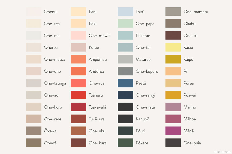
Underpinning it all is the breathtaking colour palette. The space is elegantly characterised by earthy colours inspired by the surrounding taiao (environment), connecting it to the land and its heritage through a bespoke palette that was developed jointly by Ngāti Whātua Ōrākei in collaboration with Resene over the course of two years. Known as Ko ngā tae i tāmokongia ki te Kahu Tōpuni o Tuperiri, the hues embody the identity of Ngāti Whātua Ōrākei.
“Resene – a family-owned business known for their trustworthiness and similar values, especially in sustainability and kaitiakitanga – was the perfect partner for Ngāti Whātua Ōrākei,” says Lisa. “To ensure that the colours truly represented the iwi, the community played an essential role in the process. Community members were asked to provide photos and ideas for colours, resulting in a range of 53 final selections. Each colour was then given an ingoa (name) by Ropata Paora, a matanga reo (language expert), to further solidify the connection to Ngāti Whātua Ōrākei.
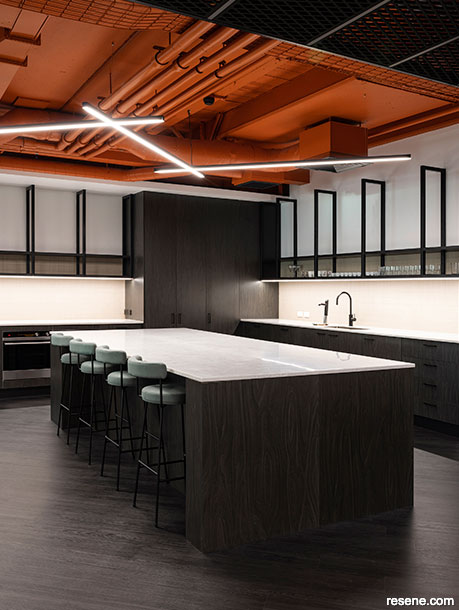
“The mahi toi (artwork) collection from our Ngāti Whātua Ōrākei creatives was curated by Dave Harriman. It has all been seamlessly woven into the fit-out of the office and the areas where kaimahi (employees) can come together to work, share kai (food) and collaborate. The end result is a functional and agile space that meets our needs as kaimahi and a place that exudes who we are. Ahikāroa, the striking orange colour of our kitchen ceiling, is inspired by the sunrise and sunset over our whenua at Takaparawhau. Complemented by the mahi toi from our whānau (family) and portraits of our tupuna (elders) and tamariki (children), it serves as a reminder of our purpose, our people, those we serve. As we work toward realising our tribal aspirations, it's encouraging to have a whare (home) that accommodates our expanding team and enables us to better serve our whanau.”
STACK’s work on the project was headed up by Creative Lead Jesse James Smith and Senior Designer Lauren Ross. “The relationship between Ngāti Whātua Ōrākei and Resene and the work that was done in the development of the colour range meant that there was a lot of meaning embedded into the project’s palette from the start,” explains Jesse. “Using Resene SpaceCote Low Sheen throughout the workplace allowed a consistent finish throughout the different areas. The superb coverage and consistency of the paint, colour and texture facilitated the creation of the gallery-type setting, providing an excellent base for the display of mahi toi within the space. It was great to be able to specify and incorporate New Zealandmade, sustainably-certified coatings that aligned with Ngāti Whātua Ōrākei’s values and community-based business focus.
The incorporation of the new Ngāti Whātua Ōrākei palette into the concept was important to the design of the space, but having a product developed with community engagement in mind added an additional layer of meaning in the creation of the new home for Ngāti Whātua Ōrākei.”
Through careful placement of the Resene paint colours and by implementing a bit of design ingenuity to make the most of the architectural assets the building offered, STACK was able to deliver a positive and powerful user experience. Since there wasn’t much natural light available and the space is relatively narrow, the team relied on careful space planning and created an illusion of added height within the kitchen through the exposed ceiling and their colour choices.
“Jesse was able to create a space that was both visually dramatic and incredibly functional,” says Lauren. “He was able to maximise the positive attributes of the space in a way that showcases his talent as a designer while creating an incredibly cost-effective solution for the client. Working on the project as the on-site designer allowed me to curate the final finishes, pulling inspiration from the symbolic stories captured in the palette range by Ngāti Whātua and Resene.”
According to Jesse and Lauren, a key concept for the space was for users to be able shift between different areas based on the work they want to focus on. Onepū, the softly greyed neutral which appears on the main walls throughout the open-plan space, helps to ground the organisation within the shores of Oneoneroa. Oneparoro, a blue-edged grey, was used to anchor and define meeting and collaborative spaces while evoking a sense of calm in complementary contrast to the orange Ahikāroa ceiling and the other bold burnt orange accents incorporated within the fit-out.
top tip To prepare new plasterboard for painting in general office areas, ensure all surfaces have been sanded smooth and wiped clean of dust and debris then seal it with Resene Broadwall Waterborne Wallboard Sealer. In wet areas like kitchens, bathrooms or breakrooms, choose Resene Waterborne Sureseal for improved moisture protection. Once your sealer is dry, lightly sand the surface to remove any nibs or rough areas and use a clean dry cloth to remove dust before applying your coloured topcoats. In general areas, choose Resene SpaceCote Low Sheen waterborne enamel or Resene Zylone Sheen for your coloured topcoats. In wet areas, use Resene SpaceCote Low Sheen Kitchen & Bathroom waterborne enamel.
Out of the design’s many beautiful elements, Jesse says the Ahikāroa ceiling is his clear favourite as it makes an impressive impact from the moment you enter. “We wanted to create some drama that would draw people into the office. Having the bold orange ceiling highlighted the importance of the space, both as a physical point of connection between the two parts of the business and through the colour’s symbolic meaning.”
When it came to the build, Harrier Construction Managing Director David Broome says the timeline was the biggest challenge, but the team pulled together to make it happen. “The client came to Harrier Construction with a tight time frame of six months to complete the design and build. From the commencement of the design process through to the completion of the project, Ngāti Whātua Ōrākei, Harrier Construction and STACK were able to keep to the pre-agreed dates. All parties communicated well with prompt decision making when required. It is a testament to Ngāti Whātua Ōrākei as a client that they allowed the project team to add value to the process rather than dictate their idea for the space. They provided direction and made clear choices when required and embraced the more bespoke product and colour selections for the fit-out that were put forward by the project team.”
While David shares the design team’s appreciation for the orange ceiling, he feels the artwork is another standout component. “The beautiful pieces that Ngāti Whātua Ōrākei curated were always going to be a fundamental feature of the space but we didn’t know which pieces would be selected and where they were to be positioned until it was time to place them. We worked closely with STACK during planning to be mindful that the material and colour selections would be complementary to the artwork, providing depth without clashing or feeling overbearing. When we installed the artwork upon completion of the build, there was great satisfaction in seeing it all finally and completely coming together. I felt both aspects turned out exceptionally well and hence they are both my favourite.
“The project was one of the more enjoyable projects I have been involved in. All of the parties worked extremely well together and the result is a stunning space that we can all be proud to have been involved in.”
Ko ngā tae i tāmokongia ki te Kahu Tōpuni o Tuperiri is the first iwi-inspired paint colour palette, which was launched in partnership between Ngāti Whātua Ōrākei and Resene. Through this curated palette of 53 culturally-significant hues, which were chosen in consultation with the community, the paint colours used for their projects are reflective of the local history of Ngāti Whātua Ōrākei and tie into colours found in te taiao (the surrounding environment) in and around Ōrākei. Each of the palette’s colours is known by an evocative Te Reo Māori name chosen by Ropata Paora.
did you know? Resene has worked with a huge range of clients to create custom-made colour palettes to suit their project, work, region or client. Each is included in the Resene e-tint system for tinting at all Resene ColorShops. For help with a custom-made colour palette, contact your Resene representative, www.resene.com/meet-the-team.
Design: STACK
Build: Harrier Construction
Client: Ngāti Whātua Ōrākei
Painting: Auckland Plastering Group
Images: Mark Scowen
This is a magazine created for the industry, by the industry and with the industry – and a publication like this is only possible because of New Zealand and Australia's remarkably talented and loyal Resene specifiers and users.
If you have a project finished in Resene paints, wood stains or coatings, whether it is strikingly colourful, beautifully tonal, a haven of natural stained and clear finishes, wonderfully unique or anything in between, we'd love to see it and have the opportunity to showcase it. Submit your projects online or email editor@blackwhitemag.com. You're welcome to share as many projects as you would like, whenever it suits. We look forward to seeing what you've been busy creating.
Earn CPD reading this magazine – If you're a specifier, earn ADNZ or NZRAB CPD points by reading BlackWhite magazine. Once you've read an issue request your CPD points via the CPD portal for ADNZ (for NZ architectural designers) or NZRAB (for NZ architects).
![]() Get inspired ! Subscribe
Get inspired ! Subscribe ![]() Get saving ! Apply for a DIY card
Get saving ! Apply for a DIY card
![]()
Can't find what you're looking for? Ask us!
Company profile | Terms | Privacy policy | Quality and environmental policy | Health and safety policy
Colours shown on this website are a representation only. Please refer to the actual paint or product sample. Resene colour charts, testpots and samples are available for ordering online. See measurements/conversions for more details on how electronic colour values are achieved.
What's new | Specifiers | Painters | DIYers | Artists | Kids | Sitemap | Home | TOP ⇧