Warm colours advance and appear closer than they are, while cool colours recede and appear further away. Brighter colours also appear closer as they stand out against other duller colours. To keep people safe, colours such as bright orange and bright red are used as safety colours.
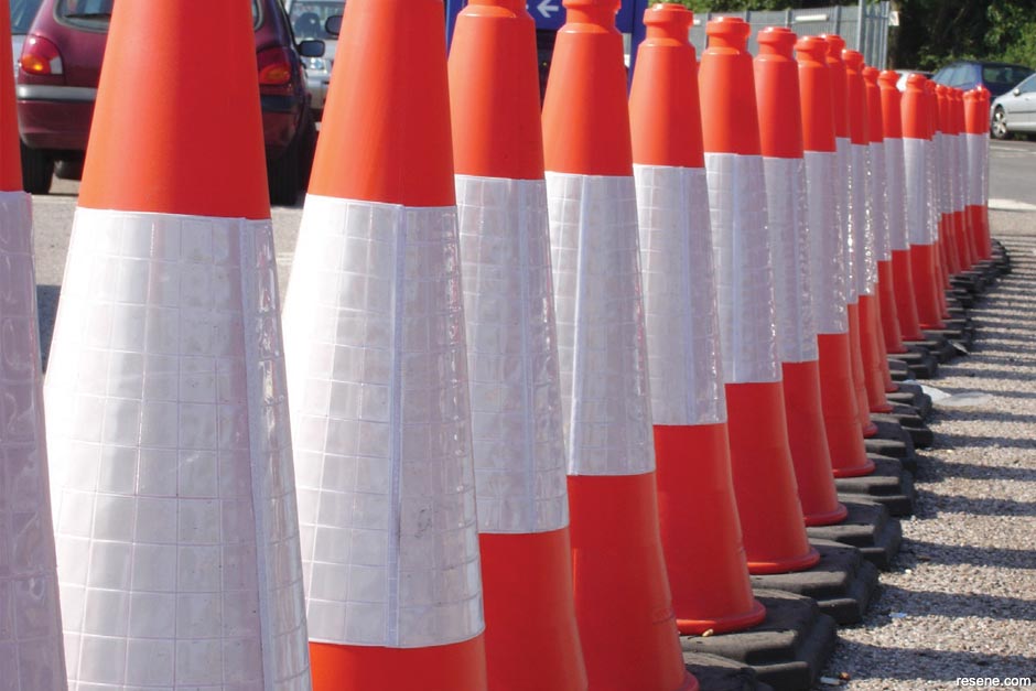
At home and on your way to school you can see a lot of safety colours – bright red stop signs, red and orange labels on appliances containing warning information, orange cones at roadworks, red sirens on police cars, red fire engines and so on.
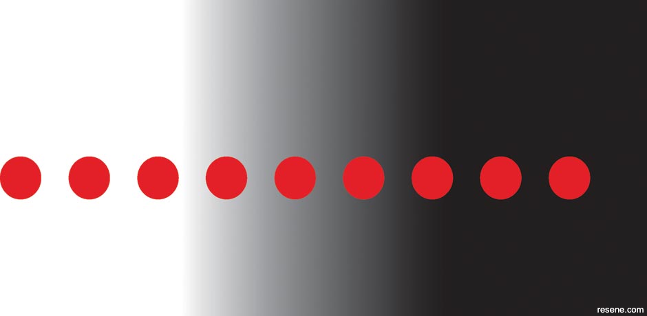
At night-time safety colours tend to be coloured lights in red and white as they stand out best against the black darkness. At night cars drive around with white headlights on but they have red hazard lights that they can turn on in an emergency to warn of danger.
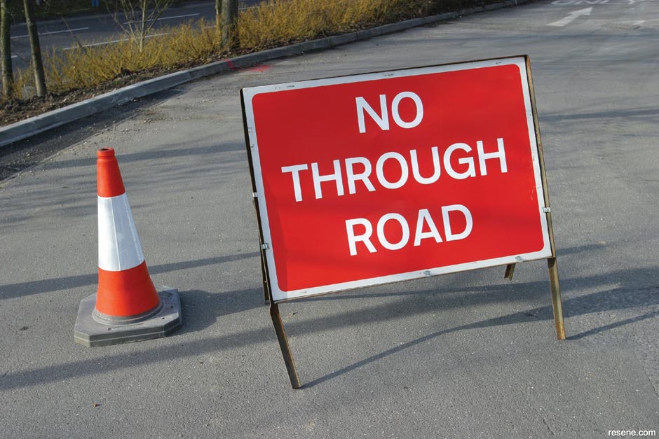
These colours are chosen for safety colours as they stand out and are easy for people to see.
Cyclists and joggers often choose to wear bright red, orange and yellow to help car drivers see them, especially early in the morning and late in the afternoon when the light is poor.

Humans have used this idea themselves with bright colours used to highlight things.
For example a red stop sign stands out more than if it were just white.
The orange vests the road workers wear help to make them visible and keep them safe.
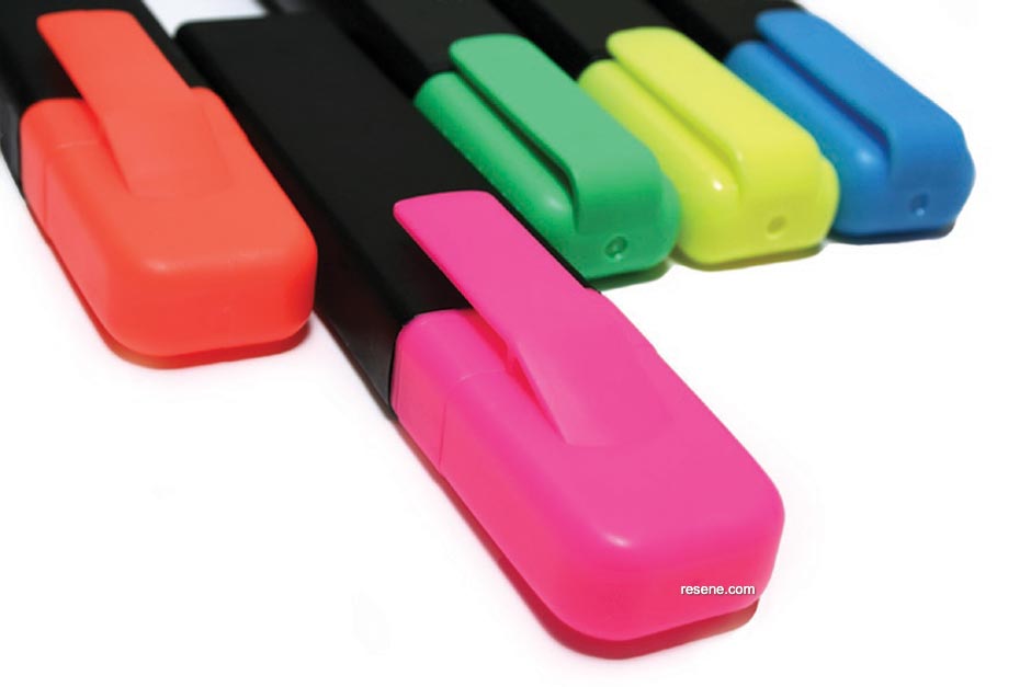
The highlighters used to mark important notes on a page help find the right information quickly later.
When stores have sales they often use red in their posters and advertisements to get attention.
Many fast food restaurants are also painted red so that they stand out when you are driving past them.

You can test for yourself which colours stand out most when it is dark.
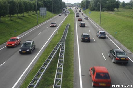
Which car colour is easiest to see?

What if it is raining?
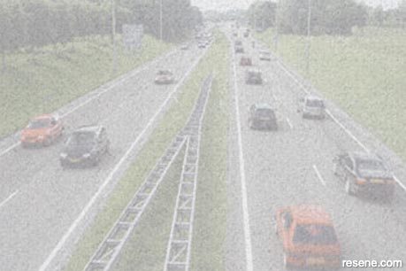
What if it is snowing?

What if it is nearly nightime and the sun has almost gone?
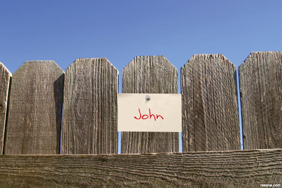
Some colours stand out much more than other colours. To test this get eight different colour felt pens and write your name on a separate piece of paper in each colour – make sure it is the same size on each piece.
Attach one to a fence or similar and walk away from it. Then stop, turn around and start walking towards it. Stop when you can read the name clearly.
Measure the distance from where you are standing to the page and record the distance.
Then repeat steps 2 and 3 with another colour.
Try this exercise again using the number 2 on different coloured background colours. Which backgrounds make the number harder and easier to read?
Even if something stands out well, that may not make it easier to read.

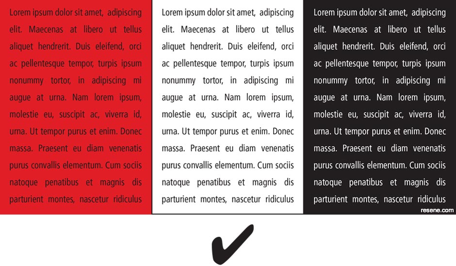
For example red and black together stand out well but if you are reading for long periods of time your eyes may find it harder to read than black words on a white background. This is because the red and black may be tiring for your eyes.
Generally black words on a white background are recommended because the contrast makes it easier to focus on the words. This is why most books are printed with black words.
THIS IS ALSO WHY...
You often see CAPITALS used in headings but not in the main story of the book. This is because capitals are very good at catching our attention but are very hard to read if there are too many together.
Most people will find Sentence 1 much easier to read.
For example try reading the following:

PDF downloads:
The Resene Everywhere colour series
Learn about colour! The Everywhere colour series is designed for children and will cover lots of things about colour and has projects you can try out for yourself to find out how things work. Colour is magical and lots of fun to experiment with... enjoy!