Humans respond to colour.
Yellow reminds us of happy faces and smiles, white is neutral and restful, red can be exciting. By changing the colours in a room, we can change a room from a happy room into a cold room. Think about some of the places you may have been recently and what colours they were painted.
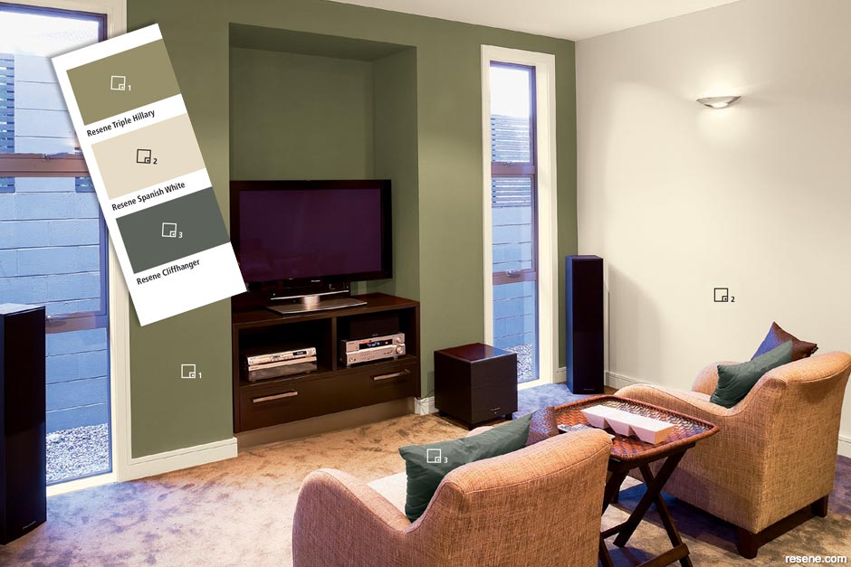
When you are thinking of the colours you would like to use in a room, you need to think about:
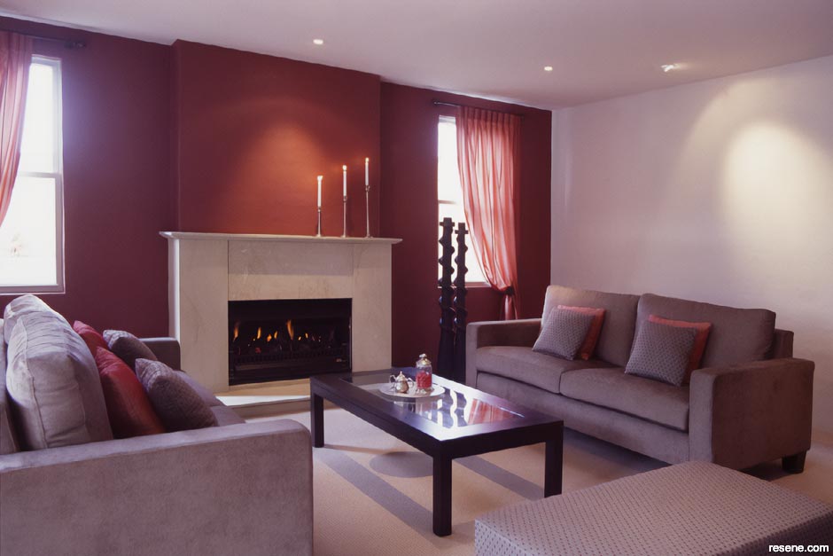
Most rooms are mainly two or three colours with small amounts called accents of brighter or stronger colours.
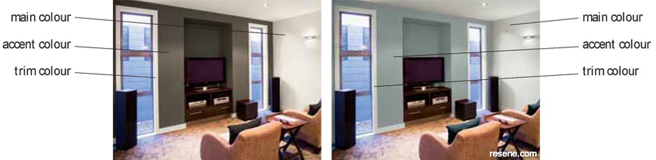
Accents usually make the colour scheme a little more lively. Don’t use too many accents though otherwise the room may look strange.
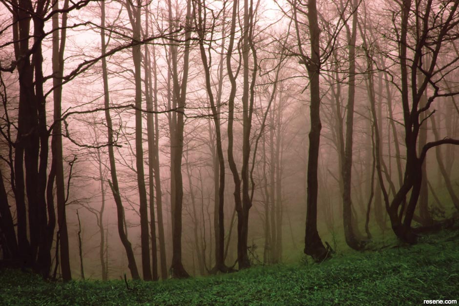
If you look outside, nature gives us some good ideas for decorating and tells us that normally things look good with: The darkest value at our feet, such as the forest floor. The medium level at eye level, such as tree trunks. The lightest value above us, such as the sky.
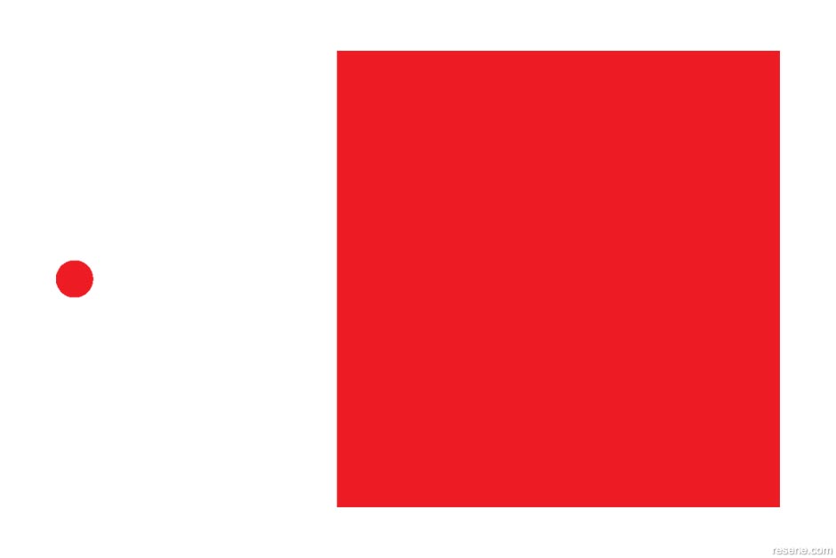
How much there is of a colour affects how you see it. Normally the more there is of a colour the darker it will seem.
This is why when you look at a colour chart and then look at the same colour on the wall, the colour on the wall can seem more intense.
If you are picking a dark colour that you think may be too dark you should use a slightly lighter colour.
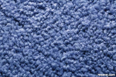
Surface textures also change the way we see colour. Smooth surfaces reflect light while heavily textured surfaces, such as carpet, reflect light in a diffused way. This means that the light is reflected at different angles depending on where it hits the surface. This makes the reflection harder for our eyes to see.
The same colour painted in a glossy paint on a wall will look lighter than the same colour in a heavy woven carpet.
The lighting will also change the colour you see. When choosing colours think about when the room will be used most and what sort of lighting there will be at that time – natural (from the sun) or artificial (from a man-made source such as lights). Then choose your colours to work with that lighting.
Colour also looks different on ceilings than it does on walls. A colour painted on a ceiling looks darker than the same colour on a wall because there is less light on the surface.
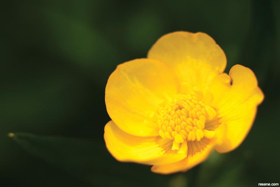
Other colours can change how colours near them look. For example, if you hold a buttercup flower under your chin, your chin will look yellow. This is the reflection of the buttercup colour.

Smooth surfaces
Textured surfaces
If you paint a wall white and then put in bright green carpet, the walls will start to look a little green because they are reflecting the floor colour.
Curtains, furniture and pictures will also absorb and reflect colours so will change how a room looks.
If you are trying to choose colours you need to make sure that other colours aren’t distracting you.
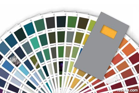
When you are choosing colours from a colour chart, place a grey isolator over the colour you are looking at. This will hide the other colours around it so you can see what the colour looks like.
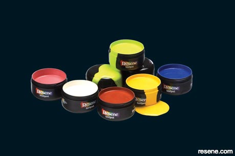
Resene recommends that people painting should try their colours in the area they are planning to paint using Resene testpots.
There are so many things that affect the way the colour will look that a testpot is the best way of making sure the colour is right before full painting begins.
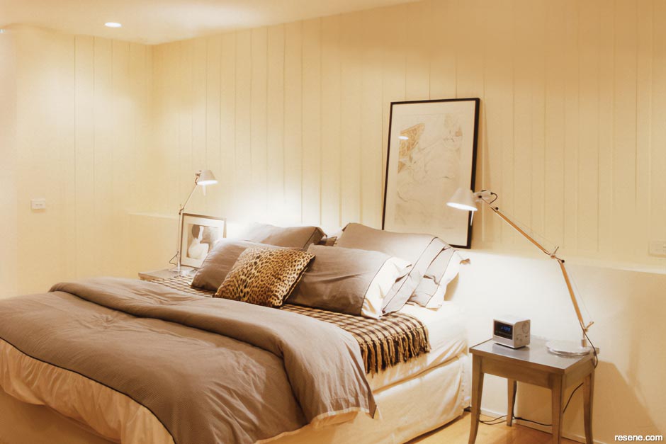
Think of your own bedroom
PDF downloads:
The Resene Everywhere colour series
Learn about colour! The Everywhere colour series is designed for children and will cover lots of things about colour and has projects you can try out for yourself to find out how things work. Colour is magical and lots of fun to experiment with... enjoy!
![]() Get inspired ! Subscribe
Get inspired ! Subscribe ![]() Get saving ! Apply for a DIY card
Get saving ! Apply for a DIY card
![]()
Can't find what you're looking for? Ask us!
Company profile | Terms | Privacy policy | Quality and environmental policy | Health and safety policy
Colours shown on this website are a representation only. Please refer to the actual paint or product sample. Resene colour charts, testpots and samples are available for ordering online. See measurements/conversions for more details on how electronic colour values are achieved.
What's new | Specifiers | Painters | DIYers | Artists | Kids | Sitemap | Home | TOP ⇧

