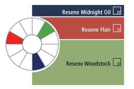
The best way to learn how colours work together is with a colour wheel. Colour wheels are made using the colour spectrum and help decorators put colour schemes together.
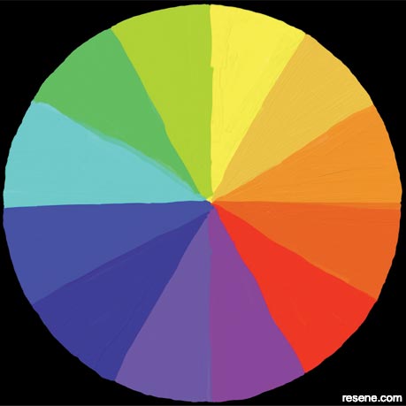
The colour wheel is divided into the three colour areas below:
Primary colours Primary colours are red, blue and yellow and are an equal distance away from each other on the colour wheel. These colours can be used to make all the other colours.
Secondary colours Secondary colours are a mixture of two primary colours. They are on the colour wheel between each of the primary colours and are an equal distance away from each other.
Tertiary colours Tertiary colours are a mixture of a primary colour and a secondary colour.
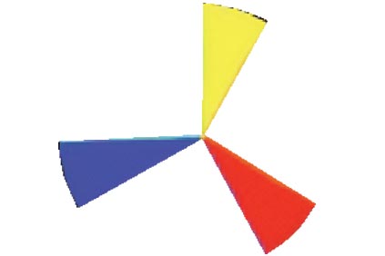
Primary colours
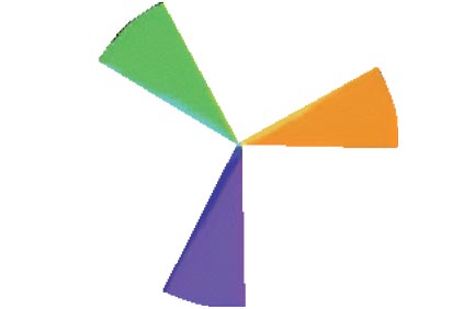
Secondary colours
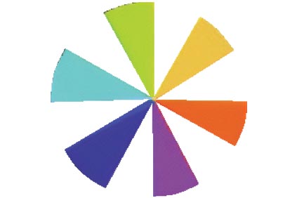
Tertiary colours
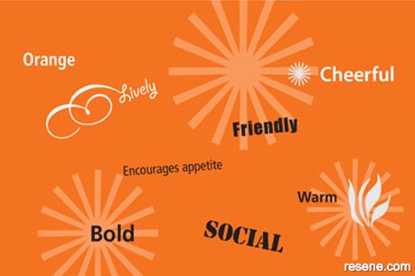
Colours are sometimes called warm colours or cool colours. Warm colours make something seem warmer, closer and cosier than it actually is. Warm colours are colours like reds and apricots. Warm colours are often used to make a cold room feel warmer or to make a room feel cosier.
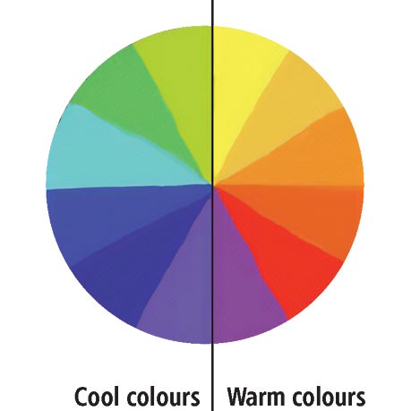
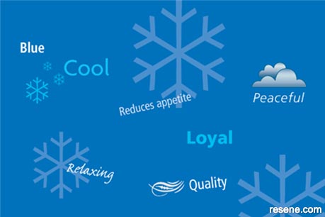
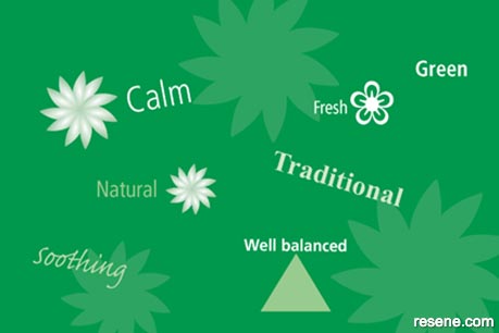
Cool colours make a room feel cool and more roomy. They are often used in rooms that get a lot of sunlight so that they don’t feel as hot. Many blues and greens are cool colours.
The Resene Colour wheel is a useful tool for understanding how colours relate to each other.
You can use this knowledge to help change what a room looks like and camouflage its bad points.
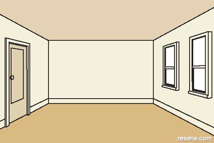
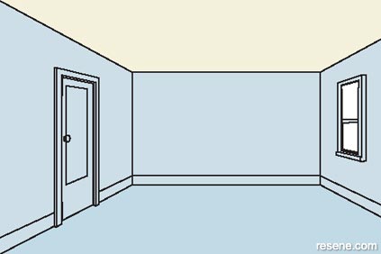
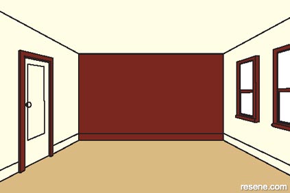
Warm colours, such as yellow and red, tend to advance and make the walls seem closer. They are good for large, uninviting rooms you want to make cosier and welcoming. Cool colours, such as green and blue, tend to recede and make the walls seem further away. This makes them a good choice for small, narrow rooms that you want to seem more spacious. For example:
Make a room look wider by painting the floor and ceiling in a similar colour and the walls in a lighter colour.
Make a room seem more spacious by painting the walls in pale cool colours to match the carpet.
Make a long room appear shorter by painting the short end wall of the room in a warm, deep colour and paint the other walls light.
1
2
 3
3
Monochromatic Monochromatic colour schemes use one colour only but use different strengths of the colour and different textures to make it more interesting.
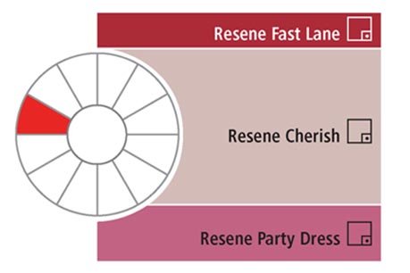
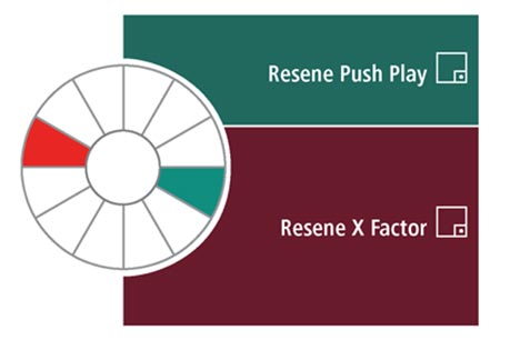
Complementary Complementary colour schemes use colours that are opposite each other on the wheel. For example, blue green and red orange. This normally works best when one colour is used the most and the other colour is used for accents.
Experiment and see which ones you like best.
Monochromatic
Complementary
Split complementary Split complementary colour schemes use any colour from the colour wheel with the two colours that are directly on either side of the colour opposite the one chosen. For example blue and violet with yellow orange.
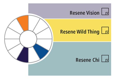
Related/analogous Related/analogous colour schemes use three to five colours and includes one of the three primary colours. The related/analogous colours are the colours on either side of the primary colour.
Split complementary
Related/analogous colour scheme
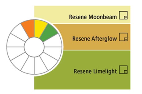
Triadic Triadic colour schemes use three colours that are an equal distance away from each other on the colour wheel. For example red orange, yellow green and blue violet. One colour should be used as the main colour and the other two as accent colours.
Achromatic Achromatic colour schemes use white to black only. These colour schemes are normally very sophisticated.
Triadic colour scheme
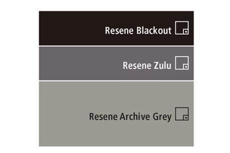
Achromatic colour scheme
Different colours have different personalities – some are exciting, some relaxing. Even the same colour can be both relaxing and exciting depending on its intensity. Intensity means how strong a colour is.
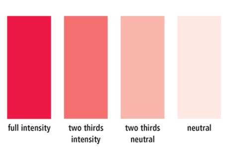
Each colour has four levels of intensity:
People use colours to suit the feeling they want to create. For example, a hospital is normally painted in light clean colours on the inside. This is to make sure it feels clean and hygienic.
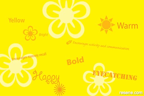
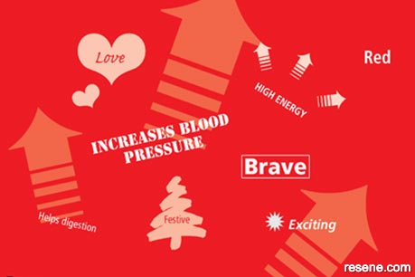
A children’s playground is normally brightly coloured. This is so that it looks like it is fun. Most balloons are brightly coloured too. This is so that they will catch your attention and look cheerful.
If you wanted to create a happy room you would select happy colours. You wouldn’t select black because it wouldn’t make the room look happy. Instead the room would look dark and serious. If you wanted to paint the inside of a library you wouldn’t normally paint it bright red and yellow because they would be too distracting and would make it hard to read any books.
Each colour works in the right place.
PDF downloads:
The Resene Everywhere colour series
Learn about colour! The Everywhere colour series is designed for children and will cover lots of things about colour and has projects you can try out for yourself to find out how things work. Colour is magical and lots of fun to experiment with... enjoy!
![]() Get inspired ! Subscribe
Get inspired ! Subscribe ![]() Get saving ! Apply for a DIY card
Get saving ! Apply for a DIY card
![]()
Can't find what you're looking for? Ask us!
Company profile | Terms | Privacy policy | Quality and environmental policy | Health and safety policy
Colours shown on this website are a representation only. Please refer to the actual paint or product sample. Resene colour charts, testpots and samples are available for ordering online. See measurements/conversions for more details on how electronic colour values are achieved.
What's new | Specifiers | Painters | DIYers | Artists | Kids | Sitemap | Home | TOP ⇧

