From BlackWhite magazine - issue 08, gold standard
Comvita’s redesigned headquarters makes a buzz with a honey-hued interior.
Of all the places where architecture and interior design inspiration can be found, by far the most popular is nature. Not only do elements pulled from our surroundings have much to offer in terms of adding aesthetic beauty to our built forms, but they are an effective method of connecting people with the tranquillity and rejuvenating qualities of the natural world. Countless studies agree that incorporating elements of nature within a building’s design can provide occupants with a psychological escape from the hustle and bustle of modern urban life.
While incorporating nature has been a long-embraced strategy for creating a sense of solace in residential projects, the benefits of creating these same connections in our workplaces have become more widely recognised in recent years. And when nature is your business, like it is for Comvita – one of New Zealand’s leading mānuka honey producers – you can bet that finding ways to bring reminders of the outside indoors was top of mind during the company’s recent office renovation.
Comvita was founded in the Bay of Plenty in 1974, and the brand’s head office and production facility were established in two adjacent buildings which were previously a local pub and a shop in the small settlement of Paengaroa. After nearly 50 years of occupying these spaces, the reasons for a refresh were stacking up. “The buildings and office spaces were dated and typical of the time – with brown and grey carpet tiles as well as white walls and desks. Despite the site being surrounded by nature, once inside, the feeling was very clinical,” recalls Danielle Barclay, Creative Director of Blur The Lines, who led the interior redesign.
While updating the finishes was a key part of the plan, Comvita was also focused on how their office spaces were actually being used. Their staff had spent the better part of three years working remotely during the pandemic in order to protect the company’s honey production, and like many workplaces, this began creating challenges for their office culture. Comvita recognised that it was time to re-imagine the space to better reflect the shift to hybrid working and provide a more supportive and collaborative environment.
Another big challenge for the design was the nature of the layout. Blur The Lines needed to find ways to visually unify the two different buildings, which are architecturally separated by an outdoor pathway, and Danielle knew from the outset that the Resene colour palette would play an important role in connecting the spaces. Through the design, colours, finishes and décor, they aimed to pay homage to the history of the brand while also reflecting the needs of what has become a global company.
“We wanted Comvita’s staff to feel inspired through a strong connection to nature and to challenge the traditional notion of an office,” she says. “While it was a commercial office project, we took a hospitality design approach and introduced materials and tones inspired by nature and, in particular, the warmth of honey.”
This project wasn’t the first time that Blur The Lines had worked with the honey producer, so a trusting relationship had already been forged. “We partnered with Comvita for the three and a half years prior and provided spatial and digital brand experience design services. Our first project together was the design of their flagship store at Auckland’s Viaduct,” says Danielle.
“With this project, the main objective was to create a space that reflected Comvita’s brand values. As a business they are passionate about working closely with nature and upholding their connection to it, so we wanted to create a colour palette that reflected nature inside. The client gave us a very open brief without any preconceived ideas about colour.”
Jason Simmonds, Capital Projects and Facilities Manager for Comvita, admits that his team weren’t entirely convinced about some of the hues recommended for the colour palette at first, but they put their trust in the design team – and they’re so glad they did. “We initially weren’t sure about the half strength Resene Gold Coast when it went up on the bare walls, but wow! The creative vision Blur The Lines had meant that when it all came together, it could not have been better,” he says.
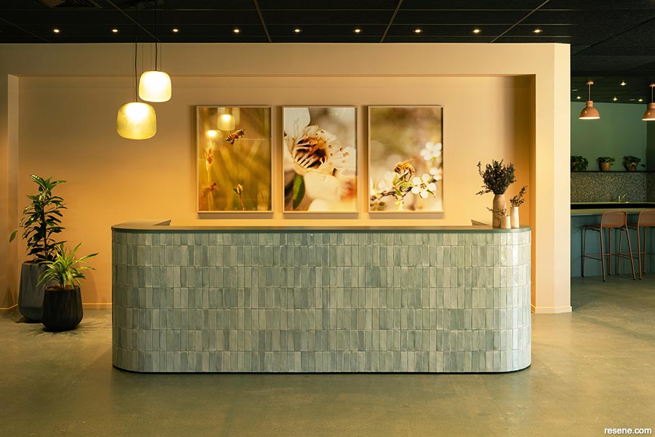
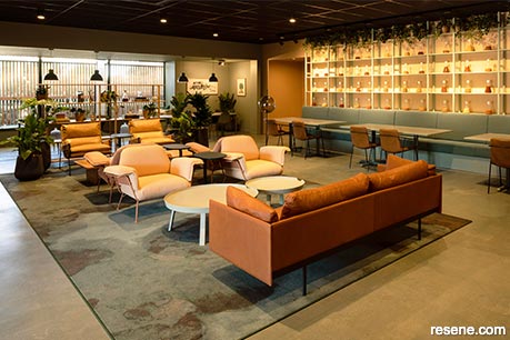
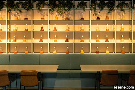
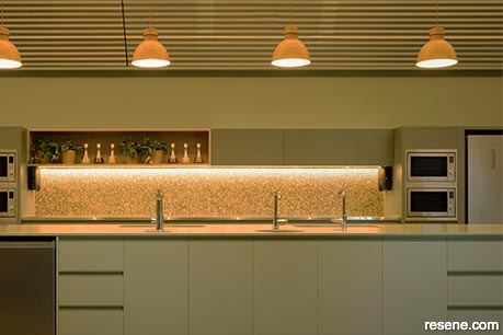
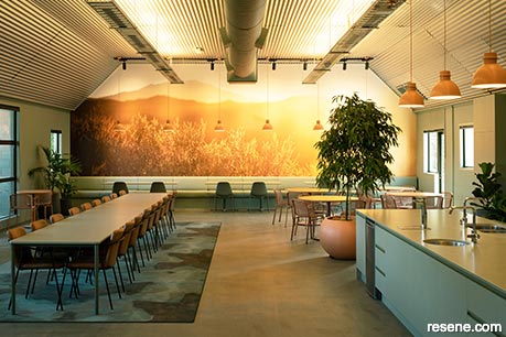
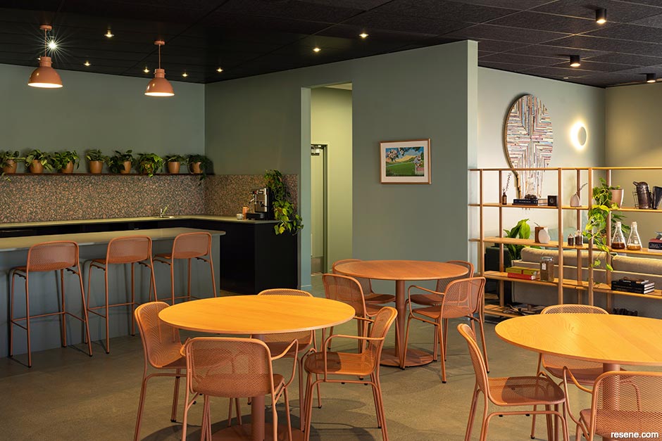
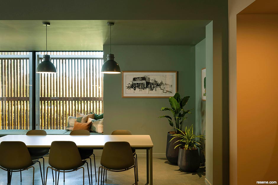
The design element that stands out most is the wall of illuminated lab vessels filled with honey, which serves an impactful focal point that drives home the office’s connection to the company it houses. In front, a 10m long green upholstered bench seat with tables creates a café-like ambience where staff can comfortably perch with their laptops. Soft green textured tiles welcome guests at the curved counter while warm leather sofas and chairs and plush rugs soften the lounging areas. The natural-toned scheme continues into the large lunchroom space, where two-toned green cabinetry, matching benchtops and seating zones blend beautifully with the Resene Spanish Green walls.

Danielle Barclay
Danielle's top tips
“Start with the brand and values and develop an overarching idea first that drives the overall concept and scheme.”
“Don’t be afraid to embrace colour and create something unexpected. We like to design office spaces that feel more like hospitality environments than traditional office spaces.”
Sourcing suitable light fixtures that would fit the design but also the time and budget constraints was another detail that proved to be tricky, but Danielle’s team came up with an ingenious solution. “We found that we couldn’t source the lights we wanted from within Australasia so we decided to paint some locally-sourced aluminium lights using Resene Lumbersider Low Sheen tinted to Resene Vantage Point and Resene Dawn Glow. In the end, this was a great solution as it allowed us to match their colours exactly to the rest of the scheme and we were very happy with the end result.”
Throughout the design, living greenery was also included; a large indoor tree and numerous potted plants were brought in for an authentic connection to nature. Like the light fixtures, Resene Lumbersider Low Sheen was also used to paint the pots to coordinate them with the rest of the interior colour scheme.
Other decorations include carefully curated memorabilia and artwork. Bee boxes that held sentimental value were repurposed by artist Claudia Aalderink as part of a custom contemporary artwork that now hangs in the breakroom area. Photography from Comvita’s regenerated forest was commissioned with prints displayed in frames and used for a large wall mural. The imagery effectively brings an indirect connection to nature – a strategy that studies have shown to be an emotionally and intellectually satisfying alternative for occupants who don’t have direct visual access to these vistas.
Jason says the refurbishment had been long anticipated and the finished design has made all the difference. “Our Market Support Centre was a little tired and we were looking to re-imagine our spaces to more appropriately reflect our values and the global natural health and wellness business we are today with a world-class space that our team would be proud to work in and would foster collaboration. Rather than a traditional office layout, we took the opportunity to create a range of flexible and collaborative working spaces to complement our ‘work from anywhere’ approach, which is now a permanent part of how we work at Comvita,” he explains. “Being in harmony with nature is deeply embedded in our company values, so the forest-inspired green and mānuka honey tones of Resene Spanish Green and Resene Gold Coast really help to create a look and feel which evokes that.”
Comvita also used the project as an opportunity to reflect the company’s growing connection with their local iwi, Kaupapa Tapuika, who helped guide the development of the site and gifted names to the buildings. Since Paengaroa’s full name is Te Paengaroa o ngā māra kūmara a Marukukere (The cultivated kūmara gardens of Marukukere, located at Paengaroa), work has begun to reinstate a kūmara garden on the site to be named Te Paenga Poto (The Short Rows). The welcome space was named Te Maru (The Shelter), referencing feelings of safety while the lunchroom was named Tānga Manawa (The Place My Heart Rests), representing the restfulness of breaktimes and the interpersonal connections the space fosters.
Jason says Tānga Manawa has become his favourite part of the finished design. “It’s at our office’s heart and this new multipurpose room is big enough for everyone to gather together, prepare and share kai (food) as well as being a natural point for people to cross paths and make those all-important casual connections. It is such a warm and inviting environment that all our people can share and enjoy in all sorts of ways. On the end wall, we have a vista from one of our large mānuka forests – which really brings us closer to our philosophy of ‘Working in Harmony with Nature’. We have also showcased a number of original artworks that were created for Comvita back in our early days alongside our co-founder Claude Stratford’s beekeeping equipment and other historically important artifacts. Bringing these precious items out of storage into our modern space enables us to connect and honour our history while still looking forward to the future as we set about building the next exciting chapter for Comvita,” he explains.
“The project has transformed the look, feel and functionality of our site and working spaces to embody the purpose and values of Comvita, our position as the global market leader in mānuka honey and a premium health and wellness brand,” Jason adds. “Most importantly, the new look and spaces are well-loved and enjoyed by our people!”
Project Manager Aidan Marra has been working at Marra Construction Ltd (MCL) for more than 24 years. His role was to oversee the build and coordinate the works with the site manager. MCL subcontracted the painting work to Millman and Amer Painters, who they’ve worked with on similarly-sized projects before that require a detailed eye and quality finish – and their skilful work did not disappoint. Aidan says their biggest challenge for the build was keeping Comvita’s operations ticking along while carrying out the renovation. “This involved careful planning with Jason and his team to come up with the best methodology to accommodate the operations, but it still allowed us to carry out the works over a relatively short time period.”
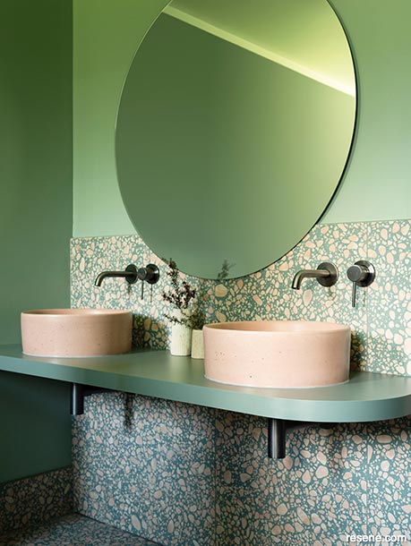
In wet areas like the bathroom and on doors and trims, Resene Lustacryl semi-gloss waterborne enamel was chosen for added durability. Walls painted in Resene Spanish Green and Resene Gold Coast, which was used at half strength.
Like Jason, Aidan’s favourite part of the finished project is the lunchroom and kitchen area. “It has a very calming effect on you when you walk into that space,” he says.
This effect wasn’t lost on the Resene Total Colour Award judges, who recognised the project’s thoughtfully considered design with a Resene Total Colour Commercial Interior Award. In their comments, they singled out the calm and soothing ambience the Resene colour palette created, calling it, “wholesomely earthy and perfectly aligned to the product category” with “architecture and colour working in tandem to elevate the sense of wellness.”
The judges also commended Blur The Lines’ use of Resene The Range fashion colours and how they were cleverly infused in places that can be easily updated in the future. While another refresh of this scale will likely be decades off, this approach allows Comvita the flexibility and choice to evolve their colour palette going forward as they see fit.
“The fantastic outcome of this project is down to the team who created it,” says Jason. “Blur The Lines was amazing in developing and designing an interior that exceeded expectations, Jigsaw Architects made it all seamlessly work with the building over many iterations and MCL was excellent to deal with and provided a quality finished product – which included a lot of detailed components.”
Top tip
Available in a palette of five nature-inspired hues, Resene ConcreteWash can be used to impart a subtle coloured effect to concrete walls, floors, benchtops and more. For interior concrete flooring, start with a basecoat in untinted Resene Concrete Wax before applying one to two coats of Resene Concrete Wax tinted to your chosen Resene ConcreteWash colour. If more pigmentation is desired, an additional coat of Resene ConcreteWash coloured topcoat may be applied before applying a final clear untinted layer to seal the floor.
Colours mentioned in this article...
Products mentioned in this article...
Interior design and colour selection: Blur The Lines
Architectural specification: Jigsaw Architects
Build: Marra Construction Ltd
Painting: Millman and Amer Painters Ltd
Images: Tyler Connolly
This is a magazine created for the industry, by the industry and with the industry – and a publication like this is only possible because of New Zealand and Australia's remarkably talented and loyal Resene specifiers and users.
If you have a project finished in Resene paints, wood stains or coatings, whether it is strikingly colourful, beautifully tonal, a haven of natural stained and clear finishes, wonderfully unique or anything in between, we'd love to see it and have the opportunity to showcase it. Submit your projects online or email editor@blackwhitemag.com. You're welcome to share as many projects as you would like, whenever it suits. We look forward to seeing what you've been busy creating.
Earn CPD reading this magazine – If you're a specifier, earn ADNZ or NZRAB CPD points by reading BlackWhite magazine. Once you've read an issue request your CPD points via the CPD portal for ADNZ (for NZ architectural designers) or NZRAB (for NZ architects).
![]() Get inspired ! Subscribe
Get inspired ! Subscribe ![]() Get saving ! Apply for a DIY card
Get saving ! Apply for a DIY card
![]()
Can't find what you're looking for? Ask us!
Company profile | Terms | Privacy policy | Quality and environmental policy | Health and safety policy
Colours shown on this website are a representation only. Please refer to the actual paint or product sample. Resene colour charts, testpots and samples are available for ordering online. See measurements/conversions for more details on how electronic colour values are achieved.
What's new | Specifiers | Painters | DIYers | Artists | Kids | Sitemap | Home | TOP ⇧


