From BlackWhite magazine - issue 08, gold standard
A historic student accommodation gets a refurbishment that reveres the past while supporting the needs of today’s residents.
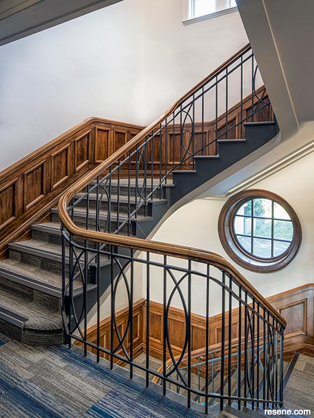
Out of the many Resene colours specified to rejuvenate the William Weir Wing, Lianne says off black Resene Foundry ended up being her favourite.
“We used it on the cement skirtings and radiators and it ties the corridors together and provides a crisp connection between the carpet and the grey of the lower wall. It’s nice and strong,” she says. Step sides painted in Resene Lustacryl semi-gloss waterborne enamel tinted to Resene Foundry, upper walls and ceiling in Resene SpaceCote Flat tinted to Resene Black White and timber panelling, railings and trims clear finished in Resene Qristal Clear Poly-Gloss.
Living away from home while attending university is a transformative rite of passage for many newly-minted adults. For students who have only ever lived at home, taking up residence on campus can make the transition to independence far easier to process, where support from faculty members, school staff and more seasoned students is close at hand as they attempt to forge their way through a trial-and-error approach to many of life’s ‘firsts’.
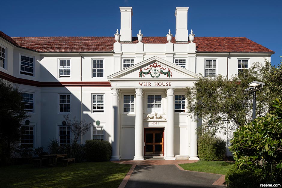
For those studying at Victoria University of Wellington (VUW), the most interesting student housing option is Weir House. With most of VUW’s student accommodation being modern and standard, nothing else quite compares to this three-storey, Georgian-style, heritage-listed gem. Built in 1930, the William Weir Wing – one of two buildings that comprises Weir House – was the first purpose-built student hostel at VUW and only the second to be constructed in New Zealand. The school is acutely aware of the property’s unique heritage qualities and see it as the jewel in the crown of their student accommodation offerings.
As one would expect with a structure that’s been subjected to nearly a century of wear-and-tear from young people in their formative years, the time had come for a significant refurbishment inside and out. Comprehensive exterior maintenance was required, including a complete repaint to the concrete walls, timber windows and exterior steel. Internally, there were complex challenges to be sorted. The upper floors of the William Weir Wing, where the bedrooms are located, are accessed by a main formal staircase, which leads to two short corridors. One of these connects to the lengthy primary corridor. With no visual cues, few windows and little to differentiate each floor’s appearance, navigating the building wasn’t exactly straightforward. In the basement, the recreation areas, study spaces and a laundry were also due for a refresh.
Studio Pacific Architecture (SPA) had previously prepared the Heritage Conservation Plan for William Weir Wing and served as the architect for the Te Whānau Wing and the rebuilding work on the Hunter Building at VUW, so when they took the lead on this project, their team was already armed with a thorough understanding of the uses and qualities of the original spaces. Their brief was to sensitively modernise the accommodation to meet the changing gender ratios, incorporate a new heating system and fire doors, replace three major bathrooms and two minor bathrooms and update the common spaces to be lighter and brighter. Of course, it was also in need of fresh coats of paint throughout.
With so many aspects to be updated, the project schedule proved to be the biggest challenge. Since approximately 90 students call Weir House home during the school year, it had to remain in undisrupted use when classes were in session. This required the work to be completed during the annual Christmas holidays, which needed to be staged over the course of several years with firm starting and completion dates for each phase of construction. The first summer break in 2020/21 saw Key Commercial complete the fire and ventilation upgrades and the Floor A bathroom. In the subsequent summer breaks, 2021/22 and 2022/23, Hawkins completed the bedrooms and corridors, the Floor B and C bathrooms, the basement and worked on the exterior. Last summer, the final exterior work wrapped up, with new cladding applied on the west wall and new windows installed to matching the existing ones.
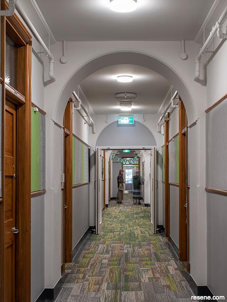
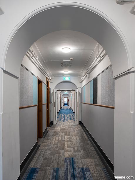
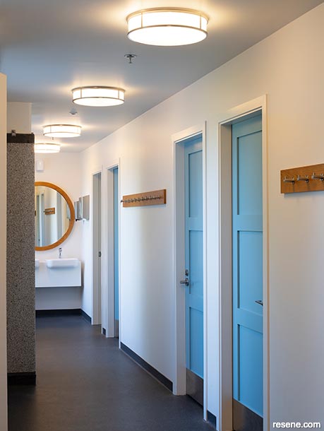
Another challenge that needed to be addressed was the long tunnel-like corridor. “Since it only has windows at each end, the lack of sunlight made it dark and gloomy,” says SPA’s Principal and Heritage Architect Lianne Cox. “This was addressed through clever adaptive lighting. During the day, brighter fittings provide ample daylight-style illumination. But at night, these fixtures switch off and traditional light fittings take over to give off a lower, warmer light output fit for winding down. Cheerful areas of colour were also added to each end that make the most of the light available and visually draw the eye down the corridor’s length.”
Of all the project’s goals, perhaps the most important was for the private and shared spaces to feel personal and provide a supportive environment for students who may be experiencing stress, loneliness or depression. “VUW are very aware of the stresses that students can feel and the potential for self-harm,” explains Lianne. “The bedrooms had to be warm and personal and provide a space that felt safe and inviting. We did this by emphasising the existing features of the rooms, notably the beautiful built-in rimu joinery which was repaired and refinished. We removed MDF panels that were screwed to the inside of the doors and replaced them with neutral pinboards which, along with pinboards on the walls, makes it easy for students to personalise their space.”
Despite the previously uniform appearance across the corridors and faculties, each accommodation floor within the William Weir Wing had always had a strong community identity. Every year, the Resident Assistant of each floor chooses a different theme, providing each level with its own sense of identity and belonging. SPA took a similar approach by assigning each level a different Resene colour. “Our approach was to keep continuity within the building with a background colour scheme of strong warm neutrals and then give each floor a clearly identifiable colour in key areas. We chose green for Floor A (Resene Highland), blue for Floor B (Resene Awash) and orange for Floor C (Resene Smoke Tree),” says Lianne.
“The corridors are very long, so we were looking to get some difference and modulation along the main corridor length and show off the timber trims. From there, we looked for carpet tile ranges that suited and selected the flooring. We then took flooring samples and lots of Resene drawdowns to site and looked at them in the natural light. This gave us the rich neutral paint colours we used on the walls and the dark grey skirtings in Resene Foundry, which are common to all the floors,” she adds.
The design team created a pattern using the carpet flooring planks which positioned strong pops of colour under the windows at the ends of the corridors and at the key intersections and stair landings. This was reinforced with touches of similar colour within the pinboard fabric on the corridor walls, which all tied into each floor’s designated Resene hue.
In the bedrooms, SPA focused on creating an understated yet welcoming colour palette. Warm neutral paint colours were chosen to complement the original timber joinery and textiles while allowing each student to personalise their room to their own tastes with bedding and decorations. Resene Foundry was carried in from the corridors and applied to the coved concrete skirting to provide a solid foundation and suit the mix of medium greys that appear in the carpeting. The walls up to the picture rail were painted in Resene Sisal, a warm putty, while the upper walls and ceiling were treated to light and bright Resene Black White. Modern up/down linear light fittings were also suspended in the rooms, which offer two different lighting options – a strong white light for study or dressing and a soft uplight for relaxation.
One surprise that was uncovered was the six 60mm diameter holes drilled through the top rail and the top panel of every bedroom wardrobe door. “This had been done per the sprinkler standards, as the rooms are sprinklered, but the wardrobes are not. However, the act was a desecration of beautiful timber and joinery and it was a jarring note in the rooms. We solved this in two cost effective ways. To repair it, we first applied a very thin rimu veneer over the holes in the rail that is barely noticeable. Next, a matching pinboard was placed into the top panel that conceals the holes behind, allowing the quality of the joinery and timber to be the talking point,” says Lianne.
“Throughout the project, repaired timber was lightly sanded and then coated in Resene Qristal Clear. We wanted the natural look of timber and for it to show its age with the signs of 90 years of use. Resene Qristal Clear provided a totally clear finish, which allowed the age of the timber and previous repairs to be visible,” she adds.
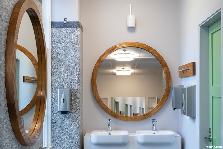
A favourite feature of the William Weir Wing’s original 1930s bathrooms was the charming terrazzo flooring, wall panelling and screen walls. In the 1980s, the bathrooms were divided into smaller gendered bathrooms and the terrazzo had either been removed, damaged, covered with tiles or hidden behind lightweight partitioning. The new design reverted them back to a single space with unisex cubicles along the back wall and exposing the original windows and terrazzo on the other. Resene Black White on the walls and ceiling let the terrazzo and timber mirror surrounds warm the room while the cubicle doors, which are painted in Resene Lusta-Glo enamel tinted to each floor’s signature hue, provide a burst of colour and personality.
“The bathrooms hark back to the original design and feature the original windows and panels of terrazzo,” Lianne says. “We were so lucky that these were still there and useable. We did repairs to the terrazzo but left signs of past plumbing connections and old walls to show it was part of the original fit-out from 1930. I think it is a good mix of heritage interest and feel with modern fixtures.”
Throughout the project, SPA specified Resene ClinicalCote for the lower walls on the recommendation of their Resene representative. “The formula needed to be hard-wearing and easily cleaned. The corridors in particular needed to withstand the constant movement of people and furniture and annual student decorations,” says Lianne. “Our Resene representative knows everything and is always helping us with specs and questions. I also like that Resene is a New Zealand-based, family-owned business that’s involved in communities. They do great sponsorship for all kinds of causes and organisations.”
Lianne’s Resene representative also helped her team find the right heritage hues for the project. “Colour matches were required for all the paint that was intended to match the existing colours, which we didn’t have a specification for: the blue in the laundry and the colours used on the exterior of the building,” she says. “Colour matching was done by Hawkins for the blue laundry using chips of paint brought into a Resene ColorShop. The exterior cream and feature red and green were matched by our Resene representative on site. The main exterior cream was a match to Resene Double Rice Cake. The laundry was repainted entirely, using the warm neutral of the corridor on the wall and Resene Awash to match the existing colour on the feature walls.”
Conrad Pearce served as the project manager for Key Commercial Interiors’ work on the William Weir Wing. For his team, the existing terrazzo flooring and walls in the bathrooms were the trickiest part. “There was a strong desire to save as much of this material as possible. The decision on how much was to be saved could only be addressed once we had completely stripped out all of the old wall framing and lining. With the students due to return after their summer break, there was not a lot of time for decision making. This meant working really closely with the consultant team to finalise designs. We had anticipated that this would be a challenge for the project, so we had already engaged a specialist coatings installer, BM Scott, so they were ready to go once the design was finalised.”
Flett Painters Ltd and Frame Contracting were tasked with getting the project’s meticulous painting work completed in amongst all the other active trades. Sequencing was difficult within the short holiday timeframes, but Conrad says the painting crews were incredibly patient and professional.
Benjamin ‘Benji’ Solomona, Hawkins Site Manager, says working within a live environment was his team’s biggest challenge. “This meant that our work hours were restricted due to noise and access around the scaffolding and building needed to be carefully considered. In some instances, we had to carry out work inside the bedrooms and so planning out our scope of works to fit in with the students’ schedules was tricky at times. Weather was also a challenging factor for the exterior painting.”
“It’s been a privilege to work on such a cool heritage building with so much history. My favourite part was also the most stressful, which was the demolition of the James Hutchinson Wing – mainly because we exposed the west elevation of Weir House to show off the west entrance a bit more,” says Benji. “Throughout the project, we have built a good relationship with our client, the consultants and the VUW staff, which has made our journey carrying out this project very smooth and enjoyable.”
“Getting a great result on a project like this takes all parties working together efficiently. VUW and SPA were very inclusive and invested in working closely together to get decisions made in a timely manner. This enabled us to deliver their vision. The Key Commercial team and our subcontractors were also very passionate about pulling through for one of our key clients, and we couldn’t have delivered such a successful project without their support,” says Conrad.
“We were very happy with the finished product and how the overall project went. Working on very strict timelines is never easy – and it can be especially difficult when dealing with heritage finishes. Our Key Commercial crew and subcontracted team really stepped up on this project and took great care when installing the rimu fire doors. I think the new bathrooms turned out really good and they are a vast improvement for the students and the university while managing to maintain the heritage feel,” he adds.
Sandie Wright, VUW’s Associate Director of Student Living, says the updates are refreshing. “The interior was in total need of refurbishment; it was tired and worn out having seen many students pass through its doors. The lightness of all the spaces would be the most noticeable improvement. The lighter and brighter paint colours, and the changes to the lighting – especially down the halls – have had a major impact on the feel of the spaces, making them brighter and more welcoming.”
Of all the updates, it’s the refurbished bathrooms that are Sandie’s favourite outcome. “The bathrooms underwent major changes and the walls blocking the original windows were removed and the bathrooms flipped to the opposite side letting the natural light back in. I love the bathrooms now. Where possible, the original terrazzo has been restored – and it is lovely to see a little more of the heritage of the building exposed,” she says.
Sandie believes the carefully curated selection of Resene paint colours has made all the difference in how the space feels for its occupants. “The colour palette is amazing. It reflects the heritage of the building, but it is also fresh and bright. Colour is so important in setting the tone of a space. As a university accommodation, spaces like our common rooms – where students study and relax – need to be restful; the bedrooms need to feel personal, warm and safe; but things can be more colourful in busy spaces, like our hallways and bathrooms. The paint palette also highlights the heritage features, like the deep skirtings and wood panelling, as well as the height of rooms. In the bathrooms, the paint colours enhance the colours of the terrazzo and the timber mirrors and, from a practical point of view, are easy to maintain and clean. And the students love that each floor is characterised by a different colour.”

Lianne Cox
“The team at Studio Pacific Architecture was great to work with,” adds Sandie. “They have assisted us with other projects and they understand our student living environment and its challenges well. Weir House is a heritage-listed building, which added complexity to this project, but the architecture and design team was able to give clear advice and options for consideration. The project spanned a number of years, as we have limited time when there are no students in the hall – early December to the end of January – where we can complete any major works, and this project also included extensive exterior remediation as well as a new ventilation system. I am very happy with the end result!”
“The simpler the new interventions are, the more the heritage features will stand out. For example, the new basin and vanities in the bathroom are compact and quiet. This lets the attention be on the windows and the terrazzo walls.”
“Notice what you love about a heritage space and base your design on that. For the corridors, it was the rhythm of timber trims and doors along the corridors, and the big window at the end. We used a clear finish on the timber which reflects light and shows the grain and chose paint colours to set this off.”
Colours mentioned in this article...
Products mentioned in this article...
Architectural specification and colour selection: Studio Pacific Architecture
Build: Key Commercial (Stage 1), Hawkins (Stages 2 and 3)
Painting: Flett Painters Ltd (Stage 1), Frame Contracting (Stages 2 and 3)
Structural engineering: Dunning Thornton
Services engineering: Advanced Building Services
Quantity surveyor: Rawlinsons
Fire suppression: Fire HQ
Images: Andy Spain
This is a magazine created for the industry, by the industry and with the industry – and a publication like this is only possible because of New Zealand and Australia's remarkably talented and loyal Resene specifiers and users.
If you have a project finished in Resene paints, wood stains or coatings, whether it is strikingly colourful, beautifully tonal, a haven of natural stained and clear finishes, wonderfully unique or anything in between, we'd love to see it and have the opportunity to showcase it. Submit your projects online or email editor@blackwhitemag.com. You're welcome to share as many projects as you would like, whenever it suits. We look forward to seeing what you've been busy creating.
Earn CPD reading this magazine – If you're a specifier, earn ADNZ or NZRAB CPD points by reading BlackWhite magazine. Once you've read an issue request your CPD points via the CPD portal for ADNZ (for NZ architectural designers) or NZRAB (for NZ architects).
![]() Get inspired ! Subscribe
Get inspired ! Subscribe ![]() Get saving ! Apply for a DIY card
Get saving ! Apply for a DIY card
![]()
Can't find what you're looking for? Ask us!
Company profile | Terms | Privacy policy | Quality and environmental policy | Health and safety policy
Colours shown on this website are a representation only. Please refer to the actual paint or product sample. Resene colour charts, testpots and samples are available for ordering online. See measurements/conversions for more details on how electronic colour values are achieved.
What's new | Specifiers | Painters | DIYers | Artists | Kids | Sitemap | Home | TOP ⇧


