From BlackWhite magazine - issue 08, green thumb
Designer Darryl Church shares strategies for harnessing contextual colours to create eye-catching exteriors.

Darryl Church
The more effort you put into selecting colours for a building’s exterior, the more you realise what a complex business it can be. A successful exterior palette goes far beyond you and your client’s personal preferences. When done with care and consideration, your specifications can help your design to harmonise with its surroundings – both the natural aspects and man-made ones. Exterior colour choices can significantly impact a structure’s overall appearance, enhancing or highlighting its best traits. Some hues will help your project to blend in with its environment, others can make it stand out. Certain colours can present safety issues due to glare while some will simply lose their charm when viewed under outdoor conditions.
There are, of course, all sorts of different types of settings where a project could be located and the inherent colours of its particular surroundings will also have an influence on the look of the exterior. Paint colours are greatly affected by relativity and each hue can look entirely different depending on what other colours are adjacent to it. When you consider our unique mix of tropical, subtropical, temperate and arid climates and the range of different plants that grows in each, the colours of our natural environment are quite distinctive. Colours seen in nature also differ broadly on a national and regional level. For example, a building in the Bay of Plenty will sit amongst a bluer and greener context than one that is set within the reds and golds of the Australian outback.
And then there could be specific goals that need to be achieved through your exterior colour palette. A residential home that sits alone on a rural section nestled into a forested landscape might benefit from being clad in earthy tones to complement its surroundings. If the client wants their property to be better hidden from view, cladding in a dark olive-toned green like Resene Half Karaka might better conceal it within a bushy, wooded environment than a cleaner timber green like Resene Kaitoke Green. Conversely, a structure situated in an urban setting surrounded by materials like concrete and steel might call for greys and blues like Resene Gull Grey or Resene Rolling Stone to help it blend in with its surrounding context.
With so many facets to be aware of, it makes sense that some default to predictable exterior colour choices instead of hues that would better highlight architectural features or add visual interest to our built environments. Others rise to the challenge. Over the past 20 years, designer Darryl Church has won numerous awards recognising his skilful approach to colour use on his projects. His deep understanding of the different factors that need to be considered when selecting colours and materials for use outdoors has been proven across a diverse array of building typologies, from residential homes to commercial office buildings to dynamic churches and distinctive schools.
“An exterior colour scheme is the sum of all the elements, and in a building, there are many elements that make a whole,” explains Darryl. “Then, when you break these down, there is another level of consideration in texture, grain, sheen, translucency and reflection. When choosing colour for some of these elements, there are restrictions. Prefabricated materials might only come in limited stock colour range palettes – the likes of steel claddings, wooden cladding or brick veneer. But surfaces where paint is applied allow us to choose colours from across the whole spectrum. This is where the most opportunity for creating a unique colour scheme originates. Colour preferences can be polarising, so many designers choose to play it safe. In some ways, I don’t mind the plethora of neutral buildings because it allows projects with innovative colour schemes to make a statement.”
Many of DCA’s projects blend beautifully with the context of their surroundings, becoming part of the landscape rather than leaping out from it, while others feature exciting pops of bold colours which have been carefully considered. Many of us associate earthy greens and browns, watery blues, stone greys and similarly muted colours with Mother Nature but forget the stunning pinks and purples present in sunrises and sunsets, the golds of tussock and broom, the rusty reds and oranges seen in lichens and the lush verdant greens of popular native and introduced plants. Many of these hues are bright and dynamic, and Darryl and his team use expertly curated selections to bring attention to both decorative and functional elements on their project exteriors without clashing with the surrounding environment.
did you know? The accent colours in your exterior palette need to be sufficiently different from your main paint colour to ensure there is enough contrast between them in bright sunlight conditions. Instead of choosing a full and half strength colour pairing, which might be different enough to create contrast indoors, consider choosing a triple and full strength of your colour. The Resene The Range Whites & Neutrals Collection has up to six strength variations of the most popular colours so you can easily move up and down a colour scale to suit.
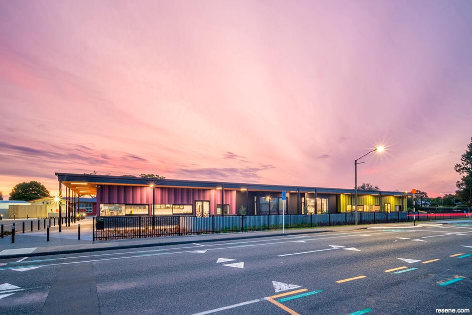
In the case of educational facilities, brightly-coloured cladding is not only friendly and approachable, but well-placed colours can assist in wayfinding. Signage may not be very helpful for young children that can’t yet read, but schools made up of numerous blocks that use colour to differentiate buildings or mark appropriate points of entry can make it easier for students to find the correct classroom when they return from recess.
More often than not, DCA’s team is the driving force behind bold exterior colour use on their school designs. “A lot of the conversation about colour in educational facilities is a two-way dialogue, but ultimately, we make the final selections for the whole scheme as we consider the colours of the buildings to be integral with the design ideas,” says Darryl.
“It’s always interesting and never predictable,” he adds. “Some schools are hands off, saying ‘you are the experts, you decide’, while others will have very strong ideas about colours. In some instances, we have been instructed to stay away from any colours that might be associated with gangs. In other cases, there might be a strong preference to align with the school’s identity colours. Certain projects might be considered a flagship building, and the request will be for us to differentiate that building from the others.”
Darryl says the boldest exterior colour scheme his team has completed to date was Toi Ohomai’s Health and Sciences Building. “This building was in the heart of the campus and a beacon for student learning commons, and we chose a palette of greens, both muted and bright. We drew our colour inspiration from the nearby forest as a place of respite, nature and health.
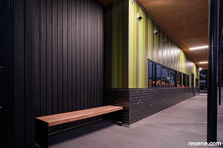
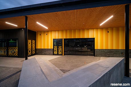
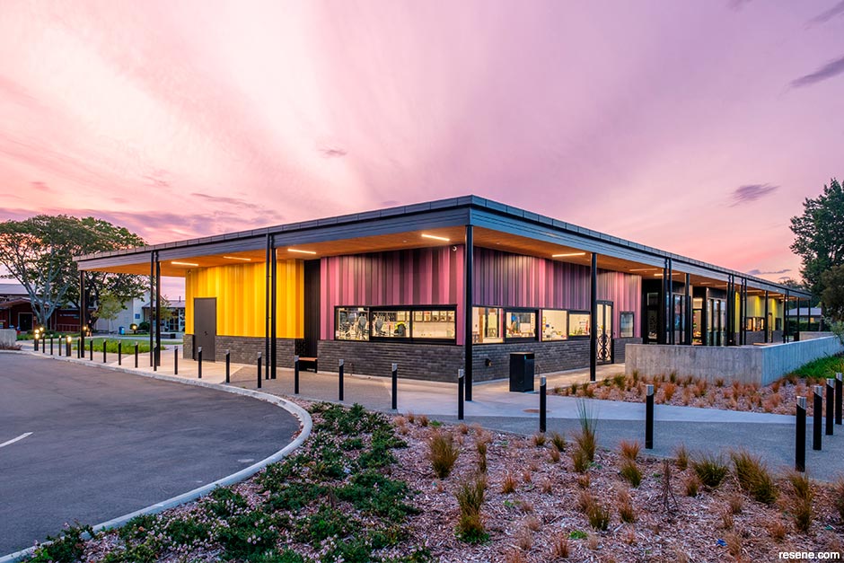
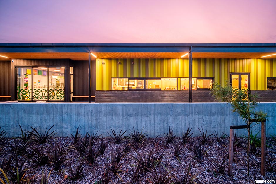
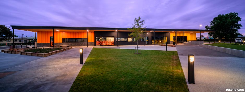
“Another would be the Heretaunga Intermediate Technology Block. This is a flagship building for the school and they are extremely proud of their technology curriculum. We sought ideas for colour generation through the briefing process and found they had four house groups, each with a colour assigned: purple, green, yellow and orange. They had the potential to be used in quite a vulgar way. We had to consider the proportion of walls we designated to colour, then we broke them into a variegated colour block scheme, separated by neutral cladding so they never visually met. It’s a colourful building, but not overwhelmingly colourful.”
The Heretaunga Intermediate Technology Block caught the attention of the Resene Total Colour Award judges because of the way the exterior palette was executed and they commented that the exuberance of colour emphasises the strength of the vertical architecture. The sections of multi-coloured cladding make the building’s elevations exciting, capturing the attention of onlookers without shouting nor fighting with the inherent colours in the surrounding environment. The warm tones of the yellow and orange Linea, painted in Resene Thumbs Up, Resene Dixie Chick, Resene Starbell, Resene Twisted Sister, Resene Clockwork Orange and Resene Ayers Rock, complement the straw-coloured hue of the timber soffits stained in Resene Waterborne Woodsman Uluru while the purple and green sections in Resene Chocolate Fish, Resene RSVP, Resene Fandango, Resene Waiouru, Resene Koru and Resene Topspin provide contrast in combination with sections of timber cladding stained in Resene Waterborne Woodsman Pitch Black and steel accents in Resene Armourcote 510 tinted to Resene Black. The project was awarded a Resene Total Colour Education Award in recognition of DCA’s careful curation.
Some project typologies – particularly those in suburban or rural contexts – often demand a more restrained approach. But when Darryl looks to blend a building with its surroundings, vegetation isn’t always what drives his exterior colour palettes. “We find that, in some locations, camouflage might be the most respectful response. For instance, planning rules around the Rotorua Lakes dictate a requirement for dwellings to be recessive against bush hillside backdrops,” says Darryl. “When we designed the QE Health, a wellness facility, blending meant a monochromatic white colour scheme. The site is surrounded by geothermal vents, so there is this constant plume of white thermal steam columns rising into the sky. For a house in a rural location, we noted the local context of white and light galvanised steel woolsheds in the area. Some might consider it to contrast with the rural vegetation, but we considered it to be blending into the local built vernacular, rather than blending with landscape earth tones.”
When DCA considers a project’s local context, the palette might also draw from history, culture and narratives. “For a kura (school) in Te Kaha, we chose Resene Parchment for the weatherboard cladding and Resene Waterborne Woodsman Uluru for the timber soffits to echo the sandy beach tones. Timber columns were stained in Resene Waterborne Woodsman Dark Oak and the steelwork was painted in Resene Ironsand. All these colours were mimicked again in the brickwork art surrounding the kura, speaking to the narratives of the local iwi.”
Some paint colours are simply more suitable for use indoors than outdoors. During the day, building exteriors are often viewed under direct sunlight. When it’s bright outside, sunlight can be very harsh and glary, flattening subtle colours and washing out light or nuanced hues. This effect is less pronounced on interior paint colours as sunlight that makes its way indoors is filtered to some degree, so there is generally less glare overall – and there is often more control over lighting conditions. That means there are far fewer limitations as to which paint colours can be used on interior surfaces, and colours with plenty of interest and complexity can be fully appreciated for their nuances.
Because glare can become a safety issue outdoors, it’s important not to exacerbate it. Whites and bright colours with high Light Reflectance Values (LRV) reflect more sunlight back at the observer. Many councils have a set maximum LRV for colours used on the outside of buildings to eliminate unnecessary glare. Often, this is below 50%. However, a number of manufacturers of popular exterior building products require specified coating colours to have an LRV of no less than 40% as darker paint colours absorb more of the sun’s energy than lighter hues, and the heat from this energy can be so intense that it damages the substrate. In these circumstances, Resene CoolColours can be important for balancing the need to camouflage and reduce glare with the requirements of your building material. Resene CoolColours look the same as normal Resene colours, but thanks to special pigment technology, they reflect more heat so that the surface and substrate don’t get as hot as a normal colour would. They are created by replacing the standard carbon black pigment that absorbs heat and light with a unique pigment that enables much of the infrared portion of the sun’s energy to be reflected.
Choosing a lower sheen formula or textured finish for exterior surfaces can also help to further reduce glare. Low sheen and matte options suitable for exterior applications include: Resene Lumbersider Low Sheen waterborne paint, Resene Lumbersider Matt waterborne paint, Resene X-200 weathertight membrane, Resene Walk-on flooring and paving paint, Resene AquaShield mineral effect, Resene Non-Skid Deck & Path and Resene Woodsman wood stains (waterborne, solventborne, decking and natural wood oil). Resene Construction Systems also offer a wide range of textured exterior cladding systems. Speak with your Resene representative to learn more about the choices that will best suit your project or find out more about these products at www.resene.com/products and www.reseneconstruction.co.nz.
Councils may also have restrictive covenants in place to dictate new developments. These are usually intended to ensure top tip When specifying waterborne acrylic formulas outdoors, add another layer of protection to keep bright and bold hues looking their best with Resene Clearcoat UVS. Formulated with UV absorbers, Resene Clearcoat UVS filters out harmful UV light, protecting the underlying coloured coat. uniformity, requiring buildings to use similar designs, colours and materials within a specific area. These colour regulations can be creatively stifling, especially if guidelines are overly regimented. Darryl recalls one such project where he and his team came up with an ingenious workaround.
“We were designing a commercial office building and our client had a yellow and red corporate colour scheme. As the project was located on State Highway One, there were some planning rules imposed on the use of ‘bright’ or ‘distracting’ colours. We submitted a black exterior colour scheme and it was accepted by planners. However, our design featured double height glazing over the reception façade facing the motorway. We painted the interior wall and features in yellow and red. At night, thanks to strategically-placed interior lighting, the whole building became a giant red and yellow billboard for the company.”
DCA’s creative solution underscores just how far clever thinking and attention to detail can go in the face of perceived constraints, and it invites others to consider creative solutions that can be implemented in support of client goals. By taking an innovative approach, your Resene paint colours and wood stains could be the ticket that takes your next exterior above and beyond their expectations.
Top tips
Draw attention to key features in your exterior design by specifying them in a high gloss finish, such as Resene Enamacryl or Resene Uracryl. The higher gloss will make the colour seem brighter and easier to see.
As well as the elements, exterior finishes are also prone to graffiti attacks. Protect exteriors from unwanted tagging with Resene Uracryl GraffitiShield, which can be used over painted finishes and concrete. Or apply Resene Uracryl tinted to the paint colour of your choice. This will give your client peace of mind that, if graffiti does occur, it can be quickly and easily removed without requiring a new paint job.
If you are limited by the range of Light Reflectance Values (LRV) you can specify on a project, search by LRV range in the online Resene colour library. Simply set the minimum and maximum LRV and it will show you the colour options available to help you narrow down your choices.
When specifying waterborne acrylic formulas outdoors, add another layer of protection to keep bright and bold hues looking their best with Resene Clearcoat UVS. Formulated with UV absorbers, Resene Clearcoat UVS filters out harmful UV light, protecting the underlying coloured coat.
› To see more of DCA’s striking portfolio of expertly-coloured projects, visit www.dcaarchitects.co.nz.
Colours mentioned in this article...
Products mentioned in this article...
This is a magazine created for the industry, by the industry and with the industry – and a publication like this is only possible because of New Zealand and Australia's remarkably talented and loyal Resene specifiers and users.
If you have a project finished in Resene paints, wood stains or coatings, whether it is strikingly colourful, beautifully tonal, a haven of natural stained and clear finishes, wonderfully unique or anything in between, we'd love to see it and have the opportunity to showcase it. Submit your projects online or email editor@blackwhitemag.com. You're welcome to share as many projects as you would like, whenever it suits. We look forward to seeing what you've been busy creating.
Earn CPD reading this magazine – If you're a specifier, earn ADNZ or NZRAB CPD points by reading BlackWhite magazine. Once you've read an issue request your CPD points via the CPD portal for ADNZ (for NZ architectural designers) or NZRAB (for NZ architects).
![]() Get inspired ! Subscribe
Get inspired ! Subscribe ![]() Get saving ! Apply for a DIY card
Get saving ! Apply for a DIY card
![]()
Can't find what you're looking for? Ask us!
Company profile | Terms | Privacy policy | Quality and environmental policy | Health and safety policy
Colours shown on this website are a representation only. Please refer to the actual paint or product sample. Resene colour charts, testpots and samples are available for ordering online. See measurements/conversions for more details on how electronic colour values are achieved.
What's new | Specifiers | Painters | DIYers | Artists | Kids | Sitemap | Home | TOP ⇧


