From BlackWhite magazine - issue 07, bright spot
Lucinda Penn uses Resene paints to create a can’t-miss liquor label.
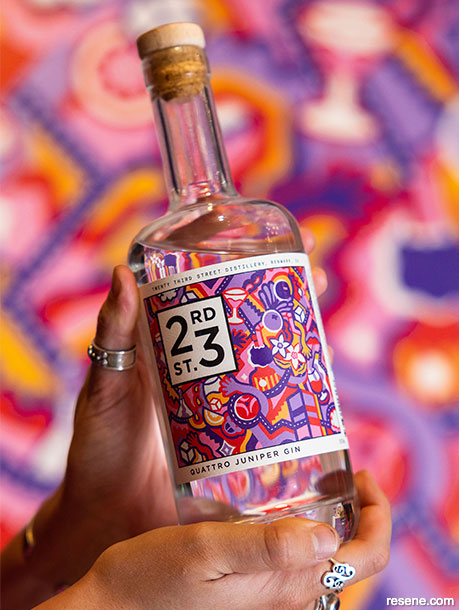
In a time when most branding and graphic arts are created digitally, artist Lucinda Penn took a hand-painted approach to make the artwork commissioned by 23rd Street Distillery, which they’ve used on the label of their newly released Quattro Juniper Gin.
The glossy, raised texture of her brushstrokes in Resene Lumbersider Low Sheen remain visible amidst her boldly graphic design in Resene Daisy Bush, Resene Dancing Girl, Resene Sunshade, Resene Vibe, Resene Ballerina and a custom made Resene white.
Over the course of the past decade in both Australia’s and New Zealand’s gin markets, the number of distilleries, variety of products offered and quantities being produced has seen immense growth. With so many options now available to choose from, it’s getting increasingly harder to ensure new gin products stand out from the crowd once they hit the shelves. For South Australia’s 23rd Street Distillery, their idea to have different creatives produce bespoke artworks that could feature as part of their label designs not only makes their product uniquely enticing, but it also offers support and promotion for talented local artists like Lucinda Penn.
Lucinda, who also goes by the wordmark LCND, works across both physical and digital media but is best known for her large-scale murals. Her first public work is on Mount Barker Road in Stirling, Adelaide Hills, but Lucinda’s art can now be found all over South Australia – including a feature wall at Adelaide Airport. Inspired by the everyday, optimism and symbolism underpin her energetic colour palettes and serve as an exploration of her own place in the universe.
23rd Street Distillery first engaged Lucinda to create a commission for one of their labels after she responded to a callout seeking artistic collaborators. The new gin they were planning to release – which they ultimately named Quattro Juniper Gin – was something of a feat to formulate and produce, so they wanted the bottle’s artwork to be representative of its particular qualities.
Lucinda says the gin’s recipe was a long time in the making and she wanted to do those efforts justice. “It took a lot of trials and experimentation for the distilling team to create the qualities they were after at a sellable scale. Last year, I went for a trip down to the distillery in Renmark, SA to explore the distilling process with their brand manager, Amelia. I was able to climb up the iconic glass distilling tower to see the piping as part of the process and the large wooden distilling pots down on the ground.”
Made using a quartet of distinct juniper varietals gathered from across Australia and Europe, which were extracted across four different production methods, it’s easy to understand how the gin got its name. The brand describes it as enticing with fresh aromas of lemon and juniper followed by a floral sweetness and a background of woody cinnamon and nutmeg spice; the palate is punchy, full and complex with a lingering finish that’s simultaneously warm and fresh.
To do the uniqueness of the spirit justice, Lucinda says she wanted to tell the story of the gin through a visual narrative of symbolic motifs. “The striking colour palette stems from the unique Bulgarian Red juniper (red), the native coastal Boobialla (light purple) with the additional traditional deeper-coloured junipers from Bulgaria and Macedonia (dark purple). In the design, there are repeating themes which appear in ‘fours’ such as the cocktails, ice cubes, hands and diamond-shaped star motifs as well as the four sides of the iconic distilling tower of the Renmark distillery. When searching for these details, you will also find citrus, distilling equipment, juniper flowers and the roads to Renmark – which all play a part in its unique production process,” she explains.
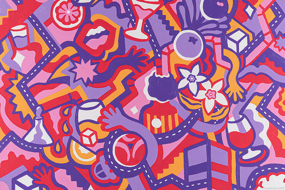
When selecting the Resene paint colours to use to represent all these important elements, Lucinda did some research to discover what hues could be used to fill a gap in the brand’s colour story. “After comparing the other 23rd Street Distillery bottle labels created by different artists, I found there weren’t many red and purple tones. I first chose Resene Vibe, which suited the Red Bulgarian juniper, and Resene Dancing Girl, which is a repeat favourite of mine that suited the light purple juniper. My style is an amalgamation of art and design principles, and I always use a darker colour, so Resene Daisy Bush was chosen to create depth by pushing the darkest tone backwards and using some contours for emphasis. Resene Sunshade stands out as the brightest colour while Resene Ballerina harmonises the palette. Overall, there are some colours which are in a similar family, but there is enough difference between all of them that they stand alone, being pushed forward and backwards on the flat surface to create intrigue,” she says.
Among her biggest challenges when painting the artwork was creating a design that had many quartets of objects where nothing important would be covered by the logo once it was scaled down. “The artwork on the board itself also still needed to feel cohesive without putting anything important in the space the logo would occupy. This involved lots of measurements which became complicated at times, but this was managed by working with the design team and brand managers to navigate changes in the label layout.”
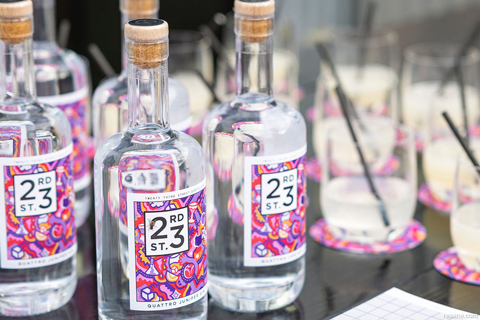
Quattro Juniper Gin was also the brand team’s first endeavour in releasing a smaller 500mL bottle compared to their usual 750mL size, so the process of creating an artwork that could suit the shrunken label dimensions was somewhat exploratory. Once completed, Lucinda’s painted artwork was approximately 55cm x 45cm then photographed to get the highest-quality image possible before scaling it down to fit the label design. Lucinda says the vibrancy of Resene paint colours and the consistency of Resene Lumbersider Low Sheen were integral to the success of the final label design.
Lucinda says the vibrancy of Resene paint colours and the consistency of Resene Lumbersider Low Sheen were integral to the success of the final label design. “When I paint murals, I love using Resene Lumbersider Low Sheen on my walls so much that I use my surplus paints in the studio on boards and canvases. Upcycling is a passion of mine, and this not only allows me to create vibrant and striking work, but it also helps to avoid waste. I had all of these Resene Lumbersider Low Sheen paints on hand from other projects which allowed me to trial different colour combinations while I was working through the design. This resulted in finding a new-to-me colour palette that was selected especially for this artwork.”
In honour of her commitment to using Resene paints to bring the product label to life, the judges at this year’s Resene Total Colour Awards recognised Lucinda’s clever and distinctive design with the Resene Total Colour Product Award. With such a visually-appealing design in show-stopping colours, they agreed it would be impossible to walk past such a well-dressed gin without wanting to get a closer look.
Original painting: Lucinda Penn
Gin production, brand management and graphic design: 23rd Street Distillery
Images: Jarrad French
This is a magazine created for the industry, by the industry and with the industry – and a publication like this is only possible because of New Zealand and Australia's remarkably talented and loyal Resene specifiers and users.
If you have a project finished in Resene paints, wood stains or coatings, whether it is strikingly colourful, beautifully tonal, a haven of natural stained and clear finishes, wonderfully unique or anything in between, we'd love to see it and have the opportunity to showcase it. Submit your projects online or email editor@blackwhitemag.com. You're welcome to share as many projects as you would like, whenever it suits. We look forward to seeing what you've been busy creating.
Earn CPD reading this magazine – If you're a specifier, earn ADNZ or NZRAB CPD points by reading BlackWhite magazine. Once you've read an issue request your CPD points via the CPD portal for ADNZ (for NZ architectural designers) or NZRAB (for NZ architects).
![]() Get inspired ! Subscribe
Get inspired ! Subscribe ![]() Get saving ! Apply for a DIY card
Get saving ! Apply for a DIY card
![]()
Can't find what you're looking for? Ask us!
Company profile | Terms | Privacy policy | Quality and environmental policy | Health and safety policy
Colours shown on this website are a representation only. Please refer to the actual paint or product sample. Resene colour charts, testpots and samples are available for ordering online. See measurements/conversions for more details on how electronic colour values are achieved.
What's new | Specifiers | Painters | DIYers | Artists | Kids | Sitemap | Home | TOP ⇧


