From BlackWhite magazine - issue 07, blue sky
Maddie Zwart models a brighter future for Wellington’s Civic Square.

Maddie Zwart
In many urban centres around the world, public squares are the city’s beating heart. They function like an extrapolation of a kitchen within a residential dwelling, the hearth where family and friends are drawn to gather. Whether we’re enjoying a casual lunch with coworkers or coming together for a jubilant celebration, we’re attracted to these landmarks to experience a taste of the buzzing energy that comes from playing an active role in the community’s social fabric. But as any urban designer or city planner worth their salt will tell you, just having a vacant footprint set aside in a city’s centre isn’t enough to bring people flocking to it. It needs to be designed with humans in mind and provide reasons for the community to engage with the space and one another, including appropriate amenities and programming to activate it.
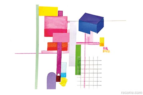
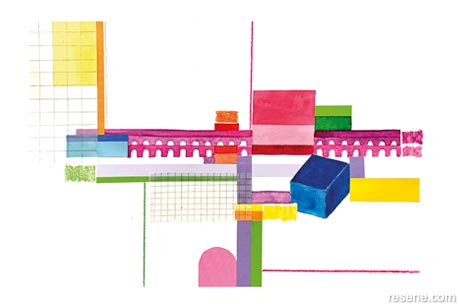
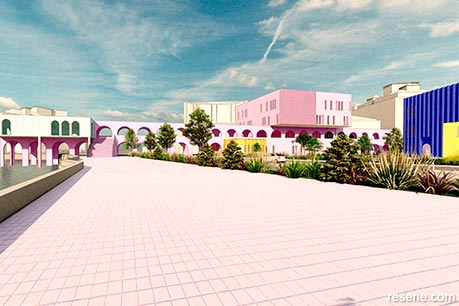
In a recent assignment, architecture student Maddie Zwart explored how the capital’s central plaza could be re-energised for citizens to better enjoy it, both now and in the decades ahead. Her resulting project, Architecture in a Playful Utopia, investigates a dichotomy of brutalism and gentleness, where strong concrete elements are energetically coloured to contrast with their surroundings and invite a playful experience. It’s a strikingly different and pleasantly optimistic alternative to the current space – one that attracted the attention of the judges at this year’s Resene Total Colour Awards and earned Maddie the Resene Total Colour Rising Star Award.
“The brief for the project was based on the ongoing changes happening in Te Ngākau, Wellington’s Civic Square,” explains Maddie. “Our fourth-year studio class was given the site and a basic brief, then we were split into different streams that dealt with various urban and architectural outcomes. My stream focused on urbanity and public use and I selected my specific site within Te Ngākau because I wanted to explore a different way of connecting the city to the sea. I thought it was particularly opportunistic to design a composition of buildings that would offer different creative and educational programmes for community members to participate in. I was encouraged to explore my unique creative voice in the process, which evolved into framing my proposal as a cultural landmark.”
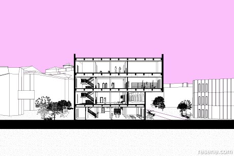
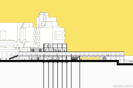
Maddie and her classmates were required to complete a full set of working construction drawings as part of their submission. She says this opportunity to dive into the details allowed her to engage with the textures and atmospheres of each building, right down to the finishes and furniture, to focus on achieving a holistic, sustainable design. “The function of my project is a vibrant urban park that responds to human-scale interaction and thinks about the city through a creative lens. Multifunctional education programmes invite people to enjoy the park’s activities while navigating thresholds between different colours and forms. But another important part of the project was to study sustainable design by approaching it through both materials and social issues, which encouraged us to think ahead to the future of sustainable design,” she says.
One of her biggest challenges lay in the colour selection and reconciling the reactions others had to the bolder hues she was drawn to using. When Maddie sought other opinions during her initial planning stages, some encouraged her to take a more conservative approach, but she held fast to her concept. “Living in Wellington, I have been exposed to some important architecture – such as that of Ian Athfield and Roger Walker. They were not afraid of using colour in their work and I think that approach is an interesting urban context to continue exploring,” she explains. “I wanted to challenge the way we currently use colour, as I believe the ultimate goal of architecture is to create engaging, functional spaces for people to enjoy. Some people in my studio classes were certainly confronted by the proposed use of bright colours in such a public space, with some saying that it may not even work. While it is out of the ordinary for spaces like this to exist in Wellington, that doesn’t mean that they shouldn’t. I kept headstrong in my development of the colour palette, as I wanted the project to be a provocation of the current urban development happening around the country.”
Maddie’s colour scheme was heavily influenced by her personal artistic painting practice. “Connecting the colour selections with my painting process inspired me to focus on creating a composition of colourful ‘blocks’ on the site. Due to the project’s urban implications, it was integral that the colours were vibrant enough to make an impact and that each colour contributed to the overall scheme. I find the relationship between art and architecture particularly fascinating. Because of this, I try to integrate various creative practices into my architectural work. So far, watercolour, sewing, collage, ceramics and acrylics have all made appearances in my projects.”
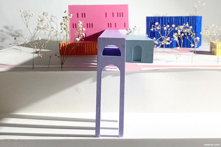
For Maddie, the colours she assigned to each block were symbolic of the activities that would take place there. “I felt it was important the colours had some relation to each structure’s purpose. For example, the Resene Glamour Puss block has artists’ studios, so I thought the colour should feel playful and creative. And I thought that the block that houses an auditorium should feel more present on the site, so I chose bold Resene Resolution Blue to contrast strongly with some of the gentler colours.”
Maddie says her Resene paint specifications also play a part in the project’s sustainability, as they can be easily maintained and reapplied as needed throughout each building’s lifetime. “Resene Lumbersider Low Sheen paint was chosen for the exterior of the buildings as I thought this finish would play nicely off the concrete texture underneath and is a versatile choice because it is easy to maintain. And since Resene is a New Zealand-owned company, specifying Resene products aligned with the social sustainability values of the project.”

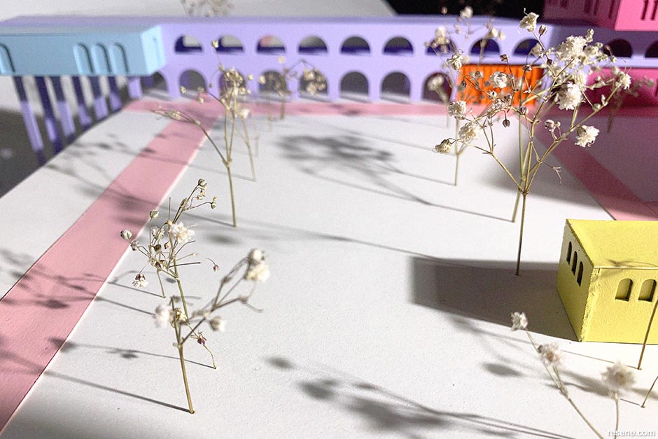
Maddie first referenced swatches on Resene’s online electronic colour library to find hues similar to her sketches before greater planning went into where each hue would be used. After completing her renders, Maddie wanted to better explore the physical qualities of the site and how the colours would relate to it and one another. This led her to construct a physical model out of paper and card painted with Resene testpots. The model allowed people to interact with the design and the paint colours that had been specified, which made it a successful tool to communicate her colour scheme and architectural decisions.
Taking the time to complete her model also brought others around to Maddie’s way of seeing. “I actively choose to be around colour, from the clothes I wear to the furniture in my home. This project allowed me to express my enthusiasm for colour through architecture and test its limits. I was surprised about how receptive people were to my colour choices in the end. This made me feel excited about the future of urbanity, and maybe we will see more pink and purple buildings popping up around the city.”
The project also gave Maddie the chance to reflect on the current social norms for exterior colour use. “I think that, when using colour, it is important to be unapologetic in a way, and I used the conversations with my lecturers and peers around colour to fuel my creative drive. The project is an ode to my own creative positioning as someone who loves to surround myself with colour in my everyday life. The topic of colour certainly bought up interesting conversations in my studio classes. If something like this was to happen in Wellington, there would need to be discussions on what colours mean for certain cultures and how the community might respond to this. However, as a student, I felt empowered to explore my creative voice so that I can use these learnings when I enter the industry.”
It’s clear from Maddie’s finished project just how passionate she is about a number of design-related issues like building sustainability, the housing crisis and the need for increased urban vibrancy – which will no doubt influence her future architecture career. “I am particularly interested in the urbanity of architecture and the relationship between this and other creative disciplines,” she says. “In my thesis, I am investigating how my personal creative processes – specifically sewing and collage – might impact architecture in the city. Surrounding these interests, topics such as environmental concerns, housing density and urban vibrancy are always in the back of my mind. In future, I hope to work on project typologies that address the community, such as cultural centres or galleries. I would also like to work on projects for housing density and contribute to our cities evolving into more pedestrian-friendly, sustainable networks.”
“I feel very lucky to have grown up on the beautiful Kāpiti Coast with my mum, dad and two sisters,” Maddie adds. Our family has always been underpinned by design and architecture. In my lifetime, my parents have self-built three homes and they’re set to start another this year. Their DIY attitude meant that, from a young age, I was getting stuck into various projects including painting ceilings and building decks. I have always been interested in making things and am grateful to my family for continuously supporting my creative pursuits.”
“I think my particular interest in architecture stems from I was six years old. I was watching Dream Home and told Mum I wanted to be the person that made the houses. Seventeen years later, I’m currently completing my Master of Architecture thesis at Victoria University of Wellington with Sam Kebbell as my supervisor and I’m loving it. Last summer, I completed a scholarship with FliP Homes and First Light Studio. I found the studio culture really engaging and exciting. It gave me time to practice my CAD skills and get involved in the industry, including working on some real-life solutions to density in Wellington. I’m super grateful to the team for supporting me.”
When she’s not busy with her university assignments, Maddie says she is often trying out a new artistic medium or nurturing a favourite creative skill. “A mixed media work I made recently features some Resene testpots I nicked from my Dad’s garage. I hope when I exit university, I can keep up this momentum and explore even more creative opportunities.”
We can’t wait to see where Maddie’s zest for colour and challenging the status quo takes her.
› Check out Maddie’s Instagram page at www.instagram.com/zwartmade_ to see more of her creative work.
This is a magazine created for the industry, by the industry and with the industry – and a publication like this is only possible because of New Zealand and Australia's remarkably talented and loyal Resene specifiers and users.
If you have a project finished in Resene paints, wood stains or coatings, whether it is strikingly colourful, beautifully tonal, a haven of natural stained and clear finishes, wonderfully unique or anything in between, we'd love to see it and have the opportunity to showcase it. Submit your projects online or email editor@blackwhitemag.com. You're welcome to share as many projects as you would like, whenever it suits. We look forward to seeing what you've been busy creating.
Earn CPD reading this magazine – If you're a specifier, earn ADNZ or NZRAB CPD points by reading BlackWhite magazine. Once you've read an issue request your CPD points via the CPD portal for ADNZ (for NZ architectural designers) or NZRAB (for NZ architects).
![]() Get inspired ! Subscribe
Get inspired ! Subscribe ![]() Get saving ! Apply for a DIY card
Get saving ! Apply for a DIY card
![]()
Can't find what you're looking for? Ask us!
Company profile | Terms | Privacy policy | Quality and environmental policy | Health and safety policy
Colours shown on this website are a representation only. Please refer to the actual paint or product sample. Resene colour charts, testpots and samples are available for ordering online. See measurements/conversions for more details on how electronic colour values are achieved.
What's new | Specifiers | Painters | DIYers | Artists | Kids | Sitemap | Home | TOP ⇧


