This kitchen splashback was designed to be part of the kitchen in a very inclusive way by referencing the different colours and luminosity levels used elsewhere in the kitchen area, in a very exacting way.
It needed to attract attention and possess energy while working in harmony with the rest of the open plan area including the dining and living areas.
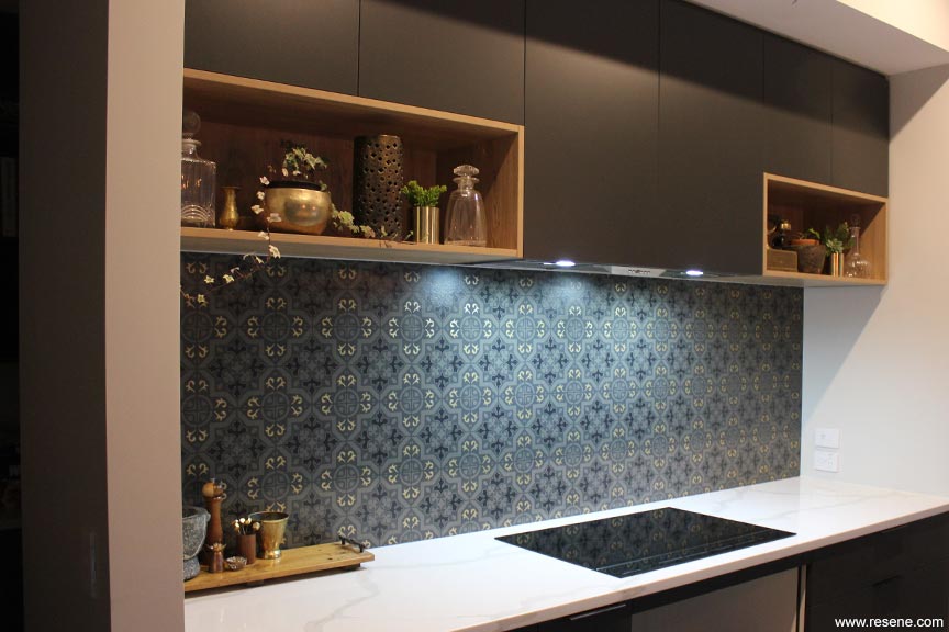
To ensure this outcome, the plan was create a hand painted tile look stencil to allow full control of where, what and how, the colour would be used. But being a splashback it also needed to be fit for purpose and durable.
Fortunately the splashback concept was part of the initial kitchen design so an area was allotted that fitted the desired stencil. The generous space of 2800mm x 800mm allowed for a good level of detail, which gave the pattern interest. In total it took 27 hours to complete to allow for the detailing to be hand-painted and intricate rather than roller applied. A super fine artist brush was used to paint the detail, leaving a border approximately 2mm from the edge of the stencil graphic. This effect gave the splashback depth, intrigue and a more artisan higher end finish.
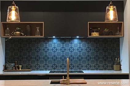
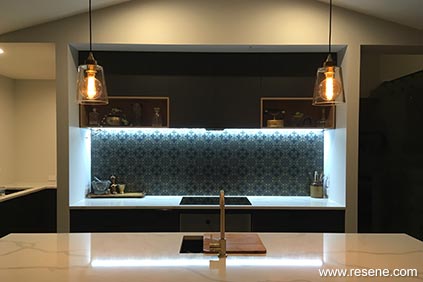
The design brief for the house was modern but timeless alpine design, always considering the environment outside. It brings to mind visuals of schist stone, golden tussocks, and heat though the sun or fire, all characteristics Otago is famous for. This was used to direct the colour palette of Resene Masala, Resene Merino, Resene Black and Resene Gold Dust metallic.
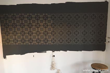
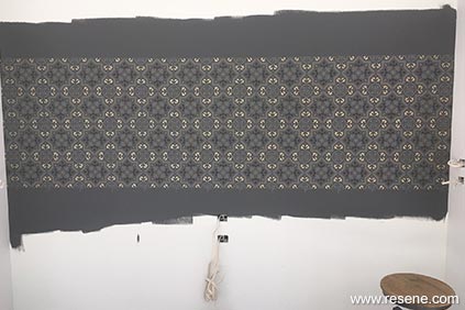
Resene Masala matched and complemented the cabinetry colour, providing a perfect background for the stencil. Its earthiness works with the polished concrete floors, creating a real sense of continuity in the kitchen area bringing both these aspects together. Resene Black added to Resene Masala was used for detailing and to reference the dark cabinetry handles. Resene Gold Dust was used for additional detailing and to draw attention to the gold tapware and reference other gold highlights in the kitchen area. The shimmering and gloss of the metallic gold also gives movement and energy to the design which is ideal in a social environment, such as a kitchen, it also offers a welcome contrast to the variations of Resene Masala. Resene Merino adds value to Resene Masala for the initial stencilling introducing small colour variations.
The complete work has been finished in Resene Uracryl satin clear for protection from the rigours of kitchen life.
Artist: Elissa Eastwood, Eastwood Environmental Ltd
Project: Resene Total Colour Awards 2019
Resene case studies/awards project gallery
View case studies that have used Resene products including many from our Resene Total Colour Awards. We hope these projects provide inspiration for decorating projects of your own... view projects
Total Colour Award winners:
2023 |
2022 |
2021 |
2020 |
2019 |
2018 |
2017 |
2016 |
2015 |
2014 |
2013 |
2012 |
2011 |
2010 |
Entry info
Latest projects | Project archive | Resene news archive | Colour chart archive
Order online now:
Testpots |
Paints |
Primers and Sealers |
Stains |
Clears |
Accessories
![]() Get inspired ! Subscribe
Get inspired ! Subscribe ![]() Get saving ! Apply for a DIY card
Get saving ! Apply for a DIY card
Can't find what you're looking for? Ask us!
Company profile | Terms | Privacy policy | Quality and environmental policy | Health and safety policy
Colours shown on this website are a representation only. Please refer to the actual paint or product sample. Resene colour charts, testpots and samples are available for ordering online. See measurements/conversions for more details on how electronic colour values are achieved.
What's new | Specifiers | Painters | DIYers | Artists | Kids | Sitemap | Home | TOP ⇧


