From habitat magazine - issue 36, pattern play
Gingham, with stripes and florals – why not? Interior designers share secrets on layering patterns like a pro.
Move over minimalism. Maximalist interiors layered to the hilt with patterns are big news. But it’s a style that many find intimidating. As children, we’re often taught not to mix patterns in our clothing. Perhaps, as a consequence, when it comes to decorating, we often lack confidence when using more than one pattern. But before you put patterns in the too-hard basket – stripe up some courage, find your checks and balances and know that mixing florals with polka dots won’t make you a Busy Lizzy. Creating dynamic spaces filled with playful patterns is a way of filling our homes with creativity, fun and personality. Painting patterns onto your walls, floor or furniture with coordinating Resene paint shades or using designs from the Resene Wallpaper Collection is a good place to earn your stripes, put together a little flower power or find checkmate on your floor. Here is some inspiration to get you started.
If you’re unsure what type of patterns will work in your room, take a hint from your home’s architecture. Patterns often have their roots in an era or a location, which can be an excellent place to find inspiration. For example, stripes, checkerboard/gingham and floral prints are vastly different styles, but they all have their roots in English country homes and marry well in a villa or bungalow. Mid-century modernism is famed for its geometric patterns, often made up of delicate thin lines paired with organic shapes, and works well with other futuristic patterns in a Scandi-styled home. Meanwhile, a classic trellis design, often associated with William Morris-inspired wallpapers (try Resene Wallpaper Collection MR70100), could be the starting point for your home’s glam makeover.
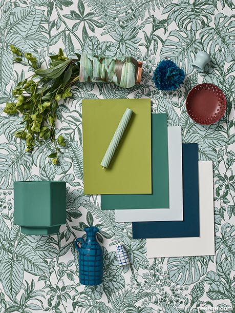
One of the keys to successfully layering multiple patterns is by connecting through colour and limiting your colour palette. Start by basing your colour scheme on a favourite pattern in a cushion or Resene wallpaper and find matching or complementary Resene paint colours. You can use the very helpful Resene Colour Match online and the Resene Palette Generator to find the perfect paint colours or try the Resene DecoratAR app.
Next, hold your patterns next to each other to check they harmonise. Some designs may appear monochromatic even though they combine several colours – to pick out the dominant colour, try blurring your eyes and see which hue jumps out. It also helps to follow the 60-30-10 rule. For example, use your dominant colour in 60 per cent of your room, the secondary colour in 30 per cent and save your accent colour for the final 10 per cent. Consider the number of contrasting colours in each pattern. A simple, repetitive pattern – such as a chevron or stripe – will appear bolder and busier if the two tones are opposite – e.g. blue and white. Yet two similar tones of blue or blues of different strengths, such as Resene Frozen and Resene Quarter Frozen (see right), will blend and present in a similar way to a flat block of colour.
Interior designer Megan Harrison-Turner has a nice catchphrase when pattern matching: “Connect with colour and contrast with scale.” Avoid teaming large patterns with other large patterns as the room can become too busy and the eye has nowhere to rest. It also helps to use a 2/3:1/3 ratio when picking out the sizes of different shapes.
“There needs to be a pronounced differentiation in the scale of the patterns,” she says. “For instance, large patterns and small patterns together work better than large and medium because the difference is more obvious.
“If you have a 10-centimetre-wide stripe, match it with a stripe that’s four or five centimetres wide. An eight-centimetre-wide stripe wouldn’t have enough contrast and would get a bit lost.”
Interior designer Vanessa Nouwens is on the same page, particularly regarding the trend for wallpapers with oversized floral motifs. “If using a floral pattern, try combining large-scale floral prints with delicate flower designs – too many large prints will dominate and will make the space very busy. Florals also work well when teamed with stripes and spots.”
Mixing patterns is a bit of a balancing act. Successful rooms often have places for the eye to rest or areas where there isn’t as much stimulation or interest. This gives the brain the space to make sense of what it’s looking at. “Combine patterns with blocks of colour in matching hues to make the room feel cohesive. It will calm your scheme down,” says Vanessa.
Megan suggests looking at the complexity of your chosen patterns and simplifying down the rest of the room. “If choosing two complicated patterns (of different scales, of course), add a simple pattern, such as stripes, and a solid Resene paint colour for balance. This is a great look, and it’s hard to go wrong with this recipe,” she says.
“Stripes are a wonderful foil to strong patterns and add spice to subdued patterns – use them in small amounts to add a dynamic layer, ensuring colours match closely with the predominant pattern,” she adds.
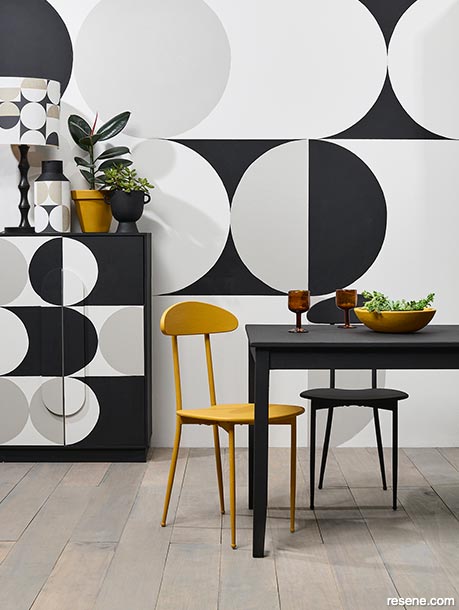
Try using contrasting neutral or muted pastel colours if a classic black and white checkerboard is too bold for your room. Floor and pendant light in Resene Eighth Joss and Resene Doeskin, wall in Resene Eighth Joss, dining chairs in Resene Quarter Doeskin, checkerboard vase in Resene Black and Resene White Linen and bowl in Resene Tobacco Brown. Dining table from Nood, artwork from Simply Creative.
Top tip Painting a pattern on a floor is a cost-effective way to change a room design without the long-term commitment of tiles. Resene Walk-on is a satin general-purpose flooring and paving paint that gives maximum durability and an abrasion-resistant finish. Finish with Resene Concrete Wax.
You’ve gathered your patterns; now, let’s spread them out. Consider all the surfaces and components when layering a room with pattern. Patterns can be used everywhere – on the floor or wall using stencils, on the walls or ceiling using Resene wallpaper or paint, or on lamps or cushions. Where you choose to place your pattern can enhance the room’s appearance.
For example, vertical stripes will optically elongate a shape. In contrast, horizontal lines will add width, which is helpful if you are trying to lower the visual height of a room. Spreading your pattern use around the space, while balancing with areas of flat colour, will create vibrancy and dynamism. Contrast and balance will help your wallpapers shine agrees Resene Senior Architectural Representative, Rebecca Long. “Contrast botanical wallpapers with geometrics, faux brick with faux steel and spots with stripes. Link the contrasting patterns through colour, sheen or texture to create cohesiveness.”
Room size is another factor to consider when deciding on patterns – generally, the larger the space, the bigger the print it can handle. The same rules apply when applying a pattern to an object or furniture. Limit the number of designs at play – no more than five or six, ideally – and remember to break up the pattern with areas of flat colour. Mimic the pattern shapes in the shape of your furniture and architecture – or vice versa. For example, if you have a cross-feature on the leg of a table or a curve on a headboard, repeating those shapes in your chosen patterns will help them ‘share’ the room with ease. Texture also counts as a pattern and can be an effortless way to add variation – try a textured coating such as Resene Sandtex Mediterranean effect or Resene FX Paint Effects to add a subtle layer to the room.
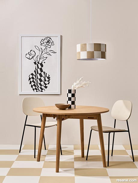
Checkerboard patterns may not be new, but they are very now. Used in iconic European architecture such as the Palaces of Versailles and Venaria in France and Italy and Britain’s Westminster Abbey, the checkerboard is making a resurgence in interiors and on the fashion runways. “The checkerboard is a simple pattern, but it is also quite bold in its design. The key to layering checks within one room is to mix the scale and spread its use around the room,” says Vanessa.
“You can also soften checkerboard patterns by choosing a check that combines two colours close in hue. A dusty pink like Resene Wafer and sage green like Resene Haven will appear ‘quieter’ than black and white.” To create a checkerboard design on a wall or floor:
Stripes are the most straightforward pattern to incorporate and can be achieved easily with paint. For clean lines, it’s best to mask the edges – using the width of the tape as the width of your stripe is a helpful trick. Hand-drawn stripes are easy to achieve yet best kept to small furniture or a section of a wall. Using pencil guidelines gives your brush something to follow when going freehand. Stripes are a great team player, and work well with many other patterns, says Megan. “Stripes can also create structure and calm among busy patterns, which can be nice as a resting place for the eye while still retaining interest,” she says.
Other patterns to try are trellis, basket weave or woven rattan on a large scale. These patterns are especially effective when paired with floral and leafy botanical prints.
Some patterns are just hard to make work together – and often that’s to do with the scale of the designs themselves. For example, Megan says animal prints usually don’t work with gingham or plaids. “Animal prints can be tricky, so can plaids. It’s best to sit with swatches for a couple of days before committing.”
Start small and layer patterns piece by piece – wallpaper a wall, add some patterned cushions to a block-colour couch, then paint an item of furniture in a playful design. Most importantly, have fun and follow your gut – a little trial and error as you go is often the key to pattern success.
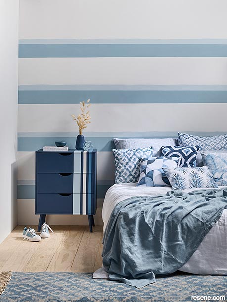
In this pattern-on-pattern room, I created an English country home aesthetic. I started with a botanical print – Resene Wallpaper Collection 37520-2 – for the main wall. Its delicate design gives an overall softness, making it a perfect pattern for a high stud or large room. The bold simplicity of block colour – Resene Tangaroa with battens in Resene St Kilda – on the lower wall provides breathing space between the upper wall and floor pattern and avoids pattern ‘clash’.
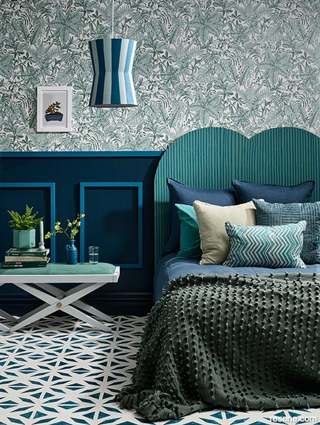
To create the floor pattern, I painted the base in Resene Rice Cake with a stencil design in Resene FX Paint Effects Medium mixed with Resene Tangaroa. The Resene FX Paint Effects Medium was applied through a stencil using a flat artist’s brush to create a ‘glazed tile’ look.
Once I had the three main surfaces balanced, I added more layers. The hand-painted stripes of the headboard (Resene Stromboli painted with pinstripes in Resene St Kilda) work well because the two colours are close in tone and almost appear as one colour and are therefore, less busy. Their imperfect strokes temper the straightness of the adjacent wall panels. The lampshade is painted in Resene Sorrento with broad stripes in Resene St Kilda, which accentuate its shape and enable it to stand out against its background. The legs and frame (painted in Resene Duck Egg Blue) of the bedside table mimic the geometric shapes of the floor motif. I added a final pattern layer with textural spots using a throw.
Vases, pots and accessories in Resene Sorrento, Resene Stromboli, Resene Tangaroa, Resene Duck Egg Blue and Resene St Kilda. Drinking glass from Freedom, candle and candleholder from Floral-centric, zigzag cushion from Collect Living, artwork by Grace Popplewell from Endemic World, velvet cushion from H&M Home, duvet, pillowcase, throw and other cushions from Adairs.

Projects: Kate Alexander, Megan Harrison-Turner, Vanessa Nouwens
Words: Kate Alexander
Images: Bryce Carleton
Search habitat magazine stories
Printed copies of habitat highlights are available from late March 2024 at Resene ColorShops and resellers, while stocks last. You can view back issues of habitat magazine online.
Specifiers:
If you have an idea, project or story that you think would suit habitat, we’d love to hear from you. Please drop us an email with your details and include photos if submitting a project.
Sign up for a DIY card and Save! Australia | New Zealand
![]() Get inspired ! Subscribe
Get inspired ! Subscribe ![]() Get saving ! Apply for a DIY card
Get saving ! Apply for a DIY card
![]()
Can't find what you're looking for? Ask us!
Company profile | Terms | Privacy policy | Quality and environmental policy | Health and safety policy
Colours shown on this website are a representation only. Please refer to the actual paint or product sample. Resene colour charts, testpots and samples are available for ordering online. See measurements/conversions for more details on how electronic colour values are achieved.
What's new | Specifiers | Painters | DIYers | Artists | Kids | Sitemap | Home | TOP ⇧