From Habitat magazine - issue 32, tips and tricks
Look to what you’ll be hanging on your walls to inspire your colour scheme.
It's a common conundrum for homeowners to finally settle on the perfect paint colour for a room and then feel at a loss for what to hang on the walls. But according to designer and stylist Kate Alexander of Places & Graces, this approach to fleshing out your interior scheme employs a bit of backwards thinking.
Art inspiration
"I can't even begin to count the number of clients who come to me asking me to pick artwork for their already designed space," she says. "While it can be done, it's much more of a struggle both in terms of finding something that will not only be the right colour, size, vibe and subject for the space, but it also needs to resonate with the owner. When I'm beginning a new design, I always start with the art instead."
Kate's strategy makes sense. Whether you opt for an investment piece or simply want to display something that holds sentimental value, art is always personal – and it's an integral part of a decorating scheme. Certainly, you should enjoy looking at the artworks you hang in your home; the subject, composition and colours all play a role in its visual appeal. But picking items that really speak to you is key, and it's the thing that sets art apart from simple decoration.
"I think buying art can be scary for people. Often buyers aren't confident choosing which art would work in their home. I believe it's important to feel a connection to the art. If something stops you in your tracks or makes you smile, or stirs some sort of positive emotion, it's probably right for you," says artist Jen Sievers.
The free online Resene Colour Palette Generator is a useful tool that can take the guesswork out of creating a colour scheme that will complement the hues in your art. Simply upload an image of the artwork to www.resene.com/palettegenerator and the tool will create a customised Resene palette based on the most common colourways that occur in the image. It will also tell you what proportion of the palette they are to help give you an idea of the colour balance, which can be especially helpful when you're trying to translate that information into your new interior colour palette.
When it comes to original artwork, though, it can be a challenge to photograph it in a way that will result in a truly perfect colour match. If an absolute match is the look you're going for, there is one way you can be absolutely sure you'll get it. There are hundreds of local artists across New Zealand and Australia that use Resene paints to create their masterpieces. Alice Berry is one of them.
"I love Resene colours because they are so thick, juicy and vibrant," says Alice. There are so many colours to choose from, and while I have my favourites, I like to bring in different colours each time I paint. I've learned how to work with them to create a lot of texture in my works – which sometimes means I let them partially dry and then go hard layering up the paint. The metallics are great, too. They bring a whole different element to my artworks – plus, I really enjoy a bit of sparkle in my life."
Hannah Jensen, Jen Sievers and Georgina Hoby Scutt are three other artists that use Resene paints to create their works, too. All agree that they're drawn to them because of the range of colours available and the finish they create.
When asked about individual original pieces, each artist was easily able to provide a list of which Resene colours they used to create it – which we then asked Kate Alexander to work her magic with. Kate shows how those same colours could be translated into interior schemes that not only look great but also do justice to the art by letting it be the star of the show.
Top tip: To get clean lines when painting two colours onto one area, use low tack masking tape to define each area for painting. If you'd rather paint and minimise taping, then paint the whole area first with one of the colours, usually the lightest or most used colour, then you only need to do one line of masking to paint the second colour.
For Alice, original artwork is all about just that: originality.
"You'll never find the same thing anywhere else. As artists, we put a lot of energy into our work and the final piece has a magic about it that you can't get from mass produced art. To be able to feel the paint, see the shadows and the textures that exist at different times of day. It's incomparable."
But with that being said, Alice also believes that there's nothing wrong with mixing it up.
"In my home, I have a mix of commercial/mass produced prints I love along with original pieces from some of my favourite artists. The originals always bring me joy, and each time I look at them, I notice something new – even within my own works!"
When Alice is seeking out colours, she often finds her inspiration comes from within. "As an abstract expressionist, I paint what I feel and experience."
"My recent body of work 'A Midsummer Night's Dream' was inspired by my experiences in Samoa. My palettes expressed my memories, so they were very rich and vibrant as they reflected my time there, which I loved."
In that collection of works, the blues of the ocean, the fresh greens of the tropical forest and the energising pinks, oranges and earthy tones from gardens and traditional Tapa clothes, all play a part in her colour palette.
"Painting is a real joy for me. I don't ever sketch out a painting before I start. I just gather the colours that feel right and see what happens. I also paint on all the frames of my pieces to signify freedom and not being stuck inside the box," explains Alice.
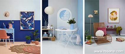
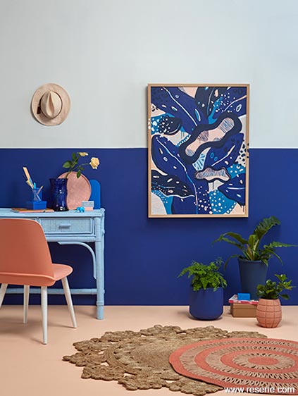
Kate designed a small home office space featuring original artwork Calm of the Sea/Laolao by Alice Berry, which is part of her aforementioned 'A Midsummer Night's Dream' collection and was created exclusively using Resene colours. It was painted using Resene Aviator, Resene Blue Night, Resene Cornflower, Resene Wax Flower and Resene Half Alabaster. Not only does the repetition of these same colours across a number of different surfaces within the room create a sense of rhythm, so do the many horizontal lines, including the 'horizon line' that divides the wall, the rectilinear shape of the desk painted Resene Sail and the picture frame. These angular forms have been balanced with rounder shapes, such as the tray in Resene Cornflower, the curve of the Resene New York Pink chair and the concentric circles of the woven rug, which are also painted Resene New York Pink. These details, too, play off the dots and shapes within the painting itself.
By painting the lower portion of the wall in the same mid-value colour from the artwork – in this case, Resene Aviator – it grounds the artwork more than had it been displayed just on a wall painted from top to bottom in Resene Triple Alabaster, which was used for the top section of the wall.
On the floor is lighter Resene Romantic, which visually reads as a lighter version of Resene New York Pink. "Though it isn't a colour directly used in the artwork," says Kate, "it feels enough the same that it still works with the palette while also acting as a point of difference from the rest of the scheme."
To finish the look, Kate painted smaller accessories and accents in Resene Aviator, Resene Cornflower, Resene Torea Bay and Resene Sail. And it's this attention to detail that really solidifies the cohesiveness of the room's design.
Top tip: Always check your paint colour choices with a Resene testpot before you commit. Paint an A2 size card, leaving a white border, and move it from wall to wall at different times of the day and evening to see how the light affects the colour.
Top tip: Always check your paint colour choices with a Resene testpot before you commit. Paint an A2 size card, leaving a white border, and move it from wall to wall at different times of the day and evening to see how the light affects the colour.
"Choosing the right colours for your home is such a personal journey," says Hannah Jensen.
"A home is a safe place for you to relax, unwind and hold joy-filled memories – and how you express that is the fun side of decorating. Hanging original artwork is such a special addition to your sanctuary, and finding a piece that evokes emotion within is always a great way to choose a work."
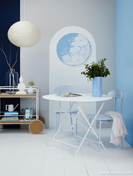
Chrysanthemum and Peonies by Hannah Jensen inspired the colour palette and unique design in this space, and its round shape inspired a painted wall design to frame it. Wall in Resene Flotsam, arch and floor in Resene Alabaster, right wall in Resene Polo Blue, stripe at left in Resene Bunting, chairs in Resene Link Water, vase in Resene Time Out and coasters in Resene Frozen. Table from Jardin, trolley from BoConcept.
Kate's design of a calming conservatory to house Hannah Jensen's unique 'carved painting' titled Chrysanthemum and Peonies certainly plays to the idea of sanctuary. Hannah builds up between 25 and 75 layers of Resene paint on her canvases before carving away designs that expose the colours underneath. This piece features 34 layers comprised of Resene Alabaster topped in Resene Polo Blue, inspiring the room's restful colour palette.
Rather than sticking to those two colours only, Kate also brought Resene Time Out, Resene Link Water, Resene Bunting, Resene Flotsam and Resene Frozen into her design to bring more texture into the space. The result is a room that matches in a literal sense – with the right wall in Resene Polo Blue and the arch and floor in Resene Alabaster – but doesn't convey the feeling that it's overly 'matchy-matchy'.
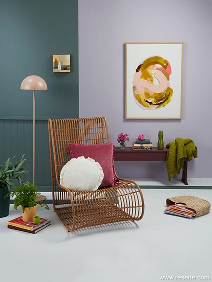
Kate's relaxed reading nook with its grown-up English country vibe shows how far your choice of hues can go in creating interest in a room. "Restful, receding colours were used for the backdrop, with the main wall in Resene Lola and a return wall with tongue-and-groove panelling in moody and brooding Resene Jurassic, to create an inviting space to wind down with a book," explains Kate.
Back wall in Resene Lola, return wall with tongue-and-groove panelling in Resene Jurassic, floor in Resene Concrete with stripe in Resene Jurassic, bench in Resene Cab Sav, tall plant pot in Resene Permanent Green, short plant pot in Resene Porsche and tiny vase in Resene Citron. Chair from Freedom Furniture, lamp from Città, original artwork (Begin Again by Jen Sievers and Still Life with White Bottle by Georgina Hoby Scutt) from endemicworld.
These serene shades have been punctuated by pops of bright fluoro, including the plant pot in Resene Porsche and the small vase in Resene Citron, injecting an element of cheerfulness in a small yet peaceful way. These highlights play off of the colours within the two original artworks, which were also created using Resene paints.
A stripe of Resene Jurassic follows the shape of the Resene Concrete floorplate and takes the colour off the wall and out into the room; its straight lines contrasting with the flowing curves of the chair, lampshade and large painting. It also moves your eyes around the room, forcing them to take their time and soak it all in – just as a painting does.
A mixture of different textures – shiny, matte, rough, smooth, hard, soft, knit and woven – bring tactile interest, adding to the cosiness of the nook. Kate was inspired by the differences in textures in the two paintings and has expanded that dichotomy into the rest of the room to create contrast.
"When you choose more than one piece of artwork to go in a space, mixing up their scales is one way of creating contrast between works that share colours in common. These two pieces are also similar in their brushstrokes and how their layers were formed, so even though they are of different styles, they still carry a sense of continuity between them. The swirls of the paintings are picked up in the shape of the chair, too. Although it's a large piece of furniture, its permeable structure ensures that it doesn't dominate the space," explains Kate.
In the same manner, a long bench in Resene Cab Sav does the work of a shelf. It offers plenty of space to hold books and decorative accessories, but it keeps sight lines lower to the ground to leave more visual space for the artwork.
While the case for basing the design of your interior scheme on the artwork you'll be displaying in it has been made, what about those of us who already have a scheme that's short on art – especially if you're looking for one or more originals?
"Original artwork carries an energy, almost like a tiny piece of the artist's soul. You can feel an original in a way that you can't with a mass produced artwork," says Jen Sievers.
Georgina Hoby Scutt agrees. "An original piece of art is full of soul. It holds its own energy and projects that into the space. It may sit as a quiet peaceful vibe, or radiate with huge energy."
Whether you're looking to find something unique or if you're struggling to find an original artwork that meets your needs, the good news is that most artists are open to commissions. Approach an artist whose style you appreciate with the dimensions and colours you're looking for and they will likely jump at the chance to create something special for your particular space.
"Many people think that creatives should just be allowed to do their own thing, but in actuality, a number of artists really enjoy the challenge of having a few constraints. It pushes them to grow and create things that they might not have done otherwise," explains Kate.
Whether you've already settled on your scheme or have yet to start, another sure-fire way to ensure that your artwork will match your interior scheme is to paint it yourself. Pick up some Resene testpots from your local ColorShop in colours that you love and let yourself get stuck in.
Need some inspiration? Visit www.habitatbyresene.com for a host of DIY artwork projects and other creative paint ideas to get you started.
If you have a space where you can't step back very far, such as in a hallway, it might just be the perfect place to hang an original painting. You won't have to deal with the glare off glass and will be able to get up close and personal with all of the details.
It's common for homeowners to want to hang their artwork quite high on the wall, possibly to keep it up out of harm's way and reduce the risk of it being bumped. However, you shouldn't be afraid to hang artwork – especially larger pieces – lower on the wall, which will allow you to view the details comfortably at eye level. After all, artwork that can't be seen properly can't be enjoyed properly!
Visit www.resene.com/artistgallery to learn more about some of the talented artists who incorporate Resene paints and products in their incredible original work.
styling: Kate Alexander
images: Bryce Carleton
artists: Alice Berry, Hannah Jensen, Georgina Hoby Scutt, Jen Sievers
Search habitat magazine stories
Printed copies of habitat highlights are available from late March 2024 at Resene ColorShops and resellers, while stocks last. You can view back issues of habitat magazine online.
Specifiers:
If you have an idea, project or story that you think would suit habitat, we’d love to hear from you. Please drop us an email with your details and include photos if submitting a project.
Sign up for a DIY card and Save! Australia | New Zealand
![]() Get inspired ! Subscribe
Get inspired ! Subscribe ![]() Get saving ! Apply for a DIY card
Get saving ! Apply for a DIY card
![]()
Can't find what you're looking for? Ask us!
Company profile | Terms | Privacy policy | Quality and environmental policy | Health and safety policy
Colours shown on this website are a representation only. Please refer to the actual paint or product sample. Resene colour charts, testpots and samples are available for ordering online. See measurements/conversions for more details on how electronic colour values are achieved.
What's new | Specifiers | Painters | DIYers | Artists | Kids | Sitemap | Home | TOP ⇧