From Habitat magazine - issue 26, autumn/winter 2017
Soft linens to ethnic prints, botanic designs and luxe weaves – must have fabrics for this season.
Our love of linen continues unabated and with new washing and tumbling techniques, fabrics are getting even softer. It may seem an oxymoron but synthetic fabrics are being made to more closely mimic natural fabrics like linen. Easy to care for and work with, these are a great option.
Look out for obvious weaves. These natural looking fabrics look great in neutral shades and washed pastel tones. Layer them up to add subtle contrast.
The ‘crafted’ look has an artisan vibe that borders on the cottagey with a soft natural palette of honeyed browns and earthy greens. Earthy tones of rust, terracotta, ochre and cinnamon replace lighter grey-browns.
Colour co-ordinate: Try Resene Quarter Coriander, on the walls, a muted pastel green to give quiet interest.
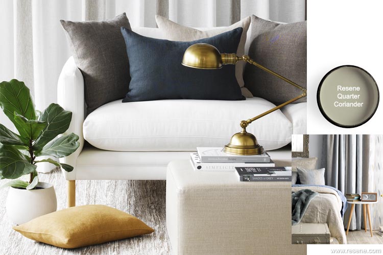
Garda collection from James Dunlop Textiles.
At the paler end of the spectrum, these colours are a part of the continuing popularity of the Scandi style with its soft grey-blues and watercolour shades, where natural materials and texture meet dusky pastels and icy whites
Blush pink and dusky mauves go well with the soft natural look. Sheer fabrics, floaty and ethereal, feed into this style.
Blues of all hues are popular from light sky blue to cobalt. Dark blues move ever closer to black. Stepping away from the classic French navy, colour drifts down into a deeper, darker world of black iris and indigo ink. Add denim blue, aqua blues and ultra-marines for looks that become coastal and casual.
Green returns as an interior colour with botanic green from grassy to olive, with the odd shot of jade and emerald.
Colour co-ordinate: Try Resene Quarter Atmosphere on the wall, a misty grey.
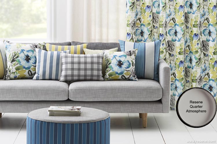
Tropicana and Stockholm from Warwick Fabrics.
As more and more people travel the world as tourists or emigrants, we seek an eclectic style with a rich tapestry of colour, ethnic patterns and texture. Global design influences and spicy colours create depth and personality.
Mixing geometric prints and textures is key to the fusion look. Cushions are an impactful way to start. Classic techniques such as Shibori, where fabric is twisted, folded and dyed, remain popular.
Deconstructed stripes, ombre effects and ikat designs give an organic, less tailored look. These more natural lines lend themselves particularly well to curtains, as they are more forgiving of the folds created by the curtain top.
Colour co-ordinate: Try Resene Celebrate as a feature wall, a spicy turmeric yellow. Or try an earthy ombre effect with a selection of Resene colours.
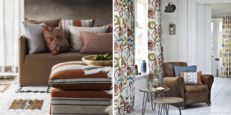
Left: Native from James Dunlop Textiles. Right: Java from Warwick Fabrics.
Whether it’s a tropical bamboo print or an over-blown painterly floral pattern, botanic prints allow us to bring the outside in. Many fabrics are whimsical while high-quality printing techniques create striking drama.
The look takes on a 'wilderness' excitability with big leaf motifs, leather contrasts, faux fur accents and fabrics with an eroded, worn effect.
Vibrant green is a mainstay colour, accented with energetic, up-beat colours like orange and yellow.
Colour co-ordinate: Try Resene Clockwork Orange as a feature wall, for a burnt autumnal orange.
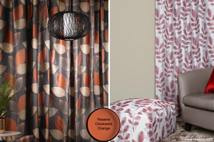
Left: Sandbelt from Maurice Kain. Right: Denizen from the Resene Curtain Collection with walls in Resene Truffle.
Dramatic shades, rich textures and beautiful detailing meet in the luxe look. A palette of oyster and mink with metallic accents combines with opulent silk and velvet for an elegant timeless feel. This refined glamorous look is all about sumptuous textures and luxurious materials that shine in a chic, serene palette.
Or go bold with rich jewel coloured fabrics that carry a decadent Bohemian vibe: emerald green, purple and ruby red.
Colour co-ordinate: Add a metallic feature wall in one of the many colours from the Resene Metallics and special effects range.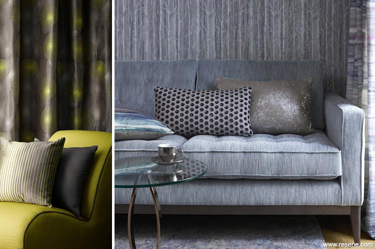
Left: Astral and Sonic from Maurice Kain. Right: Voyage Alchemy from Warwick Fabrics.
Geometric shapes, patterns and textures are never far away from featuring in our interiors and are continuing in strength this year. Choose from muted tones or monochrome styling to really create a statement piece. Combine with hints of metallic and natural textures for a versatile interior look that is also thoroughly modern.
And watch out for a return of stylised motifs that hark back to the Art Deco age.
Colour co-ordinate: Create your own geo-inspired wall art with a mix of Resene testpots, available in a huge range of colours.
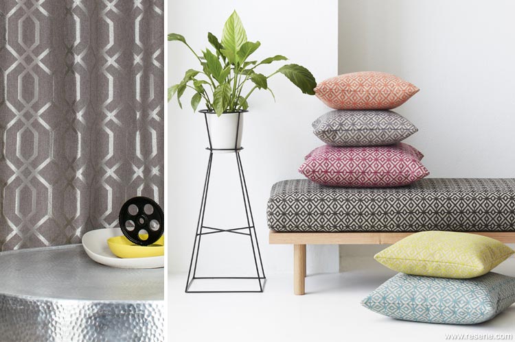
Left: Intersection from the Resene Curtain Collection with walls in Resene Quarter Atmosphere. Right: Bolton from Warwick Fabrics.
The spirit of the seaside has always been alive and well in this country. Relaxed textures and simple stripes reflect the comfort and informality of a home by the sea… even if you don't actually live by the coast.
Fresh blues are a natural starting point. Partner them with stripes and patterns inspired by the seaside. Add fluid sheers, washed linens in sandy shades, and textured cushions.
Colour co-ordinate: Try Resene Breathless on the walls, a cool blue-grey blend.
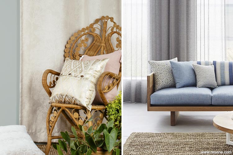
Left: Generation from the Resene Curtain Collection with walls in Resene Duck Egg Blue. Right: Axella from Warwick Fabrics.
Pictures and trends: Basford Brands, James Dunlop Textiles and Warwick Fabrics
Search habitat magazine stories
Printed copies of habitat highlights are available from late March 2024 at Resene ColorShops and resellers, while stocks last. You can view back issues of habitat magazine online.
Specifiers:
If you have an idea, project or story that you think would suit habitat, we’d love to hear from you. Please drop us an email with your details and include photos if submitting a project.
Sign up for a DIY card and Save! Australia | New Zealand
![]() Get inspired ! Subscribe
Get inspired ! Subscribe ![]() Get saving ! Apply for a DIY card
Get saving ! Apply for a DIY card
![]()
Can't find what you're looking for? Ask us!
Company profile | Terms | Privacy policy | Quality and environmental policy | Health and safety policy
Colours shown on this website are a representation only. Please refer to the actual paint or product sample. Resene colour charts, testpots and samples are available for ordering online. See measurements/conversions for more details on how electronic colour values are achieved.
What's new | Specifiers | Painters | DIYers | Artists | Kids | Sitemap | Home | TOP ⇧