From Habitat magazine - issue 15
The widely held view is that art looks better on white walls. But is that always the case?
The theory goes that art looks better on white walls – it apparently allows the art to stand out, and for the eye not to be distracted by the coloured walls behind.
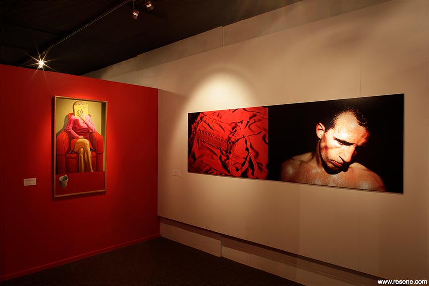
But it isn’t necessarily so! Some recent exhibitions around the country have showcased the vitality and impact which results from acting fearlessly with colour. One of these, an exhibition simply titled Colour, staged last year in two venues in Wanganui, used 11 distinctly coloured spaces to explore the feelings produced by art against the different backdrops.
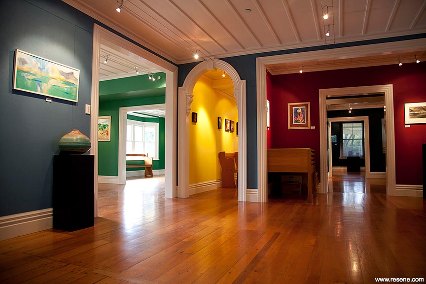
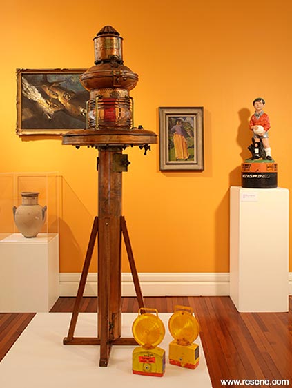
The Northland Society of Arts’ Reyburn House Gallery has also taken the colour principle seriously. David Cunis, the society’s gallery technician, sees neutral walls as both boring and out-dated, minimising rather than maximising the art’s impact. The society’s chairman, David Procter, agrees that hanging art against a rich colour often works wonders.
The same principles can be used at home. Approach your own ‘artwork styling’ by taking stock. Examine each space’s character, scale, setting, lighting, and reflective properties. This sounds complicated, but a little thought and planning can have a fabulous result.
Next, ask yourself whether you adore those artworks you own. Just because some painting was handed down to you doesn’t mean you have to display it! Life is too short to look at things you don’t cherish.
So – here’s the fun bit – what is it that you really adore in art and life? What moods or themes would you like your own spaces to evoke? Why not reflect these passions? If you want to remind yourself of a specific place or create a certain atmosphere, you can do so through art. Other possessions can always be stored, given away, or sold! If you have admired artworks you’ve seen in a particular café or while on a wonderful holiday, commission or buy something similar. Your surroundings should psychologically lift you.
You may have totally differently themed artworks assigned to different rooms. Each room can have its own distinctive feel. Think about those rooms in relationship to the artworks. Could the colour or treatment of the walls be changed to better suit?
Some people work in the opposite way. They’ll ‘inherit’ a certain interior wall colour, and then find artworks which they think will suit the colours. It may work, but do this and you may never truly love your surroundings!
Why not experiment with different wall settings by painting different Hoppercoloured Resene testpots onto large pieces of paper? Try A3-sized pieces of card, and place these behind the artworks you intend to display in each space. Now cast a critical eye over the colour in its setting. Does it work with the current amount of light? How does it look against what’s beyond the windows?
Will this background colour calm you down? Or rev you up? Which feelings would you rather experience daily?
Take a look at the stunning colours in Whangarei’s Reyburn House, in the pictures above. Do you like the feel of strong colour contrasted against other strong colours, or would you prefer the rooms to be graduations of similar basic tones? Maybe you’d prefer just one definitely hued wall in each space, with a certain grouping of themed artworks hung here.
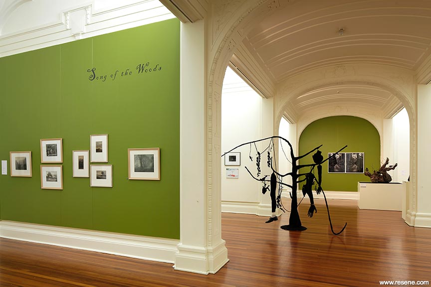
Curator and public programmes manager of Wanganui’s Sarjeant Gallery Greg Donson thoroughly enjoys using strong background colour. A recent show titled Song of the Woods focused on trees, and therefore featured a leafy green (Resene Grass Hopper) painted backdrop.
The Colour exhibition at the Sarjeant Gallery with Resene Golden Bell walls and artworks by Peter McIntyre and Derwent Lees.
Greg finds that “quiet, unassuming artworks” can receive more attention against a coloured wall. Such artworks, on cream, would “get lost,” he says. “Selecting a colour provides drama and draws attention. You shouldn’t match a wall colour too closely to a major tone within an artwork, though, as this can look too contrived. What you’re after is a tone which enhances but won’t overpower the works,” he says.
Auckland auction house Art + Object often repaint their walls in strong colour (electric pink, yellow, sleek silvery grey) for different exhibitions to utterly change the way people view an artwork.
Director of art Ben Plumbly cautions against using too bold a colour that will drain the life out of artworks. Sometimes, he says he’ll take his cues from background colours in the artworks to be displayed. He says you know you’ve been successful when the art appears bigger and more substantial, rather than weaker, smaller or more pallid.
Finally, if you’ve painted a wall for particular artworks, and don’t love the result, it may be an issue of visual balance, or too many focal points. Try subtracting room items. Add black or white accessories, ceilings or floors. These may ‘ground’ or lighten your scheme so it all looks right. Switch paintings around. Your eye should be the final judge!
Don’t be afraid to experiment. Everyone loves seeing art against solid colour, rather than white or cream. Hang it no higher than general eye level. Having two or three strongly coloured walls to choose from means more of your pieces can have the perfect backdrop. For instance, a dark-blue-toned piece with no frame will disappear against a similarly dark backdrop, but will zing against a yellow wall.
Take your cues from the art itself but also the size and light of a space. Contrasting art against different colours of similar ‘weight’ or ‘depth’ is a good thing, visually pushing a picture out. Don’t be timid. Create bits of theatre with strong colour, even if it presents more of a challenge when styling your home. Remember, more lighting might be required for optimal effect. Your everyday backdrop can become a whole lot more exciting.
And if you do end up deciding that white suits you best, try something with a touch of black in it, such as Resene Black White, which will add more depth.
words: Leisl Johnstone
Search habitat magazine stories
Printed copies of habitat highlights are available from late March 2024 at Resene ColorShops and resellers, while stocks last. You can view back issues of habitat magazine online.
Specifiers:
If you have an idea, project or story that you think would suit habitat, we’d love to hear from you. Please drop us an email with your details and include photos if submitting a project.
Sign up for a DIY card and Save! Australia | New Zealand
![]() Get inspired ! Subscribe
Get inspired ! Subscribe ![]() Get saving ! Apply for a DIY card
Get saving ! Apply for a DIY card
![]()
Can't find what you're looking for? Ask us!
Company profile | Terms | Privacy policy | Quality and environmental policy | Health and safety policy
Colours shown on this website are a representation only. Please refer to the actual paint or product sample. Resene colour charts, testpots and samples are available for ordering online. See measurements/conversions for more details on how electronic colour values are achieved.
What's new | Specifiers | Painters | DIYers | Artists | Kids | Sitemap | Home | TOP ⇧


