Architecture NZ x Resene Colour Collab
After graduating from Melbourne’s RMIT, architect Paul Anselmi worked in Europe and Asia. Six years ago, he joined Bull O’Sullivan Architecture’s newly built Lyttelton studio, where his focus has been on crafted residential and small public projects.

You recently won two Resene Total Colour Awards. Can you tell us about your colour choices in each project?
The suburban Chen Anselmi Units were made up of 18 colours, selected by my partner Maria and me; they were either subtle, calming background colours or more lively accents. The challenge was that each needed to work with others in its space. When you have compact and controlled space, colour can be a powerful tool for the senses, providing a feeling of expanse, uplift and inspiration.
Like the units, the Te Hohepa Te Kōhanga Reo preschool in Christchurch used colour as an economical solution to a limited material palette. The preschool’s spiritual four-coloured whetū (star) creates a juxtaposition between two colours on each façade and its respective internal space, and this offers a way to differentiate each learning area with a certain feeling and to provide wayfinding for the children. In the central courtyard, the four colours come together like a bright kaleidoscope. We brought each colour into every material, from paint on the cladding and joinery to carpets and acoustic panels.
Colour is clearly integral to your work.
The use of colour can be such a simple-but-powerful tool to invoke sensations or memories: shared collective memories of place, nature, objects or feelings, or more personal individual memories.
Were there any particular memories that inspired you to choose the colours you selected for your collaboration?
In short, earth and art. I wanted to go back to the basis of indigenous artworks that inspire me. This interest began when I was exposed to local art as a kid, through an Aboriginal aunt and a cousin, who was a young artist. During high school, with their help, I curated an exhibition of local indigenous artworks. It’s amazing to think that ochre pigments, clay and charcoal, have been used in imagery in Australia for 50,000 years and are all dug from the artists’ land. There’s something familiar, warm and universal to these pigments that is relevant to the past and the present. This could be anything from the earth, bricks, burnt wood, rusted metal, autumn leaves, kōkōwai carvings, and so on.
What drew you to reference Aboriginal artist John Mawurndjul’s 2003 work Mardayin at Kudjarnngal?
I love the understated-but-complex compositions created through the layering in John’s works. The rarrk cross-hatching technique is very multidimensional; you can view it at micro and macro levels. Up close, the composition is made up of careful details of overlapping lines and structures but, when you zoom out, the colour tones seem to change and the layering forms a kind of shimmering veil. I’m attracted to John’s personal abstraction of the rarrk technique. Here, there is a clear underlying grid and everything else seems organic within that. He uses the traditional pigments, but they look contemporary and new colours seem to emerge through the layering.
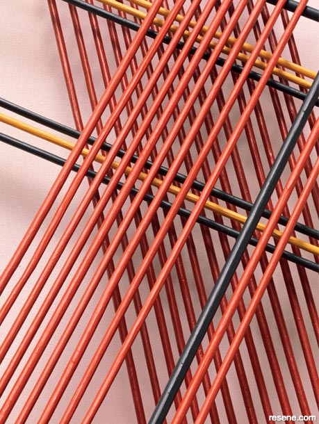
How was your artwork created?
I wanted to translate a micro-detail of the rarrk cross-hatching in John’s painting into three-dimensional space. Sticks painted in Resene colours were suspended and overlapped, and light and shadow add a layer of depth and complexity. The muddied pinkish-white (Resene Ethereal) is the background, with yellow ochre and black accents. Moving between scales and layering are similarly things we do in architecture.
Architecture NZ. December 2021
Expert inspiration
Get inspired by colour and design professionals!
Discover architecture, art, design and colour! Browse through articles from the following magazines: Architecture NZ, Good, NZ House & Garden, Style, Life & Leisure and BlackWhite.
![]() Get inspired ! Subscribe
Get inspired ! Subscribe ![]() Get saving ! Apply for a DIY card
Get saving ! Apply for a DIY card
![]()
Can't find what you're looking for? Ask us!
Company profile | Terms | Privacy policy | Quality and environmental policy | Health and safety policy
Colours shown on this website are a representation only. Please refer to the actual paint or product sample. Resene colour charts, testpots and samples are available for ordering online. See measurements/conversions for more details on how electronic colour values are achieved.
What's new | Specifiers | Painters | DIYers | Artists | Kids | Sitemap | Home | TOP ⇧