Opting for a statement piece of furniture such as a sofa in a splashy colour can bring a lot of character to your living space.
But given that it’s a big investment, you’ll want to have a solid plan for what paint colours and décor will complement it and how to style it in your home – especially if you want to try and make it work with existing items you already own.
For others, home decorating can be a process – especially for young people and new homeowners. Not everyone will have a big budget set aside to buy everything they have their heart set on all at once. You might need to save and splurge in fits and starts; but while you wait to bring your full decorating dreams to fruition, that doesn't mean your space needs to look fragmented or incomplete.
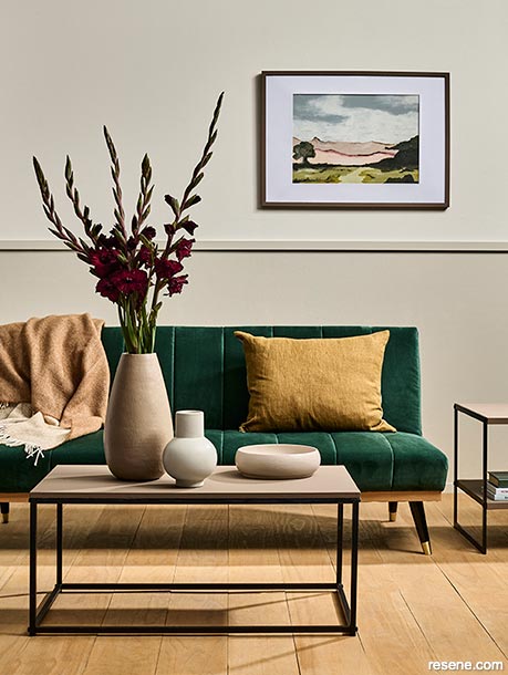
Although this space says luxe, the emerald velvet sofa is the only spendy item in it. It shows that with a carefully curated colour palette, a bit of creativity and a ‘number eight wire’ attitude, the same decorating lessons can make one special item shine – or bridge the gap while you scrimp and save up for the rest of your furniture.
The base of this living space and much of its décor is neutral. And yet, the way it has been richly layered with varying tones and textures makes it both interesting and harmonious. Rather than a flat white or cold grey wall colour, the wall features a pair of warm and complex tonal neutrals: Resene Eighth Thorndon Cream on the upper portion and Resene Half Thorndon Cream on the lower portion. Both of these hues have a slight greenish undertone; while they don’t visually read as overtly verdant, it helps them to blend beautifully with the emerald of the statement sofa.
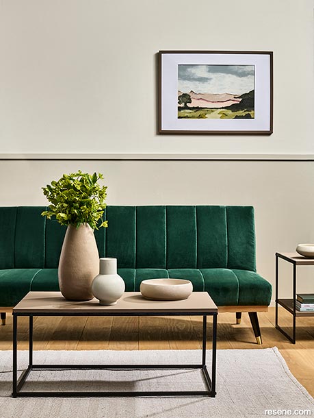
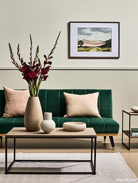
Historically, dado rails were installed in dining spaces at the height of the back of the chairs to help protect the wall surface from damage. Today, they’re an affordable and easy way to add character to a room with nothing more than a measuring tape, level, hammer, nails, wood filler and some fine sandpaper. Plus, if you’re concerned that carrying a single paint colour from tip to toe in a room will be overwhelming, a dado rail creates a natural break and the opportunity to use one colour for the bottom portion of a space and a different colour for the top. In most cases, it’s preferable to use your darker hue for the lower section to create a ‘grounding’ effect in the space. Your upper paint colour can also be carried up on to your ceiling and the darker one can be taken on to your floor for added continuity.
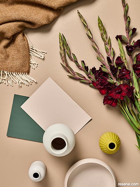
We have opted for a darker neutral on the floor, Resene Dusty Road, to bring further grounding to the space. Rather than having a green undertone, Resene Dusty Road has a hint of red to it. Because red and green are opposite one another on the colour wheel, they create what’s known as a complementary colour scheme. But because these complementary hues only appear as undertones, the effect is subtler and avoids the risk of feeling too ‘festive’.
Another way to reduce the contrast between your red and green tones is to use your palette to reduce the distance between them. This can be done by converting your palette from a complementary colour scheme to an analogous one. Analogous colour schemes are made up of hues that fall next to each other on the colour wheel. By adding accents in orange, gold and yellow tones, you bridge the gap in the spectrum between the red and green.
One of the best things about paint is that you can use it on practically anything, so long as you use the right paint type for the job and put in the proper prep work. It’s a budget-conscious decorator’s best friend and a great tool for getting more life out of pieces of furniture and décor that you already own or for creating a matching set out of a mismatched collection. After lightly sanding down the tops of our budget tables and wiping away the dust with a clean, dry cloth, we applied a coat of Resene Waterborne Smooth Surface Sealer. This helped to give our painted topcoats in Resene Lustacryl tinted to Resene Domino something to grip on to. Resene Lustacryl enamel has a durable, semi-gloss finish that’s appropriate for furniture without looking ‘too shiny’, making it a great choice for upcycled pieces.
When it comes to furniture, one of the under-appreciated details is the colour and shape of the legs. Generally speaking, the shape of your sofa and coffee table legs should be similar, the colour should be similar on both for it to feel like a ‘set’. If the legs of your sofa are black and cylindrical and your coffee table legs are angular and wooden, paint the latter in Resene Lustacryl tinted to Resene Black to unite them.
One of the integral principles for making a space feel cohesive is carrying out a colour scheme that relies on the ‘rule of three’, so try to ensure that each accent colour that you use occurs in at least three places throughout your space. Your eye and brain will automatically link them and communicate that the different items you are seeing are connected to one another. By using Resene paints to colour each of the hard surfaces in our space, it’s easy to make sure each colour is used three times. For instance, Resene Domino appears on the coffee table, the side table and the picture frame while Resene Dusty Road appears on the floor, the large vase and in the artwork.
It can sometimes be difficult to find a piece of artwork that coordinates with the colours in your space. But by picking up a few Resene testpots in colours from your palette, you can always create one yourself that’s sure to be a perfect match. In this space, we painted a landscape in Resene Periglacial Blue, Resene Half Thorndon Cream, Resene Lemon Ginger, Resene Middle Earth, Resene Half Doeskin, Resene Domino, Resene Midnight Moss, Resene Soothe and Resene Digeridoo. But if you don’t consider yourself much of an artist, there are plenty of professionals and amateurs around the country that use Resene to create their works who would be happy to produce a piece especially for your space in colours that match or coordinate. The majority of those in the Resene Artists’ Gallery take commissions, so simply look for a style that speaks to you and you’ll find all the information you’ll need to make contact. Not only will you be supporting a local artist, but you’ll also end up with a completely unique work of art that’s perfect for your space.
Some of the colours in this palette may seem surprising, but they all work together because they rely on hues drawn directly from nature. Even something as simple as shopping for fresh (or fake) flowers in a colour that ties into your palette, such as these gladiolas that play off the painting’s Resene Digeridoo details, can go a long way in rounding out your palette without breaking the bank – especially if they’re displayed in a vase painted with a Resene testpot to match or coordinate with your colour scheme.
Styling by Laura Lynn Johnston. Photography by Bryce Carleton. 2022
Colour inspiration - latest looks gallery
Get inspired with colour and the latest decorating and colour trends! Select just the right look and mood for your space.
Filter: kids & teens | greens | blues | yellows | neutrals | oranges/browns | pinks/reds | greys/blacks | violets | pops-of-colour/multi-colour
A patio for the gods
A Mediterranean inspired outdoor living space
Master planning
An embedded ensuite in a master bedroom
![]() Get inspired ! Subscribe
Get inspired ! Subscribe ![]() Get saving ! Apply for a DIY card
Get saving ! Apply for a DIY card
![]()
Can't find what you're looking for? Ask us!
Company profile | Terms | Privacy policy | Quality and environmental policy | Health and safety policy
Colours shown on this website are a representation only. Please refer to the actual paint or product sample. Resene colour charts, testpots and samples are available for ordering online. See measurements/conversions for more details on how electronic colour values are achieved.
What's new | Specifiers | Painters | DIYers | Artists | Kids | Sitemap | Home | TOP ⇧