If you’re about to create a colour scheme and don’t know where to begin, here’s a six-step process to get you started.
There’s no point painting your interiors in vintage pastels if no-one in your family likes pink, lemon and pale blue. The best colours are chosen with the owner’s personality in mind. A nature lover may prefer greens and blues to bright reds, while an out-going owner may prefer bold colours.
You may already know what colours you like. Even so, use this book, magazines and websites to inspire you. Don’t over-think it, just collect or tag what appeals. Then, when you have a decent-sized collection, look for common elements. It might be that your choices are all light, casual and beachy, or all moody and masculine.
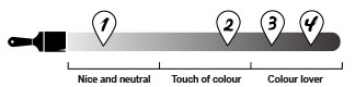
Visit your local Resene ColorShop or reseller and pick out colours that you’re instinctively drawn to. Together with your collected images, you’ll soon see a pattern emerge. If you thrive on change, you might choose a neutral colour scheme so that you can regularly choose new accessories like cushions and rugs without affecting the entire scheme. tiles or timber flooring then mid-range colour on the walls and pale colours on the ceiling.
A big driver of interior style and colours is the style of the house. An old character home will inspire a different look to a modern box, or a mid-century suburban home, or a timber-clad retreat in the bush.
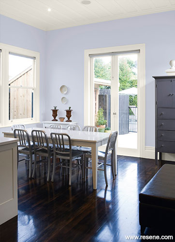
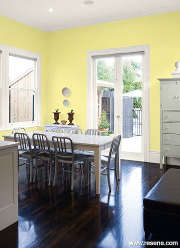
It’s the same with the setting. If there’s a dominant feature nearby like the sea, bush, rolling farmland or city skyline, you might use colours inspired by those aspects. If you want to highlight the view, choose a lighter colour palette. If you want to distance the view make your interior colour scheme more contrasting.
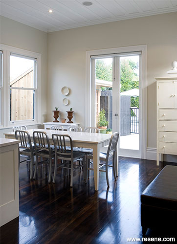
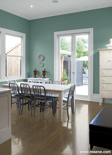
Which leads on to the next point. Nature conditions us to expect balance and harmony, and offers good guidelines to using colour. In nature, darker colours are often underfoot, like the earth, while mid-range colours are at eye level, like trees and leaves. The lightest colour is above us, like the sky and clouds. This can translate to interiors by using darker carpet, tiles or timber flooring then mid-range colour on the walls and pale colours on the ceiling.
Using a favourite painting, wallpaper, curtain fabric or a recently purchased cushion as the starting point for a scheme is a great way to create good colour composition. You can already see that the colours work together so draw them out of the art/wallpaper/fabric and use them on the walls and trims. Note the proportions the colours are used in, and mimic that in your colour scheme.
Select colours that reflect the mood you are trying to create. If you want a calm atmosphere, use greens, blues and earthy neutrals, and steer clear of high-energy reds. Conversely, if you want a stimulating interior, go for reds and oranges.
Most people find neutral or more pastel colours easy to use – colours that have quite a bit of white in them. So instead of grass green, you would have soft apple. Instead of brown, it would be beige. The common element, white, means that you can successfully combine any pastels into a colour scheme.
Successful colour schemes have one thing in common – balance. Try to use no more than two to three principal colours with touches of other accent colours to lift the scheme. The basic rule of using two-thirds of one colour and one-third of another is often successful.
Varying the gloss level of your paint also helps the colour scheme look more interesting. Most opt for Resene Zylone Sheen or the more washable Resene SpaceCote Low Sheen on walls, Resene Ceiling Paint or the more washable Resene SpaceCote Flat on ceilings and Resene Lustacryl semi-gloss or glossier Resene Enamacryl gloss on trim and joinery. The lower the sheen level the moodier and earthier the colour will look. A higher gloss will make the colour seem cleaner and brighter.
Top tip: Once you have narrowed down your colour choices, use Resene testpots to confirm your colour scheme. Apply two coats onto a piece of A2 card, leaving a border around it so the colour isn’t influenced by anything else. When the paint is dry, pin your colour to the wall and view it in daylight and artificial light, moving it around different areas of the room and folding it into the corner of the room for a true feel of the finished effect.
› Return to Habitat plus 03 - interior colour schemes
Updated 2/17
Search Habitat articles
If you have an idea, project or story that you think would suit Habitat plus, we’d love to hear from you. Please drop us an email with your details and include photos if submitting a project.
Habitat plus are not mailed directly. They are available free from Resene ColorShops and resellers while stocks last and available for viewing online.
![]() Get inspired ! Subscribe
Get inspired ! Subscribe ![]() Get saving ! Apply for a DIY card
Get saving ! Apply for a DIY card
![]()
Can't find what you're looking for? Ask us!
Company profile | Terms | Privacy policy | Quality and environmental policy | Health and safety policy
Colours shown on this website are a representation only. Please refer to the actual paint or product sample. Resene colour charts, testpots and samples are available for ordering online. See measurements/conversions for more details on how electronic colour values are achieved.
What's new | Specifiers | Painters | DIYers | Artists | Kids | Sitemap | Home | TOP ⇧