From the Resene decorating blog
Purple can be a bit like licorice when it comes to choosing an interior colour palette; typically, you either love it or hate it.
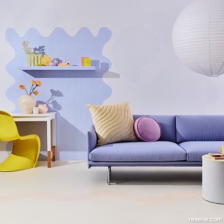
Vivid lilac shades pair with bright yellow for an unexpectedly delightful colour palette.
The main wall is painted in Resene Snow Drift with painted shape and shelf in Resene Hawkes Blue. Flooring in Resene Half Milk Punch with a subtle top layer in Resene Tuft Bush, stool in Resene Alabaster and desk in Resene Eighth Black White. Couch from Bauhaus, chair, vases, cushions, lightshade from Places & Graces. Project by Kate Alexander, image by Bryce Carleton.
But ‘purple’ can mean many things from dramatically deep plum like Resene Blackberry through the true violet purple of Resene Showstopper to the delicate lilac of Resene Fog which means it is a surprisingly versatile shade that we think deserves a closer look.
It can offer a degree of colour saturation and richness that few other colours can achieve, or with the blue and grey undertones of muted mauves it can be restrained and restful. The key to using purple is to get just the right tone for your space and complete colour palette, in just the right amount.
Resene Colour Consultant Amy Watkins is a fan of the drama darker colours can bring and suggests trying Resene Black Doris on all the walls of a formal dining or living area paired with contrasting trims in dusty grey-blue Resene Unite to soften the space and highlight the purple.
For a softer colour combination more suited to a bedroom or day-to-day living space, Amy suggests trying greyed lilac Resene Alaska for walls with muted teal Resene Epic for trims or furniture pieces.
To make the most of the restful nature of paler colours in the purple palette, Amy says the key is to keep to light or muted colours like cool Resene Breathless. To add some edginess or personality to these softer colour tones, Amy suggests looking at a contrasting or darker colour tone to use as a highlight in small amounts; just a piece of furniture or other feature accent. Try mid-toned blue Resene Rulebreaker or muted orange Resene Tuscany for this contemporary twist.
Shades of purple have, if you’ll excuse the pun, a colourful history. Mauve in particular is famous for being the world’s first synthetic dye colour, created by accident in the 1850s when British chemist William Henry Perkin was trying to synthesise quinine for the treatment of malaria.
The discovery triggered something of a boom in synthetic dye, making dyed textiles cheaper and more accessible. Until that point most dyes were made from organic substances. Traditional purple, for example, was made in ancient times from the desiccated glands of sea snails, which made it hugely expensive. That’s one reason the colour is so often associated with luxury and royalty.
Thankfully no sea snails have to die to create today’s purples. Sitting between red and blue on the colour wheel, purple is extremely versatile, able to be dialled up for heat and intensity, or down for cooler, subtle effects.
The colour is also thought to stimulate the imagination, inspiring creativity and fresh ideas, which makes it a perfect shade to experiment with in our interiors.
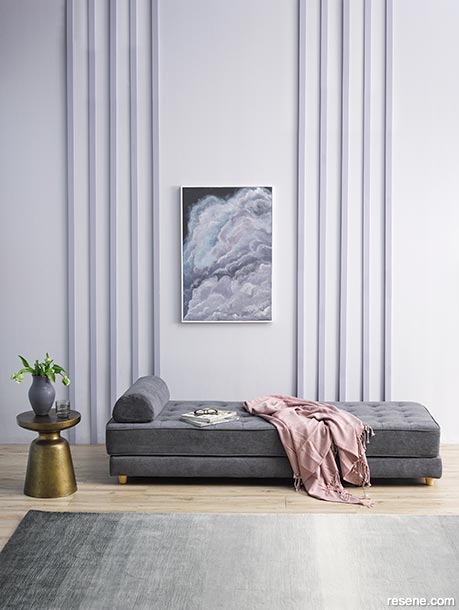
Subtle mauve tones and textures give this space a restrained, relaxing elegance.
Walls painted in Resene Ghost with battens in Resene Santas Grey, floor in Resene Colorwood Rock Salt, painting in Resene Gumboot, Resene Matakana, Resene Zulu, Resene Jimmy Dean, Resene Santas Grey, Resene Ghost, Resene In The Mauve and Resene Sea Fog with frame in Resene Sea Fog. The vase is Resene Matakana. Rug and smoked glass from Freedom Furniture, chaise longue and side table from Nood, throw from H&M Home. Project by Laura Lynn Johnstone, image by Melanie Jenkins.
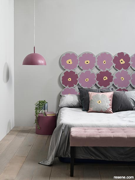
Muted mauve and violet flowers soften this otherwise plain bedroom.
Walls painted in Resene Quarter Delta, floor in Resene Colorwood Greywash, bedhead flowers in Resene Strikemaster and Resene Cosmic, with ‘pollen’ in Resene Chamois and Resene Hampton, background in Resene Delta and flower centres in Resene Cod Grey. The light and side table are Resene Cosmic. Project by Megan Harrison-Turner, image by Bryce Carleton.
Finding the right purple-toned colour to use is important if you want to embrace the hue without it overwhelming a space.
At one end of the purple spectrum we have lilacs like Resene Blue Chalk, which come from, in simple terms, the red and blue combination to create purple but with more white added. Lavender is often fairly interchangeable with lilac, perhaps slightly darker and bluer. Both colours tend to reflect the flowers they’re named after and both are often thought of as types of mauve.
At the other end of the purple gradient, we have violet and indigo shades like Resene Blackcurrant, which are created by adding more black to the red and blue combination.
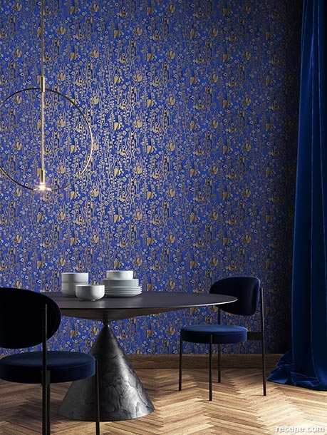
Paired with gold in Resene Wallpaper Collection AGA402, lush purples lend immediate luxury. Team with decor pieces in dark black or charcoal like Resene Bokara Grey, and golden toned wood finishes in Resene Colorwood Natural on flooring.
The important thing to remember though is colour descriptions are pretty subjective and personal. One person’s lilac is another person’s mauve or even amethyst, and one person’s violet is another person’s indigo or plum.
The key is to get a broad understanding so you can start to filter through whole spectrum colours to find the shades of purple you love, and work out the colour combinations that will offer you the finished result you want.
Top tip: Soft greys with the hint of a blue or lilac undertone like Resene Ted are a good neutral base for other deeper mauves and purples like Resene De Janeiro or Resene Grapevine.
Given its historical association with wealth and royalty, painting your rooms in deep, jewel-toned purples can be a cost-effective way to get a luxurious finish.
Pair smoky, rich Resene Enigma, look great with metallics like Resene Gold for a luxurious glamour that feels aged and regal. Try your metallic mixed Resene FX Paint Effects Medium, to create a more worn, burnished and lived-in finish.
Complete your room with plenty of glass or brass to reflect light and add a layer of luxury fabrics like suede, velvet or faux fur.
Cut through the richness with a hint of fresh yellow in Resene Rum Swizzle on trim and for added maximalism try sharp acid green Resene Happy Hour.
If you want a darker shade of luxury that’s not purple, try charcoal Resene Mine Shaft and then incorporate your purples as pastel lilacs and violets like Resene Lola or Resene Divine as highlight colours.
Through most of the 2010s, blush, peachy shades known as ‘millennial pinks’ were a strong trend in interior colour palettes. As we’ve hit the 2020s that trend has evolved to see soft, pastel lilacs often taking up the role of a subtle colour that can be used essentially as a neutral.
Try walls in Resene Chalk Lavender then finish the space with tonal layers of similarly dreamy colours like Resene Breathless or Resene Misty Lavender for a soothing, calming space. Run the spectrum from lavender to warm blue-greys with touches of Resene Dusted Blue and Resene Destiny.
Resene Ghost, a grey-mauve, is another soothing shade that works well as a neutral. Try it paired with the crisp blue of Resene Jagged Ice and creamy Resene Astra.
Top tip: Use a lavender shade like Resene Half Fog on your ceilings for an unexpected twist, and pair with a deep green like Resene Half Forest Green or burgundy Resene Aubergine for extra impact. For a subtler finish, pair it with walls in class Resene Half Alabaster.
With any of these shades that run between pale lilac to deep violet, the world is your purple oyster. Spend some time experimenting with Resene testpots and colour charts to work out where in the spectrum your tastes sit, and how you can use these versatile shades your way.


January 30, 2023
For help choosing colours to suit your projects, visit your local Resene ColorShop, ask a Resene Colour Expert online or book a Resene Colour Consultation.
Book a colour consult | Ask a Colour Expert | Ask a Paint Expert
Resene's decorating blog
Paint your home beautiful! Discover the latest decorating trends, tips and colour news.
![]()
Previous «
Kids bedrooms on a budget
![]()
Blog home
View the latest trends, tips and news
![]()
» Next
Make your reno more sustainable
![]() Get inspired ! Subscribe
Get inspired ! Subscribe ![]() Get saving ! Apply for a DIY card
Get saving ! Apply for a DIY card
![]()
Can't find what you're looking for? Ask us!
Company profile | Terms | Privacy policy | Quality and environmental policy | Health and safety policy
Colours shown on this website are a representation only. Please refer to the actual paint or product sample. Resene colour charts, testpots and samples are available for ordering online. See measurements/conversions for more details on how electronic colour values are achieved.
What's new | Specifiers | Painters | DIYers | Artists | Kids | Sitemap | Home | TOP ⇧