From the Resene decorating blog
There is something so satisfying about stepping into the entrance of a home and greeting multiple colours as you cast your eye around surrounding rooms. Of course, one elegant hue throughout a home can look stunning, but the flow of more than one colour in different spaces carries vitality.
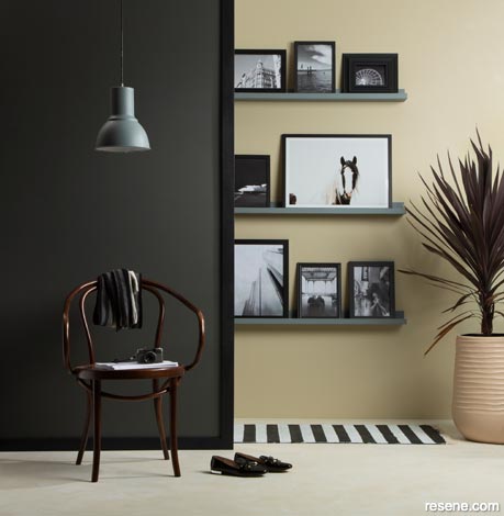
Striking contrast between two colours celebrate depth and interest in a space, even if it is only in a small part of a room. In this hallway, the main wall is in Resene Armadillo, the wall lining is in Resene Blackjack, the return wall is in Resene Beachcomber, the shelves are in Resene Rolling Stone, the floor is in Resene Black Haze and Resene Sugar Loaf, the plant pot is in Resene Rodeo Dust and the pendant light is in Resene Rolling Stone. Project by Kate Alexander, image by Bryce Carleton.
There’s no reason why we should adhere to only one colour in an entire home when there is a chance to get creative. Bright and punchy, dark and moody or subtle and muted, whatever your preference, a series of colours will bring interest and life.
With each room serving a different purpose, bedrooms and living rooms are for relaxing in, bathrooms should be sanctuaries, kitchens are places for entertaining and activity, storage rooms and toilets are where we spend the least of our time. Many of us want our rooms to feel a little different from each other.
Start by treating your home as an empty canvas; what colours make your heart sing? Take this as your inspiration – what better colours to surround yourself in each day? Think of a favourite season and the colours it evokes or focus on a favourite artwork and the tones that work together. Choose your colours from there.
Once you have a selection of your preferred colours, lay them on a table, in room order, to see how the colours flow. This is easier than trying to picture them in your mind.
When you’re standing in your hallway or living area, what other rooms can you see? What is your sightline? Whatever colours you see in surrounding rooms need to be cohesive with your hallway colour. The hues need to work together to provide visual continuity and, as a result, bring a pleasant feeling that runs smoothly from room to room. If they don’t, the home will feel messy and cluttered.
Resene Colour Consultant Amy Watkins recommends using the same colour tones, not necessarily the same depth, in an open-plan living area or joint space, such as a hallway leading to a kitchen. “In a villa, you might have an archway dividing a hallway that leads to a living area. Here is a chance to go dark in the hallway, with Resene Grey Chateau. Then use a lighter colour, Resene Iron in the living room or bedrooms. The surrounding colours don’t have to be from the same colour family. There is enough separation between the dark hallway and neighbouring rooms to create a sense of division.”
The key, Amy says, is that the trims throughout the house stay in the same tone. Don’t introduce a new colour trim in each room of the house. “In the bedrooms, keep the same colour trim that you have in the living room and hallway.” Save selecting your trim for when you have decided on what colour to put on each wall. A fresh white may only suit some of the richer colours you’ve chosen, so choosing your trims last allows you to see what trim colour will suit every wall.
Stylist Megan Harrison Turner says the trick to perfecting the flow of colours is two-fold. “First, before deciding on any colours, look at the light in your home,” she says. “Try and see how, in some rooms, the wall colour differs between rooms despite being the same colour. A house wants variety and pace, not just one bland same-same all the way through.”
Harmony is key, despite how bright or dark the colours are, Megan says. “All the colours need to work together even when they are not next to each other. Even if the colours are on different floors, the whole house needs to have colours that play nicely together. When using lots of colours – for instance, every child may get to choose a colour for their bedroom – keeping the use of the colour proportional is a good way of having a house feel like a comprehensive whole not piecemeal. For example, choose a colour for a feature wall in each bedroom and the kitchen splashback but perhaps not in the living spaces.”
"I recently worked on a beach house in which the doors were painted in bright, fun colours inspired by a colourful vintage cups and saucer set the client owned," Megan says. "But the rooms remained achromatic and the floors throughout were polished concrete.”
Kate Alexander, creative director of Places and Graces, recommends setting an overall house colour scheme and then bringing in these colours in every room in different proportions. “You can give each room its own personality and choose the right colours for that space but ensure there is a common thread. If you have a black front door painted in Resene All Black, this will tie in with a black-framed artwork in the hallway and a black coffee table in the lounge.”
Stick to either warm or cool colours as the base, Kate says: “Mix yellow with blue, but one needs to be the hero. In a home where tones of blue and grey are on the walls, add yellow for the occasional pop but let blue remain the hero.”
For colours in the same colour family, one option of warm, soulful neutrals is combining dusty coral Resene Cashmere, pink-brown Resene Dust Storm and the mushroom pink of Resene Spring Wood with Resene Umber White on your trims.
For colours in a different family but with a similar feel, use muted, dusky hues. Some of these you can easily extend into a girl's or boy's bedroom. Combine the misty green of Resene Pale Leaf, the pale cherry of Resene Alluring, the powder blue of Resene Relax and the lavender grey of Resene French Grey.
Before you start painting, do your planning, having your colours set out in full. Your flooring will need to accommodate your walls too, so ensure the underlying tones of your floorboards or carpet complement your walls.
If you have a walk-in wardrobe, powder room or storage room, this can be a place to bring in the strongest, most daring version of the colours used.
Ensuring your accent colours are consistent throughout each room will bring coherency too. Repeat them, even though the purpose of each room will differ, for unity. Use the blue-green tones of your lounge as cushion accent colours in your bedroom or in your hallway artwork. As a result, the blue-green ties the rooms together and you can swap them with each other from room to room, yet they will still fit in.
Once you’ve chosen your complementary colours, you’ll see the living proof that paint can quietly and calmly tell the story of your home.
December 07, 2020
For more colour and paint ideas and inspiration, see your local Resene ColorShop or visit the Resene decorating inspiration gallery online.
Book a colour consult | Ask a Colour Expert | Ask a Paint Expert
Resene's decorating blog
Paint your home beautiful! Discover the latest decorating trends, tips and colour news.
![]()
Previous «
Green blues to use in any room
![]()
Blog home
View the latest trends, tips and news
![]()
» Next
Sweet as rooms
![]() Get inspired ! Subscribe
Get inspired ! Subscribe ![]() Get saving ! Apply for a DIY card
Get saving ! Apply for a DIY card
![]()
Can't find what you're looking for? Ask us!
Company profile | Terms | Privacy policy | Quality and environmental policy | Health and safety policy
Colours shown on this website are a representation only. Please refer to the actual paint or product sample. Resene colour charts, testpots and samples are available for ordering online. See measurements/conversions for more details on how electronic colour values are achieved.
What's new | Specifiers | Painters | DIYers | Artists | Kids | Sitemap | Home | TOP ⇧